2020-02-06
关键字:EditText自定义背景、shape、corners
通过 xml 定义 View 的背景 Drawable 资源还是挺常用的。
本篇博文记录几种常用的自定义 Drawable 方式。
1、圆角矩形
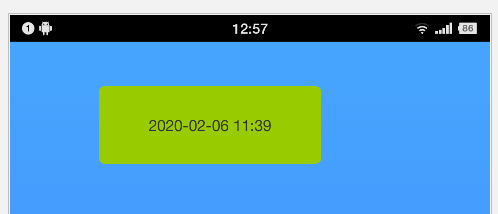
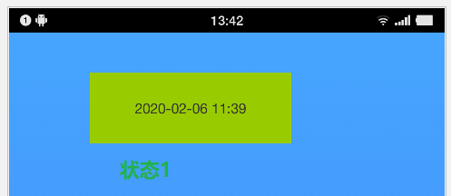
A、普通圆角矩形
<?xml version="1.0" encoding="utf-8"?>
<shape xmlns:android="http://schemas.android.com/apk/res/android"
    android:shape="rectangle">

    <corners android:radius="5dp" />

    <solid
        android:color="@android:color/holo_green_light" />

</shape>
出来的效果如下图所示:
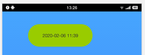
圆角率可以自行微调确定合适的值,也可以通过计算而来。如果想要呈现出一个椭圆形背景,则圆角率的值应等于 View 高度的一半。例如,笔者上图所示 View 的高度为 70dp,要让它的背景呈现椭圆形,则需将圆角率设置为 35dp:
<?xml version="1.0" encoding="utf-8"?>
<shape xmlns:android="http://schemas.android.com/apk/res/android"
    android:shape="rectangle">

    <corners android:radius="35dp" />

    <solid
        android:color="@android:color/holo_green_light" />

</shape>
效果如果下图所示:
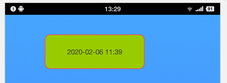
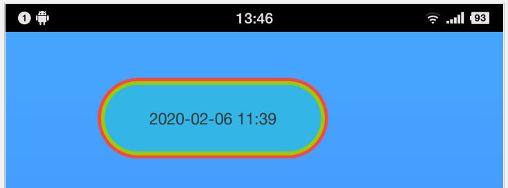
B、带边框的圆角矩形
<?xml version="1.0" encoding="utf-8"?>
<shape xmlns:android="http://schemas.android.com/apk/res/android"
    android:shape="rectangle">

    <corners android:radius="10dp" />

    <solid
        android:color="@android:color/holo_green_light" />

    <stroke
        android:width="1dp"
        android:color="@android:color/holo_red_light"/>

</shape>
效果如下图所示:
2、渐变色背景
<?xml version="1.0" encoding="utf-8"?>
<shape xmlns:android="http://schemas.android.com/apk/res/android">

    <corners android:radius="35dp" />

    <gradient
        android:angle="0"
        android:startColor="#74C941"
        android:endColor="#ffffff"/>

</shape>
出来的效果如下图所示:
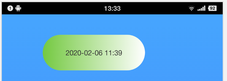
渐变方向受 android:angle 标签控制。0度时为从左至右渐变,90度时为从下至上渐变。角度控制渐变方向的关系是逆时针方向旋转。
<?xml version="1.0" encoding="utf-8"?>
<shape xmlns:android="http://schemas.android.com/apk/res/android">

    <corners android:radius="35dp" />

    <gradient
        android:angle="90"
        android:startColor="#74C941"
        android:endColor="#ffffff"/>

</shape>

3、状态切换背景
这种背景通常用于按钮。我们常常能遇到某个按钮在未按下时是一种背景色,在按下以后切换到另外一种背景色的需求。这种背景的设置代码如下所示:
<?xml version="1.0" encoding="utf-8"?>
<selector xmlns:android="http://schemas.android.com/apk/res/android">

    <item
        android:state_selected="true"
        android:drawable="@android:color/holo_red_light" />

    <item
        android:state_selected="false"
        android:drawable="@android:color/holo_green_light" />

</selector>
效果图如下所示:

4、组合圆环背景
<?xml version="1.0" encoding="utf-8"?>
<layer-list xmlns:android="http://schemas.android.com/apk/res/android">

    <item
        android:bottom="0dp">
        <shape android:shape="rectangle">
            <corners android:radius="35dp" />
            <solid android:color="@android:color/holo_red_light" />
        </shape>
    </item>

    <item
        android:left="3dp"
        android:top="3dp"
        android:right="3dp"
        android:bottom="3dp">
        <shape android:shape="rectangle">
            <corners android:radius="35dp" />
            <solid android:color="@android:color/holo_green_light" />
        </shape>
    </item>

    <item
        android:left="6dp"
        android:top="6dp"
        android:right="6dp"
        android:bottom="6dp">
        <shape android:shape="rectangle">
            <corners android:radius="35dp" />
            <solid android:color="@android:color/holo_blue_light" />
        </shape>
    </item>

</layer-list>
出来的效果图如下所示:
这种背景图片比较常见的场景有:用户头像背景框。如下图所示:
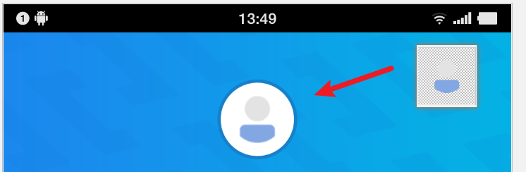
上图的用户头像就是由上面的圆环背景再加上一个普通图标组合而成的。
5、EditText的背景
EditText 自定义背景的方式与前面普通 View 的一样。都是通过自定义 xml 形式的 Drawable 再将它以 setBackground() 的形式设置进 EditText 即可。同时若要改变 EditText 光标的背景,也是一样,具体参阅下面代码即可:
    <EditText
        android:id="@+id/etOrderNo"
        android:textCursorDrawable="@drawable/edittext_cursor_color"
        android:background="@drawable/activity_main_cdjh_searchbar_et"
        android:layout_weight="1"
        android:layout_width="0dp"
        android:layout_height="match_parent"/>
上述加粗标绿的两行即是自定义控件及光标背景的代码。若不想要 EditText 的背景,则直接将颜色设置成透明或者为 null 即可。
以笔者上面的代码为例,EditText 背景 Drawable 为:
<?xml version="1.0" encoding="utf-8"?>

<selector xmlns:android="http://schemas.android.com/apk/res/android">

    <item>
        <shape>
            <stroke android:color="@null" android:width="0dp"/>
            <corners
                android:radius="8dp" />
        </shape>
    </item>

</selector>
光标背景的 Drawable 为:
<?xml version="1.0" encoding="utf-8"?>
<shape xmlns:android="http://schemas.android.com/apk/res/android"
    android:shape="rectangle">

    <size android:width="2dp" />
    <solid android:color="@color/edittext_cursor" />

</shape>