最近更新
2020.04.01
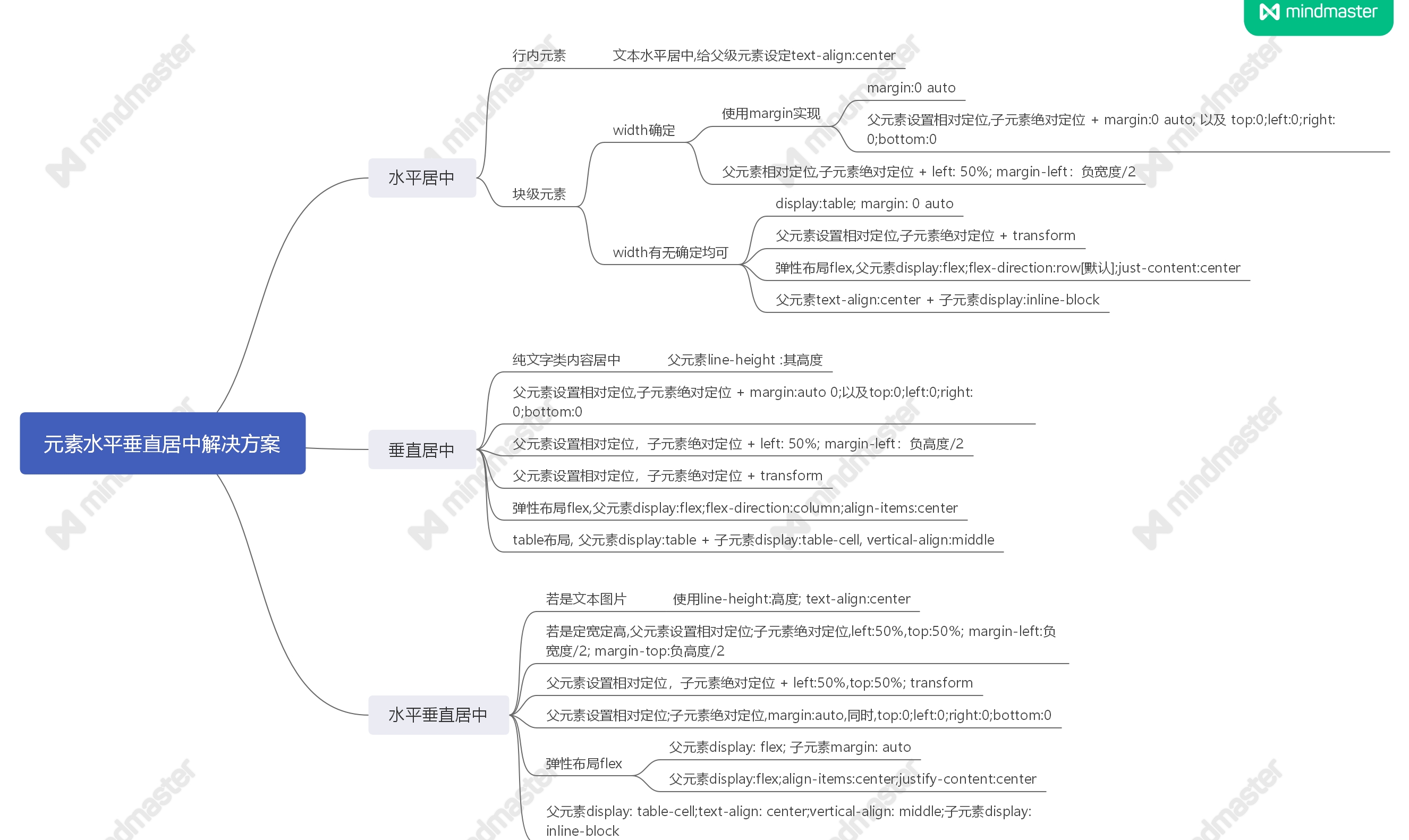
1. 水平居中
1.1 行内元素:文本水平居中,给父级元素设定text-align:center
html
<div class="spanParent">
	<span>span等行内元素水平居中</span>
</div>
css
/* 行内元素:文本水平居中,
给父级元素设定text-align:center */
.spanParent {
	 100%;
	text-align: center;
	/*文本水平居中,给父级元素设定*/
	border-bottom: 1px solid #ccc;
	background: pink;
}
1.2 块级元素,width确定
块级元素,width确定,使用margin实现:margin:0 auto
html
<div class="box"></div>
css
.box {
	 100px;
	height: 100px;
	background: yellow;
	/*水平居中,上下,左右*/
	margin: 0 auto;
}
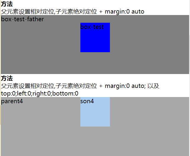
margin:0 auto
<div class="box-test-father">box-test-father
	<div class="box-test"></div>
</div>
css
.box-test-father {
	 100%;
	height: 200px;
	background-color: gray;
}

.box-test {
	 100px;
	height: 100px;
	background-color: #0000FF;
	margin: 0 auto;
}
父元素设置相对定位,子元素绝对定位 + margin:0 auto; 以及 top:0;left:0;right:0;bottom:0
.parent4 {
	/*相对定位*/
	position: relative;
	 100%;
	height: 200px;
	background: darkgray;
}

.son4 {
	/*设置绝对定位*/
	position: absolute;
	/*宽度固定*/
	 100px;
	height: 100px;
	background: #abcdef;
	/*设置top | left | right | bottom都等于0*/
	top: 0;
	left: 0;
	right: 0;
	bottom: 0;
	margin: 0 auto;
}
与上面一种方式的区别,见效果图
父元素相对定位,子元素绝对定位 + left: 50%; margin-left:负宽度/2
html
<div class="parent">
	<div class="son">son</div>
</div>
css
/* 块级元素(宽度确定) */
.parent1 {
	/*相对定位*/
	position: relative;
	 100%;
	height: 200px;
	background: darkgray;
}

.son1 {
	 100px;
	height: 100px;
	background: pink;
	position: absolute;
	left: 50%;
	margin-left: -50px;
}
1.3 块级元素,width有无确定均可
display:table; margin: 0 auto
.box6 {
	/*基本样式*/
	 100px;
	height: 100px;
	background: skyblue;

	display: table;
	margin: 0 auto;
}
父元素设置相对定位,子元素绝对定位 + transform
/* 块级元素(宽度未确定) */
.parent2 {
	/*相对定位*/
	position: relative;
	 100%;
	height: 200px;
	background: darkgray;
}

.son2 {
	 100px;
	height: 100px;
	background: pink;
	position: absolute;
	left: 50%;
	/*设置子元素 transform:translateX(-50%)*/
	transform: translate(-50%, 0);
}
弹性布局flex,父元素display:flex;flex-direction:row[默认];just-content:center
设置父元素display:flex(声明弹性盒模型)
flex-direction:row(设置主轴方向为水平方向)
justify-content:center(定义项目在主轴上的对齐方式)
/* 块级元素(宽度未确定) */
.parent3 {
	display: flex;
	/*row设置主轴方向为水平方向*/
	flex-direction: row;
	/*定义了在当前行上,弹性项目沿主轴如何排布*/
	justify-content: center;
	background: darkcyan;
}

.son3 {
	 100px;
	height: 100px;
	background: pink;
}
父元素text-align:center + 子元素display:inline-block
在子元素中设置display属性为inline-block后,能相对于父元素表现内联样式,
所以父元素的text-align: center;文本居中对子元素生效(缺点:只能实现水平居中)
.parent7 {
	background-color: navy;
	 400px;
	height: 300px;
	text-align: center;
}

.son7 {
	background-color: #cccccc;
	 100px;
	height: 100px;
	display: inline-block;
}
2.垂直居中
2.1 父元素line-height : 其高度,适合纯文字类内容居中
若是单行文本内容,可以设置 line-height 等于父元素的高度,
注意这是定高的,也就是高度是固定不变的,
这种方法只适用于单行文本的元素才适用,比如块级元素里面文本
html内容结构代码
<div class="parent">
     <span>文本垂直居中</span>
</div>
css层叠样式结构代码
.parent{
    400px;
    height:100px;
    background:pink;
    line-height:100px;/*line-height:属性值==元素的高度值*/
}
2.2 父元素设置相对定位,子元素绝对定位 + margin:auto 0;以及top:0;left:0;right:0;bottom:0
.parent4 {
	/*相对定位*/
	position: relative;
	 100%;
	height: 200px;
	background: darkgray;
}

.son4 {
	/*设置绝对定位*/
	position: absolute;
	/*宽度固定*/
	 100px;
	height: 100px;
	background: #abcdef;
	/*设置top | left | right | bottom都等于0*/
	top: 0;
	left: 0;
	right: 0;
	bottom: 0;
	margin: auto 0;
}
2.3 父元素设置相对定位,子元素绝对定位 + top: 50%; margin-top:负高度/2
html结构代码示例所示
<div class="parent">
      <div class="son"></div>
</div>
css结构代码
.parent{
        position:relative;
        400px;        /*父元素设置宽度和高度*/
        height:400px;
        border:1px solid red
}
.son{
        100px;
        height:100px;
        position:absolute;
        top:50%;
        margin-top:-50px; /*-宽度/2*/
        background:pink;
}
优点:适用于所有浏览器
缺点:父元素空间不够时,子元素可能不可见,当浏览器窗口缩小时,滚动条不出现时,如果子元素设置了overflow:auto,则高度不够时会出现滚动条
2.4 父元素设置相对定位,子元素绝对定位 + transform
html结构代码示例所示
<div class="parent">
      <div class="son"></div>
</div>
css结构代码
.parent{
        position:relative;
        400px;        /*父元素设置宽度和高度*/
        height:400px;
        border:1px solid red
}
.son{
        100px;
        height:100px;
        position:absolute;
        top:50%;
        /*设置子元素 transform: translateY(-50%);*/
        transform: translate(0, -50%);
        background:pink;
}
2.5 table布局, 父元素display:table + 子元素display:table-cell, vertical-align:middle
父元素使用display:table,让元素以表格的形式渲染
子元素可用display:table-cell(让元素以表格形式渲染), vertical-align:middle(使元素垂直对齐)
html内容结构代码
<div class="parent">
     <div class="son">content</div>
 </div>
css层叠样式结构代码
.parent{
    display:table; /*让元素以表格形式渲染*/
    border:1px solid red;
    background:red;
    height:200px;
}
.son{
    display:table-cell; /*让元素以表格的单元表格形式渲染*/
    vertical-align:middle;/*使用元素的垂直对齐*/
    background:yellow;
}
2.6 弹性布局flex,父元素display:flex;flex-direction:column;align-items:center
display:flex(声明弹性盒模型)
flex-direction:column(设置主轴方向为垂直方向)
align-items:center(元素在侧轴中间位置,富裕空间在侧轴两侧)
html内容结构代码
<div class="parent">
    <div class="son">1</div>
</div>
css层叠样式代码
.parent{
    height:400px;
    display:flex;
    flex-direction: column;/*容器内项目的排列方向(默认横向排列),row表示沿水平主轴由左向右排列,column沿垂直主轴右上到下 */
    align-items: center;  /*居中*/
    border:1px solid red;
}
.son{
    100px;
    height:100px;
    background:orange;
}
优点:使用display:flex布局,内容块的宽高任意,优雅的溢出,可用于复杂的高级布局技术
缺点:IE678不支持,兼容性处理,火狐,谷歌,要浏览器前缀
3.水平垂直居中
3.1 若是文本图片,则可以使用line-height:高度; text-align:center
html结构代码
<div class="wrap">
    文本水平垂直居中显示
</div>
css结构代码
.wrap {
	 400px;
	height: 400px;
	text-align: center;
	/*文本水平居中显示*/
	line-height: 400px;
	/*垂直居中显示*/
	font-size: 36px;
	border: 1px solid red;
}
3.2 若是定宽定高,父元素设置相对定位;子元素绝对定位,left:50%,top:50%; margin-left:负宽度/2; margin-top:负高度/2
html结构内容代码
<div class="parent">
      <div class="son"></div>
</div>
css示例代码如下所示
.parent{
    100%;
    height:500px;
    position:relative;
    background:red;
}
.son{
    100px;
    height:100px;
    background:pink;
    position:absolute;
    left:50%;
    top:50%;      /*top50%*/
        margin-left:-50px;/*-(元素宽度/2)*/
    margin-top:-50px; /*-(元素高度/2)*/
}
3.3 父元素设置相对定位;子元素绝对定位,margin:auto,同时,top:0;left:0;right:0;bottom:0
html内容结构代码
<div class="parent">
    <div class="son"></div>
</div>
css层叠样式代码
.son{
    position:absolute;  /*设置绝对定位*/
    100px;        /*宽度固定*/
    height:100px;
    background:#abcdef;
    top:0;
    left:0;             /*设置top | left | right | bottom都等于0*/
    right:0;
    bottom:0;
    margin: auto;      /*水平垂直居中*/
}
3.4 父元素display: table-cell;text-align: center;vertical-align: middle;子元素display: inline-block
兼容性:IE6,IE7下垂直居中失效
CSS代码:
.parent {
	/*基本样式*/
	 500px;
	height: 500px;
	background: #fee;
	/*display*/
	display: table-cell;
	text-align: center;
	vertical-align: middle;
}

.son {
	/*基本样式*/
	 200px;
	height: 200px;
	background: #aa0;
	/*display:通过转为行内块配合父级元素使用text-align实现水平居中*/
	display: inline-block;
}
3.5 父元素设置相对定位,子元素绝对定位 + left:50%,top:50%; transform
兼容性:一看到CSS3属性就知道了IE8及以下浏览器都不支持
CSS代码:
.parent {
	/*基本样式*/
	 500px;
	height: 500px;
	background: #fee;
	/*定位方式*/
	position: relative;
}

.son {
	/*基本样式*/
	 200px;
	height: 200px;
	background: #aa0;
	/*定位方式*/
	position: absolute;
	top: 50%;
	left: 50%;
	transform: translate(-50%, -50%);
	-webkit-transform: translate(-50%, -50%);
}
3.6 弹性布局flex,父元素display: flex; 子元素margin: auto
兼容性:IE9及以下版本垂直居中都失效,由于代码简单,推荐移动端使用
CSS代码:
.parent {
	/*基本样式*/
	 500px;
	height: 500px;
	background: #fee;
	/*display*/
	display: flex;
}

.son {
	/*基本样式*/
	 200px;
	height: 200px;
	background: #aa0;
	/*居中*/
	margin: auto;
}
3.7 弹性布局flex-2;父元素display:flex;align-items:center;justify-content:center
兼容性:IE9及以下版本水平垂直居中完全失效,推荐移动端使用
CSS代码:
.parent {
	/*基本样式*/
	 500px;
	height: 500px;
	background: #fee;
	/*display*/
	display: flex;
	align-items: center;
	justify-content: center;
}

.son {
	/*基本样式*/
	 200px;
	height: 200px;
	background: #aa0;
}
参考: