difference between width auto and width 100 percent
Previously my assumption about auto was that the width is set to that of the contents. Now I see that it takes the full width of the parent.
Can anyone please describe the differences between these?
回答1
Width 100% : It will make content with 100%. margin, border, padding will be added to this width and element will overflow if any of these added.
Width auto : It will fit the element in available space including margin, border and padding. space remaining after adjusting margin + padding + border will be available width/ height.
Width 100% + box-sizing: border box : It will also fits the element in available space including border, padding (margin will make it overflow the container).
回答2
It's about margins and border. If you use auto, then add border, your div won't become bigger than its container.
On the other hand, if you use 100% and some border, the element's width will be 100% + border or margin.
For more info see this.
回答3
Width auto
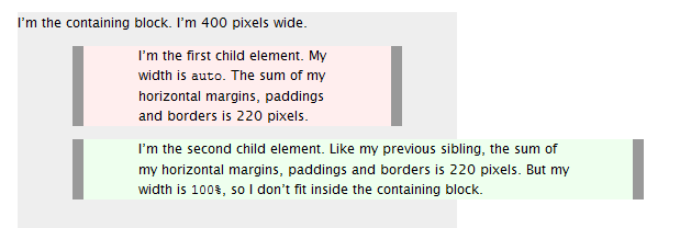
The initial width of a block level element like div or p is auto. This makes it expand to occupy all available horizontal space within its containing block. If it has any horizontal padding or border, the widths of those do not add to the total width of the element.
Width 100%
On the other hand, if you specify 100%, the element’s total width will be 100% of its containing block plus any horizontal margin, padding and border (unless you’ve used box-sizing:border-box, in which case only margins are added to the 100% to change how its total width is calculated). This may be what you want, but most likely it isn’t.
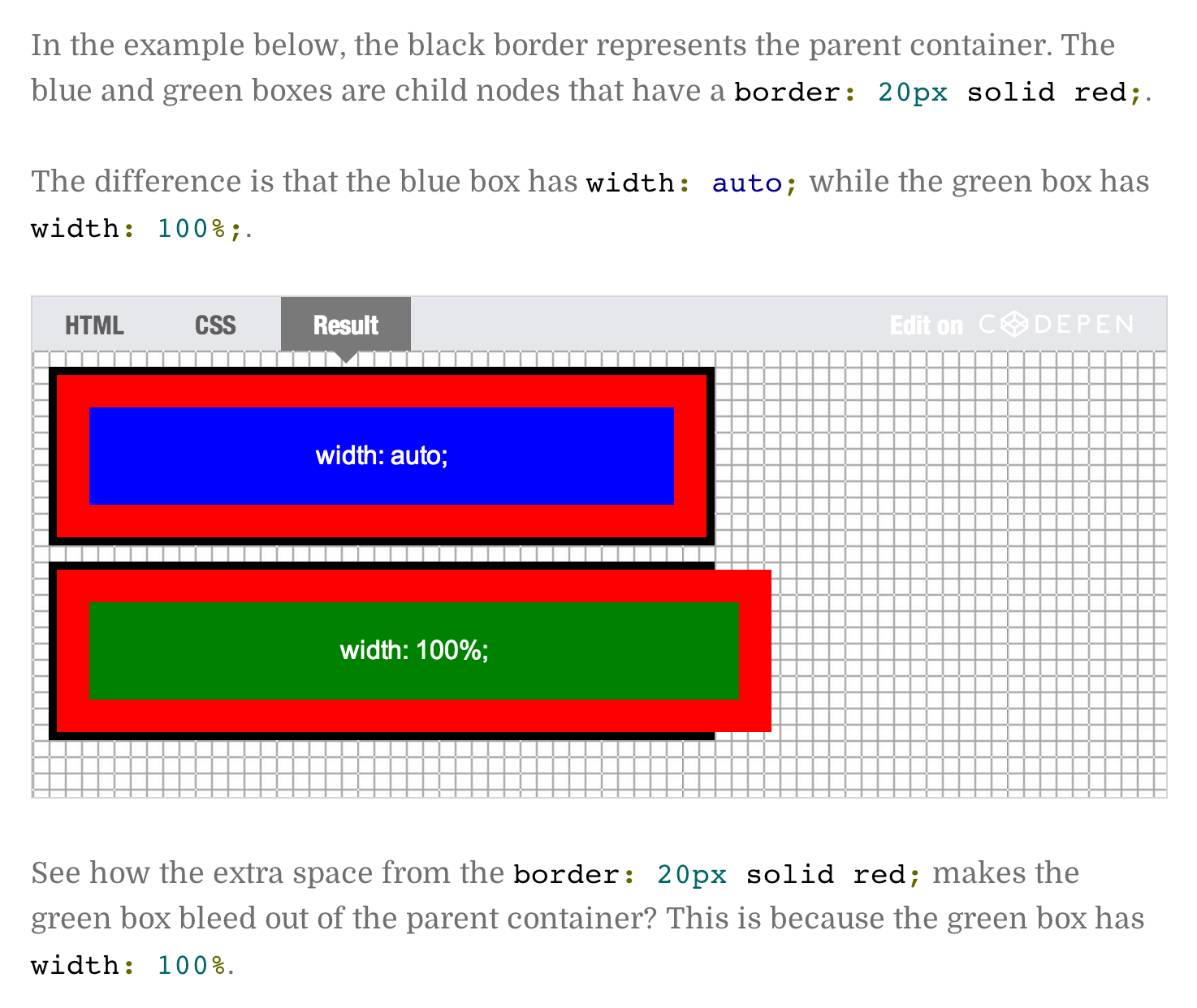
To visualise the difference see this picture:
回答4
-
auto;will try as hard as possible to keep an element the same width as its parent container when additional space is added from margins, padding, or borders. -
100%;will make the element as wide as the parent container. Extra spacing will be added to the element's size without regards to the parent. This typically causes problems.
Setting auto leads to 100%
It's all explained in the spec
http://www.w3.org/TR/CSS2/visudet.html#blockwidth
O.O
Essentially, auto means taking all the other specified paddings, borders and margins into account, fill the remaining space (assuming only the width is set to auto). So effectively 100% minus borders, padding and margins.
To fix, just set it to match the other elements, or stick them all in a containing element with a set width.