居中相关布局
水平居中布局
- inline-block + text-align:子元素
display: inline-block,父元素text-align - 定位 + transform:直接在元素上
left:50% + transform:translatex(-50%) - display:block + margin:auto:在元素上
display:block + margin:0 auto
方案一. inline-block + text-align
text-align是可以控制行内内容(文字、行内元素、行内块级元素)进行水平对齐。
对于块级元素我们可以设置display: inline-block进行对齐。
注:text-align属性具有继承性,会导致自己元素内部的文本也是居中显示的,需要自身设置text-align覆盖
<style>
    .wrap {
         100%;
        height: 200px;
        background-color: aqua;
        text-align: center;
    }
    .content {
         200px;
        height: 200px;
        background-color: blueviolet;
        display: inline-block;
    }
</style>
<body>
    <div class="wrap">
        <div class="content"></div>
    </div>
</body>
方案二:定位 + transform
此方法不需要知道子元素的宽,利用transform的相对自身定位,可以解决定位。
注:父级元素是否脱离文档流,不影响子元素水平居中效果,但是transform是css3属性,存在浏览器兼容问题
<style>
    .wrap {
        position: relative;
         100%;
        height: 200px;
        background-color: aqua;
    }
    .content {
        position: absolute;
        left: 50%;
        transform: translateX(-50%);
         200px;  /* 可以不用知道宽 */
        height: 200px; /* 可以不用知道高 */
        background-color: blueviolet;
    }
</style>
<body>
    <div class="wrap">
        <div class="content"></div>
    </div>
</body>
方案三:dispaly: block + margin: auto
此方法需要知道子元素的宽和高或者使子元素成为块级元素。margin: 0 auto会自动分配实现外边距效果。
注:这里子元素设置display为block或者table都是可以的,如果子元素脱离文档流(浮动,定位),会导致margin属性的值无效。
<style>
    .wrap {
         100%;
        height: 200px;
        background-color: aqua;
    }
    .content {
         200px;
        height: 200px;
        background-color: blueviolet;
        display: block;
        margin: 0 auto;
    }
</style>
<body>
    <div class="wrap">
        <div class="content"></div>
    </div>
</body>
垂直相关布局
-
定位 + transform:
top:50% + transform:translateY(-50%) -
display:table-cell + vertical:设置父元素
diplay:table-cell + vertical-align: middle;
方案一:定位 + transform
该方案与水平居中方案二同样原理,不赘述。
<style>
    .wrap {
        position: relative;
         200px;
        height: 600px;
        background-color: aqua;
    }
    .content {
        position: absolute;
        top: 50%;
        transform: translateY(-50%);
         200px;
        height: 200px;
        background-color: blueviolet;
    }
</style>
<body>
    <div class="wrap">
        <div class="content"></div>
    </div>
</body>
方案二:display:table-cell + vertical
设置display: table-cell的元素具有td元素的行为,它的子元素布局方式类似文本元素,可以在父元素使用vertical-align: middle;实现子元素的垂直居中。
注意:vertical-align属性具有继承性,导致父元素内文本也是垂直居中显示的。
<style>
    .wrap {
        display: table-cell;
        vertical-align: middle;
         200px;
        height: 600px;
        background-color: aqua;
    }
    .content {
         200px;
        height: 200px;
        background-color: blueviolet;
    }
</style>
<body>
    <div class="wrap">
        <div class="content"></div>
    </div>
</body>
水平垂直居中
- 定位 + 负mrgin:需要知道子元素宽高
left:50% right:50% + margin-top:-100px margin-left--100px - 定位 + transform:不需要知道子元素宽高
left:50% top:50% + transform:translate(-50%,-50%) - css-table + 行内/行内块 元素:不需要宽高,但需要撑开内容。父元素
diplay:table-cell vetical-align:middle,子元素display:inline-block - css-table + 块元素:不需要知道宽高。父元素
diplay:table-cell vetical-align:middle,子元素margin: 0 auto - flex布局:直接父元素
dipaly:flex align-itme:center justify-content:center
方案一:定位 + 负mrgin
结合上面水平+垂直的方案,该方案兼容性很好,但是需要知道子元素的高宽
<style>
    .wrap {
        position: relative;
         1200px;
        height: 800px;
        background-color: aqua;
    }
    .content {
        position: absolute;
        left: 50%;
        top: 50%;
      	margin-top:-100px;
      	margin-left:-100px;
         200px;
        height: 200px;
        background-color: blueviolet;
    }
</style>
<body>
    <div class="wrap">
        <div class="content"></div>
    </div>
</body>
方案二:定位 + transform
该方案不需要知道子元素的高和宽,但老浏览器可能会存在兼容性问题。
<style>
    .wrap {
        position: relative;
         1200px;
        height: 800px;
        background-color: aqua;
    }
    .content {
        position: absolute;
        left: 50%;
        top: 50%;
        transform: translate(-50%, -50%);
         200px;
        height: 200px;
        background-color: blueviolet;
    }
</style>
<body>
    <div class="wrap">
        <div class="content"></div>
    </div>
</body>
方案三:css-table + 行内/行内块 元素
利用新增的table属性该方案兼容性不错,不需要知道子元素的宽和高
<style>
    .wrap {
        display: table-cell;
        vertical-align: middle;
         1200px;
        height: 800px;
        background-color: aqua;
    }
    .content {
        diplay: inline-block;
         200px;
        height: 200px;  /* 此处不一定需要宽高,内容撑开就可 */
        background-color: blueviolet;
    }
</style>
<body>
    <div class="wrap">
        <div class="content"></div>
    </div>
</body>
方案四:css-table + 块元素
该方案,是对方案三的补充,可以不用使子元素成为行内块元素就可以水平垂直居中。
<style>
    .wrap {
        display: table-cell;
        vertical-align: middle;
         1200px;
        height: 800px;
        background-color: aqua;
    }
    .content {
        margin: 0 auto;
         200px;
        height: 200px;
        background-color: blueviolet;
    }
</style>
<body>
    <div class="wrap">
        <div class="content"></div>
    </div>
</body>
更简便的布局方法:flex布局
使用flex布局更加简便、有效对元素进行布局,无论是水平、垂直亦或是水平垂直居中都不在话下,但是flex布局会有一些兼容性的问题,但如果没有兼容性的要求,flex布局无疑是最好的方式之一。
 <style>
     .wrap {
         display: flex;
         align-items: center;  /* 垂直居中 */
         justify-content: center;  /* 水平居中 */
          1200px;
         height: 800px;
         background-color: aqua;
     }
     .content {
          200px;
         height: 200px;
         background-color: blueviolet;
     }
 </style>
 <body>
     <div class="wrap">
         <div class="content"></div>
     </div>
 </body>
N列布局
两列布局
这里的两列布局指的是,其中一列是定宽元素,另一列元素宽度自适应。比如,我们实现做列定宽,右列自适应的布局。
方案一:左边元素浮动,定宽,右边元素设置margin-left
左边元素定宽并且设置为浮动,右边元素margin-left设置为左边元素宽度大小。
<style>
    .l, .r {
        height: 600px;
    }
    .l {
         400px;
        background-color: aqua;
        float: left;
    }
    .r {
        background-color: blueviolet;
        margin-left: 400px;
    }
</style>
<body>
    <div class="l">定宽</div>
    <div class="r">自适应</div>
</body>
方案二:左边元素浮动、定宽,右边元素设置为overflow:hidden
右边元素因为设置了overflow: hidden开启了BFC,与外界隔离,所以能实现效果。
注意:overflow:hidden的设置也使得右边元素内容超出隐藏。这里如果不设置overflow:hidden,右边元素的宽度是100%,有一部分被左边浮动元素盖住,不是我们要的结果,虽然看起来没什么区别。
<style>
    .l, .r {
        height: 600px;
    }
    .l {
         400px;
        background-color: aqua;
        float: left;
    }
    .r {
        background-color: blueviolet;
        overflow: hidden;
    }
</style>
<body>
    <div class="l">定宽</div>
    <div class="r">自适应</div>
</body>
方案三:将左右元素用一个display:table的元素包裹,左右元素设置为display: table-cell
基于表格元素,没有定宽和高的元素会被按比例分配布局
<style>
    .w {
        display: table;
        table-layout: fixed;
         100%;
    }
    .l, .r {
        display: table-cell;
        height: 600px;
    }
    .l {
         400px;
        background-color: aqua;
    }
    .r {
        background-color: blueviolet;
    }
</style>
<body>
    <div class="w">
        <div class="l">定宽</div>
        <div class="r">自适应</div>
    </div>
</body>
方案四:flex布局
父容器采用flex布局,左边元素定宽之后,右边元素,因为只有一个,所以flex属性设置为不是0的正值(也就是设置flex-grow),都会占满剩余空间。
但会有兼容性问题
 <style>
     .p {
         display: flex;
         height: 600px;
     }
     .l {
        background-color: aqua;
         400px;
     }
     .r {
         flex: 1;
         background-color: blueviolet;
     }
 </style>
 <body>
     <div class="p">
         <div class="l">定宽</div>
         <div class="r">自适应</div>
     </div>
 </body>
三列布局
三列布局主要分三种情况,普通布局,以及有名的圣杯布局、双飞翼布局,详细区别下面讲
普通三列布局: 定宽 + overflow: hidden
<style>
    .l, .c, .r {
        height: 600px;
    }
    .l {
         400px;
        background-color: aqua;
        float: left;
    }
    .c {
         400px;
        background-color: blueviolet;
        float: left;
    }
    .r {
        background-color: brown;
        overflow: hidden;
    }
</style>
<body>
    <div class="l">定宽</div>
    <div class="c">定宽</div>
    <div class="r">自适应</div>
</body>
圣杯布局
解决两边定宽,中间自适应的经典方法。但圣杯布局具有缺陷,当中间的子元素小于两边的子元素的时候,布局就会出现混乱。以下是大致流程:
- 左中右三者都设置
float - 设置
main的宽度为100% - 设置左右两边子元素
margin-left,左边设置为:-100%,右边设置为:-自身宽度。 - 设置容器(父元素)的
padding值,将左右padding值设为相应的子元素宽度 - 最后利用相对定位进行最后的设置就可。
    <style>
        .w{
            padding: 0 200px;
        }
        .c {
             100%;
            height: 200px;
            float: left;
            background-color: blueviolet;
        }
        .l {
             200px;
            height: 200px;
            float: left;
            margin-left: -200px;
            background-color: aqua;
            position: relative;
            left: -200px;
        }
        .r {
             200px;
            height: 200px;
            float: left;
            margin-left: -200px;
            background-color: brown;
            position: relative;
            right:  -200px;
        }
    </style>
    <body>
        <div class="w">
          <!-- 为了更快的将主页面的内容将加载出来,并且使得SEO更好,将主栏目放在前面。 -->
            <div class="c">自适应</div>
            <div class="l">定宽</div>
            <div class="r">定宽</div>
        </div>
    </body>
双飞翼布局
双飞翼布局相较于圣杯布局,不仅解决了圣杯布局的问题,也同时做到了更简洁。主要步骤为:
- 让三者左浮动
- 通过在居中子元素设置一个容器,使容器满足宽度100%
- 为 两侧子元素设置负边距,左侧子元素设置:
margin-left为-100%,右侧元素设置为:-自身宽度 - 给居中容器的子元素设置
margin分别为两侧的宽度
<style>
    .l, .c, .r {
        height: 600px;
        float: left;
    }
    .l {
         400px;
        background-color: aqua;
        /* 为了让l元素从当前行移动到第一行同一位置*/
        margin-left: -100%;
    }
    .c {
         100%;
        background-color: blue;
    }
    .i {
        height: 600px;
        background-color: blueviolet;
        margin-left: 400px;
        margin-right: 400px;
    }
    .r {
         400px;
        background-color: brown;
         /* 为了让r元素移动到第一行*/
        margin-left: -400px;
    }
</style>
<body>
    <div class="c">
        <div class="i">自适应</div>
    </div>
    <div class="l">定宽</div>
    <div class="r">定宽</div>
</body>
flex布局
flex布局会更加简单有效,毕竟就是为了一维布局而生的。只是会在老浏览器上有兼容性问题。
<style>
    .w {
        display: flex;
        height: 600px;
    }
    .l {
         400px;
        background-color: aqua;
    }
    .c {
        flex: 1;
        background-color: blueviolet;
    }
    .r {
         400px;
        background-color: brown;
    }
</style>
<body>
    <div class="w">
        <div class="l">定宽</div>
        <div class="c">自适应</div>
        <div class="r">定宽</div>
    </div>
</body
多列等分布局
多个列高度不定,自适应等分宽度布局。
方案一: 浮动 + 百分数平分
<style>
   .col {
       float: left;
        20%;
       height: 300px;
   }
   .col1 {
       background-color: blue;
   }
   .col2 {
       background-color: blueviolet;
   }
   .col3 {
       background-color: aqua;
   }
   .col4 {
       background-color: beige;
   }
   .col5 {
       background-color: salmon;
   }
</style>
<body>
    <div class="w">
        <div class="col col1"></div>
        <div class="col col2"></div>
        <div class="col col3"></div>
        <div class="col col4"></div>
        <div class="col col5"></div>
    </div>
</body>
方案二:使用column布局
在父元素指定column属性几列即可
浏览器会有兼容性问题
 <style>
     .w {
         /* 指定列数 */
         column-count: 5;
         /* 指定列与列之间的间隙,默认1em */
         column-gap: 0;
     }
     .col {
         height: 300px;
     }
     .col1 {
         background-color: blue;
     }
     .col2 {
         background-color: blueviolet;
     }
     .col3 {
         background-color: aqua;
     }
     .col4 {
         background-color: beige;
     }
     .col5 {
         background-color: salmon;
     }
 </style>
 <body>
     <div class="w">
         <div class="col col1"></div>
         <div class="col col2"></div>
         <div class="col col3"></div>
         <div class="col col4"></div>
         <div class="col col5"></div>
     </div>
 </body>
方案三:最简便的flex布局
 <style>
     .w {
        display: flex;
     }
     .col {
         height: 300px;
         flex: 1;
     }
     .col1 {
         background-color: blue;
     }
     .col2 {
         background-color: blueviolet;
     }
     .col3 {
         background-color: aqua;
     }
     .col4 {
         background-color: beige;
     }
     .col5 {
         background-color: salmon;
     }
 </style>
 <body>
     <div class="w">
         <div class="col col1"></div>
         <div class="col col2"></div>
         <div class="col col3"></div>
         <div class="col col4"></div>
         <div class="col col5"></div>
     </div>
 </body>
 </html>
多列等高布局
多列内容不一致,保证每一列的高度是相同的。最高的高度由内容最多的列决定
方案一:使用display:table布局
为父元素设置display:table,子元素设置diaplay: table-cell。
 <style>
    .w {
        display: table;
    }
    .col {
        display: table-cell;
         20%;
    }
    .col1 {
        background-color: blue;
    }
    .col2 {
        background-color: blueviolet;
    }
    .col3 {
        background-color: aqua;
    }
    .col4 {
        background-color: beige;
    }
    .col5 {
        background-color: salmon;
    }
 </style>
 <body>
     <div class="w">
         <div class="col col1">啊啊啊啊啊啊啊啊啊啊啊啊</div>
         <div class="col col2">啊啊啊啊啊啊啊啊啊啊啊啊啊啊啊啊啊啊啊啊啊啊啊啊啊啊啊啊啊啊啊啊啊啊啊啊啊啊啊啊啊啊啊啊啊啊啊啊啊</div>
         <div class="col col3">啊啊啊啊啊啊啊啊啊啊啊啊啊啊啊啊啊啊啊啊啊啊啊啊啊啊啊啊啊啊啊啊啊啊啊啊啊啊啊啊啊啊啊啊啊啊啊啊啊啊啊啊啊啊啊啊啊啊啊啊啊啊啊啊啊啊啊啊啊啊啊啊啊啊啊啊啊啊啊啊啊啊啊啊啊啊啊啊啊啊啊啊啊啊</div>
         <div class="col col4"></div>
         <div class="col col5">啊啊啊啊啊啊啊啊啊啊啊啊啊啊啊啊啊啊啊啊啊啊啊啊啊啊啊啊啊啊啊啊啊啊啊啊啊啊啊啊啊啊啊啊啊啊啊啊啊啊啊啊啊啊啊啊啊啊啊啊啊啊啊啊啊啊啊啊啊啊啊啊啊啊啊啊啊啊啊啊啊啊啊啊啊啊啊啊啊啊啊啊啊啊啊啊啊啊啊啊啊啊啊啊啊啊啊啊啊啊啊啊啊啊啊啊啊啊啊啊啊啊啊啊啊啊啊啊啊啊啊啊啊啊啊啊啊啊啊啊啊</div>
     </div>
 </body>
方案二:使用flex布局
默认情况下,display: flex元素align-item属性值默认为stretch。如果项目未设置,则子元素会占满整个容器的高度。
 <style>
    .w {
        display: flex;
    }
    .col {
        flex: 1;
    }
    .col1 {
        background-color: blue;
    }
    .col2 {
        background-color: blueviolet;
    }
    .col3 {
        background-color: aqua;
    }
    .col4 {
        background-color: beige;
    }
    .col5 {
        background-color: salmon;
    }
 </style>
 <body>
     <div class="w">
         <div class="col col1">啊啊啊啊啊啊啊啊啊啊啊啊</div>
         <div class="col col2">啊啊啊啊啊啊啊啊啊啊啊啊啊啊啊啊啊啊啊啊啊啊啊啊啊啊啊啊啊啊啊啊啊啊啊啊啊啊啊啊啊啊啊啊啊啊啊啊啊</div>
         <div class="col col3">啊啊啊啊啊啊啊啊啊啊啊啊啊啊啊啊啊啊啊啊啊啊啊啊啊啊啊啊啊啊啊啊啊啊啊啊啊啊啊啊啊啊啊啊啊啊啊啊啊啊啊啊啊啊啊啊啊啊啊啊啊啊啊啊啊啊啊啊啊啊啊啊啊啊啊啊啊啊啊啊啊啊啊啊啊啊啊啊啊啊啊啊啊啊</div>
         <div class="col col4"></div>
         <div class="col col5">啊啊啊啊啊啊啊啊啊啊啊啊啊啊啊啊啊啊啊啊啊啊啊啊啊啊啊啊啊啊啊啊啊啊啊啊啊啊啊啊啊啊啊啊啊啊啊啊啊啊啊啊啊啊啊啊啊啊啊啊啊啊啊啊啊啊啊啊啊啊啊啊啊啊啊啊啊啊啊啊啊啊啊啊啊啊啊啊啊啊啊啊啊啊啊啊啊啊啊啊啊啊啊啊啊啊啊啊啊啊啊啊啊啊啊啊啊啊啊啊啊啊啊啊啊啊啊啊啊啊啊啊啊啊啊啊啊啊啊啊啊</div>
     </div>
 </body>
三. 全屏布局
全屏布局就是头部、内容区、底部三大区域占满屏幕的布局。
实现效果:
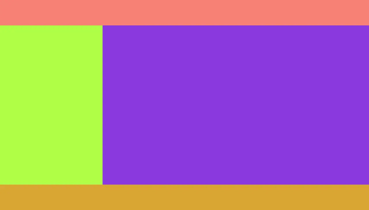
 <style>
        html, body {
            margin: 0;
            overflow: hidden;
        }
        .header {
            position: fixed;
            left: 0;
            top: 0;
            right: 0;
            height: 100px;
            background-color: salmon;
        }

        .w {
            position: fixed;
            left: 0;
            right: 0;
            top: 100px;
            bottom: 100px;
            overflow: auto;
            background-color: palevioletred;
        }

        .w .l {
             400px;
            /* height: 100%; */
            position: fixed;
            left: 0;
            top: 100px;
            bottom: 100px;
            background-color: greenyellow;
        }

        .w .r {
            position: fixed;
            left: 400px;
            right: 0;
            top: 100px;
            bottom: 100px;
            background-color: blueviolet;
        }

        .footer {
            position: fixed;
            left: 0;
            right: 0;
            bottom: 0;
            height: 100px;
            background-color: goldenrod;
        }
    </style>
    <body>
        <div class="header"></div>
        <div class="w">
            <div class="l"></div>
            <div class="r"></div>
        </div>
        <div class="footer"></div>
    </body>
搬运文章
[CSS布局中圣杯布局与双飞翼布局的实现思路差异在哪里?](CSS布局中圣杯布局与双飞翼布局的实现思路差异在哪里? - Shelley Lee的回答 - 知乎 https://www.zhihu.com/question/21504052/answer/149611362)