zoukankan      html  css  js  c++  java
  • 利用CSS3D效果制作简易旋转木马效果

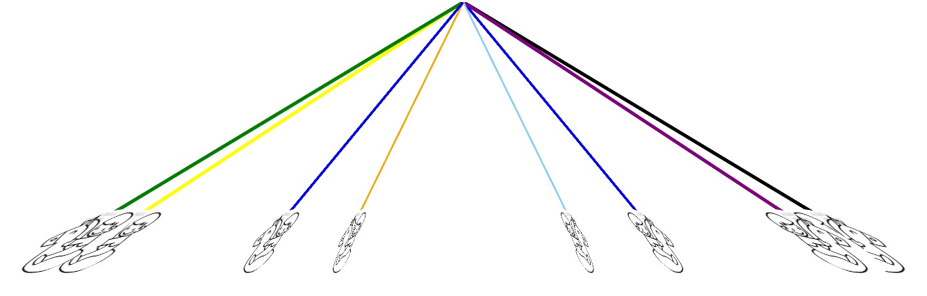
    最近看一下css3d的一些特性,想着也实验学习一下,制作个小demo之类的。就练习了一下。开发一个粗糙的选择木马效果,如图

    其实就是找到角度和位置,计算每根柱子的旋转角度摆放到3d空间的置顶位置即可。然后利用css的animate属性让3d舞台无线旋转,就有了一简易的旋转木马效果。感兴趣的可以看一下,可以把代码中的图片路径改为自己的图片地址就行了。直接可用。

    代码如下:

    <!DOCTYPE html>
    <html>
    <head lang="en">
        <meta charset="UTF-8">
        <title></title>
        <style>
            .box{
                width:800px;
                height: 600px;
                margin:0px auto;
            }
            .box .stage{
                perspective:0px;
                perspective-origin: center center;
            }
            .box .stage .container{
                transform-style: preserve-3d;
    
            }
            .box ul,.box li{
                list-style: none;
                margin:0px;
                padding:0px;
                text-align: center;
                font-weight: bold;
            }
            .box ul{
                margin-left:200px;
                width:400px;
                height:400px;
            }
            .box li{
                position: absolute;
                margin-left:200px;
                width:10px;
                height:300px;
                background: blue;
                color:red;
                transform-origin: 5px top;
            }
    
            .box li> .horse{
                width:100px;
                height:100px;
                position: absolute;
                top:298px;
                left:-55px;
                border-radius: 50px;
                background-image: url("horse.jpg");
                background-size: contain;
            }
    
            .box ul{
                animation: run 20s linear infinite;
            }
    
            @-webkit-keyframes run {
                0%{
                    transform: rotateY(0deg);
                }
                100%{
                    transform: rotateY(360deg);
                }
            }
    
            @-webkit-keyframes horserun {
                0%{
                    transform: translateY(0px);
                }
                100%{
                    transform: translateY(50px);
                }
            }
    
    
        </style>
        <script src="js/jquery-1.11.2.js"></script>
        <script>
    
            $(function(){
                var len=$(".container>li").length;
                $(".container>li").each(function(e){
                    var index=$(".container>li").index(this)+1;
                    $(this).css({
                       "transform":"rotateY("+360/len * index+"deg) skew(60deg)"
                    });
    
                });
            })
    
        </script>
    </head>
    <body>
    <div class="box">
        <div class="stage">
            <ul class="container">
                <li class="horse1">
                    <div class="horse"></div>
                </li>
                <li style="background: orange">
                    <div class="horse"></div>
                </li>
                <li style="background: #ffff00">
                    <div class="horse"></div>
                </li>
                <li style="background: green">
                    <div class="horse"></div>
                </li>
                <li style="background: blue">
                    <div class="horse"></div>
                </li>
                <li style="background:lightskyblue ">
                    <div class="horse"></div>
                </li>
                <li style="background: purple">
                    <div class="horse"></div>
                </li>
                <li style="background: black">
                    <div class="horse"></div>
                </li>
            </ul>
        </div>
    </div>
    </body>
    </html>

    学习css3d的试验demo,觉得好玩就练习一下。。。

    感谢阅读。。。

  • 相关阅读:
    指针常量与常量指针
    C语言创建并使用dll
    C语言创建并使用lib
    配置错误
    目前常用的自然语言处理开源项目/开发包大汇总
    pyhanlp 文本聚类详细介绍
    Spring Boot中对自然语言处理工具包hanlp的调用详解
    pyhanlp 停用词与用户自定义词典功能详解
    Hanlp分词实例:Java实现TFIDF算法
    Spark应用HanLP对中文语料进行文本挖掘--聚类详解教程
  • 原文地址:https://www.cnblogs.com/chunyangji/p/6098517.html
Copyright © 2011-2022 走看看