<import name="flex-row" src="../Common/ui/h-ui/basic/c_flex_row"></import>
<import name="flex-col" src="../Common/ui/h-ui/basic/c_flex_col"></import>
<template>
    <div class="container">
        <flex-row h-style="margin-top: 30px;margin-bottom: 30px;">
            <flex-col bg-color="bg-primary" justify="center">
                <text>A</text>
            </flex-col>
            <flex-col bg-color="bg-info" justify="center">
                <text>B</text>
            </flex-col>
            <flex-col bg-color="bg-primary" justify="center">
                <text>C</text>
            </flex-col>
        </flex-row>
    </div>
</template>

<style lang="less">
    @import '../Common/styles/container.less';
    .container text {
         color: #ffffff;
    }
</style>

<import name="flex-row" src="../Common/ui/h-ui/basic/c_flex_row"></import>
<import name="flex-col" src="../Common/ui/h-ui/basic/c_flex_col"></import>
<template>
<div class="container">
<flex-row h-style="margin-top: 30px;margin-bottom: 30px;">
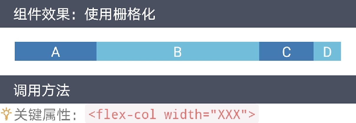
<flex-col width="3" bg-color="bg-primary" justify="center">
<text>A</text>
</flex-col>
<flex-col width="6" bg-color="bg-info" justify="center">
<text>B</text>
</flex-col>
<flex-col width="2" bg-color="bg-primary" justify="center">
<text>C</text>
</flex-col>
<flex-col width="1" bg-color="bg-info" justify="center">
<text>D</text>
</flex-col>
</flex-row>
</div>
</template>
<style lang="less">
@import '../Common/styles/container.less';
.container text {
color: #ffffff;
}
</style>

<import name="flex-row" src="../Common/ui/h-ui/basic/c_flex_row"></import>
<import name="flex-col" src="../Common/ui/h-ui/basic/c_flex_col"></import>
<template>
<div class="container">
<flex-row h-style="margin-top: 30px;margin-bottom: 30px;">
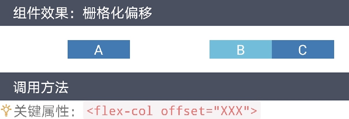
<flex-col offset="2" bg-color="bg-primary" justify="center">
<text>A</text>
</flex-col>
<flex-col offset="3" bg-color="bg-info" justify="center">
<text>B</text>
</flex-col>
<flex-col bg-color="bg-primary" justify="center">
<text>C</text>
</flex-col>
</flex-row>
</div>
</template>
<style lang="less">
@import '../Common/styles/container.less';
.container text {
color: #ffffff;
}
</style>

<import name="flex-row" src="../Common/ui/h-ui/basic/c_flex_row"></import>
<import name="flex-col" src="../Common/ui/h-ui/basic/c_flex_col"></import>
<template>
<div class="container">
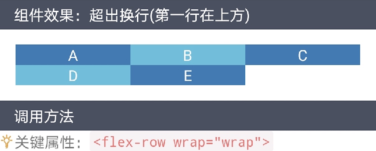
<flex-row wrap="wrap" h-style="margin-top: 30px;margin-bottom: 30px;">
<flex-col width="4" bg-color="bg-primary" justify="center">
<text>A</text>
</flex-col>
<flex-col width="4" bg-color="bg-info" justify="center">
<text>B</text>
</flex-col>
<flex-col width="4" bg-color="bg-primary" justify="center">
<text>C</text>
</flex-col>
<flex-col width="4" bg-color="bg-info" justify="center">
<text>D</text>
</flex-col>
<flex-col width="4" bg-color="bg-primary" justify="center">
<text>E</text>
</flex-col>
</flex-row>
</div>
</template>
<style lang="less">
@import '../Common/styles/container.less';
.container text {
color: #ffffff;
}
</style>

<import name="flex-row" src="../Common/ui/h-ui/basic/c_flex_row"></import>
<import name="flex-col" src="../Common/ui/h-ui/basic/c_flex_col"></import>
<template>
<div class="container">
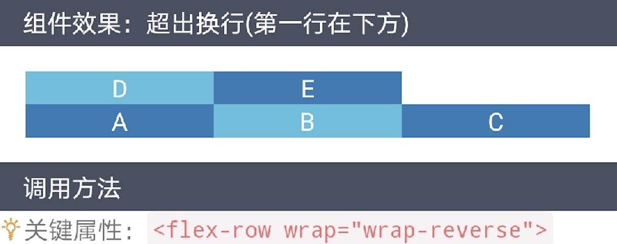
<flex-row wrap="wrap-reverse" h-style="margin-top: 30px;margin-bottom: 30px;">
<flex-col width="4" bg-color="bg-primary" justify="center">
<text>A</text>
</flex-col>
<flex-col width="4" bg-color="bg-info" justify="center">
<text>B</text>
</flex-col>
<flex-col width="4" bg-color="bg-primary" justify="center">
<text>C</text>
</flex-col>
<flex-col width="4" bg-color="bg-info" justify="center">
<text>D</text>
</flex-col>
<flex-col width="4" bg-color="bg-primary" justify="center">
<text>E</text>
</flex-col>
</flex-row>
</div>
</template>
<style lang="less">
@import '../Common/styles/container.less';
.container text {
color: #ffffff;
}
</style>

<import name="flex-row" src="../Common/ui/h-ui/basic/c_flex_row"></import>
<import name="flex-col" src="../Common/ui/h-ui/basic/c_flex_col"></import>
<template>
<div class="container">
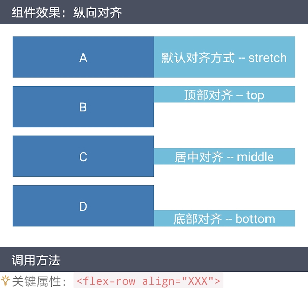
<flex-row h-style="margin-bottom: 20px;">
<flex-col bg-color="bg-primary" justify="center" h-style="height: 100px;">
<text>A</text>
</flex-col>
<flex-col bg-color="bg-info" justify="center">
<text>默认对齐方式 -- stretch</text>
</flex-col>
</flex-row>
<flex-row align="top" h-style="margin-bottom: 20px;">
<flex-col bg-color="bg-primary" justify="center" h-style="height: 100px;">
<text>B</text>
</flex-col>
<flex-col bg-color="bg-info" justify="center">
<text>顶部对齐 -- top</text>
</flex-col>
</flex-row>
<flex-row align="middle" h-style="margin-bottom: 20px;">
<flex-col bg-color="bg-primary" justify="center" h-style="height: 100px;">
<text>C</text>
</flex-col>
<flex-col bg-color="bg-info" justify="center">
<text>居中对齐 -- middle</text>
</flex-col>
</flex-row>
<flex-row align="bottom" h-style="margin-bottom: 20px;">
<flex-col bg-color="bg-primary" justify="center" h-style="height: 100px;">
<text>D</text>
</flex-col>
<flex-col bg-color="bg-info" justify="center">
<text>底部对齐 -- bottom</text>
</flex-col>
</flex-row>
</div>
</template>
<style lang="less">
@import '../Common/styles/container.less';
.container text {
color: #ffffff;
}
</style>

<import name="flex-row" src="../Common/ui/h-ui/basic/c_flex_row"></import>
<import name="flex-col" src="../Common/ui/h-ui/basic/c_flex_col"></import>
<template>
<div class="container">
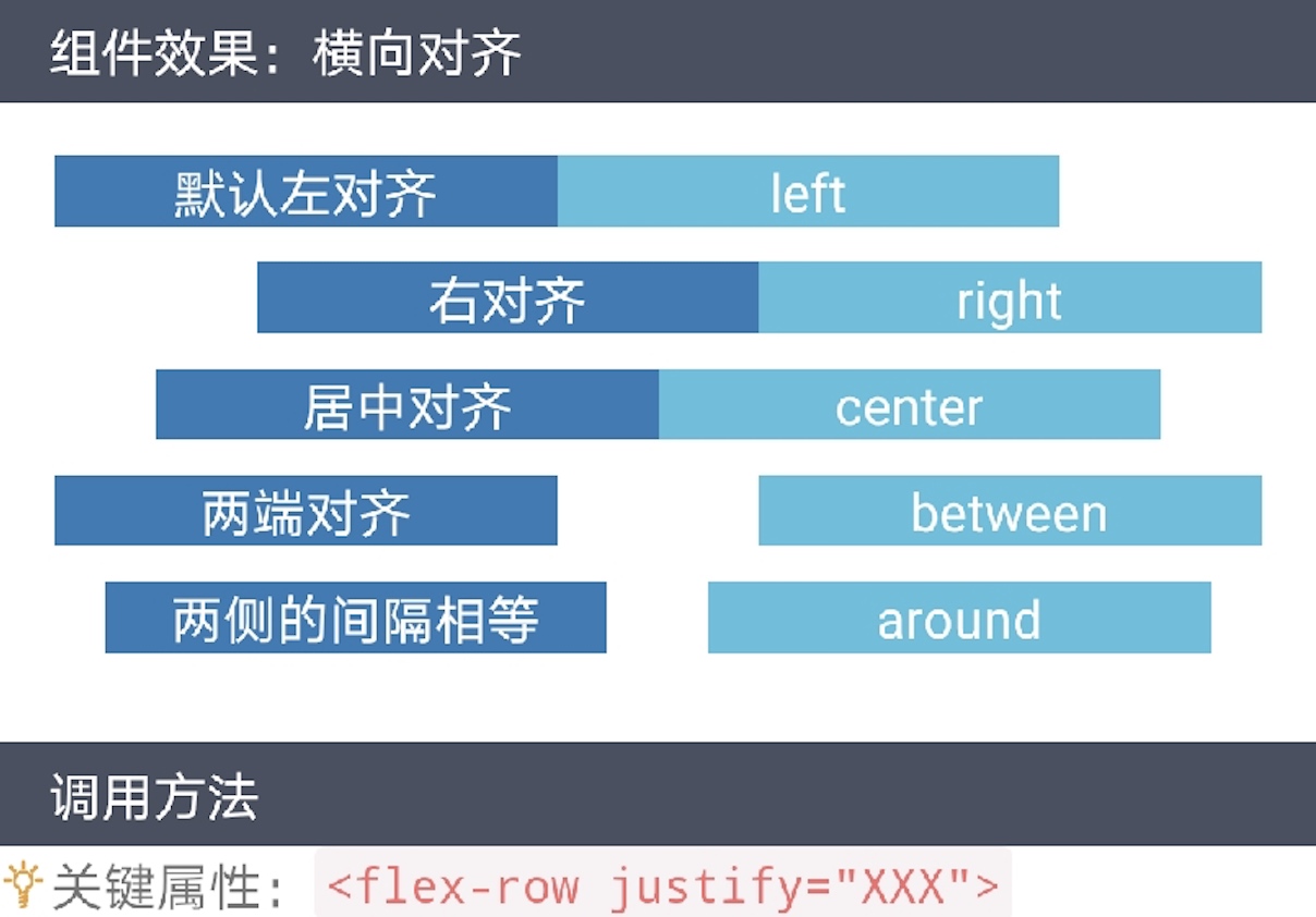
<flex-row h-style="margin-bottom: 20px;">
<flex-col width="5" bg-color="bg-primary" justify="center">
<text>默认左对齐</text>
</flex-col>
<flex-col width="5" bg-color="bg-info" justify="center">
<text>left</text>
</flex-col>
</flex-row>
<flex-row justify="right" h-style="margin-bottom: 20px;">
<flex-col width="5" bg-color="bg-primary" justify="center">
<text>右对齐</text>
</flex-col>
<flex-col width="5" bg-color="bg-info" justify="center">
<text>right</text>
</flex-col>
</flex-row>
<flex-row justify="center" h-style="margin-bottom: 20px;">
<flex-col width="5" bg-color="bg-primary" justify="center">
<text>居中对齐</text>
</flex-col>
<flex-col width="5" bg-color="bg-info" justify="center">
<text>center</text>
</flex-col>
</flex-row>
<flex-row justify="between" h-style="margin-bottom: 20px;">
<flex-col width="5" bg-color="bg-primary" justify="center">
<text>两端对齐</text>
</flex-col>
<flex-col width="5" bg-color="bg-info" justify="center">
<text>between</text>
</flex-col>
</flex-row>
<flex-row justify="around" h-style="margin-bottom: 20px;">
<flex-col width="5" bg-color="bg-primary" justify="center">
<text>两侧的间隔相等</text>
</flex-col>
<flex-col width="5" bg-color="bg-info" justify="center">
<text>around</text>
</flex-col>
</flex-row>
</div>
</template>
<style lang="less">
@import '../Common/styles/container.less';
.container text {
color: #ffffff;
}
</style>
扫码体验