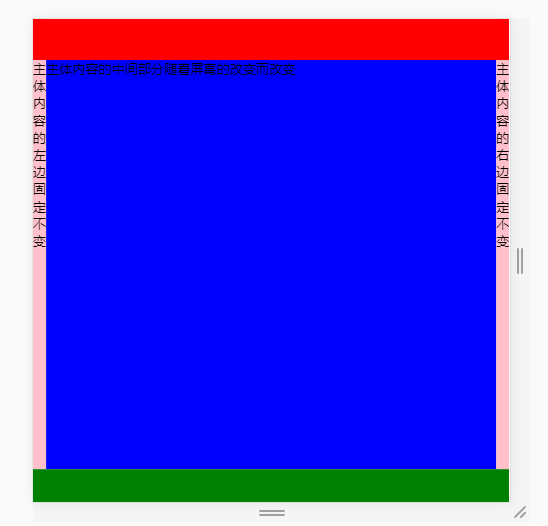
 1 <body>
 2     <div class="container">
 3         <header></header>
 4         <main>
 5             <nav>主体内容的左边固定不变</nav>
 6             <section>主体内容的中间部分随着屏幕的改变而改变</section>
 7             <aside>主体内容的右边固定不变</aside>
 8         </main>
 9         <footer></footer>
10     </div>
11 </body>
 1 <style>
 2         *{
 3             margin: 0;
 4             padding: 0;
 5         }
 6         html,body{
 7             width: 100%;
 8             height: 100%;
 9         }
10         .container{
11             width: 100%;
12             height: 100%;
13             /* 给最外层大盒子开弹性盒 */
14             display: flex;
15             /* 切记不要忘了设置方向 不然顶部和头部就在一行显示了 */
16             flex-direction: column;
17         }
18         header{
19             /* 给头部设置固定的高度 */
20             width: 100%;
21             height: 50px;
22             background: red;
23         }
24         main{
25             /* 给主体部分设定flex 为1  达到上下变化中间随着变化 */
26             width: 100%;
27             height: calc(100% - 90px);
28             flex: 1;
29             /*  开弹性盒的目的是让里面内容达到 左右固定不动中间变化 */
30             display: flex;
31         }
32         nav{
33             width: 80px;
34             height: 100%;
35             background: pink;
36             flex:0;
37         }
38         aside{
39             width: 80px;
40             height: 100%;
41             background: pink;
42             flex: 0;
43         }
44         section{
45             flex: 1;
46             height: 100%;
47             background-color: blue;
48         }
49         footer{
50             /* 给尾部也设定固定的高度 */
51             width: 100%;
52             height: 40px;
53             background-color: green;
54         }
55     </style>