3.小圆型Loading
这类Loading动画的基本思想是:在呈现容器中定义1个或多个子层,再对每个子层进行样式定义,使得其均显示为一个实心圆形,最后编写关键帧动画控制,使得各个实心圆或者大小发生改变、或者平移、或者旋转。
(1)小圆大小或透明度进行变化。
例如,在container层中定义两个名为shape的子层,通过对.shape的样式定义使得两个子层均显示一个实心圆,定义关键帧控制两个圆的大小进行交替缩放,形成两个圆的切换效果。编写HTML文件如下。


<!DOCTYPE html>
<html>
<head>
<title>Loading加载动画</title>
<style>
   .container
   {
      margin: 0 auto;
      width: 300px;
      height:300px;
      position: relative;
      display:flex;
      justify-content:center;
      align-items:center;
      background:#d8d8d8;
      border: 4px solid rgba(255, 0, 0, 0.9);
      border-radius: 10%;
   }
   .shape
  {
     width: 80px;
     height: 80px;
     border-radius: 50%;
     background-color: #0000ff;
     opacity: 0.6;
     position:  absolute;
     animation: anim 2.0s infinite ease-in-out;
   }
   .shape:nth-child(2)
   {
      animation-delay: -1.0s;
   }
   @keyframes anim
   {
      0%,100% { transform: scale(0.0);}
      50%     { transform: scale(1.0); }
   }
</style>
</head>
<body>
<div  class="container">
  <div class="shape"></div>
  <div class="shape"></div>
</div>
</div>
</body>
</html>
在浏览器中打开包含这段HTML代码的html文件,可以呈现出如图27所示的Loading动画效果。
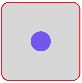
图27 Loading动画效果(21)
若改写.shape:nth-child(2)的定义如下,使得两个圆的初始位置不同,其他部分保持不变
.shape:nth-child(2)
{
top: auto;
bottom: 10px;
animation-delay: -1.0s;
}
则呈现程序如图28所示的动画效果。

图28 Loading动画效果(22)
又例如,在container层中定义三个名为shape的子层,通过对.shape的样式定义使得三个子层显示为3个同行并排放置的实心小圆,定义关键帧控制三个圆的大小进行交替缩放。编写HTML文件如下。
<!DOCTYPE html>
<html>
<head>
<title>Loading加载动画</title>
<style>
   .container
   {
      margin: 0 auto;
      width: 300px;
      height:300px;
      position: relative;
      display:flex;
      justify-content:center;
      align-items:center;
      background:#d8d8d8;
      border: 4px solid rgba(255, 0, 0, 0.9);
      border-radius: 10%;
   }
   .shape
  {
     width: 30px;
     height: 30px;
     background-color: #228b22;
     border-radius: 100%;
     display: inline-block;
     margin-left: 10px;
     animation: anim 1.4s infinite ease-in-out;
     animation-fill-mode: both;
   }
   .shape:nth-child(1)
   {
     animation-delay: -0.32s;
   }
   .shape:nth-child(2)
   {
     animation-delay: -0.16s;
   }
   @keyframes anim
   {
      0%, 80%, 100% { transform: scale(0.0); }
      40% { transform: scale(1.0); }
   }
</style>
</head>
<body>
<div  class="container">
  <div class="shape"></div>
  <div class="shape"></div>
  <div class="shape"></div>
</div>
</body>
</html>
在浏览器中打开包含这段HTML代码的html文件,可以呈现出如图29所示的Loading动画效果。
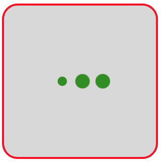
图29 Loading动画效果(23)
如将上面代码中的关键帧定义改写如下:
@keyframes anim
{
0%, 80%, 100% { transform: scale(0.2); opacity: 0.2;}
40% { transform: scale(1.0); opacity: 1; }
}
则呈现出如图30所示的Loading动画效果。

图30 Loading动画效果(24)
(2)小圆的位置发生变化。
例如,让一个小圆在一条水平窄木条上进行移动,编写如下的HTML文件。
<!DOCTYPE html>
<html>
<head>
<title>Loading加载动画</title>
<style>
   .container
   {
      margin: 0 auto;
      width: 300px;
      height:300px;
      position: relative;
      display:flex;
      justify-content:center;
      align-items:center;
      background:#d8d8d8;
      border: 4px solid rgba(255, 0, 0, 0.9);
      border-radius: 10%;
   }
   .loader
   {
      width: 200px;
      height: 8px;
      border-radius: 2px;
      position: relative;
      background: red;
      animation: changeBgColor 1s ease-in infinite alternate;
   }
   .loader>span
   {
      display: inline-block;
      width: 24px;
      height: 24px;
      border-radius: 50%;
      background: red;
      position: absolute;
      margin-top: -8px;
      margin-left:-12px;
      animation: changePosition 1s ease-in infinite alternate;
   }
   @keyframes changeBgColor
   {
       0%   { background: red;  }
       100% { background: lightblue;   }
   }
   @keyframes changePosition
   {
       0%   { background: red; }
       100% { margin-left: 188px;  background: lightblue; }
   }
</style>
</head>
<body>
<div  class="container">
   <div class="loader">
       <span></span>
   </div>
</div>
</body>
</html>
在浏览器中打开包含这段HTML代码的html文件,可以呈现出如图31所示的Loading动画效果。
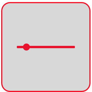
图31 Loading动画效果(25)
又例如,有蓝、黄、绿三个实心圆,让居中的黄圆不动,蓝圆和绿圆进行平移变换。编写如下的HTML文件。
<!DOCTYPE html>
<html>
<head>
<title>Loading加载动画</title>
<style>
   .container
   {
      margin: 0 auto;
      width: 300px;
      height:300px;
      position: relative;
      display:flex;
      justify-content:center;
      align-items:center;
      background:#d8d8d8;
      border: 4px solid rgba(255, 0, 0, 0.9);
      border-radius: 10%;
   }
  .ball
  {
     position: absolute;
     width: 30px;
     height: 30px;
     border-radius: 50%;
  }
  .container .yellow
  {
     background-color: #f5e82f;
  }
  .container .blue
  {
     background-color: #4cb8f5;
     animation: animateBlue 1.8s infinite;
   }
   .container .green
   {
     background-color: #a6e630;
     animation: animateGreen 1.8s infinite;
   }
   @keyframes animateGreen
   {
      0%,100% { transform: translate(-40px, 0px); }
      50%     { transform: translate(40px, 0px);  }
   }
   @keyframes animateBlue
   {
      0%,100%  { transform: translate(40px, 0); }
      50%      { transform: translate(-40px, 0px);  }
   }
}
</style>
</head>
<body>
<div  class="container">
   <div class="ball blue"></div>
   <div class="ball yellow"></div>
   <div class="ball green"></div>
</div>
</body>
</html>
在浏览器中打开包含这段HTML代码的html文件,可以呈现出如图32所示的Loading动画效果。
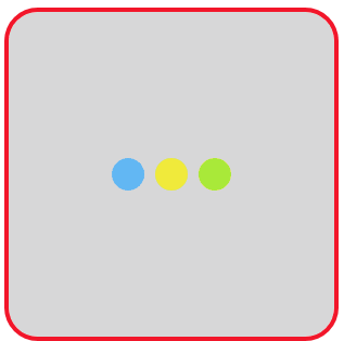
图32 Loading动画效果(26)
再例如,让5个小圆在同一行上进行位置变化,编写如下的HTML文件。
<!DOCTYPE html>
<html>
<head>
<title>Loading加载动画</title>
<style>
   .container
   {
      margin: 0 auto;
      width: 300px;
      height:300px;
      position: relative;
      display:flex;
      justify-content:center;
      align-items:center;
      background:#d8d8d8;
      border: 4px solid rgba(255, 0, 0, 0.9);
      border-radius: 10%;
   }
   .loading
   {
      width: 200px;
      height: 15px;
      position: relative;
   }
   .loading span
   {
      position: absolute;
      width: 15px;
      height: 100%;
      border-radius: 50%;
      background: #ff8c00;
      animation: load 1.04s ease-in infinite alternate;
   }
   @keyframes load
   {
       0%   {  opacity: 1;   transform: translate(0px);  }
       100% {  opacity: 0.2;  transform: translate(200px); }
   }
   .loading span:nth-child(1)
   {
       animation-delay:0.13s;
   }
   .loading span:nth-child(2)
   {
       animation-delay:0.26s;
   }
   .loading span:nth-child(3)
   {
       animation-delay:0.39s;
   }
   .loading span:nth-child(4)
   {
       animation-delay:0.52s;
   }
   .loading span:nth-child(5)
   {
       animation-delay:0.65s;
   }
</style>
</head>
<body>
<div  class="container">
  <div class="loading">
    <span></span><span></span><span></span>
    <span></span><span></span>
  </div>
</div>
</body>
</html>
在浏览器中打开包含这段HTML代码的html文件,可以呈现出如图33所示的Loading动画效果。

图33 Loading动画效果(27)
若改写上面文件中.loading span和关键帧的定义如下,其余部分保持不变
.loading span
{
15px;
height: 100%;
display: inline-block;
margin-right: 15px;
background: #ff8c00;
animation: load 1.04s ease infinite;
}
@keyframes load
{
0% { opacity: 1; transform: rotate(0deg); }
100% { opacity: 0; transform: rotate(90deg); }
}
则呈现出如图34所示的动画效果。
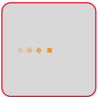
图34 Loading动画效果(28)
还例如,让4个小圆在指定的四个位置进行切换变化,编写如下的HTML文件。
<!DOCTYPE html>
<html>
<head>
<title>Loading加载动画</title>
<style>
   .container
   {
      margin: 0 auto;
      width: 300px;
      height:300px;
      position: relative;
      display:flex;
      justify-content:center;
      align-items:center;
      background:#d8d8d8;
      border: 4px solid rgba(255, 0, 0, 0.9);
      border-radius: 10%;
   }
   .shape
   {
       width: 40px;
       height: 40px;
       border-radius:50%;
       border:0;
       position:absolute;
       background-color: #00ff00;
       animation: spin 2s infinite ease;
   }
   .shape:first-child
   {
      background:#ff8c00;
      animation-delay:-1.5s;
   }
   .shape:nth-child(2)
   {
      background:#20b2aa;
      animation-delay:-1s;
   }
   .shape:nth-child(3)
   {
      background:#32cd32;
      animation-delay:-0.5s;
   }
   .shape:last-child
   {
      background:#da70d6;
   }
   @keyframes spin
   {
      0%,100%  { transform:translate(-60px,0);}
      25%      { transform:translate(0,-60px);}
      50%      { transform:translate(60px,0); }
      75%      { transform:translate(0,60px);   }
   }
</style>
</head>
<body>
<div  class="container">
    <div class="shape"></div>
    <div class="shape"></div>
    <div class="shape"></div>
    <div class="shape"></div>
</div>
</body>
</html>
在浏览器中打开包含这段HTML代码的html文件,可以呈现出如图35所示的Loading动画效果。
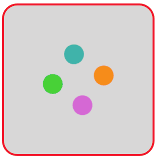
图35 Loading动画效果(29)
在这个例子的基础上,我们再复杂一点点,搞大中小三种类型各4种颜色的12个圆进行位置变换。编写如下的HTML文件。
<!DOCTYPE html>
<html>
<head>
<title>Loading加载动画</title>
<style>
   .container
   {
      margin: 0 auto;
      width: 300px;
      height:300px;
      position: relative;
      display:flex;
      justify-content:center;
      align-items:center;
      background:#d8d8d8;
      border: 4px solid rgba(255, 0, 0, 0.9);
      border-radius: 10%;
   }
   .group
   {
       width: 64px;
       height: 24px;
       position: absolute;
   }
   .group:nth-child(2)
   {
       transform: rotate(90deg);
   }
   .group:nth-child(3)
   {
       transform: rotate(180deg);
   }
   .group:nth-child(4)
   {
       transform: rotate(270deg);
   }
   .shape
   {
       top: 50%;
       left: 50%;
       border-radius:50%;
       animation: move 2.5s infinite;
       position: absolute;
   }
   .shape:nth-child(1)
   {
       width: 8px;
       height: 8px;
       margin-top:-4px;
       margin-left:-4px;
       animation-delay: -0.3s;
   }
   .shape:nth-child(2)
   {
       width: 16px;
       height: 16px;
       margin-top:-8px;
       margin-left:--8px;
       animation-delay: -0.6s;
   }
   .shape:nth-child(3)
   {
       width: 24px;
       height: 24px;
       margin-top:-12px;
       margin-left:-12px;
       animation-delay: -0.9s;
   }
   .blue
   {
       background-color: #00f;
   }
   .red
   {
       background-color: #f00;
   }
   .yellow
   {
       background-color: #ff0;
   }
   .green
   {
      background-color: #0f0;
   }
   @keyframes move
   {
      0%   { transform: translateX(0); }
      25%  { transform: translateX(-64px); }
      75%  { transform: translateX(32px); }
      100% {transform: translateX(0); }
   }
</style>
</head>
<body>
<div  class="container">
   <div class="group">
      <div class="shape blue"></div>
      <div class="shape blue"></div>
      <div class="shape blue"></div>
   </div>
   <div class="group">
      <div class="shape yellow"></div>
      <div class="shape yellow"></div>
      <div class="shape yellow"></div>
   </div>
   <div class="group">
      <div class="shape red"></div>
      <div class="shape red"></div>
      <div class="shape red"></div>
   </div>
   <div class="group">
      <div class="shape green"></div>
      <div class="shape green"></div>
      <div class="shape green"></div>
   </div>
</div>
</body>
</html>
在浏览器中打开包含这段HTML代码的html文件,可以呈现出如图36所示的Loading动画效果。
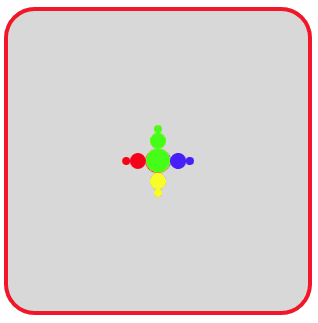
图36 Loading动画效果(30)
在调试时,删除.shape定义中的“top: 50%;”和“left: 50%;”两句设置,则呈现出如图37所示的动画效果,也挺有趣的。

图37 Loading动画效果(31)
若再继续删除.shape:nth-child(1)、.shape:nth-child(2)和.shape:nth-child(3)定义中有关margin-top和margin-left属性设置的相关6个语句,则则呈现出如图38所示的动画效果。

图38 Loading动画效果(32)
(3)小圆排列在圆周上形成旋转的效果。
我们先实现一个小圆在圆周轨道上运动的实例,编写如下的HTML文件。
<!DOCTYPE html>
<html>
<head>
<title>Loading加载动画</title>
<style>
   .container
   {
      margin: 0 auto;
      width: 300px;
      height:300px;
      position: relative;
      display:flex;
      justify-content:center;
      align-items:center;
      background:#d8d8d8;
      border: 4px solid rgba(255, 0, 0, 0.9);
      border-radius: 10%;
   }
   .loader
   {
      width:100px;
      height:100px;
      border-radius:50%;
      border:2px solid #f3f3f3;
      animation:load 2s linear infinite;
   }
   .loader:before
   {
      content: '';
      display: block;
      width: 0;
      height: 0;
      position: absolute;
      top: -8px;
      left: 50%;
      border: 8px solid #f3f3f3;
      border-radius: 50%;
   }
   @keyframes load
   {
      0%   { transform: rotate(0deg); }
      100% { transform:rotate(360deg); }
   }
</style>
</head>
<body>
<div  class="container">
  <div class='loader'></div>
</div>
</body>
</html>
在浏览器中打开包含这段HTML代码的html文件,可以呈现出如图39所示的Loading动画效果。
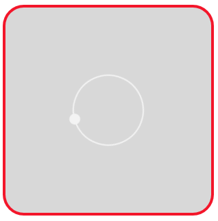
图39 Loading动画效果(33)
多个圆围成一个圆周进行旋转,怎么实现呢?
最简单地在圆周上分布多个小圆的实现方法是将border的border-style属性值设置为“dotted”点状边框,这样圆周边框上会分布一些小圆,让它们旋转起来。编写如下的HTML文件。
<!DOCTYPE html>
<html>
<head>
<title>Loading加载动画</title>
<style>
   .container
   {
      margin: 0 auto;
      width: 300px;
      height:300px;
      position: relative;
      display:flex;
      justify-content:center;
      align-items:center;
      background:#d8d8d8;
      border: 4px solid rgba(255, 0, 0, 0.9);
      border-radius: 10%;
   }
   .loader
   {
      width:100px;
      height:100px;
      border-radius:50%;
      border:16px dotted #f3f3f3;
      animation:load 2s linear infinite;
   }
   @keyframes load
   {
      0%   { transform: rotate(0deg); }
      100% { transform:rotate(360deg); }
   }
</style>
</head>
<body>
<div  class="container">
  <div class='loader'></div>
</div>
</body>
</html>
在浏览器中打开包含这段HTML代码的html文件,可以呈现出如图40所示的Loading动画效果。

图40 Loading动画效果(34)
但是这种方法得到的小圆是一个整体(因为只用一个div的边框得到),无法对其中某个小圆进行单独控制。为此,大多数情况下需要建立多个子层从而得到多个小圆。此时,需要合理地安排小圆的位置,使得它们看起来排列成圆周。
例如安排4个小圆在一个正方形A的四个顶点位置,另外安排4个小圆在正方形A绕中心旋转45°后的4个顶点位置,那么这8个小圆一定会排列成一个圆周。再对它们进行动画效果设置。编写如下的HTML文件。
<!DOCTYPE html>
<html>
<head>
<title>Loading加载动画</title>
<style>
   .container
   {
      margin: 0 auto;
      width: 300px;
      height:300px;
      position: relative;
      display:flex;
      justify-content:center;
      align-items:center;
      background:#d8d8d8;
      border: 4px solid rgba(255, 0, 0, 0.9);
      border-radius: 10%;
   }
   .loading
   {
      width: 100px;
      height: 100px;
      position: absolute;
   }
   .loading>span
   {
      width: 20px;
      height: 20px;
      border-radius: 50%;
      background: #ff8c00;
      position: absolute;
      animation: anim 1.5s linear infinite;
   }
   .loading>span:nth-child(1)
   {
      top: 0;
      left: 0;
   }
   .loading>span:nth-child(2)
   {
      top: 0;
      right: 0;
   }
   .loading>span:nth-child(3)
   {
      right: 0;
      bottom: 0;
   }
   .loading>span:nth-child(4)
   {
      bottom: 0;
      left: 0;
   }
   .loading:nth-of-type(2)
   {
      transform: rotate(45deg);
   }
   @keyframes anim
   {
      0%   { transform: scale(0); }
      50%  { transform: scale(1); }
      100% { transform: scale(0); }
   }
   .loading:nth-of-type(1) span:nth-of-type(1)
   {
       animation-delay: -0.1s;
   }
   .loading:nth-of-type(2) span:nth-of-type(1)
   {
       animation-delay: -0.3s;
   }
   .loading:nth-of-type(1) span:nth-of-type(2)
   {
       animation-delay: -0.5s;
   }
   .loading:nth-of-type(2) span:nth-of-type(2)
   {
       animation-delay: -0.7s;
   }
   .loading:nth-of-type(1) span:nth-of-type(3)
   {
       animation-delay: -0.9s;
   }
   .loading:nth-of-type(2) span:nth-of-type(3)
   {
       animation-delay: -1.1s;
   }
   .loading:nth-of-type(1) span:nth-of-type(4)
   {
       animation-delay: -1.3s;
   }
   .loading:nth-of-type(2) span:nth-of-type(4)
   {
       animation-delay: -1.5s;
   }
</style>
</head>
<body>
<div  class="container">
  <div class="loading">
     <span></span><span></span>
     <span></span><span></span>
  </div>
  <div class="loading">
     <span></span><span></span>
     <span></span><span></span>
  </div>
</div>
</body>
</html>
在浏览器中打开包含这段HTML代码的html文件,可以呈现出如图41所示的Loading动画效果。

图41 Loading动画效果(35)
若将上面HTML代码中的关键帧定义改写为:
@keyframes anim
{
0%, 100% { opacity: 0.0;}
50% { opacity: 1; }
}
则呈现出如图42所示的动画效果。
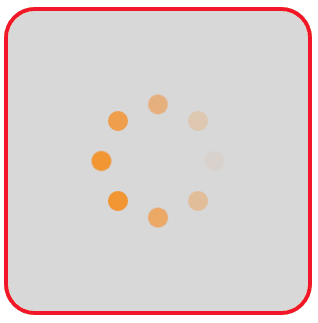
图42 Loading动画效果(36)
若将上面HTML代码中的关键帧定义改写为:
@keyframes anim
{
0%, 80%,100% { opacity: 0.0;}
40% { opacity: 1; } }
则呈现出如图43所示的动画效果,此时圆周上好像只有6个小圆在旋转。
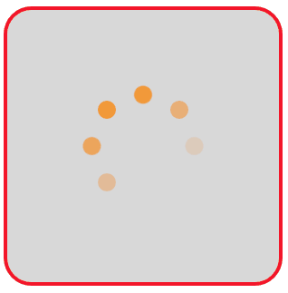
图43 Loading动画效果(37)
(4)利用box-shadow属性设置阴影图形。
同样可以通过对box-shadow属性进行设置,使得设定的阴影图形显示成小圆,并且将多个小圆(阴影形成的)围成一个圆周。
例如,设页面中有<div class='loader'></div>,定义.loader的样式定义为:
.loader
{
160px;
height:160px;
border-radius: 50%;
box-shadow: inset 0 0 0 16px #fff,
-80px -80px 0 -64px #f00,
0 -112px 0 -64px #f0f,
80px -80px 0 -64px #ff0,
-80px 80px 0 -64px #0f0,
0 112px 0 -64px #0ff,
80px 80px 0 -64px #00f,
-112px 0 0 -64px #808,
112px 0 0 -64px #000;
}
可在页面中显示如图44的图案,这个图案中的9个圆对应box-shadow属性值设定的9个分项。
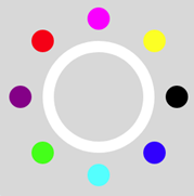
图44 box-shadow属性设置的9个圆
定义关键帧,让这9个圆旋转起来,编写如下的HTML文件。
<!DOCTYPE html>
<html>
<head>
<title>Loading加载动画</title>
<style>
   .container
   {
      margin: 0 auto;
      width: 300px;
      height:300px;
      position: relative;
      display:flex;
      justify-content:center;
      align-items:center;
      background:#d8d8d8;
      border: 4px solid rgba(255, 0, 0, 0.9);
      border-radius: 10%;
   }
   .loader
   {
      width:160px;
      height:160px;
      border-radius: 50%;
      box-shadow: inset 0 0 0 16px  #fff,
                  -80px -80px 0 -64px #f00,
                  0 -112px 0 -64px #f0f,
                  80px -80px 0 -64px #ff0,
                  -80px 80px 0 -64px #0f0,
                  0 112px 0 -64px #0ff,
                  80px 80px 0 -64px #00f,
                  -112px 0 0 -64px #808,
                  112px 0 0 -64px #000;
       animation: load 3s linear infinite;
   }
   @keyframes load
   {
      0%   { transform: rotate(0deg); }
      100% { transform:rotate(360deg); }
   }
</style>
</head>
<body>
<div  class="container">
  <div class='loader'></div>
</div>
</body>
</html>
在浏览器中打开包含这段HTML代码的html文件,可以呈现出如图45所示的Loading动画效果。

图45 Loading动画效果(38)
再利用box-shadow属性设置4个小圆和四个方块,实现方和圆的舞动Loading动画效果。编写的HTML文件内容如下。
<!DOCTYPE html>
<html>
<head>
<title>Loading</title>
<style>
  .container
  {
    margin: 0 auto;
    width: 300px;
    height:300px;
    background:#d8d8d8;
    border: 4px solid rgba(255, 0, 0, 0.9);
    border-radius: 10%;
  }
  .loader
  {
    margin: 120px auto;
    width: 0;
    height: 0;
    box-shadow: -30px -30px 0 25px #60f,
                30px -30px 0 25px #60f,
                -30px 30px 0 25px #60f,
                30px 30px 0 25px #60f;
    animation: circSquare 2.5s ease-in-out infinite;
  }
  @keyframes circSquare
  {
     50%
     {
        width: 60px;
        height: 60px;
        border-radius: 50%;
        transform: rotate(0.5turn);
        box-shadow: -100px 0 0 #c36, 100px 0 0 #c0f,
                    -100px 0 0 #f00, 100px 0 0 #f0f;
     }
     80%, 100%
     {
        transform: rotate(360deg);
     }
  }
</style>
</head>
<body>
<div class="container">
  <div class="loader"></div>
</div>
</body>
</html>
在浏览器中打开包含这段HTML代码的html文件,可以呈现出如图46所示的Loading动画效果。

图46 Loading动画效果(39)