1.圆锥渐变
在CSS中,除了线性渐变(linear-gradient)和径向渐变(radial-gradient)外,还有一种渐变叫“圆锥渐变”。它是围绕中心点按照扇形方向进行旋转的渐变,而不是像径向渐变那样从中心点沿圆环向外慢慢辐射。
圆锥渐变的调用格式为:
background-image: conic-gradient(from angle at position, start-color, ..., stop-color )
其中,参数from angle可选,表示起始的角度,默认为从上到下;position可选,给定圆锥锥点的位置;start-color定义开始颜色;stop-color定义结束颜色。
设页面中有<div class="shape"></div>,若定义.shape的样式规则为:
.shape
{
margin: 0 auto;
400px;
height: 300px;
border: 1px solid;
background-image:conic-gradient(red , yellow);
}
可在页面中显示如图1所示的图案。图1中圆锥渐变起始点是图形中心,然后以顺时针方向绕中心实现渐变效果,颜色从红色开始,渐变转为黄色。
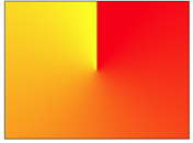
图1 红色圆锥渐变为黄色
若修改.shape样式中background-image属性定义为:
background-image:conic-gradient(from 90deg ,red , yellow);
则在页面中显示如图2所示的图案。在图2中可以看出,相比于图1渐变的起始角度旋转了90deg。
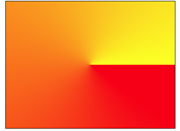
图2 红色圆锥渐变为黄色(from 90deg)
若修改.shape样式中background-image属性定义为:
background-image:conic-gradient(at 20% 20%,red , yellow);
则在页面中显示如图3所示的图案。在图3中明显看出渐变中心点往左上角方向移了。
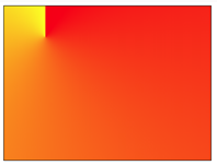
图3 渐变中心点at 20% 20%
圆锥渐变可以指定多个颜色,若修改.shape样式中background-image属性定义为:
.shape
{
margin: 0 auto;
400px;
height: 300px;
border: 1px solid;
background-image:conic-gradient(red,orange,yellow,green,indigo,blue,violet);
}
则在页面中显示如图4所示的图案。
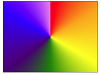
图4 七彩圆锥渐变
圆锥渐变中指定的颜色可以使用透明度,例如若修改.shape样式中background-image属性定义为:
background-image:conic-gradient(rgba(255,0,0,0), rgba(255,0,0,1));
则在页面中显示如图5所示的图案。

图5 使用了透明度的红色圆锥渐变
圆锥渐变中指定的颜色还可以定义停止位置,例如若修改.shape样式中background-image属性定义为:
background-image:conic-gradient(red 15%, green 30%, blue 60%);
则在页面中显示如图6所示的图案。
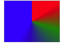
图6 颜色结点不均匀分布
若修改.shape样式中background-image属性定义为:
background-image:conic-gradient(red 50%, yellow 50%);
则均在页面中显示如图7所示的图案。此时,红黄两种颜色平分背景空间,取消了渐变效果。
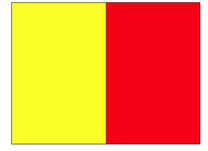
图7 半黄半红
若修改.shape样式中background-image属性定义为:
background-image:conic-gradient(red 33%, yellow 33%, yellow 66%,blue 66%);
则在页面中显示如图8所示的图案。
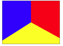
图8 中心圆周上红黄蓝各占120deg
若修改.shape样式中background-image属性定义为:
background-image:conic-gradient(red 33%, yellow 66%,blue 66%);
则在页面中显示如图9所示的图案。注意图9与图8的差别,图8中的黄色区域在图9中变成了红色向黄色的圆锥渐变。
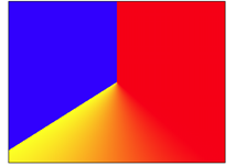
图9 红黄间圆锥渐变
若修改.shape样式中background-image属性定义为:
background-image:repeating-conic-gradient(red 10%, yellow 20%);
则在页面中显示如图10所示的图案。
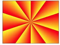
图10 重复的圆锥渐变
若修改.shape样式中background-image属性定义为:
background-image:repeating-conic-gradient(red 0, red 11%,yellow 11%,yellow 22%, blue 22%, blue 33%);
则在页面中显示如图11所示的图案。
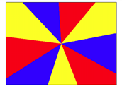
图11 红黄蓝三色图(1)
若修改.shape样式中background-image属性定义为:
background-image:repeating-conic-gradient(red 0 10deg,yellow 10deg 20deg,blue 20deg 30deg);
则在页面中显示如图12所示的图案。
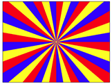
图12 红黄蓝三色图(2)
需要说明的是:目前不是所有的主流浏览器都支持圆锥渐变。本文中的图形效果在“360安全浏览器12”中会得到呈现,但IE 11和Microsoft Edge上会不呈现。其他的主流浏览器没有进行一一测试,请读者自行测试好了。
2.利用圆锥渐变绘制图形
利用圆锥渐变可以绘制出图形,下面给出一些示例。
(1)饼图。
若定义.shape的样式规则为:
.shape
{
margin: 50px auto;
200px;
height: 200px;
border-radius: 50%;
background: conic-gradient(red 30%,yellow 30%,yellow 70%,blue 70%);
}
可在页面中显示如图13所示的饼图图案。
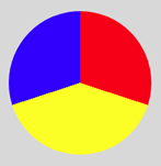
图13 饼图
若修改.shape样式中background-image属性定义为:
background: conic-gradient(red 0 50deg,orange 0 100deg,yellow 0 150deg,
green 0 200deg,indigo 0 250deg,blue 0 300deg,violet 0);
可在页面中显示如图14所示的七彩饼图图案。
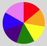
图14 七彩饼图
在conic-gradient 函数中,0 50deg的区间使用red,0 100deg的区间使用orange、…、0 360deg的区间使用violet,而且,先定义的颜色的层叠在后定义的颜色之上。因此,实际上0 50deg的区间使用red,50deg 100deg的区间使用orange、…、300deg 360deg的区间使用violet。这种写法比较偷懒,无需具体计算,只需给出各颜色的终止角度即可。
(2)条纹。
若定义.shape的样式规则为:
.shape
{
margin: 50px auto;
200px;
height: 200px;
border: 1px solid;
border-radius: 50%;
background-image:repeating-conic-gradient(red 0 50%,yellow 50% 100%);
background-size:50px 50px;
}
可在页面中显示如图15所示的垂直条纹图案。
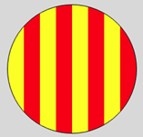
图15 圆内垂直条纹
若修改.shape样式中background-image属性定义为:
background-image:repeating-conic-gradient(from 90deg, red 0 50%,yellow 50% 100%);
可在页面中显示如图16所示的水平条纹图案。
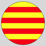
图16 圆内水平条纹
(3)背景图案。
若定义.shape的样式规则为:
.shape
{
margin: 50px auto;
200px;
height: 200px;
border: 1px solid;
background: conic-gradient(from -45deg,#f00 0 180deg,#ff0 0);
background-size:25px 50px;
}
可在页面中显示如图17所示的背景图案。
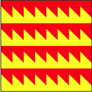
图17 背景图案(1)
若定义.shape的样式规则为:
.shape
{
margin: 50px auto;
200px;
height: 200px;
border: 1px solid;
background: conic-gradient(from 60deg,#f00 0 120deg, #ff0 0 240deg,#00f 0);
background-size:50px 50px;
}
可在页面中显示如图18所示的背景图案。
图18 背景图案(2)
若定义.shape的样式规则为:
.shape
{
margin: 50px auto;
200px;
height: 200px;
border: 1px solid;
border-radius: 50%;
background-image:repeating-conic-gradient(red 0 33.3%,yellow 0 66.7%,blue 0 100%);
background-size:50px 50px;
}
可在页面中显示如图19所示的圆形背景图案。
图19 圆形背景图案
若定义.shape的样式规则为:
.shape
{
margin: 50px auto;
200px;
height: 200px;
border: 1px solid;
background: conic-gradient(#f00 0 90deg, #ff0 0 180deg,#f0f 0 270deg,#00f 0);
background-size:25px 25px;
}
可在页面中显示如图20所示的背景图案。
图20 背景图案(3)
若定义.shape的样式规则为:
.shape
{
margin: 50px auto;
200px;
height: 200px;
border: 1px solid;
background: conic-gradient(#f00 0 45deg,#ff0 0 90deg,#0f0 0 135deg,#00f 0 180deg,
#f00 0 225deg,#ff0 0 270deg,#0f0 0 315deg,#00f 0 360deg);
background-size:50px 50px;
}
可在页面中显示如图21所示的背景图案。
图21 背景图案(4)
若定义.shape的样式规则为:
.shape
{
margin: 0 auto;
400px;
height: 400px;
border: 1px solid;
background:conic-gradient(#fff 90deg, #000 90deg 180deg,
#fff 180deg 270deg, #000 270deg);
background-size: 100px 100px;
}
可在页面中显示如图22所示的国际象棋棋盘图。
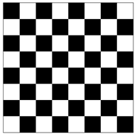
图22 国际象棋棋盘
若定义.shape的样式规则为:
.shape
{
200px;
height: 200px;
background: conic-gradient(#000 0, #000 12.5%, #fff 12.5%, #fff 37.5%,
#000 37.5%, #000 62.5%, #fff 62.5%, #fff 87.5%, #000 87.5%,#000 0);
border: 1px solid #000;
background-size: 50px 50px;
}
或者
.shape
{
200px;
height: 200px;
background: repeating-conic-gradient(#000 0, #000 12.5%, #fff 12.5%, #fff 37.5%,#000 37.5%,#000 50%);
border: 1px solid #000;
background-size: 50px 50px;
}
均可在页面中显示如图23所示的图形。
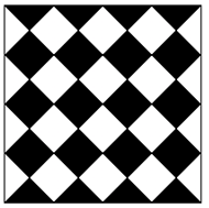
图23 菱形的平铺
(4)SierPinski地毯。
若定义.shape的样式规则为:
.shape
{
margin: 50px auto;
200px;
height: 200px;
background: conic-gradient(from 270deg at calc(100% / 3) calc(100% / 3),
#f00 90deg, transparent 0 )
calc(200px / 3) calc(200px / 3) / 100% 100% ,
conic-gradient(from 270deg at calc(100% / 3) calc(100% / 3),
#f00 90deg, transparent 0 )
calc(100% / 6) calc(100% / 6) / calc(100% / 3) calc(100% / 3),
conic-gradient(from 270deg at calc(100% / 3) calc(100% / 3),
#f00 90deg, transparent 0 )
calc(100% / 6) calc(100% / 6) / calc(100% / 9) calc(100% / 9);
border: 1px solid #000;
}
可在页面中显示如图24所示的SierPinski地毯图形。
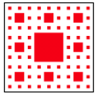
图24 SierPinski地毯
3.圆锥渐变在动画制作中的应用实例
利用圆锥渐变绘制图形,定义适当的关键帧,可以实现动画效果。
(1)Loading动画。
例如,制作如图25所示的Loading动画效果。
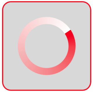
图25 Loading动画效果
图25中的Loading圆环其实就是一个圆锥渐变,且使用了CSS遮罩属性只让外圈25%的范围显示,定义关键帧让圆环旋转起来,Loading圆环动画效果就出现了。
编写的HTML文件如下。


<!DOCTYPE html>
<html>
<title>Loading动画</title>
<head>
<style>
  .container
  {
    margin: 0 auto;
    width: 300px;
    height:300px;
    background:#d8d8d8;
    border: 4px solid rgba(255, 0, 0, 0.9);
    border-radius: 10%;
  }
  .shape
  {
    margin: 50px auto;
    width: 200px;
    height: 200px;
    border-radius: 50%;
    background: conic-gradient(#f00, 30%, white);
    -webkit-mask-image: radial-gradient(closest-side, transparent 75%, black 76%);
    mask-image: radial-gradient(closest-side, transparent 75%, black 76%);
    animation: spin 1s linear infinite reverse;
  }
  @keyframes spin
  {
    from { transform: rotate(0deg); }
    to { transform: rotate(360deg); }
  }
</style>
</head>
<body>
<div class="container">
   <div class="shape"></div>
</div>
</body>
</html>
(2)旋转的饼图。
编写的HTML文件如下。
<!DOCTYPE html>
<html>
<title>旋转的饼图</title>
<head>
<style>
  .container
  {
    margin: 0 auto;
    width: 300px;
    height:300px;
    background:#d8d8d8;
    border: 4px solid rgba(255, 0, 0, 0.9);
    border-radius: 10%;
  }
   .shape
  {
     margin: 50px auto;
     width: 200px;
     height: 200px;
     border-radius: 50%;
     background: conic-gradient(red 0 50deg,orange 0 100deg,yellow 0 150deg,
                        green 0 200deg,indigo 0 250deg,blue 0  300deg,violet 0);
     animation:rotate 2s linear infinite;
  }
  @keyframes rotate
  {
      0%   { transform: rotate(0deg); }
      100% { transform:rotate(360deg); }
  }
</style>
</head>
<body>
<div class="container">
   <div class="shape"></div>
</div>
</body>
</html>
在浏览器中打开包含这段HTML代码的html文件,可以呈现出如图26所示的动画效果。
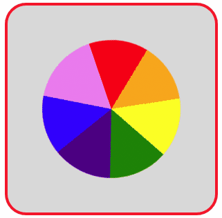
图26 旋转的饼图
若编写的HTML文件如下。
<!DOCTYPE html>
<html>
<title>旋转的放射线</title>
<head>
<style>
  .container
  {
    position: relative;
    margin: 50px auto;
    width: 300px;
    height:200px;
    background:#d8d8d8;
    overflow:hidden;
    border: 4px solid rgba(255, 0, 0, 0.9);
    border-radius: 10%;
  }
   .shape
  {
     position: absolute;
     top:-100px;
     left:-150px;
     width: 600px;
     height: 400px;
     background: repeating-conic-gradient(red 0 10deg,orange 0 20deg,yellow 0 30deg,
                        green 0 40deg,indigo 0 50deg,blue 0 60deg);
     animation:rotate 2s linear infinite;
  }
  @keyframes rotate
  {
      0%   { transform: rotate(0deg); }
      100% { transform:rotate(360deg); }
  }
</style>
</head>
<body>
<div class="container">
   <div class="shape"></div>
</div>
</body>
</html>
在浏览器中打开包含这段HTML代码的html文件,可以呈现出如图27所示的动画效果。
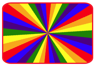
图27 旋转的放射线