1. 单行布局
1.1 基础的行布局
居中展示
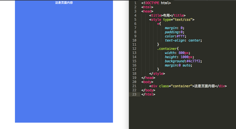
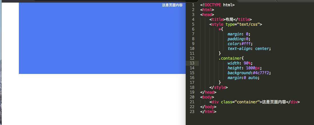
1.2 行布局自适应
宽度指定百分比
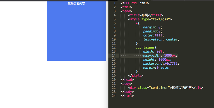
1.3 行布局自适应限制最大宽
最大1000px,小于时自适应
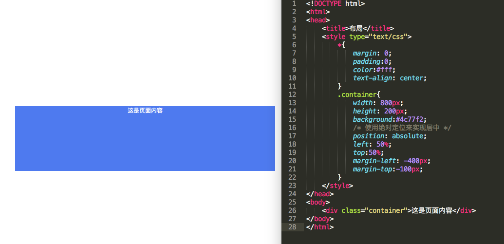
1.4 行布局垂直水平居中
2.多行布局
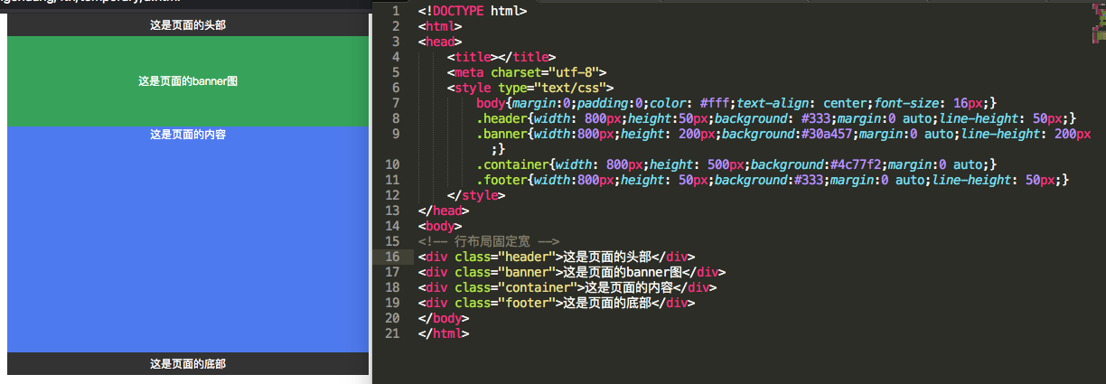
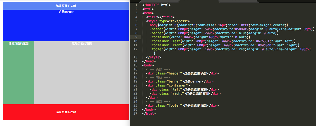
2.1 行布局固定宽
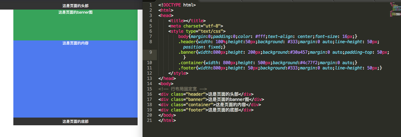
2.2 行布局部位自适应

2.3 行布局导航随屏幕滚动
3.多列布局
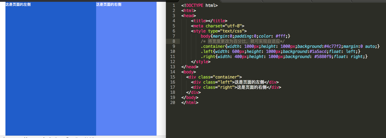
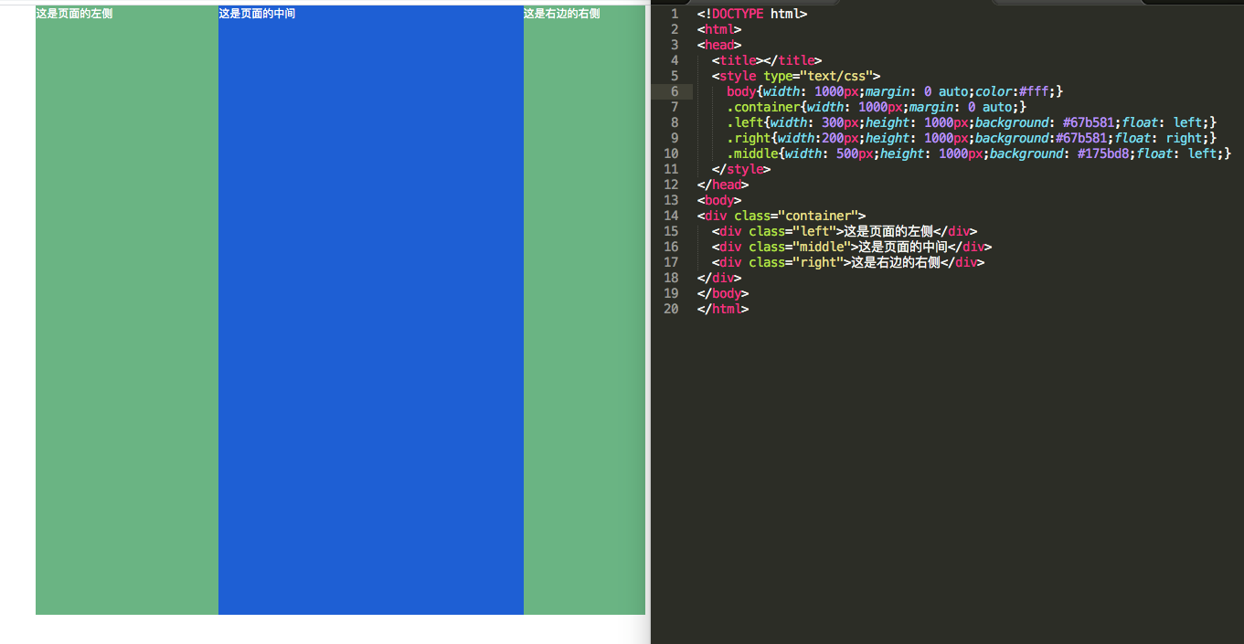
3.1 两列布局固定
3.2 两列布局自适应
将宽度更改为百分比,就可实现自适应
3.3 三列布局固定
3.4 三列布局自适应
将宽度更改为百分比,就可实现自适应
3.5 经典的三列布局
3.6 圣杯布局
布局要求:
1.三列布局,中间宽度自适应,两边定宽
2.中间栏要在浏览器中优先展示出来
3.允许任意列的宽度最高
4.用最简单的css语句,最少的HACK语句来实现
<!DOCTYPE html>
<html>
<head>
  <title></title>
  <style type="text/css">
    *{margin: 0;padding:0;}
    body{min- 700px;}
    .header,.footer{
      float: left; 100%;height: 40px;line-height: 40px;text-align: center;background:#ddd;
    }
    .container{
      padding:0 220px 0 200px;
    }
    .left, .middle, .right{
      float: left;
      position: relative;
      min-height: 300px;
    }
    .middle{
       100%;
      background:#1a5acd;
    }
    .left{
       200px;
      background: #f00;
      /*关键*/
      left: -100%;
      margin-left: -200px;
    }
    .right{
       220px;
      background: #30a457;
      margin-left: -220px;
      right:-220px;
    }
  </style>
</head>
<body>
<div class="header">
  <h4>header</h4>
</div>
<div class="container">
   <div class="middle">
      <h4>middle</h4>
      <p>这是页面的主体内容 这是页面的主体内容 这是页面的主体内容 这是页面的主体内容 这是页面的主体内容 这是页面的主体内容 这是页面的主体内容 这是页面的主体内容 这是页面的主体内容 这是页面的主体内容</p>
    </div>

    <div class="left">
      <h4>left</h4>
      <p>这是页面的左边</p>
    </div>

    <div class="right">
      <h4>right</h4>
      <p>这是页面的右边</p>
    </div>
</div>
<div class="footer">
  <h4>footer</h4>
</div>
</body>
</html>

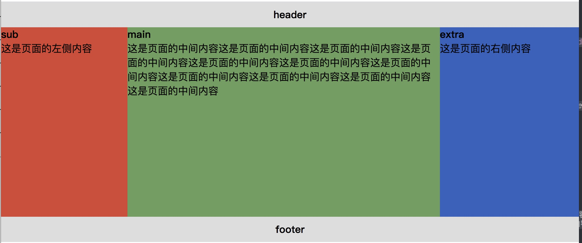
3.7 双飞燕布局
经淘宝UED的工程师针对圣杯布局改良后得出双飞翼布局,去掉相对布局,只需要浮动和父边距。
<!DOCTYPE html>
<html>
<head>
  <title></title>
  <meta charset="utf-8">
  <style type="text/css">
    *{margin:0;padding:0;}
    body{min- 700px;}
    .header,.footer{
      100%;height: 40px;line-height: 40px;text-align: center;background:#ddd;float: left;
    }
    .sub,.main,.extra{
      float: left;min-height: 300px;
    }
    .main{ 100%;min-height: 300px;}
    .main-inner{margin-left: 200px;margin-right: 220px;background: #30a547;min-height: 300px}
    .sub{ 200px;background:#f00;margin-left: -100%;}
    .extra{ 220px;background: #1a5acd;margin-left:-220px;}
  </style>
</head>
<body>
<div class="header">
  <h4>header</h4>
</div>
<div class="main">
  <div class="main-inner">
    <h4>main</h4>
    <p>这是页面的中间内容这是页面的中间内容这是页面的中间内容这是页面的中间内容这是页面的中间内容这是页面的中间内容这是页面的中间内容这是页面的中间内容这是页面的中间内容这是页面的中间内容这是页面的中间内容</p>
  </div>
</div>
<div class="sub"><!-- 子类 -->
  <h4>sub</h4>
  <p>这是页面的左侧内容</p>
</div>
<div class="extra"><!-- 附加类 -->
  <h4>extra</h4>
  <p>这是页面的右侧内容</p>
</div>
<div class="footer">
  <h4>footer</h4>
</div>
</body>
</html>
4.总结
4.1 行布局
左右居中
div{
      position:absolute;
      left:50%;
      right:50%;
      margin-left: -50% * width;
      margin-top: -50% * height;
}
页面自适应
div{100%;}
4.2 列布局
使用特定的容器来承载需要的多列布局。
每一列可以通过float属性以及合理去分配多列布局的宽度来达到想要的布局。
4.3 混合布局
行布局和列布局的混合使用
4.4 圣杯局部和双飞翼布局
| 圣杯布局 | 双飞翼布局 | |
|---|---|---|
| 流程方式 | middle部分首先放在container的最前部分 然后是left,right |
main要放在最前面 其次是sub子类,extra附加类 |
| 示例 | <div class="container">
<div>中间</div>
<div>左侧</div>
<div>右侧</div>
</div>
|
      <div class="main">
        <div>中间</div>
      </div>
      <div>左侧</div>
      <div>右侧</div>
|
作业:
<!DOCTYPE html>
<html>
<head>
  <meta charset="UTF-8">
  <title></title>
  <style type="text/css">
    *{margin:0;padding:0;}
    .cont{800px;margin:0 auto;}
    .first{ height:226px;background:#add8e6;800px;}
    .first img{ 310px;height: 186px;margin-left: 60px;margin-top: 20px; }
    .second{background:#ffb6c1;800px;height: 160px;}
    .second img{ 200px;height: 60px;margin-left: 40px;margin-top:50px; }
  </style>
</head>
<body>
  <div class="cont">
  <div class="first">
      <img src="http://climg.mukewang.com/58c0f808000129a303600215.jpg"  />
      <img src="http://climg.mukewang.com/58c0f819000198a703600214.jpg"  />
  </div>
  <div class="second">
      <img src="http://climg.mukewang.com/58c0f81d0001fe4402000060.jpg"  />
      <img src="http://climg.mukewang.com/58c0f81d0001fe4402000060.jpg"  />
      <img src="http://climg.mukewang.com/58c0f81d0001fe4402000060.jpg"  />
  </div>
  </div>
</body>
</html>
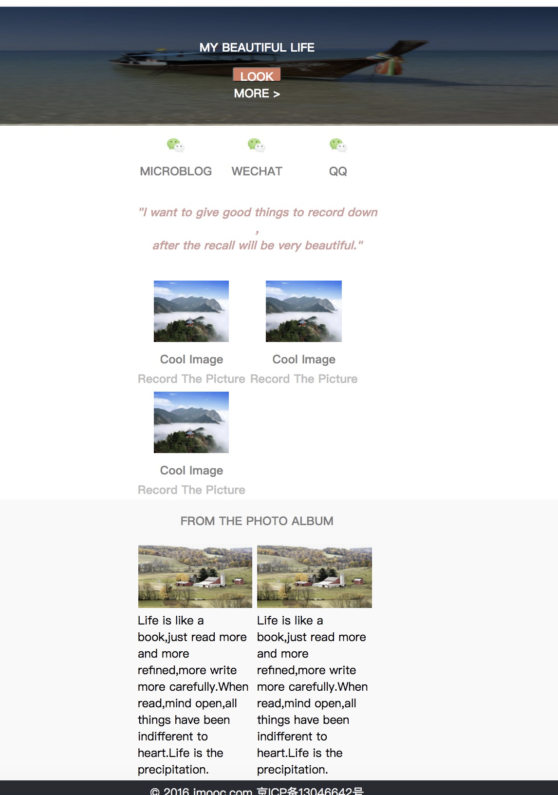
5.案例
<!DOCTYPE html>
<html>
<head>
<title>CSS网页布局案例</title>
<meta charset="utf-8">
<link rel="stylesheet" type="text/css" href="index.css">
</head>
<body>
<!-- 从整体到部分,从左到右,从上到下 -->
<!-- 头部-->
<div class="header">
<!-- logo -->
<div class="logo">
<img src="https://www.imooc.com/static/img/index/logo-recommended.png" alt="logo">
</div>
<div class="nav">
<ul>
<li>首页</li>
<li>图片</li>
<li>视频</li>
<li>手记</li>
</ul>
</div>
</div>
<!-- 主体分为3块。分别是banner、分享图片、文字,图片展示区 -->
<div class="main">
<div class="top">
<img src="https://timgsa.baidu.com/timg?image&quality=80&size=b9999_10000&sec=1592338709703&di=07d460ef888d09fa7ff76a5d2ec2c981&imgtype=0&src=http%3A%2F%2Fimg.xshuma.com%2F201210%2F21452012100576182.jpg">
</div>
<!-- 图片上不仅有字,还有一层遮罩层-->
<div class="topLayer"></div>
<!-- 遮罩层上的文字和按钮 -->
<div class="topLayer-top">
<div class="word">MY BEAUTIFUL LIFE</div>
<button>LOOK MORE ></button>
</div>
<!-- 主体的中间部分 -->
<div class="middle">
<div class="m-top">
<div class="common weibo">
<img src="https://timgsa.baidu.com/timg?image&quality=80&size=b9999_10000&sec=1592341647247&di=88b9de43746857343791e1b7681acf98&imgtype=0&src=http%3A%2F%2Fimg0.imgtn.bdimg.com%2Fit%2Fu%3D3185403135%2C123247526%26fm%3D214%26gp%3D0.jpg">
<div class="comm">MICROBLOG</div>
</div>
<div class="common wechat">
<img src="https://timgsa.baidu.com/timg?image&quality=80&size=b9999_10000&sec=1592341647247&di=88b9de43746857343791e1b7681acf98&imgtype=0&src=http%3A%2F%2Fimg0.imgtn.bdimg.com%2Fit%2Fu%3D3185403135%2C123247526%26fm%3D214%26gp%3D0.jpg">
<div class="comm">WECHAT</div>
</div>
<div class="common qq">
<img src="https://timgsa.baidu.com/timg?image&quality=80&size=b9999_10000&sec=1592341647247&di=88b9de43746857343791e1b7681acf98&imgtype=0&src=http%3A%2F%2Fimg0.imgtn.bdimg.com%2Fit%2Fu%3D3185403135%2C123247526%26fm%3D214%26gp%3D0.jpg">
<div class="comm">QQ</div>
</div>
<div class="clear"></div>
</div>
<!-- 文字-->
<div class="m-middle">
<div class="m-middle">
"I want to give good things to record down ,<br>after the recall will be very beautiful."
</div>
</div>
<!-- 图片+描述 -->
<div class="m-bottom">
<div class="m-com">
<img src="https://timgsa.baidu.com/timg?image&quality=80&size=b9999_10000&sec=1592344325231&di=f79efb123c70adf8d4b0935ea73f40b9&imgtype=0&src=http%3A%2F%2Fimages2.tuniucdn.com%2Fgott_resource%2Fpicture%2F7a0807ac-0020-4b07-95f4-b32f5a63c162.jpg">
<div class="des1">Cool Image</div>
<div class="des2">Record The Picture</div>
</div>
<div class="clear"></div>
</div>
</div>
<!-- 标题+图文混排 -->
<div class="bottom">
<div class="content">
<div class="title">FROM THE PHOTO ALBUM</div>
<div class="pic-content">
<dl>
<dt><img src="https://timgsa.baidu.com/timg?image&quality=80&size=b9999_10000&sec=1592344325229&di=19bac96d93188366c282b48672ab723e&imgtype=0&src=http%3A%2F%2Fpicture.ik123.com%2Fuploads%2Fallimg%2F160707%2F4-160FG50511.jpg"></dt>
<dd>Life is like a book,just read more and more refined,more write more carefully.When read,mind open,all things have been indifferent to heart.Life is the precipitation.</dd>
</dl>
</div>
<div class="clear"></div>
</div>
</div>
</div>
<!-- 底部 -->
<div class="footer">© 2016 imooc.com 京ICP备13046642号</div>
</body>
</html>