引言
在上一篇中讲述了主窗体的创建和设计。主窗体的无边框效果、阴影效果、拖动事件处理、窗体美化等工作在前面的博客中早就涉及,因此上篇博文中并未花费过多笔墨。这一篇继续讲述工具箱(Tool Button)的实现。另外,在实现的过程中还做了另外一个贴心的小功能:可伸缩的侧边栏。不过后来发现应用起来后效果不佳,于是就没在主窗体中加入这个功能了,单独做了一个demo作为示范。
工具箱的实现
工具箱是将若干的工具按钮组织在一起,为用户提供简便导航功能的一个组件。在Qt中实现这个功能不难,Qt库本身就提供了QToolButton和QToolBox两个类用于类似功能。在这里我们从QToolButton类派生一个子类自定义按钮动作。QToolButton类本身只提供了一些基本功能。因此我们需要实现一些事件处理器来自定义工具按钮的动作和外观。
看码说话:
CustomToolButton::CustomToolButton(const QString& path, QWidget *parent)
	: QToolButton(parent), m_filePath(path)
{
	// Get the widget's palette, we do have to change the color of the tool button.
	QPalette text_palette = palette();
	text_palette.setColor(QPalette::ButtonText, QColor(230, 230, 230));
	setPalette(text_palette);
	// set the style of QToolButton.
	setToolButtonStyle(Qt::ToolButtonTextUnderIcon);
	// set the font style of tool buttons
	// since the return value has the type of const, we have to remove the
	// constness if we want to modify.
	QFont text_font = const_cast<QFont&>(font());
	text_font.setBold(true);
	setFont(text_font);
	// set the fixed size for tool buttons.
	QPixmap background(m_filePath);
	setIcon(background);
	setIconSize(background.size());
	setFixedSize(background.width()+25, background.height()+25);

	setAutoRaise(true);
	m_mousePressed = false;
	m_mouseHover = false;
}
/*
 * Arguments topColor, centerColor, bottomColor are alpha values for QColor.
 */
void CustomToolButton::doPaintStuff(int topColor, int centerColor, int bottomColor)
{
	QPainter painter(this);
	QPen p(Qt::NoBrush, 1);
	painter.setPen(p);
	// create linear gradient brush to draw the widget
	QLinearGradient linear(rect().topLeft(), rect().bottomLeft());
	linear.setColorAt(0, QColor(230, 230, 230, topColor));
	linear.setColorAt(0.5, QColor(230, 230, 230, centerColor));
	linear.setColorAt(1, QColor(230, 230, 230, bottomColor));

	// paint the widget.
	painter.setBrush(linear);
	painter.drawRect(rect());
}

void CustomToolButton::setButtonPressed(bool isPressed)
{
	m_mousePressed = isPressed;
	update();
}

void CustomToolButton::enterEvent(QEvent *)
{
	m_mouseHover = true;
	update();
}

void CustomToolButton::leaveEvent(QEvent *)
{
	m_mouseHover = false;
	update();
}

void CustomToolButton::paintEvent(QPaintEvent *event)
{
	if (m_mouseHover)
	{
		doPaintStuff(0, 100, 150);
	}
	else
	{
		if (m_mousePressed)
		{
			doPaintStuff(0, 100, 150);
		}
	}
	QToolButton::paintEvent(event);
}

void CustomToolButton::mousePressEvent(QMouseEvent *event)
{
	if (event->button() == Qt::LeftButton)
	{
		emit clicked();
	}
}
在该子类中我们重写了enterEvent(),leaveEvent(), paintEvent(), mousePressEvent()这几个事件处理函数。分别对应鼠标进入、离开、点击按钮区域事件,paintEvent()则用于绘制按钮的外观。此外,还是用了几个状态变量,用于记录鼠标当前的移动状态。利用这些状态,我们就能顺利实现不同状态的外观绘制。值得注意的是doPaintStuff()这个函数。这个函数实际做的工作是给工具按钮添加垂直的渐变效果。使用了QLinearGradient这个类,可以实现线性的渐变效果,这在很多界面元素设计中都非常有用。
在主函数中怎么调用这个自定义的按钮类呢?
MainWin::MainWin(QWidget *parent)
	: QWidget(parent)
{
	ui.setupUi(this);

	setWindowTitle("Tool Button");
	QStringList string_list;
	string_list<<":/toolWidget/tiJian"<<":/toolWidget/muMa"<<":/toolWidget/repair"<<":/toolWidget/qingLi"
		<<":/toolWidget/jiaSu"<<":/toolWidget/expert"<<":/toolWidget/menZhen"<<":/toolWidget/gongNeng";

	QVBoxLayout *layout = new QVBoxLayout(this);
	QHBoxLayout *button_layout = new QHBoxLayout(this);

	QSignalMapper *signal_mapper = new QSignalMapper(this);
	for(int i=0; i< string_list.size(); i++)
	{
		CustomToolButton *tool_button = new CustomToolButton(string_list.at(i));
		tool_button->setText("Test");
		button_list.append(tool_button);
		connect(tool_button, SIGNAL(clicked()), signal_mapper, SLOT(map()));
		signal_mapper->setMapping(tool_button, QString::number(i, 10));

		button_layout->addWidget(tool_button, 0, Qt::AlignBottom);
	}
	layout->addLayout(button_layout);
	layout->addStretch();
	setLayout(layout);

}
从代码中看,我们用了一个循环生成了若干个自定义按钮,然后全部放到水平布局管理器中进行管理。这个很容易理解,重点内容是QSignalMapper类的应用。QSignalMapper类是一个工具类,它主要的功能是将一组无参数信号集中管理,将信号用整型值或字符串值表示,然后再以一种统一的形式发送出去。其好处是,当有很多的信号需要统一管理的时候非常方便,不用手动调用connect()为信号绑定槽函数,因此代码结构也更为简练。在上面的代码中,我们将按钮点击信号转换为数值形式表示。这样也是很自然的做法,一方面形式简单,另一方面水平排列的工具按钮按序编号符合人类习惯。
可伸缩的侧边栏
还是看看什么叫做可伸缩的侧边栏,这样的功能在QQ的聊天窗口就可以看见:
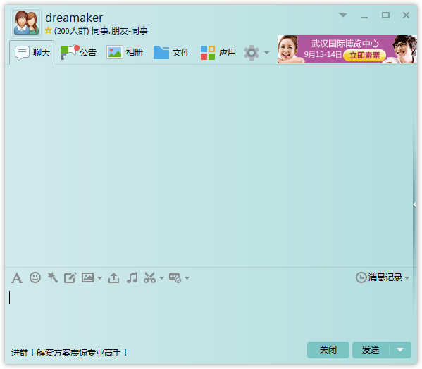
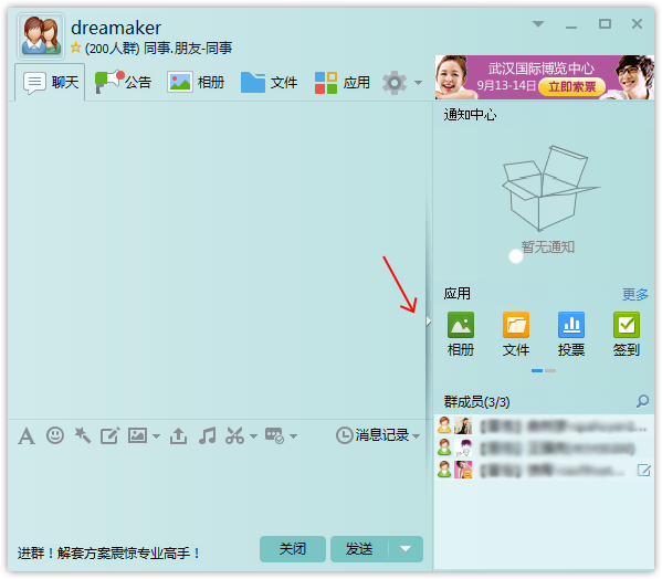
侧边栏的收缩可以在需要的时候隐藏部分组件,从而为其他组件提供更为广阔的视角。如上图中的侧边栏收缩为文本框组件提供更多的空间,整个界面上看起来也更为清爽。稍微一剖析:这个边栏要能点击,点击之后要切换图标,响应的组件要隐藏。如此一分析,代码可如下编写:
TestSideBar::TestSideBar(QWidget *parent)
	: QMainWindow(parent)
{
	ui.setupUi(this);
	flag = false;
	mainLayout = new QHBoxLayout(this);

	mainSplitter = new QSplitter(Qt::Horizontal, this);
	mainSplitter->setFrameStyle(QFrame::NoFrame);
	mainSplitter->setHandleWidth(1);
	mainSplitter->setChildrenCollapsible(false);

	zoomButton = new QPushButton(this);
	zoomButton->setSizePolicy(QSizePolicy::Expanding, QSizePolicy::Expanding);
	zoomButton->setIcon(QIcon(":/right"));
	zoomButton->setFixedWidth(6);
	zoomButton->setFocusPolicy(Qt::NoFocus);
	zoomButton->setStyleSheet("background: #E8E8E8; border: none; padding: 0px;");

	leftWidget = new QWidget(this);
	leftWidget->setStyleSheet("background: yellow;");
	rightWidget = new QWidget(this);
	rightWidget->setStyleSheet("background: blue;");

	mainSplitter->addWidget(leftWidget);
	mainSplitter->addWidget(rightWidget);

	mainLayout->addWidget(zoomButton);
	mainLayout->addWidget(mainSplitter);
	mainLayout->setSpacing(0);
	mainLayout->setContentsMargins(0, 0, 0, 0);

	QWidget* w = new QWidget(this);
	w->setLayout(mainLayout);
	setCentralWidget(w);

	connect(zoomButton, SIGNAL(clicked()), this, SLOT(onZoomClicked()));
}

void TestSideBar::onZoomClicked()
{
	if (flag)   // 根据当前的展开状态,进行切换
	{
		flag = false;
		zoomButton->setIcon(QIcon(":/left"));
		leftWidget->setVisible(true);
	}
	else
	{
		flag = true;
		zoomButton->setIcon(QIcon(":/right"));
		leftWidget->setVisible(false);
	}
}

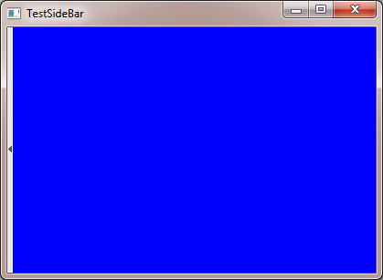
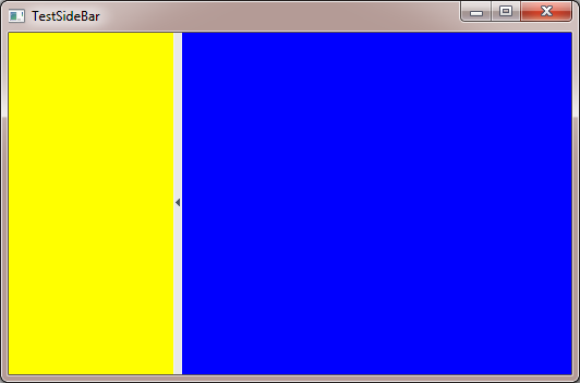
可以发现这里的侧边栏果然一直固定在最左侧,要达到QQ聊天界面那要的效果呢,只需要改几行代码就好了:
TestSideBar::TestSideBar(QWidget *parent)
	: QMainWindow(parent)
{
        // 其他保持不变,省略……

	mainSplitter->addWidget(leftWidget);
	mainSplitter->addWidget(zoomButton);
	mainSplitter->addWidget(rightWidget);

	mainLayout->addWidget(mainSplitter, 1);
	mainLayout->setSpacing(0);
	mainLayout->setContentsMargins(0, 0, 0, 0);

        // 其他保持不变,省略……
}

小结
这一篇主要讲了上篇遗留的一个功能,工具按钮组的开发。另外,实现了另外一个功能:侧边栏的伸缩。下一篇继续树形控件(tree widget)、堆栈式窗口布局(stacked layout)的讲解。