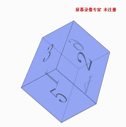
先看个效果图
  1 <!DOCTYPE html>
  2 <html>
  3 <head>
  4     <meta http-equiv="Content-Type" content="text/html; charset=utf-8" />
  5     <title>旋转盒子</title>
  6     <meta charset="utf-8" />
  7     <style>
  8         * {
  9             margin: 0px;
 10             padding: 0px;
 11         }
 12         @keyframes box {
 13             100% {
 14                 transform: rotate3d(100,100,100,360deg);
 15             }
 16         }
 17         #box {
 18             position: absolute;
 19             top: 30%;
 20             left: 50%;
 21             /*position:relative;*/
 22             perspective: 2000px;
 23             perspective-origin: 500px -300px;
 24             animation: box 5s linear 7s infinite both;
 25             transform-style: preserve-3d;
 26         }
 27         .item {
 28             position: absolute;
 29             border: 1px solid #000000;
 30             opacity: 0.5;
 31             width: 200px;
 32             height: 200px;
 33             font-size: 100px;
 34             background-color: #7b8efb;
 35             text-align: center;
 36             line-height: 200px;
 37         }
 38         @keyframes box1 {
 39             100% {
 40                 transform: rotateY(-90deg);
 41             }
 42         }
 43         #box1 {
 44             z-index: 6;
 45             transform-origin: left;
 46             animation: box1 1s linear 1s both;
 47         }
 48         @keyframes box2 {
 49             100% {
 50                 transform: rotateY(90deg);
 51             }
 52         }
 53         #box2 {
 54             z-index: 5;
 55             transform-origin: right;
 56             animation: box2 1s linear 2s both;
 57         }
 58         @keyframes box3 {
 59             100% {
 60                 transform: rotateX(90deg);
 61             }
 62         }
 63         #box3 {
 64             z-index: 4;
 65             transform-origin: top;
 66             animation: box3 1s linear 3s both;
 67         }
 68         @keyframes box4 {
 69             100% {
 70                 transform: rotateX(-90deg);
 71             }
 72         }
 73         #box4 {
 74             z-index: 3;
 75             transform-origin: bottom;
 76             animation: box4 1s linear 4s both;
 77         }
 78         @keyframes box5 {
 79             100% {
 80                 transform: translateZ(200px);
 81             }
 82         }
 83         #box5 {
 84             z-index: 2;
 85             animation: box5 1s linear 5s both;
 86         }
 87         @keyframes box6 {
 88             100% {
 89                 transform: rotateY(180deg);
 90             }
 91         }
 92         #box6 {
 93             animation: box6 1s linear 6s both;
 94         }
 95     </style>
 96 </head>
 97 <body>
 98     <div id="box">
 99         <div class="item" id="box1">1</div>
100         <div class="item" id="box2">2</div>
101         <div class="item" id="box3">3</div>
102         <div class="item" id="box4">4</div>
103         <div class="item" id="box5">5</div>
104         <div class="item" id="box6">6</div>
105     </div>
106 </body>
107 </html>