最近做了一个移动端页面,要求适配手机屏幕,用到的是九宫格。在处理屏幕适配上花了不少时间,也在测试中找到最好的布局方法。
分享代码之余也能够在下一次的工作项目中避免犯相同的错误。
<!DOCTYPE html>
<html lang="en">
<head>
    <meta charset="UTF-8" />
    <title>移动端测试</title>
     <meta name="viewport" content="width=device-width, initial-scale=1,maximum-scale=1,user-scalable=no">
     <link rel="stylesheet" type="text/css" href="css/test.css" />
</head>
<body>
    <div class="wrap">
       <div class="con">
           <table>
               <tr>
                   <td><div class="box">1</div></td>
                   <td><div class="box">2</div></td>
                   <td><div class="box">3</div></td>
               </tr>
                <tr>
                   <td><div class="box">8</div></td>
                   <td><div class="box">m</div></td>
                   <td><div class="box">4</div></td>
               </tr>
                <tr>
                   <td><div class="box">7</div></td>
                   <td><div class="box">6</div></td>
                   <td><div class="box">5</div></td>
               </tr>
           </table>
       </div>
    </div>
</body>
</html>
*{
    margin: 0;
    padding: 0;
}
img{
    border:0;
}
ol, ul ,li{list-style: none;}
a{
    text-decoration: none;
}
body{
    font-size: 62.5%;
    font-family:"Microsoft YaHei";
}
.wrap{
     100%;
    max- 750px;
    height: 600px;
    background: #ff894c;
    margin: 0 auto;
}
.con{
    100%;
    position: relative;
    left: 0;
    top: 120px;
}
table{
    margin: 0 auto;
    box-sizing: border-box;
    padding: 15px 15px 0 0;
}
table tr td{
   display: inline-block;
   float: left;
   padding: 0 0 15px 15px;
}
table tr td .box{
     75px;
    height: 75px;
    line-height: 75px;
    display: inline-block;
    background: #ffcc99;
    color: #fff;
    font-size: 2rem;
    text-align: center;
}
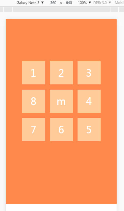
一开始在做页面的时候考虑的是用css媒体查询@media screen and(min-device-width),给每个td加margin值,而且td里也没有div,用最外层padding值控制距离。
最终在iphone 6 plus 上出现问题,元素的距离没有显示。后来改为padding值后,元素终于整齐排列。在往后的项目中,能用padding 值尽量不要用margin值,因为
那就是大大的坑...老是被代码调戏...如果有更好的建议欢迎留言。