图 5.1
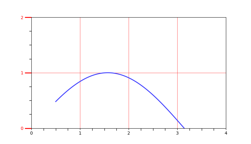


import matplotlib.pyplot as plt
import numpy as np
from matplotlib.ticker import AutoMinorLocator, MultipleLocator, FuncFormatter


x=np.linspace(0.5, 3.5, 100)
y=np.sin(x)


fig=plt.figure(figsize=(8, 8))
ax=fig.add_subplot(111)


ax.xaxis.set_major_locator(MultipleLocator(1.0))
ax.yaxis.set_major_locator(MultipleLocator(1.0))


ax.xaxis.set_minor_locator(AutoMinorLocator(4))
ax.yaxis.set_minor_locator(AutoMinorLocator(4))


def minor_tick(x, pos):
    if not x%1.0:
        return ""
    return "%.2f"%x
ax.xaxis.set_minor_formatter(FuncFormatter(minor_tick))


ax.tick_params("y", which='major',length=15, width=2.0, colors='r')

ax.tick_params(which='minor', length=5, width=1.0, labelsize=10, labelcolor='0.25')


ax.set_xlim(0, 4)
ax.set_ylim(0, 2)


ax.plot(x, y, c=(0.25, 0.25, 1.00), lw=2, zorder=10)
# ax.plot(x, y, c=(0.25, 0.25, 1.00), lw=2, zorder=0)


ax.grid(linestyle='-', linewidth=0.5, color='r', zorder=0)
# ax.grid(linestyle='-', linewidth=0.5, color='r', zorder=10)
# ax.grid(linestyle='--', linewidth=0.5, color='0.25', zorder=0)


plt.show()
-------------------------------------------------------------------------------------
图 5.2

import matplotlib.pyplot as plt
import numpy as np

fig=plt.figure(facecolor=(1.0, 1.0, 0.9412))

ax=fig.add_axes([0.1, 0.4, 0.5, 0.5])


for ticklabel in ax.xaxis.get_ticklabels():
    ticklabel.set_color("slateblue")
    ticklabel.set_fontsize(18)
    ticklabel.set_rotation(30)

for ticklabel in ax.yaxis.get_ticklabels():
    ticklabel.set_color("lightgreen")
    ticklabel.set_fontsize(20)
    ticklabel.set_rotation(2)

plt.show()
-------------------------------------------------------------------------------------
图 5.3
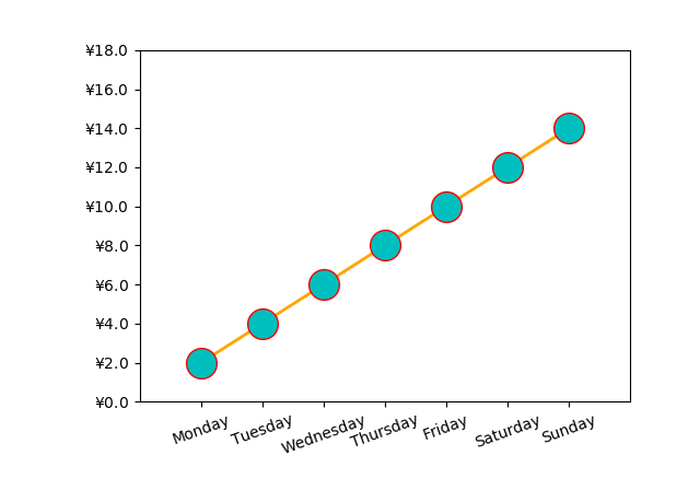
import matplotlib.pyplot as plt
import numpy as np

from calendar import month_name, day_name
from matplotlib.ticker import FormatStrFormatter


fig=plt.figure()

ax=fig.add_axes([0.2, 0.2, 0.7, 0.7])

x=np.arange(1, 8, 1)
y=2*x

ax.plot(x, y, ls='-', lw=2, color='orange', marker='o',
                                    ms=20, mfc='c', mec='r')

ax.yaxis.set_major_formatter(FormatStrFormatter(r"$yen%1.1f$"))

plt.xticks(x, day_name[0:7], rotation=20)


ax.set_xlim(0, 8)
ax.set_ylim(0, 18)


plt.show()
-------------------------------------------------------------------------------------
图 5.4
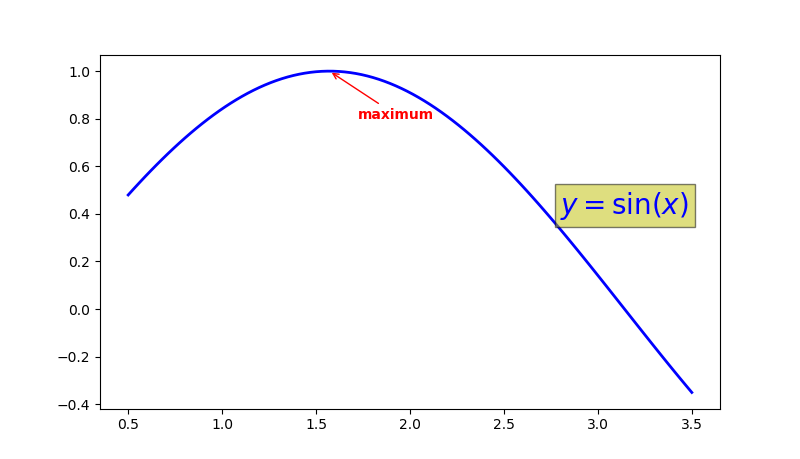
import matplotlib.pyplot as plt
import numpy as np

x=np.linspace(0.5, 3.5, 100)
y=np.sin(x)

fig=plt.figure(figsize=(8, 8))
ax=fig.add_subplot(111)


ax.plot(x, y, c='b', ls='-', lw=2)

ax.annotate("maximum", xy=(np.pi/2, 1.0), xycoords='data',
            xytext=((np.pi/2)+0.15, 0.8), textcoords="data",
            weight="bold", color='r',
            arrowprops=dict(arrowstyle='->', connectionstyle='arc3', color='r'))


ax.text(2.8, 0.4, "$y=sin(x)$", fontsize=20, color='b',
               bbox=dict(facecolor='y', alpha=0.5))

plt.show()
-------------------------------------------------------------------------------------
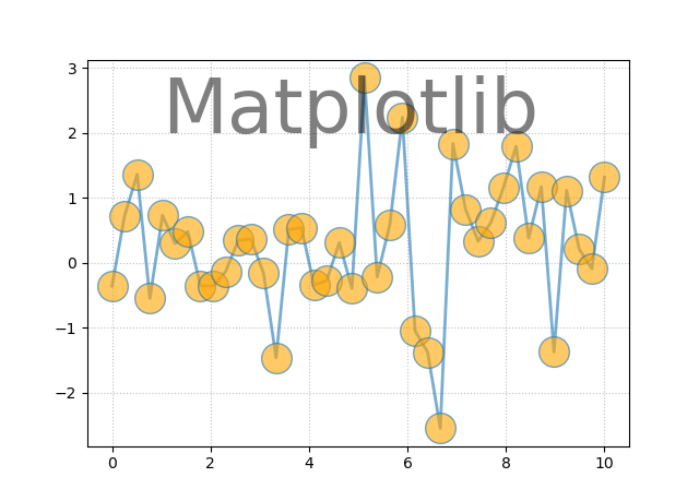
图 5.5
import matplotlib.pyplot as plt
import numpy as np

x=np.linspace(0.0, 10, 40)
y=np.random.randn(40)

plt.plot(x, y, ls='-', lw=2, marker='o', ms=20, mfc='orange', alpha=0.6)

plt.grid(ls=':', color='gray', alpha=0.5)

plt.text(6, 0, 'Matplotlib', size=30, rotation=30.0,
         bbox=dict(boxstyle='round', ec='#8968CD', fc='#FFE1FF'))

plt.show()
-------------------------------------------------------------------------------------
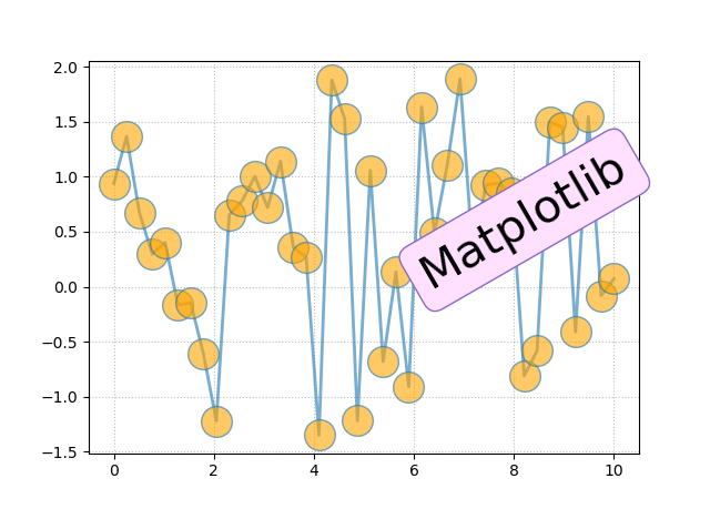
图 5.6
import matplotlib.pyplot as plt
import numpy as np

x=np.linspace(0.0, 10, 40)
y=np.random.randn(40)

plt.plot(x, y, ls='-', lw=2, marker='o', ms=20, mfc='orange', alpha=0.6)

plt.grid(ls=':', color='gray', alpha=0.5)

plt.text(1, 2, 'Matplotlib', size=50, alpha=0.5)

plt.show()
-------------------------------------------------------------------------------------
图 5.7
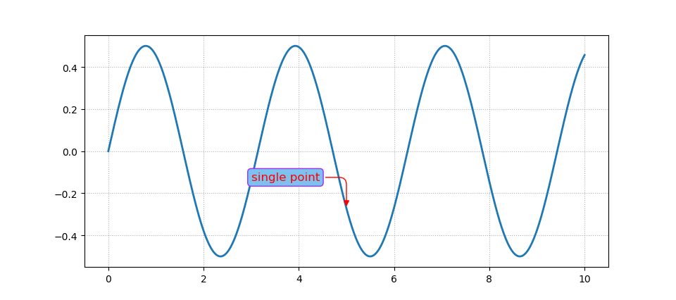
import matplotlib.pyplot as plt
import numpy as np

x=np.linspace(0, 10, 2000)
y=np.sin(x)*np.cos(x)

fig=plt.figure()
ax=fig.add_subplot(111)

ax.plot(x, y, ls='-', lw=2)


bbox=dict(boxstyle='round', fc='#7EC0EE', ec='#9B30FF')

arrowprops=dict(arrowstyle='-|>', color='r',
                connectionstyle='angle, angleA=0, angleB=90, rad=10')

ax.annotate("single point", (5, np.sin(5)*np.cos(5)),
            xytext=(3, np.sin(3)*np.cos(3)),
            fontsize=12, color='r', bbox=bbox, arrowprops=arrowprops)


ax.grid(ls=":", color='gray', alpha=0.6)

plt.show()
-------------------------------------------------------------------------------------
图 5.8
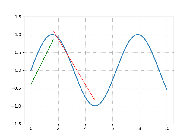
import matplotlib.pyplot as plt
import numpy as np


x=np.linspace(0, 10, 2000)
y=np.sin(x)


fig=plt.figure()
ax=fig.add_subplot(111)


ax.plot(x, y, ls='-', lw=2)

ax.set_ylim(-1.5, 1.5)


arrowprops=dict(arrowstyle='-|>', color='r')

ax.annotate("", (3*np.pi/2, np.sin(3*np.pi/2)+0.15),
            xytext=(np.pi/2, np.sin(np.pi/2)+0.15), color='r', arrowprops=arrowprops)


ax.arrow(0.0, -0.4, np.pi/2, 1.2, head_width=0.05, head_length=0.1, fc='g', ec='g')


ax.grid(ls=':', color='gray', alpha=0.6)

plt.show()
-------------------------------------------------------------------------------------
图 5.9
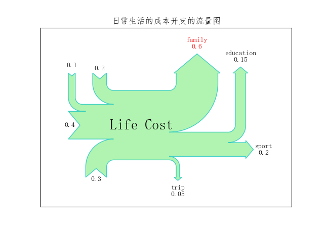
import matplotlib.pyplot as plt
import matplotlib as mpl
import numpy as np

from matplotlib.sankey import Sankey

mpl.rcParams["font.sans-serif"]=['FangSong']
mpl.rcParams['axes.unicode_minus']=False


flows=[0.2, 0.1, 0.4, 0.3, -0.6, -0.05, -0.15, -0.2]

labels=['', '', '', '', 'family', 'trip', 'education', 'sport']
orientations=[1, 1, 0, -1, 1, -1, 1, 0]

sankey=Sankey()

sankey.add(flows=flows, labels=labels, orientations=orientations, color='c',
           fc='lightgreen', patchlabel='Life Cost', alpha=0.7)


diagrams=sankey.finish()
diagrams[0].texts[4].set_color('r')
diagrams[0].texts[4].set_weight('bold')
diagrams[0].text.set_fontsize(20)
diagrams[0].text.set_fontweight('bold')

plt.title("日常生活的成本开支的流量图")

plt.show()
-------------------------------------------------------------------------------------
图 5.10

import matplotlib.pyplot as plt
import matplotlib.patheffects as pes

import numpy as np

x=np.linspace(0.5, 3.5, 100)
y=np.sin(x)

fontsize=23

plt.plot(x, y, ls='--', lw=2)


title='$y=sin({x})$'
xaxis_label='$x\_axis$'
yaxis_label="$y\_axis$"


title_text_obj=plt.title(title, fontsize=fontsize, va='bottom')
xaxis_label_text_obj=plt.xlabel(xaxis_label,
                                fontsize=fontsize-3, alpha=1.0)
yaxis_label_text_obj=plt.ylabel(yaxis_label,
                                fontsize=fontsize-3, alpha=1.0)


title_text_obj.set_path_effects([pes.withSimplePatchShadow()])


pe=pes.withSimplePatchShadow(offset=(1, -1), shadow_rgbFace='r', alpha=0.3)


xaxis_label_text_obj.set_path_effects([pe])
yaxis_label_text_obj.set_path_effects([pe])


plt.show()
-------------------------------------------------------------------------------------
图 5.11
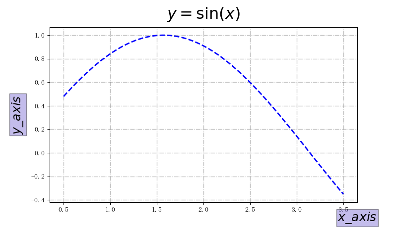
import matplotlib.pyplot as plt
import numpy as np

x=np.linspace(0.5, 3.5, 100)
y=np.sin(x)


fig=plt.figure(figsize=(8, 8))
ax=fig.add_subplot(111)


box=dict(facecolor='#6959CD', pad=2, alpha=0.4)
ax.plot(x, y, c='b', ls='--', lw=2)


title='$y=sin({x})$'
xaxis_label='$x\_axis$'
yaxis_label="$y\_axis$"


ax.set_xlabel(xaxis_label, fontsize=18, bbox=box)
ax.set_ylabel(yaxis_label, fontsize=18, bbox=box)
ax.set_title(title, fontsize=23, va='bottom')


ax.yaxis.set_label_coords(-0.08, 0.5)
ax.xaxis.set_label_coords(1.0, -0.05)

ax.grid(ls='-.', lw=1, color='gray', alpha=0.5)

plt.show()
-------------------------------------------------------------------------------------