高度相等列在Web页面设计中永远是一个网页设计师的需求。如果所有列都有相同的背景色,高度相等还是不相等都无关紧要,因为你只要在这些列的父元素中设置一个背景色就可以了。但是,如果一个或多个列需要单独设置自己的背景色,那么它的视觉完整性的设计就显得非常重要了。大家都知道当初Table实现等高列布局是多么的简单,但是我们使用CSS来创建等高列布局并非是那么容易的事情。
如果一个设计是固定宽度(非流体的宽度设计),那么实现多列等高效果是相当的容易。最好的技术就是使用Dan Cederholm的Faux Columns技术。只要制作一张合适的背景图片,在你多列的父元素中进行垂直铺放,从而达到一种假像(假的多列等高布局效果)。但是在流体布局中要用CSS实现多列等高的设计那就不是那么容易的事情,因为我们没有办法在使用背景图片来实现多列等高的假像了,那么是不是就没有办法实现了呢?那当然不是那么回事了,不管是实现固定布局还是流体布局的等多列等高视觉效果,方法还是蛮多的,这些方法体现了CSS的不同技术,也各有千秋,下面我们就一起来探讨Web页面中的多列等高的实现技术。
下面要介绍的方法都是让我们的布局如何实现多列的等高视觉效果,正如下图所示:

一、假等高列
这种方法是我们实现等高列最早使用的一种方法,就是使用背景图片,在列的父元素上使用这个背景图进行Y轴的铺放,从而实现一种等高列的假像:
Html Markup
				<div class=”container clearfix”>
					<div class=”left”></div>
					<div  class=”content”></div>
					<div class=”right”></div>
				</div>
在制作样式之前需要一张类似下面的背景图:

CSS Code:
				.container {
					background: url("column.png") repeat-y;
					 960px;
					margin: 0 auto;
					}
					.left {
					float: left;
					 220px;
					}
					.content {
					float: left;
					 480px;
					}
					.right {
					float:left;
					 220px;
					}
优点:
实现方法简单,兼容性强,不需要太多的css样式就可以轻松实现。
缺点:
使用这种方法不适合流体布局等高列的布局,另外如果你需要更换背景色或实现其他列数的等高列时,都需要重新制作过背景图。
二、给容器div使用单独的背景色(固定布局)
这种方法实现有点复杂,如果你理解其实现过程也是相当的简单。这种方法我们主要给每一列的背景设在单独的<div>元素上。这种方法的实现的原则是:任何<div>元素的最大高度来撑大其他的<div>容器高度。如下图所示:

上图中,不管我们哪一列的高度最高,那么其三个容器“rightBack,contentBack,leftBack”的高度相应会随最高列的高列变化,下面我们一起来看其实现过程:
Html Markup
							<div class="container">
								<div class="rightWrap">
									<div class="contentWrap">
										<div class="leftWrap">
											<div class="aside column leftSidebar" id="left"></div>
											<div id="content" class="column section"></div>
											<div class="aside rightSidebat column" id="right"></div>
										</div>
									</div>
								</div>
							</div>
CSS Code:
							<style type="text/css">
								.container {
									 960px;
									margin: 0 auto;
								}
								.rightWrap {
									 100%;
									float: left;
									background: green;
									overflow: hidden;
									position: relative;
								}

								.contentWrap {
									float: left;
									background: orange;
									 100%;
									position: relative;
									right: 320px;/*此值等于rightSidebar的宽度*/
								}

								.leftWrap{
									 100%;
									background: lime;
									float:left;
									position: relative;
									right: 420px;/*此值等于Content的宽度*/
								}
								#left {
									float: left;
									 220px;
									overflow: hidden;
									position: relative;
									left: 740px;
								}
								#content {
									float: left;
									 420px;
									overflow: hidden;
									position:relative;
									left: 740px;
								}
								#right {
									float: left;
									overflow: hidden;
									 320px;
									background: #333;
									position: relative;
									left: 740px;
								}
							</style>
看起来蛮复杂吧?其实你只要了解了它是如何的工作原理就会变得非常简单,你只要理解并掌握以下几点:
- “div.rightWrap”、“div.contentWrap”、“div.leftWrap”都是一个封闭的容器;而“div#left”、“div#content”、“div#right”就是我们所说的列,里面放了内容;
- 每一个容器对应一列的背景色(用来放置背景色或背景图片);此例对应的是:“div.rgithWrap”用来实现“div#right”列的背景色;“div.contentWrap”用来实现“div#content”列的背景色;“div.leftWrap”用来实现“div#left”列的背景色;
- 除了最外面的容器(也就是对应的最左列容器)外,我都都对他们进行相对定位,并且设置其“right”值,此值并和相对应的列宽相等。此例中“div.contentWrap”对应的刚好是“div#right”的宽度;而“div.leftWrap”对应用的刚好是“div#content”的宽度;
- 给每列进行左浮动,并设置其列宽
- 给每一列设置相对定位,并进行“left”设置,而且“left”的值等于除第一列的所有列宽的和。此例中“left”的值等于“div#right”和“div#content”两列的宽度之和,也就是320px+420=740px
用两幅图来展示其实现的过程:
下图是实现上面的第二步对应的示例图,也就是容器“div.rightWrap”,“div.contentWrap”,“div.leftWrap”进行相对定位(position: releative),并展示了如何设置对应的“right”值。
上图虚线代表的范围是可视范围,其中有两列背景将会溢出,解决这个只需要在最外层容器“div.rightWrap”加上“overflow:hidden”就可以进行隐藏溢出的其他背景色。接下来下图所展示的是上面所说的第五步:
前面我们对三个内容元素都进行了相对定位,现在只需要按第五步将其定位回去,如上图所示。其实说到最后,你只要理解了这两幅,你就什么都清楚了。
优点:
这种方法是不需要借助其他东西(javascript,背景图等),而是纯CSS和HTML实现的等高列布局,并且能兼容所有浏览器(包括IE6),并且可以很容易创建任意列数。
缺点:
这种方法不像其他方法一样简单明了,给你理解会带来一定难度,但是只要你理解清楚了,将能帮你创建任意列数的等高布局效果。
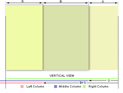
三、给容器div使用单独的背景色(流体布局)
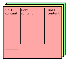
这种布局可以说是就是第二种布局方法,只是这里是一种多列的流体等高列的布局方法。前面也说过了,其实现原理就是给每一列添加相对应用的容器,并进行相互嵌套,并在每个容器中设置背景色。这里需要提醒大家你有多少列就需要多少个容器,比如说我们说的三列,那么你就需要使用三个容器。如下图所示:
HTML Markup
								<div id="container3">
									<div id="container2">
											<div id="container1">
													<div id="col1">Column 1</div>
													<div id="col2">Column 2</div>
													<div id="col3">Column 3</div>
											</div>
									</div>
								</div>
CSS Code:
								<style type="text/css">
									#container3 {
										float: left;
										 100%;
										background: green;/**/
										overflow: hidden;
										position: relative;
									}

									#container2 {
										float: left;
										 100%;
										background: yellow;
										position: relative;
										right: 30%; /*大小等于col3的宽度*/
									}

									#container1 {
										float: left;
										 100%;
										background: orange;
										position: relative;
										right: 40%;/*大小等于col2的宽度*/
									}

									#col1 {
										float:left;
										26%;/*增加了2%的padding,所以宽度减少4%*/
										position: relative;
										left: 72%;/*距左边呀增加2%就成72%*/
										overflow: hidden;
									}
									#col2 {
										float:left;
										36%;/*增加了2%的padding,所以宽度减少4%*/
										position: relative;
										left: 76%;/*距左边有三个padding为2%,所以距离变成76%*/
										overflow: hidden;
									}
									#col3 {
										float:left;
										26%;/*增加了2%的padding,所以宽度减少4%*/
										position: relative;
										left: 80%;/*距左边5个padding为2%,所以距离变成80%*/
										overflow: hidden;
									}
								</style>
上面展示的是三列的,下面我们在来看一下两列和更多列的模板:
两列的HTML Markup:
					<div id="container2">
						<div id="container1">
							<div id="col1">Column 1</div>
							<div id="col2">Column 2</div>
						</div>
					</div>
两列的CSS Code:
					<style type="text/css">
						#container2 {
							float: left;
							 100%;
							background: orange;
							position: relative;
							overflow: hidden;
						}
						#container1 {
							float: left;
							 100%;
							background: green;
							position: relative;
							right: 30%;
						}

						#col1 {
							 66%;
							float: left;
							position: relative;
							left: 32%;
						}

						#col2 {
							 26%;
							float: left;
							position: relative;
							left: 36%;
						}
					</style>
四列的HTML Markup:
							<div id="container4">
								<div id="container3">
									<div id="container2">
										<div id="container1">
											<div id="col1">col1</div>
											<div id="col2">col2</div>
											<div id="col3">col3</div>
											<div id="col4">col4</div>
										</div>
									</div>
								</div>
							</div>
四列的CSS Code:
							<style type="text/css">
								#container4 {
									float: left;
									 100%;
									background: green;
									position: relative;
									overflow: hidden;
								}

								#container3 {
									float: left;
									 100%;
									background: #B2F0F9;
									position: relative;
									right: 20%;/*此值等于col4的宽度*/
								}

								#container2 {
									float: left;
									 100%;
									background: #89FFA2;
									position: relative;
									right: 30%;/*此值等于col3的宽度*/
								}

								#container1 {
									float: left;
									 100%;
									background: #369;
									position: relative;
									right: 30%;/*此值等于col2的宽度*/
								}

								#col1 {
									 18%;/*1%的padding*/
									float: left;
									position: relative;
									left: 81%;
									overflow: hidden;
								}

								#col2 {
									float: left;
									 28%;
									position: relative;
									left: 83%;
									overflow: hidden;
								}

								#col3 {
									float: left;
									 28%;
									position: relative;
									left: 85%;
									overflow: hidden;
								}

								#col4 {
									float: left;
									 18%;
									position: relative;
									left: 87%;
									overflow: hidden;
								}
							</style>
下面来看其实现过程,如果你理解了第二制作方法,那么这个你不用想一下就知道他们是一样的道理,如果你对第二种方法还不够清楚,那么你接着看这下面的内容,你会更清楚他们是怎么一回事的。下面我们一起来看三列的实现过程:
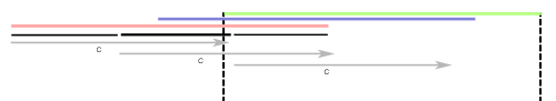
上图展示了,我们有三列,并且也说过了,这三列内容都放在了三个容器的div中,我们每一列的背景色不是放在内容列中,而是放置在容器中,现在我们需要通过对容器进行相对定位,把背景显示出来,而且我们这个容器是最外层的不能进行相对定位的移动,具体的请看下图:
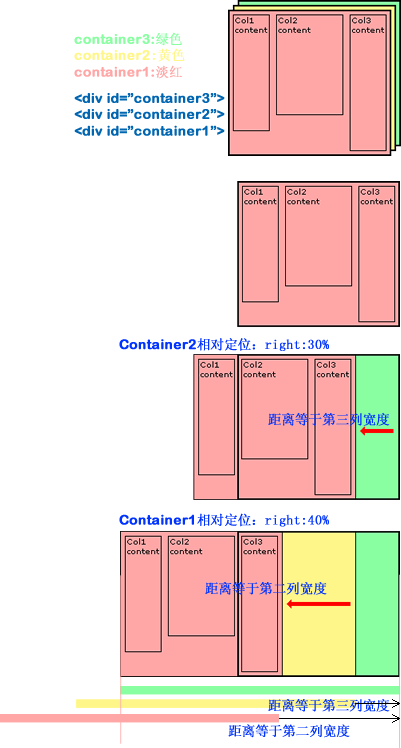
上面我们把容器进行了相对定位,这样一来,我们内容也相应的做了移动,现在我们需要对页面列的内容也进行相对定位,并把内容和容器进行相反方向的定位,这样内容和容器背景色就能对应上了,请看下图所展示的:

接下来我们需要把溢出的部分切掉去,和前面一相,在最外面的容器加上overflow:hidden;这样就OK了。
最后为了让你的效果更加好看一点,你可以尝试给他们加上padding,比如说每列加上2%的padding值,具体实现可以简单从下图中得到:

优点:
兼容各浏览器,可以制作流体等高列,交无列数限制。
缺点:
标签使用较多,结构过于复杂,不易于理解,不过你掌握了其原理也就不难了,这也不算太大缺点。
三、创建带边框的现列等高布局
平常在制作中,我们需要制作两列的等高效果,并且有一条边框效果,那么这个实例我们就一起来看其实现方法:
Html Code
				<div id="wrapper">
					<div id="sidebar">
						.....
					</div>
					<div id="main">
						....
					</div>
				</div>
CSS Code:
				<style type="text/css">
					html {
						background: #45473f;
						height: auto;
					}

					body {
						 960px;
						margin: 20px auto;
						background: #ffe3a6;
						border: 1px solid #efefef;
					}

					#wrapper {
						display: inline-block;
						border-left: 200px solid #d4c376;
						position: relative;
						vertical-align: bottom;
					}

					#sidebar {
						float: left;
						 200px;
						margin-left: -200px;
						margin-right: -1px;
						border-right: 1px solid #888;
						position: relative;
					}

					#main {
						float: left;
						border-left: 1px solid #888;
					}

					#maing,
					#sidebar{
						padding-bottom: 2em;
					}
				</style>
优点:
可以制作带有边框的两列等高布局,并能兼容所有浏览器,结构简单明了。
缺点:
不适合于更多列的应用,比如说三列以上,这样的方法就行不通了。
四、使用正padding和负margin对冲实现多列布局方法
这种方法很简单,就是在所有列中使用正的上、下padding和负的上、下margin,并在所有列外面加上一个容器,并设置overflow:hiden把溢出背景切掉。下面一起来看代码:
HTML Markup:
						<div id="container">
							<div id="left" class="column aside">
								<p>Sidebar</p>
							</div>
							<div id="content" class="column section">
								<p>Main content</p>
							</div>
							<div id="right" class="column aside">
								<p>Sidebar</p>
							</div>
						</div>
CSS Code:
					<style type="text/css">

						#container {
							margin: 0 auto;
							overflow: hidden;
							 960px;
						}

						.column {
							background: #ccc;
							float: left;
							 200px;
							margin-right: 5px;
							margin-bottom: -99999px;
							padding-bottom: 99999px;
						}

						#content {
							background: #eee;
						}

						#right {
							float: right;
							margin-right: 0;
						}
					</style>
优点:
这种可能实现多列等高布局,并且也能实现列与列之间分隔线效果,结构简单,兼容所有浏览器
缺点:
这种方法存在一个很大的缺陷,那就是如果要实现每列四周有边框效果,那么每列的底部(或顶部)将无法有边框效果。
下面我们就针对这个缺陷来介绍两种解决办法,第一种是使用背景图来模仿底部(或顶部)边框;第二种方法是使用div来模仿列的边框,下面我们来看这两种方法:
1、背景图模仿边框效果:
Html Code:
					<div id="containerOuter">
						<div id="containerInner">
							<div id="left" class="column aside">
								<p>Sidebar</p>
							</div>
							<div id="content" class="column section">
								<p>Main content</p>
							</div>
							<div id="right" class="column aside">
								<p>Sidebar</p>
							</div>
						</div>
					</div>
CSS Code:
					<style type="text/css">
						#containerOuter {
							background: url("images/bg.gif") no-repeat center bottom;
							 616px;
							margin: 0 auto;
							padding-bottom: 1px;
							overflow: hidden;
						}

						#containerInner {
							float: left;
							overflow: hidden;
							margin-right: -5px;
						}

						.column {
							background: #ccc;
							border: 1px solid #000;
							float: left;
							 200px;
							margin-right: 5px;
							margin-bottom: -99999px;
							padding-bottom: 99999px;
						}

						#content {
							background: #eee;
						}
					</style>
这种方法我们需要在外面增加一个层,并将背景图放置在这个层的底部,而且需要制作一张和列边框色一致,并且要先排列好他们之间的间距,如下图所示:
这种方法有一个最大的不足之处就是,如果我们更改了列的边框的颜色,或者改变了他们之间的间距,都需要重新制作过一张背景图来重新模仿这样的效果,下面一起来看看这种方法带来的最后效果:

2、使用div来模仿列的边框
我们这种方法是在列里面添加一个div,用这个div来模仿边框的效果,具体看代码吧:
Html Code:
				<div class="wrapper">
					<div class="container">
						<div class="col1">
							<div class="colBottom1"><!-- ie needs this comment for small div heights --></div>
						</div>
						<div class="col2">
							<div class="colBottom2"><!-- ie needs this comment for small div heights --></div>
						</div>
					</div>
				</div>
CSS Code:
				<style type="text/css">
					.wrapper {
						 960px;
						margin: 0 auto;
					}
					.container {
						position: relative;
						overflow: hidden;
						zoom: 1;
					} /* zoom fix for ie6 */
					.col1 {
						float: left;
						 728px;
						padding-bottom: 32767px;
						margin-bottom: -32767px;
						border: #f36 1px solid;
						background: #AFAFAF;
						}
					.col2 {
						float: right;
						 208px;
						padding-bottom: 32767px;
						margin-bottom: -32767px;
						border: #f36 1px solid;
						background: #6F6F6F;
					}
					.colBottom1 {
						position: absolute; /*相对于div.container*/
						bottom: 0;
						left: 0px;/*如果第一列左浮动就设置left:0;*/
						height: 1px; /*当前列的边框宽度*/
						 730px;/*当前列宽度+边框宽度*2 */
						background: #f36;/*当前列的边框颜色*/
						}
					.colBottom2 {
						position: absolute; /*相对于div.container*/
						bottom: 0;
						right: 0px; /*如果第二列右浮动就设置left:0;*/
						height: 1px; /*当前列的边框宽度*/
						 210px; /*当前列宽度+边框宽度*2 */
						background: #f36;/*当前列的边框颜色*/
					}

				</style>
五、使用边框和定位模拟列等高
这种方法是使用边框和绝对定位来实现一个假的高度相等列的效果。假设你需要实现一个两列等高布局,侧栏高度要和主内容高度相等。如:
Html Code:
				<div id="wrapper">
					<div id="mainContent">...</div>
					<div id="sidebar">...</div>
				</div>
CSS Code:
				<style type="text/css">
					#wrapper {
						 960px;
						margin: 0 auto;
					}

					#mainContent {
						border-right: 220px solid #dfdfdf;
						position: absolute;
						 740px;
					}

					#sidebar {
						background: #dfdfdf;
						margin-left: 740px;
						position: absolute;
						 220px;
					}
				</style>
优点:
结构简单,兼容各浏览器,容易掌握。
缺点:
这个方法就是无法单独给主内容列设置背景色,并且实现多列效果效果不佳。
六、边框模仿等高列
第五种方法我们无法实现主列的背景色设置,针对上面方法,稍作一下改良,这样就可以实现主内容也设置颜色的效果了
CSS Html:
				<div id="container">
					<div id="content">This is<br />some content</div>
					<div id="right">This is the right</div>
				</div>
CSS Code:
				<style type="text/css">
					#container{
						background-color:#0ff;
						overflow:hidden;
						960px;
						margin: 0 auto;
					}
					#content{
						background-color:#0ff;
						740px;
						border-right:220px solid #f00; /* 边框大小和颜色设置和right大小与颜色一样 */
						margin-right:-220px; /*此负边距大小与right边栏宽度一样*/
						float:left;
					}
					#right{
						background-color:#f00;
						220px;
						float:left;
					}
				</style>
下面我们在此基础上改变流体布局:
HTML Markup
				<div id="container">
					<div id="content">Main content section</div>
					<div id="sidebar">Right Sidebar </div>
				</div>
				<style type="text/css">
					#container{
						background-color:#0ff;
						overflow:hidden;
						margin:0 100px;
						padding-right:220px; /* 宽度大小等与边栏宽度大小*/
					}
					* html #container{
						height:1%; /* So IE plays nice */
					}
					#content{
						background-color:#0ff;
						100%;
						border-right:220px solid #f00;
						margin-right:-220px;
						float:left;
					}
					#sidebar{
						background-color:#f00;
						220px;
						float:left;
						margin-right:-220px;
					}
				</style>
上面主要展示了这种方法的二列布局,下面我们在来看看三列布局的用法
HTML Markup
					<div id="containerOuter">
						<div id="container">
							<div id="content">Main content section</div>
							<div id="left">LEFT sidebar</div>
							<div id="right">RIGHT sidebar</div>
						</div>
					</div>
CSS Code:
					<style type="text/css">
						#containerOuter {
							margin: 0 auto;
							 960px;
						}
						#container{
							background-color:#0ff;
							float:left;
							520px;
							border-left:220px solid #0f0; /* 边框大小等于左边栏宽度,颜色和左边栏背景色一致*/
							border-right:220px solid #f00;/* 边框大小等于右边栏宽度,颜色和右边栏背景色一致*/
						}
						#left{
							float:left;
							220px;
							margin-left:-220px;
							position:relative;
						}
						#content{
							float:left;
							520px;
							margin-right:-520px;
						}
						#right{
							float:right;
							220px;
							margin-right:-220px;
							position:relative;
						}
					</style>
接着在看一个三列自适应布局
Html Markup
				<div id="container">
					<div id="content">Main Content</div>
					<div id="left">Left Sidebar</div>
					<div id="right">Right Sidebar</div>
				</div>
CSS Code
				<style type="text/css">
					body{
					margin:0 100px;
					padding:0 220px 0 220px;
				}
				#container{
					background-color:#0ff;
					float:left;
					100%;
					border-left:220px solid #0f0;
					border-right:220px solid #f00;
					margin-left:-220px;
					margin-right:-220px;
					display:inline; /* So IE plays nice */
				}
				#left{
					float:left;
					220px;
					margin-left:-220px;
					position:relative;
				}
				#content{
					float:left;
					100%;
					margin-right:-100%;
				}
				#right{
					float:right;
					220px;
					margin-right:-220px;
					position:relative;
				}
			</style>
优点:
能兼容所有浏览器效果,结构简单明了,容易掌握。
缺点:
列数受到极限,超过三列不好控制。
七、模仿表格布局实列等高列效果
这种方法只适合现代浏览器,本不想介绍的,不过还是顺便列出让大家参考一下吧:
HTML Markup:
						<div class="container table">
							<div class="containerInner tableRow">
								<div class="column tableCell cell1">
									<div class="left aside">
										....
									</div>
								</div>

								<div class="column tableCell cell2">
									<div class="content section">
										...
									</div>
								</div>

								<div class="column tableCell cell3">
									<div class="right aside">
										...
									</div>
								</div>

							</div>
						</div>
CSS Code:
						<style type="text/css">
							.table {
								 auto;
								min- 1000px;
								margin: 0 auto;
								padding: 0;
								display:table;
							}

							.tableRow {
								display: table-row;
							}

							.tableCell {
								display: table-cell;
								 33%;
							}

							.cell1 {
								background: #f00;
							}

							.cell2 {
								background: #0f0;
							}

							.cell3 {
								background: #00f;
							}
						</style>
优点:
这是一种非常简单,易于实现的方法。
缺点:
兼容性不好,在ie6-7无法正常运行。
八、jQuery和javascript大法
最后要给大家介绍的是使用jQuery和javascript方法来实现多列的布局效果。
1、jQuery实现方法:
Html Markup
				<div class="container">
					<div id="left" class="aside leftSidebar"></div>
					<div id="content" class="section"></div>
					<div id="right" class="aside rightSidebar"></div>
				</div>
CSS Code:
				<style type="text/css">
					.contanier {
						 960px;
						margin: 0 auto;
					}

					.aside,
					.section {
						float:left;
						 33%;
						background: lime;
					}

					.leftSidebar {background: orange;}
					.section { background: green;}
				</style>
jQuery Code:
				<script type="text/javascript">
					$(document).ready(function(){
						//等高列的小插件
						function setEqualHeight(columns) {
							var tallestColumn = 0;
							columns.each(function(){
								currentHeight = $(this).height();
								if(currentHeight > tallestColumn) {
									tallestColumn = currentHeight;
								}
							});
							columns.height(tallestColumn);
						}
						//调用写好的插件,基中“.container > div”是你需要实现的等高列
						setEqualHeight($(".container > div"));
					});
				</script>
你也可以把上面的jQuery代码换成下面的
<script type="text/javascript">
$(document).ready(function(){
var currentTallest = 0,
currentRowStart = 0,
rowDivs = new Array(),
$el,
topPosition = 0;
$('.column').each(function() {
$el = $(this);
topPostion = $el.position().top;
if (currentRowStart != topPostion) {
// we just came to a new row. Set all the heights on the completed row
for (currentDiv = 0 ; currentDiv < rowDivs.length ; currentDiv++) {
rowDivs[currentDiv].height(currentTallest);
}
// set the variables for the new row
rowDivs.length = 0; // empty the array
currentRowStart = topPostion;
currentTallest = $el.height();
rowDivs.push($el);
} else {
// another div on the current row. Add it to the list and check if it's taller
rowDivs.push($el);
currentTallest = (currentTallest < $el.height()) ? ($el.height()) : (currentTallest);
}
// do the last row
for (currentDiv = 0 ; currentDiv < rowDivs.length ; currentDiv++) {
rowDivs[currentDiv].height(currentTallest);
}
});
});
</script>
如果你使用上面这个jQuery代码,你需要在需要实现等高列的div中加上"column"类名,这样才会有效果的。
2、JavaScript方法
上面是jQuery的实现方法,接下来看看javaScript的实现方法:
Html Markup:
				<div class="contanier">
					<div class="column" id="left"></div>
					<div id="content" class="column"></div>
					<div id="right" class="column"></div>
				</div>
CSS Code:
				<style type="text/css">
					.contanier {
						 960px;
						margin: 0 auto;
					}

					#left {
						 220px;
						float: left;
						margin-right: 20px;
						background: green;
					}

					#content {
						 480px;
						float: left;
						margin-right: 20px;
						background: lime;
					}

					#right {
						 220px;
						float: right;
						background: orange;
					}
				</style>
Javascript Code:
				<script type="text/javascript">
					function matchColumns(classname){
						var divs,contDivs,maxHeight,divHeight,d;
						// get all <div> elements in the document
						divs=document.getElementsByTagName('div');
						contDivs=[];
						// initialize maximum height value
						maxHeight=0;
						// iterate over all <div> elements in the document
						for(var i=0;i<divs.length;i++){
								// make collection with <div> elements with class attribute 'container'
								if(new RegExp("\b" + classname + "\b").test(divs[i].className)){
									d=divs[i];
									contDivs[contDivs.length]=d;
									// determine height for <div> element
									if(d.offsetHeight){
										divHeight=d.offsetHeight;
									}
									else if(d.style.pixelHeight){
										divHeight=d.style.pixelHeight;
									}
									// calculate maximum height
									maxHeight=Math.max(maxHeight,divHeight);
								}
						}
						// assign maximum height value to all of container <div> elements
						for(var i=0;i<contDivs.length;i++){
							contDivs[i].style.height=maxHeight + "px";
						}
				}
				// Runs the script when page loads
				window.onload=function(){
					if(document.getElementsByTagName){

						matchColumns('column'); // class="maincolumn"
					}
				}
				</script>
上面八大种方法就是我今天要跟大家一起分享的等高列的布局方法,他们之间更有千秋,希望能给需要的您带来一定的帮助。篇幅过长,慢慢看吧,上面的代码都是经过测试的,兼容各大浏览器,可以直接复制代码使用。
如需转载烦请注明出处:W3CPLUS