两种方式实际上在js上的原理都是一样的。都是获取时间对象,再获取时间对象的时分秒,时分秒乘以其旋转一刻度(一秒、一分、一小时)对应的角度。css3中要赋值于transform:rotate(角度),canvas中要注意的是 arc旋转的不是角度而是弧度,所以要进行转换。最后开一个一秒变化一次的定时器,让函数每秒走一次,就实现了钟表的效果。
1、canvas下的钟表设计
首先就是html布局,canvas的布局很简单
<canvas style="background-color:#ccc;" width="500px" height="500px" id="canvas1"></canvas>
背景色设为#ccc是为了区别浏览器底色与画布底色
下来就是js,先把基本的canvas套路写出来
       var oC=document.getElementById('canvas1');
        var oCG=oC.getContext('2d');
当然要在window.onload下执行。
在画钟表之前先获取
var oDate=new Date();
            var oSecs=oDate.getSeconds();
            var oMins=oDate.getMinutes()+oSecs/60;
            var oHours=oDate.getHours()+oMins/60;
            var oSecsValue=(oSecs*6-90)*Math.PI/180;
            var oMinsValue=(oMins*6-90)*Math.PI/180;
            var oHoursValue=(oHours*30-90)*Math.PI/180;
}
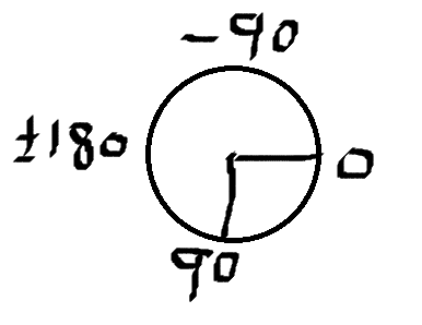
为什么后三句都要减90,附一张图大家就懂了,因为arc画圆,起始点时从右边0处开始,而时钟是从上边-90开始,所以要-90,+oSecs/60和+oMins/60是为了让秒钟走的时候时钟也跟着走秒钟走到30秒,分钟多走半个格子。分钟走了30分,时钟多走半个格子。 弧度=角度*Math.PI/180
下来就是画时钟了
     function time(){
           //构建时钟的最小间隔60个
            oCG.beginPath();
            for(var i=0;i<60;i++){
                oCG.moveTo(250,250);//移画布中心到250,250
                oCG.arc(250,250,200,6*i*Math.PI/180,6*(i+1)*Math.PI/180,false);
            };
            oCG.closePath();
            oCG.stroke();
           //建一个覆盖于最小间隔的遮罩层,半径比它小
            oCG.beginPath();
            oCG.arc(250,250,180,0,360*Math.PI/180,false);
            oCG.fillStyle='#ccc';
            oCG.closePath();
            oCG.fill();

            //构建小时间隔12个
            oCG.beginPath();
            for(var i=0;i<12;i++){
                oCG.moveTo(250,250);//移画布中心到250,250
                oCG.arc(250,250,200,30*i*Math.PI/180,30*(i+1)*Math.PI/180,false);
                oCG.lineWidth='5';
            };
            oCG.closePath();
            oCG.stroke();
            //再做一个遮罩层,目的是让小时的线长一点
            oCG.beginPath();
            oCG.arc(250,250,160,0,360*Math.PI/180,false);
            oCG.fillStyle='#ccc';
            oCG.closePath();
            oCG.fill();

            //时针的做法
            oCG.beginPath();
            oCG.moveTo(250,250);//移画布中心到250,250
            oCG.arc(250,250,100,oHoursValue,oHoursValue,false);
            oCG.lineWidth=8;
            oCG.closePath();
            oCG.stroke();
            //分针的做法
            oCG.beginPath();
            oCG.moveTo(250,250);//移画布中心到250,250
            oCG.arc(250,250,180,oMinsValue,oMinsValue,false);
            oCG.lineWidth=5;
            oCG.closePath();
            oCG.stroke();
            //秒针的做法
            oCG.beginPath();
            oCG.moveTo(250,250);//移画布中心到250,250
            oCG.arc(250,250,180,oSecsValue,oSecsValue,false);
            oCG.lineWidth=3;
            oCG.closePath();
            oCG.stroke();
        }
window.onload=function(){
setInterval(function(){
            oCG.clearRect(0,0,oC.offsetWidth,oC.offsetHeight);
            time();
        },1000)
}
clearRect(0,0,oC.offsetWidth,oC.offsetHeight),这句话的意思就是每走1秒,清除上一秒画布里面的所有东西。必须要有这句话。
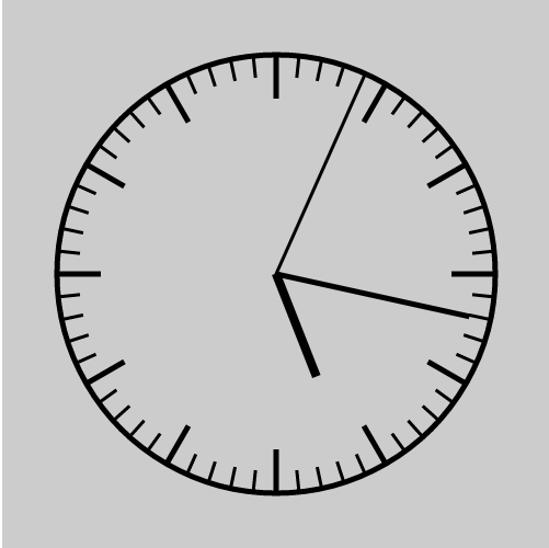
canvas做的时钟
<div id="box">
<ul id="list">
    <!--<li></li>-->
    <!--<li></li>-->
    <!--<li></li>-->
    <!--<li></li>-->
    <!--<li></li>-->
    <!--<li></li>-->
    <!--<li></li>-->
</ul>
    <div id="hour"></div>
    <div id="min"></div>
    <div id="sec"></div>
    <div id="point"></div>
</div>
css,注意的是li标签元素变换的起点 横坐标是中心,纵坐标是距离其父标签99px,表的指针旋转起来,元素变换的起点是,横坐div底部,纵坐标div中心
<style id="css">
    #box{width:200px;height:200px; border:1px solid black;-webkit-border-radius: 50%;margin:200px auto;position: relative;}
    *{margin: 0;padding: 0}
    #box ul{margin:0;padding: 0;height: 200px;position: relative;list-style: none;}
    #box ul li{width: 2px;height: 7px;position: absolute;background-color: #000; left:99px; top:0;-webkit-transform-origin:center 99px;}
    /*#box ul li:nth-of-type(1){-webkit-transform:rotate(6deg)}*/
    /*#box ul li:nth-of-type(2){-webkit-transform:rotate(12deg)}*/
    /*#box ul li:nth-of-type(3){-webkit-transform:rotate(18deg)}*/
    /*#box ul li:nth-of-type(4){-webkit-transform:rotate(24deg)}*/
    /*#box ul li:nth-of-type(5){-webkit-transform:rotate(30deg)}*/
    /*#box ul li:nth-of-type(6){-webkit-transform:rotate(36deg)}*/
    /*#box ul li:nth-of-type(7){-webkit-transform:rotate(42deg)}*/
    #box ul li:nth-of-type(5n+1){height: 15px}  //保证第一个刻度的长度要长一点
    #hour{width:6px;height: 45px; background-color:#000;position: absolute;left: 97px;top:55px;-webkit-transform-origin:bottom }
    #min {width:4px;height: 65px; background-color:gray;position: absolute;left: 97px;top:35px;-webkit-transform-origin:bottom }
    #sec {width:3px;height: 80px; background-color:red;position: absolute;left: 95px;top:20px;-webkit-transform-origin:bottom}
    #point{width: 15px ;height:15px;background-color: black;border-radius: 50%;position: absolute;left: 95px;top: 95px}
</style>
css写好js其实还是很好写的
        var oList=document.getElementById('list');
        var aLi='';
        var aCss='';
        var oCss=document.getElementById('css');
        var oHour=document.getElementById('hour');
        var oMin=document.getElementById('min');
        var oSec=document.getElementById('sec');
        for(var i=0;i<60;i++){
            aLi+='<li></li>';
            aCss+='#box ul li:nth-of-type('+(i+1)+'){-webkit-transform:rotate('+6*i+'deg)}'
        }
        oList.innerHTML=aLi;
        oCss.innerHTML+=aCss;
构建新的60li标签,让其插入到ul里面。新的60个li标签的css的样式插入到style中。
把时钟指针旋转的角度附给transform:rotate
      function toTime(){
            var iDate=new Date();
            var iSec=iDate.getSeconds();
            var iMin=iDate.getMinutes()+iSec/60;
            var iHour=iDate.getHours()+iMin/60;
            oSec.style.webkitTransform='rotate('+iSec*6+'deg)';
            oMin.style.webkitTransform='rotate('+iMin*6+'deg)';
            oHour.style.webkitTransform='rotate('+iHour*30+'deg)';
        }
定时器走起来
     toTime();
        setInterval(toTime,1000);
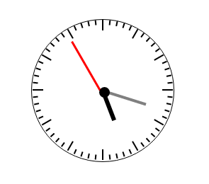
css3做的时钟
总结:
canvas是我年前做的,css这个是我今天做的。刚好看见了,就准备发个博客对比一下两者的区别。最终发现,两者并没有太大区别,核心原理上的还是一样的。小伙伴们快看看吧。