原文地址:gitub上的Flexbugs list,可以看到Flex布局在IE糟糕表现的详细描述。
2. Column flex items set to align-items:center overflow their container
flex 容器如果设置竖排,并且垂直居中,flex子项目的文字会溢出容器。解决办法是给子项目设置一个 max-100%。Edge修复了这个bug。
下面这段代码,来动手看下在IE10、11下的表现。
<style>
        .FlexContainer {
            align-items: center;
            background: hsla(0,0%,0%,.1);
            display: flex;
            /*display: -ms-flexbox;*/
            flex-direction: column;
            /*-ms-flex-direction: column;*/
            height: 200px;
            justify-content: center;
            margin: 1em;
            padding: 2em;
            width: 300px;
        }

        .FlexItem {
            background: hsla(0,0%,0%,.1);
            padding: 1em;
        }
    </style>
    <script src="js/jquery-1.9.1.min.js"></script>

</head>
<body>
<div class="FlexContainer">
    <div class="FlexItem">
        The contents inside of this box are overflowing their container.
    </div>
</div>
</body>
在IE11下预览,如图:
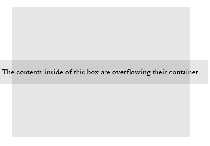
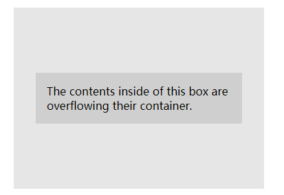
经过试验发现,就算不设置 flex-direction:column, 这段文字依旧义无反顾地溢出,而不会像在其他浏览器下那样,自动换行。比如Chrome浏览器:
给子项目设置 max- 100%,并不会对其他浏览器造成额外的影响。
为什么会这样?原来和 flex-shrink 的默认值有关系。IE默认为 0,既空间不足,项目不缩小。
但是如果设置了 flex-shrink 为 1 呢,IE 依旧固执地不缩小这个项目,原因在于容器同时设置了 flex-direction:column 和 align-items:center。
原来是这俩属性在IE10不能并存。只要取消其中一个,并把flex-shrink设置为1,该溢出问题就可以得到解决。
4. flex shorthand declarations with unitless flex-basis values are ignored
简写的flex属性,第三个参数 flex-basis 的值如果不写单位,在IE10,11下会该 flex 被忽略。比如 flex: 0 1 0%; 这个百分号不能省略。
Edge修复了这个bug。
也可以写成0px,但是推荐用0%。因为有些CSS压缩工具会把 0px 转换成 0,而不会对 0% 下手转换。
5. Column flex items don't always preserve intrinsic aspect ratios
竖排弹性容器下,如果子项宽度大于容器宽度,子项并不会随着容器保持宽高比例。
解决办法是给这个子项再包裹一个容器,这样子项就不再是一个伸缩项目,尺寸上就可以正常缩放。
    <style>
 * 1. Add a wrapper element to house the element with an intrinsic aspect ratio.*/

        .FlexContainer {
            background: hsla(0,0%,0%,.1);
            display: flex;
            flex-direction: column;
            height: 300px;
            margin: 1em;
            width: 300px;
        }
        .FlexItem { /* 1 */
            flex-shrink: 0; /* 2 */
        }
        img {
            height: auto;
            width: 100%;
        }
    </style>
</head>
<body>
<div class="FlexContainer">
    <div class="FlexItem">
        <img src="http://placehold.it/800x200/333">
    </div>
</div>
</body>
比如这个图片宽高为800*200,Flex容器宽度300。给图片加一个容器,图片正常缩放。小声的说,这个问题貌似Chrome也有呢...
6. The default flex value has changed
新的规范更改了flex的默认值,而IE10,11依旧沿用旧的默认语法。如图:
| Declaration | What it should mean | What it means in IE 10 |
|---|---|---|
| (no flex declaration) | flex: 0 1 auto |
flex: 0 0 auto |
flex: 1 |
flex: 1 1 0% |
flex: 1 0 0px |
flex: auto |
flex: 1 1 auto |
flex: 1 0 auto |
flex: initial |
flex: 0 1 auto |
flex: 0 0 auto |
7. flex-basis doesn't account for box-sizing:border-box
flex-basis如果有一个明确的值,既除了auto以外的值,那么该项目就相当于有一个明确的宽度/高度,占据固定空间。
在IE10/11下,盒子内容的宽度是 flex-basis 设置的具体的宽度,它会无视我们设置的 box-sizing:border-box;
如果 flex-basis 值是100%,元素就会溢出容器。比如看这段代码在IE下的表现:
    <style>
        .FlexContainer {
            background: hsla(0,0%,0%,.1);
            display: flex;
            margin: 1em;
            padding: 1em;
        }
        .FlexItem {
            background: hsla(0,0%,0%,.1);
            background-clip: padding-box;
            border: 1em solid transparent;
            box-sizing: border-box;
            flex: 0 0 100%;
            padding: 1em;
            text-align: center;
        }
    </style>
</head>
<body>
<div class="FlexContainer">
    <div class="FlexItem">Item with padding and border</div>
</div>
</body>
在IE11的效果如下:

这个bug在Edge已经修复。但是基于IE10和11的广大用户群,还是得想办法解决。解决办法有两种:
1. flex-basis 设置为 auto,不给它设置具体宽度,然后再给这个元素加一个 100%。
2. 给子项再包裹一个容器,把这个容器当成flex容器的子项,在这个容器上设置 flex: 0 0 100%。
8. flex-basis doesn't support calc()
IE10 、11,不支持 flex 第三个参数 flex-basis 的值为 calc()。如图:

IE11下直接报错,单独写 flex-basis 则可以识别。
而在IE10下,无论简写不简写,都无法识别这个值。
解决办法:
1. 针对IE10和IE11:
.FlexItem {
  flex: 0 0 auto;
  width: calc(100%/3);
}
2. 如果是IE 11,不采用flex简写即可。
.FlexItem {
  flex-grow: 0;
  flex-shrink: 0;
  flex-basis: calc(100%/3);
}
12. Inline elements are not treated as flex-items (嗯,为什么跳到12了,因为忽略掉的那几个是其他浏览器的。本文只批判IE)
IE10、11: 内敛元素不能作为弹性伸缩项目,包括:before 和 ::after 这些伪类元素。
IE11修复了这个bug,但是 :before 和 ::after 仍然不能作为伸缩弹性项目。
解决办法是给内联元素加个 display: block; 即可。
13. Importance is ignored on flex-basis when using flex shorthand
flex: 0 0 100%!important;
给flex简写加 !important,在IE10,只对前两个参数有效,第三个参数无效。这个bug在IE11修复。而在IE10,再单独写上flex-bsis即可:
.FlexItemImportantOverride {
  flex: 0 0 100%!important;
  flex-basis: 100%!important;
}
实际项目应用中的补充:
在IE10,justify-content 对子项目的span不起作用。这时候把span设置为 display:block; 即可。