今天拿到一个稿件,其中一个段落是这样的:(当然文字内容被我改了)
拿到这个我是有点崩溃的,我们设计真喜欢玩各种花样。就不能老老实实扁平化排版吗...
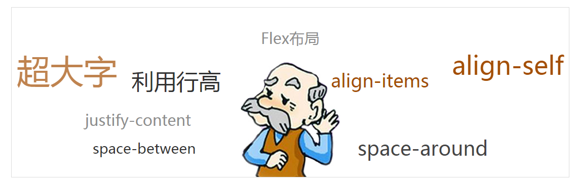
好吧,虽然随机,还是可以分出四行出来的。这就有办法了。闲话少说,直接上代码
<!DOCTYPE html>
<html lang="en">
<head>
    <meta charset="UTF-8">
    <title>Title</title>
    <meta name="viewport" content="width=device-width,minimum-scale=1.0,maximum-scale=1.0,user-scalable=no">
    <meta name="format-detection" content="telephone=no">
    <!--移动端模板-->
    <style type="text/css">
        *{
            margin: 0;
            padding: 0;
        }
        ul,li{
           list-style: none;
        }
        .box{
            width: 1100px; height: 335px;
            margin: 20px auto;
            border: 1px solid #dcdcdc;
            background: url(./images/bg_doc.jpg) no-repeat center bottom;
        }
        .box ul{
            margin-top: 40px;
        }
        .box ul li:nth-child(1){
            text-align: center;
            font-size: 30px;
            color: #8e8e8e;
        }
        .box ul li:nth-child(3){
            font-size: 30px;
            color: #8e8e8e;
            padding:35px 0 0 145px;
        }
        .box_02{
            display: flex;
            align-items: flex-end;
            padding: 0 10px;
            justify-content: space-between;
        }
        .box_02 p{
            width: 160px;
        }
        .box_02 span:nth-child(1){
            font-size: 66px;
            color: rgba(164, 79, 4, 0.7);

        }
        .box_02 span:nth-child(2){
            font-size: 44px;line-height: 44px;
            color: #333333;
        }
        .box_02 span:nth-child(4){
            font-size: 36px;
            color: #a44f04;
            align-self: flex-end;
            width: 210px; /*space-around 会平均分配间距,给这个span设定个大的宽度,让它看起来间距更宽一些*/
        }
        .box_02 span:nth-child(5){
            font-size: 50px;
            color: #a44f04;
            align-self: flex-start;
        }
        .box_04{
            display: flex;
            align-items: flex-end;
            justify-content: space-around;
            margin-top: 10px;
        }
        .box_04 span:nth-child(2){
            font-size: 39px;
            color: #454545;
        }
        .box_04 span:nth-child(1){
            font-size: 28px;
            color: #333;
            align-self: center;
        }

        .box span{
            display: block; /*IE10 专用*/
        }
    </style>

</head>
<body>
<div class="box">
    <ul>
        <li><p>Flex布局</p></li>
        <li class="box_02">
            <span>超大字</span>
            <span>利用行高</span>
            <p></p>
            <span>align-items</span>
            <span>align-self</span>
        </li>
        <li>justify-content</li>
        <li class="box_04">
            <span>space-between</span>
            <span>space-around</span>
        </li>
    </ul>
</div>
</body>
</html>