注:本篇文章仅仅用作个人知识积累以及需要了解该知识点的朋友们~
(1) 媒体查询的作用:CSS3中的Media Queries增加了更多的媒体查询,同时你可以添加不同的媒体类型的表达式用来检查媒体是否符合某些条件,如果媒体符合相应的条件,那么就会调用对应的样式表。著作权归作者所有。
1 <link rel="stylesheet" media="screen and (max- 600px)" href="small.css" />
(2)媒体类型(Media Type)
媒体类型(Media Type)在css2中是一个常见的属性,也是一个非常有用的属性,可以通过媒体类型对不同的设备指定不同的样式,在css2中我们常碰到的就是all(全部),screen(屏幕),print(页面打印或打邱预览模式),其实在媒体类型不止这三种,w3c总共列出了10种媒体类型(all,print,screen,braille,embossed,handheld,projection,speech,tty,tv)。
(2.1)媒体类型的引入
a. link引入
<link rel="stylesheet" type="text/css" href="../css/print.css" media="print" />
b. xml引入
<?xml-stylesheet rel="stylesheet" media="screen" href="css/style.css" ?>
c. @import方式引入
c.1 样式文件中调用另一个样式文件
    @import url("css/reset.css") screen;
    @import url("css/print.css") print;
c.2 在<head></head>中的<style>...</style>中调用:
<head>
    <style type="text/css">
    @import url("css/style.css") all;
    </style>
  </head>
c.3 @media引入
1 @media screen{
2      选择器{
3     属性:属性值;
4      }
5    }
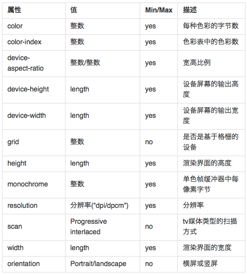
(3)媒体特性(Media Query)
可以将Media Query看成Media Type(判断条件)+CSS(符合条件的样式规则),常用的特性w3c共列出来13种。
(4)媒体查询的具体使用方式
4.1 最大宽度Max Width
1 <link rel="stylesheet" media="screen and (max-600px)" href="small.css" type="text/css" />
2 <!--当屏幕小于或等于600px时,将采用small.css样式来渲染Web页面。-->
4.2 最小宽度Min width
1 <link rel="stylesheet" media="screen and (min-900px)" href="big.css" type="text/css"  />
2 <!--当屏幕大于或等于900px时,将采用big.css样式来渲染Web页面。-->
4.3 多个Media Queries使用
1 <link rel="stylesheet" media="screen and (min-600px) and (max-900px)" href="style.css" type="text/css" />
2 <!-- Media Query可以结合多个媒体查询,换句话说,一个Media Query可以包含0到多个表达式,表达式又可以包含0到多个关键字,以及一种Media Type。正如上面的其表示的是当屏幕在600px-900px之间时采用style.css样式来渲染web页面。-->
4.4 设备屏幕的输出宽度Device Width
1 <link rel="stylesheet" media="screen and (max-device- 480px)" href="iphone.css" type="text/css" />
2 <!--上面的代码指的是iphone.css样式适用于最大设备宽度为480px,比如说iPhone上的显示,这里的max-device-width所指的是设备的实际分辨率,也就是指可视面积分辨率-->
4.5 iPad
1  <link rel="stylesheet" media="all and (orientation:portrait)" href="portrait.css" type="text/css" />
2  <link rel="stylesheet" media="all and (orientation:landscape)" href="landscape.css"  type="text/css" />
3  <!--在大数情况下,移动设备iPad上的Safari和在iPhone上的是相同的,只是他们不同之处是iPad声明了不同的方向,比如说上面的例子,在纵向(portrait)时采用portrait.css来渲染页面;在横向(landscape)时采用landscape.css来渲染页面。-->
4.6 android
1 /*240px的宽度*/
2 <link rel="stylesheet" media="only screen and (max-device-240px)" href="android240.css" type="text/css" />
3 /*360px的宽度*/
4 <link rel="stylesheet" media="only screen and (min-device-241px) and (max-device-360px)" href="android360.css" type="text/css" />
5 /*480px的宽度*/
6 <link rel="stylesheet" media="only screen and (min-device-361px) and (max-device-480px)" href="android480.css" type="text/css" />
7 <!--我们可以使用media query为android手机在不同分辨率提供特定样式,这样就可以解决屏幕分辨率的不同给android手机的页面重构问题。-->
4.7 not关键字
1 <link rel="stylesheet" media="not print and (max- 1200px)" href="print.css" type="text/css" />
2 <!--not关键字是用来排除某种制定的媒体类型,换句话来说就是用于排除符合表达式的设备。-->
4.8 only关键字
1 <link rel="stylesheet" media="only screen and (max-device-240px)" href="android240.css" type="text/css" />
2 <!-- only用来定某种特定的媒体类型,可以用来排除不支持媒体查询的浏览器。其实only很多时候是用来对那些不支持Media Query但却支持Media Type的设备隐藏样式表的。其主要有:支持媒体特性(Media Queries)的设备,正常调用样式,此时就当only不存在;对于不支持媒体特性(Media Queries)但又支持媒体类型(Media Type)的设备,这样就会不读了样式,因为其先读only而不是screen;另外不支持Media Qqueries的浏览器,不论是否支持only,样式都不会被采用。-->
4.9 在Media Query中如果没有明确指定Media Type,那么其默认为all,如:
1 <link rel="stylesheet" media="(min- 701px) and (max- 900px)" href="medium.css" type="text/css" />
4.10 还有使用逗号(,)被用来表示并列或者表示或,如:
1 <link rel="stylesheet" type="text/css" href="style.css" media="handheld and (max-480px), screen and (min-960px)" />
2 <!--style.css样式被用在宽度小于或等于480px的手持设备上,或者被用于屏幕宽度大于或等于960px的设备上。-->
参考资料
W3CPLUS