WPF教程十一:简单了解并使用控件模板
这一章梳理控件模板,每个WPF控件都设计成无外观的,但是行为设计上是不允许改变的,比如使用Button的控件时,按钮提供了能被点击的内容,那么自由的改变控件外观时,Button作为按钮的本质是没有改变的,同样响应的是按钮的逻辑。所以我们使用控件模板主要也是为了修改对应控件的显示内容,这个比样式资源和触发器可改变的内容更多,同时控件模板也能结合样式和触发器自定义更多的显示内容。
我平时写控件模板的时候,我喜欢打开Blend然后再Blend下通过鼠标直接生成对应的模板,但是这里是了解,所以我们使用代码的方式来刨析模板下都有什么,这样会更深入的了解控件模板,而不是只会用Blend,Blend是一个很方便的工具,但是细节我们还是要关注一下的。
我们通过创建一个没有任何修改的Button和一个设置了最小代码量的控件模板来观察2个的Button结构有什么不一致。来理解模板的作用。
复制以下代码,尝试跑起来观察一下,代码如下:
<Window x:Class="WPFControlTemplate.MainWindow"
        xmlns="http://schemas.microsoft.com/winfx/2006/xaml/presentation"
        xmlns:x="http://schemas.microsoft.com/winfx/2006/xaml"
        xmlns:d="http://schemas.microsoft.com/expression/blend/2008"
        xmlns:mc="http://schemas.openxmlformats.org/markup-compatibility/2006"
        xmlns:local="clr-namespace:WPFControlTemplate"
        mc:Ignorable="d"
        Title="MainWindow" Height="450" Width="800">
    <Window.Resources>
        <ControlTemplate x:Key="CustomDefaultButtonTemplate" TargetType="Button">
            <Border BorderBrush="Red" BorderThickness="1">
                <ContentPresenter />
            </Border>
        </ControlTemplate>
    </Window.Resources>
    <Grid>
        <StackPanel>
            <Button Width="230" Height="30" Content="默认按钮" Click="GetDefaultButtonControlTemplate_OnClick"/>
            <TextBox Height="200" Text="{Binding TemplateDefaultContent}"/>
            <Button Width="230" Height="30" Template="{StaticResource CustomDefaultButtonTemplate}" Content="设置了控件模板,给你展示我内部是啥样" Click="GetCustomButtonControlTemplate_OnClick"/>
            <TextBox Height="130" Text="{Binding TemplateCustomContent}"/>
        </StackPanel>
    </Grid>
</Window>
using System;
using System.ComponentModel;
using System.Text;
using System.Windows;
using System.Windows.Controls;
using System.Windows.Markup;
using System.Xml;

namespace WPFControlTemplate
{
    /// <summary>
    /// MainWindow.xaml 的交互逻辑
    /// </summary>
    public partial class MainWindow : Window
    {
        TemplateContent viewmodel = new TemplateContent();
        public MainWindow()
        {
            InitializeComponent();
            this.DataContext = viewmodel;
        }

        private string GetControlTempalte(ControlTemplate template)
        {
            StringBuilder sb = new StringBuilder();
            try
            {
                XmlWriterSettings settings = new XmlWriterSettings();
                settings.Indent = true;
                XmlWriter write = XmlWriter.Create(sb, settings);
                XamlWriter.Save(template, write);
            }
            catch (Exception ex)
            {
                sb.Append($"Error generating template:{ex.Message}");
            }
            return sb.ToString();
        }

        private void GetCustomButtonControlTemplate_OnClick(object sender, RoutedEventArgs e)
        {
            var buttonTemplate = (sender as Button).Template;
            var buttonTemplateStr = GetControlTempalte(buttonTemplate);
            viewmodel.TemplateCustomContent = buttonTemplateStr;
        }

        private void GetDefaultButtonControlTemplate_OnClick(object sender, RoutedEventArgs e)
        {
            var buttonTemplate = (sender as Button).Template;
            var buttonTemplateStr = GetControlTempalte(buttonTemplate);
            viewmodel.TemplateDefaultContent = buttonTemplateStr;
        }
    }
    public class TemplateContent : INotifyPropertyChanged
    {
        private string templateDefaultContent = string.Empty;
        public string TemplateDefaultContent
        {
            get
            {
                return templateDefaultContent;
            }
            set
            {
                templateDefaultContent = value;
                PropertyChanged?.Invoke(this, new PropertyChangedEventArgs("TemplateDefaultContent"));
            }
        }

        private string templateCustomContent = string.Empty;
        public string TemplateCustomContent
        {
            get
            { return templateCustomContent; }
            set
            {
                templateCustomContent = value;
                PropertyChanged?.Invoke(this, new PropertyChangedEventArgs("TemplateCustomContent"));
            }
        }

        public event PropertyChangedEventHandler PropertyChanged;
    }
}
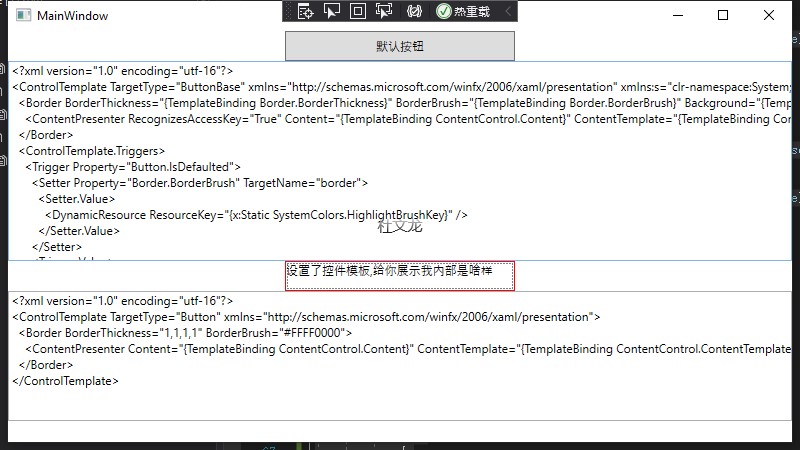
通过复制出来上下2个ControlTemplate下的内容对比,发现默认的Button中ControlTemplate包含一个Border嵌套一个ContentPresenter其中很多属性都绑定了TemplateBinding的值,他代表的是从模板中绑定,获取使用模板的控件对应的控件值,而我们自己创建的ControlTemplate的Border则都是自己写的BorderThickness=1和BorderBrush=#FFFF0000(红色),值都是我们直接在模板中写好的,所以多处引用的话,固定的这些值都是一样的。
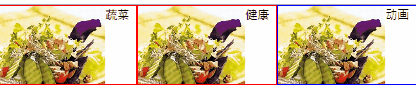
最近胃不好需要健康饮食,要多吃蔬菜,勤锻炼,所以在写这个自定义Template的话,我们通过模板让所有使用控件模板的Button都带一个一样的蔬菜图片(不允许更换图片,自定义控件会讲使用依赖项属性绑定图片路径,这里模板就一张一样的蔬菜图片)。
<Window x:Class="WPFControlTemplate.MainWindow"
        xmlns="http://schemas.microsoft.com/winfx/2006/xaml/presentation"
        xmlns:x="http://schemas.microsoft.com/winfx/2006/xaml"
        xmlns:d="http://schemas.microsoft.com/expression/blend/2008"
        xmlns:mc="http://schemas.openxmlformats.org/markup-compatibility/2006"
        xmlns:local="clr-namespace:WPFControlTemplate"
        mc:Ignorable="d"
        Title="MainWindow" Height="450" Width="800">
    <Window.Resources>
        <ControlTemplate x:Key="CustomDefaultButtonTemplate" TargetType="Button">
            <Border BorderBrush="Red" BorderThickness="1">
                <ContentPresenter />
            </Border>
        </ControlTemplate>
        <ControlTemplate x:Key="CustomAddImageButtonTemplate" TargetType="Button" >
            <Border BorderBrush="Red" BorderThickness="1">
                <StackPanel Orientation="Horizontal">
                    <Image Height="80" Source="pack://application:,,,/Images/2.png"/>
                    <TextBlock Text="{TemplateBinding Content}"/>
                </StackPanel>
            </Border>
        </ControlTemplate>
    </Window.Resources>
    <Grid>
        <StackPanel>
            <Button Width="230" Height="30" Content="默认按钮" Click="GetDefaultButtonControlTemplate_OnClick"/>
            <TextBox Height="100"  Text="{Binding TemplateDefaultContent}"/>
            <Button Width="230" Height="30" Template="{StaticResource CustomDefaultButtonTemplate}" Content="设置了控件模板,给你展示我内部是啥样" Click="GetCustomButtonControlTemplate_OnClick"/>
            <TextBox Height="100" Text="{Binding TemplateCustomContent}"/>
            <StackPanel Orientation="Horizontal">
                <Button Width="140" Height="80" Template="{StaticResource CustomAddImageButtonTemplate}" Content="蔬菜"/>
                <Button Width="140" Height="80" Template="{StaticResource CustomAddImageButtonTemplate}" Content="健康"/>
            </StackPanel>
        </StackPanel>
    </Grid>
</Window>
我们定义了一个CustomAddImageButtonTemplate的控件模板,并在里面创建了一个Images和Textblock。一个用于放置了一个蔬菜的图片,一个是绑定了template的显示文本,模板绑定和普通的数据绑定类似,因为它们是专门在控件模板中使用的,它们只支持单向数据绑定,它们可以从控件向模板传递信息,但不能从模板向控件传递信息。控件模板写到现在这个程度有点丑,我们在控件模板中加一个半透效果,鼠标移动上去图片半透,鼠标移开,图片显示。
<Window x:Class="WPFControlTemplate.MainWindow"
        xmlns="http://schemas.microsoft.com/winfx/2006/xaml/presentation"
        xmlns:x="http://schemas.microsoft.com/winfx/2006/xaml"
        xmlns:d="http://schemas.microsoft.com/expression/blend/2008"
        xmlns:mc="http://schemas.openxmlformats.org/markup-compatibility/2006"
        xmlns:local="clr-namespace:WPFControlTemplate"
        mc:Ignorable="d"
        Title="MainWindow" Height="450" Width="800">
    <Window.Resources>
        <ControlTemplate x:Key="CustomDefaultButtonTemplate" TargetType="Button">
            <Border BorderBrush="Red" BorderThickness="1">
                <ContentPresenter />
            </Border>
        </ControlTemplate>
        <ControlTemplate x:Key="CustomAddImageButtonTemplate" TargetType="Button" >
            <Border BorderBrush="Red" BorderThickness="1">
                <StackPanel Orientation="Horizontal">
                    <Image x:Name="img" Height="80" Source="pack://application:,,,/Images/2.png"/>
                    <TextBlock Text="{TemplateBinding Content}"/>
                </StackPanel>
            </Border>
            <ControlTemplate.Triggers>
                <Trigger Property="IsMouseOver" Value="true">
                    <Setter TargetName="img" Property="Opacity" Value="0.3"/>
                </Trigger>
            </ControlTemplate.Triggers>
        </ControlTemplate>
    </Window.Resources>
    <Grid>
        <StackPanel>
            <Button Width="230" Height="30" Content="默认按钮" Click="GetDefaultButtonControlTemplate_OnClick"/>
            <TextBox Height="100"  Text="{Binding TemplateDefaultContent}"/>
            <Button Width="230" Height="30" Template="{StaticResource CustomDefaultButtonTemplate}" Content="设置了控件模板,给你展示我内部是啥样" Click="GetCustomButtonControlTemplate_OnClick"/>
            <TextBox Height="100" Text="{Binding TemplateCustomContent}"/>
            <StackPanel Orientation="Horizontal">
                <Button Width="140" Height="80" Template="{StaticResource CustomAddImageButtonTemplate}" Content="蔬菜"/>
                <Button Width="140" Height="80" Template="{StaticResource CustomAddImageButtonTemplate}" Content="健康"/>
            </StackPanel>

        </StackPanel>
    </Grid>
</Window>
这样修改控件模板的话,在鼠标经过的时候图片就会有半透效果。
我这里写的控件模板很丑,模板和样式都可以修改外观,样式可以调整控件的属性,但是不能重新定义外观,但是通过控件模板,则可以实现这个效果,后面慢慢的视觉效果就会变得更好了。我们添加新的代码,使用事件触发器实现移入移出时的动画效果,修改代码如下:
<Window x:Class="WPFControlTemplate.MainWindow"
        xmlns="http://schemas.microsoft.com/winfx/2006/xaml/presentation"
        xmlns:x="http://schemas.microsoft.com/winfx/2006/xaml"
        xmlns:d="http://schemas.microsoft.com/expression/blend/2008"
        xmlns:mc="http://schemas.openxmlformats.org/markup-compatibility/2006"
        xmlns:local="clr-namespace:WPFControlTemplate"
        mc:Ignorable="d"
        Title="MainWindow" Height="450" Width="800">
    <Window.Resources>
        <ControlTemplate x:Key="CustomDefaultButtonTemplate" TargetType="Button">
            <Border BorderBrush="Red" BorderThickness="1">
                <ContentPresenter />
            </Border>
        </ControlTemplate>
        <ControlTemplate x:Key="CustomAddImageButtonTemplate" TargetType="Button" >
            <Border BorderBrush="Red" BorderThickness="1">
                <StackPanel Orientation="Horizontal">
                    <Image x:Name="img" Height="80" Source="pack://application:,,,/Images/2.png"/>
                    <TextBlock Text="{TemplateBinding Content}"/>
                </StackPanel>
            </Border>
            <ControlTemplate.Triggers>
                <Trigger Property="IsMouseOver" Value="true">
                    <Setter TargetName="img" Property="Opacity" Value="0.3"/>
                </Trigger>
            </ControlTemplate.Triggers>
        </ControlTemplate>
        <ControlTemplate TargetType="Button" x:Key="FadeAwayAnimitionButtonTemplate">
            <Border BorderBrush="Blue" BorderThickness="1">
                <StackPanel Orientation="Horizontal">
                    <Image x:Name="img" Height="80" Source="pack://application:,,,/Images/2.png"/>
                    <TextBlock Text="{TemplateBinding Content}"/>
                </StackPanel>
            </Border>
            <ControlTemplate.Triggers>
                <EventTrigger RoutedEvent="MouseEnter">
                    <EventTrigger.Actions>
                        <BeginStoryboard>
                            <Storyboard>
                                <DoubleAnimation Duration="0:0:1" To="0.3" Storyboard.TargetName="img" Storyboard.TargetProperty="Opacity" />
                            </Storyboard>
                        </BeginStoryboard>
                    </EventTrigger.Actions>
                </EventTrigger>
                <EventTrigger RoutedEvent="MouseLeave">
                    <EventTrigger.Actions>
                        <BeginStoryboard>
                            <Storyboard>
                                <DoubleAnimation Duration="0:0:0.5" To="1" Storyboard.TargetName="img" Storyboard.TargetProperty="Opacity"/>
                            </Storyboard>
                        </BeginStoryboard>
                    </EventTrigger.Actions>
                </EventTrigger>
            </ControlTemplate.Triggers>
        </ControlTemplate>
    </Window.Resources>
    <Grid>
        <StackPanel>
            <Button Width="230" Height="30" Content="默认按钮" Click="GetDefaultButtonControlTemplate_OnClick"/>
            <TextBox Height="100" Text="{Binding TemplateDefaultContent}"/>
            <Button Width="230" Height="30" Template="{StaticResource CustomDefaultButtonTemplate}" Content="设置了控件模板,给你展示我内部是啥样" Click="GetCustomButtonControlTemplate_OnClick"/>
            <TextBox Height="100" Text="{Binding TemplateCustomContent}"/>
            <StackPanel Orientation="Horizontal">
                <Button Width="140" Height="80" Template="{StaticResource CustomAddImageButtonTemplate}" Content="蔬菜"/>
                <Button Width="140" Height="80" Template="{StaticResource CustomAddImageButtonTemplate}" Content="健康"/>
                <Button Width="140" Height="80" Template="{StaticResource FadeAwayAnimitionButtonTemplate}" Content="动画"/>
            </StackPanel>
        </StackPanel>
    </Grid>
</Window>
这样就实现了移入移出时的动画效果。
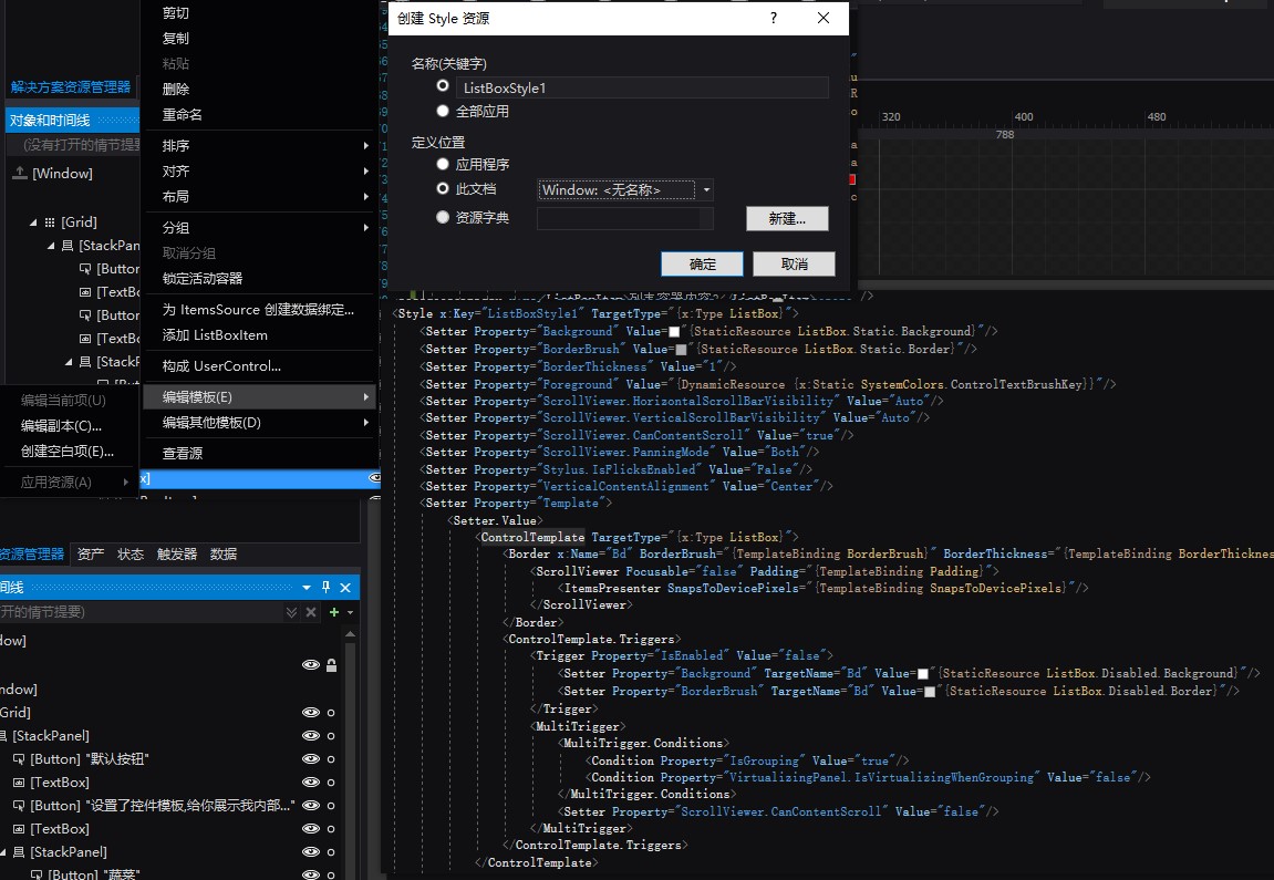
注意:因为同样一种控件在程序中为了显示不同的外观,可能有对应的N个控件模板,为了不让代码现得杂乱无章,可以把每个类型的控件对应的模板都归类到一个资源字典中,比如Button.xaml、TextBox.xaml请注意这个添加的是Resource Dictionary,不是WPF窗体,因为如果混在一起,内容一旦太多,无法找你到要的控件模板。记得再程序集下的ResourceDictionary下添加你的资源文件。同样的如果控件模板内,有使用的画刷,建议也单独拿出来,单独存放在这种资源下的Button.xaml或者TextBox.xaml。
这里写一个重要的知识点,在样式中使用控件模板,并重新设置控件模板的部分内容样式。我们修改了FadeAwayAnimitionButtonTemplate控件模板的border的颜色和粗细使用绑定。然后在资源下使用模板,并在样式下修改模板border的粗细和颜色。我们修改资源CustomButtonStyle。样式中使用模板可以更高效的设计好的控件样式和行为,在样式中使用模板代码修改如下:
<Window x:Class="WPFControlTemplate.MainWindow"
        xmlns="http://schemas.microsoft.com/winfx/2006/xaml/presentation"
        xmlns:x="http://schemas.microsoft.com/winfx/2006/xaml"
        xmlns:d="http://schemas.microsoft.com/expression/blend/2008"
        xmlns:mc="http://schemas.openxmlformats.org/markup-compatibility/2006"
        xmlns:local="clr-namespace:WPFControlTemplate"
        mc:Ignorable="d"
        Title="MainWindow" Height="450" Width="800">
    <Window.Resources>
        <ControlTemplate x:Key="CustomDefaultButtonTemplate" TargetType="Button">
            <Border BorderBrush="Red" BorderThickness="1">
                <ContentPresenter />
            </Border>
        </ControlTemplate>
        <ControlTemplate x:Key="CustomAddImageButtonTemplate" TargetType="Button" >
            <Border BorderBrush="Red" BorderThickness="1">
                <StackPanel Orientation="Horizontal">
                    <Image x:Name="img" Height="80" Source="pack://application:,,,/Images/2.png"/>
                    <TextBlock Text="{TemplateBinding Content}"/>
                </StackPanel>
            </Border>
            <ControlTemplate.Triggers>
                <Trigger Property="IsMouseOver" Value="true">
                    <Setter TargetName="img" Property="Opacity" Value="0.3"/>
                </Trigger>
            </ControlTemplate.Triggers>
        </ControlTemplate>
        <ControlTemplate TargetType="Button" x:Key="FadeAwayAnimitionButtonTemplate">
            <Border BorderBrush="{TemplateBinding BorderBrush}" BorderThickness="{TemplateBinding BorderThickness}">
                <StackPanel Orientation="Horizontal">
                    <Image x:Name="img" Height="80" Source="pack://application:,,,/Images/2.png"/>
                    <TextBlock Text="{TemplateBinding Content}"/>
                </StackPanel>
            </Border>
            <ControlTemplate.Triggers>
                <EventTrigger RoutedEvent="MouseEnter">
                    <EventTrigger.Actions>
                        <BeginStoryboard>
                            <Storyboard>
                                <DoubleAnimation Duration="0:0:1" To="0.3" Storyboard.TargetName="img" Storyboard.TargetProperty="Opacity" />
                            </Storyboard>
                        </BeginStoryboard>
                    </EventTrigger.Actions>
                </EventTrigger>
                <EventTrigger RoutedEvent="MouseLeave">
                    <EventTrigger.Actions>
                        <BeginStoryboard>
                            <Storyboard>
                                <DoubleAnimation Duration="0:0:0.5" To="1" Storyboard.TargetName="img" Storyboard.TargetProperty="Opacity"/>
                            </Storyboard>
                        </BeginStoryboard>
                    </EventTrigger.Actions>
                </EventTrigger>
            </ControlTemplate.Triggers>
        </ControlTemplate>
        <Style x:Key="CustomButtonStyle" TargetType="{x:Type Button}">
            <Setter Property="Control.Template" Value="{StaticResource FadeAwayAnimitionButtonTemplate}"></Setter>
            <Setter Property="BorderBrush" Value="Orange"/>
            <Setter Property="BorderThickness" Value="3"/>
            <Setter Property="FontSize" Value="22"/>
            <Setter Property="FontWeight" Value="Bold"/>
        </Style>
    </Window.Resources>
    <Grid>
        <StackPanel>
            <Button Width="230" Height="30" Content="默认按钮" Click="GetDefaultButtonControlTemplate_OnClick"/>
            <TextBox Height="100" Text="{Binding TemplateDefaultContent}"/>
            <Button Width="230" Height="30" Template="{StaticResource CustomDefaultButtonTemplate}" Content="设置了控件模板,给你展示我内部是啥样" Click="GetCustomButtonControlTemplate_OnClick"/>
            <TextBox Height="100" Text="{Binding TemplateCustomContent}"/>
            <StackPanel Orientation="Horizontal">
                <Button Width="140" Height="80" Template="{StaticResource CustomAddImageButtonTemplate}" Content="蔬菜"/>
                <Button Width="140" Height="80" Template="{StaticResource CustomAddImageButtonTemplate}" Content="健康"/>
                <Button Width="140" Height="80" BorderBrush="Red" BorderThickness="1" Template="{StaticResource FadeAwayAnimitionButtonTemplate}" Content="动画"/>
                <Button Width="280" Height="80" Style="{StaticResource CustomButtonStyle}" Content="样式引用控件模板并修改"/>
            </StackPanel>
        </StackPanel>
    </Grid>
</Window>
在样式中不包含模板,只是引用模板,所以在样式中不能深入到可视化层去修改对应的元素。所以在设计主题或者控件库的时候再来仔细分析这个问题。
这篇就写这么多主要内容把,这章本来是要重点写的,但是脑袋最近确实太迷糊了。最近闹心的事情太多太多了,但是不想传播负能量,不想抱怨,自己这几天没有写博客的状态,进度一拖再拖。但是任何让你觉得不好的事情不是都已经发生了吗,未来要充满希望和动力呀,一起加油各位。
重点来啦!!
1)如果你把上面的代码敲了一遍,但是你如果跟我一样RoutedEvent="MouseLeave",Trigger Property="IsMouseOver" Value="true",后面的这些属性名、事件名不知道怎么写的时候,是不是一样懵逼,告诉你一个我发现的技巧,跳转到你要设置的对象元素上比如Button 使用F12跳转过去。如果是属性一般就有了,事件如果没有的话,去看自己继承时的父类,需要的属性和事件一般也都在里面。
2)另外一个重点,使用Blend,可以快速的创建当前模板,然后再修改成自己需要的。具体用法就是再Blend下,右键对应的元素编辑模板,创建。就会出来一大串啦。
3)集合类的元素有一个容器样式、子元素样式。都可以定制,这里需要你自己去实验了,我这里就不写了,原理是一样的,只是模板对应的内容不一样,集合类的是容器和子元素2个单独创建的的模板。可以自己尝试去百度搜索一下“Blend编辑WPF模板”
这章就写这么多拉。感谢观看博文的新人或大佬们,很多时候虽然人生处在低谷,但是总要有些东西需要自己坚持并努力下去,不是吗。加油!