详细看下flex弹性布局具体属性:
flex容器属性详解:
flex-direction:row/column;(横排/竖排) 决定元素的排列方向;
flex-wrap:nowrap/wrap/wrap-reverse(翻转); 排列不下时如何排,默认排不下就压缩进行排;
flex-flow是: flex-direction 和 flex-wrap的简写;(例如:flex-flow:row nowrap;)
justify-content:center; 元素在主轴上的对齐方式(center元素居中对齐);
align-items 元素在交叉轴的对齐方式;
flex元素属性详解:
flex-grow 当有多余空间时,元素的放大比例;
flex-shirink当空间不足时,元素的缩小比例;
flex-basis 元素在主轴上占据的空间;
flex时grow / shrink / basis的简写;
order 定义元素的排列顺序;
align-self 定义元素自身的对齐方式;
容器属性:
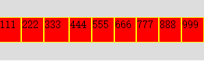
1、flex-direction:row/column; //决定 flex 元素的排列方式:横排/竖排(默认:row 横排)
div.com1{display: flex; flex-direction:row;}
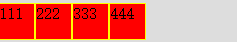
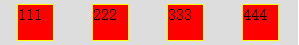
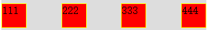
2、justify-content:center/flex-start/flex-end/center/space-around;
center:左右居中对齐
flex-start:从左边开始对齐;
flex-end:从右边开始对齐;
space-around:在主轴的空间是一样的;
space-between:进行两端对齐
div.com1{display: flex; flex-direction:row; justify-content:center;}

div.com1{display: flex; flex-direction:row; justify-content:space-around;}
div.com1{display: flex; flex-direction:row; justify-content:space-between;} //两端对齐
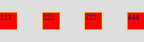
3、align-items:flex-start/flex-end/center;元素在交叉轴的对齐方式;
flex-start:从左边开始对齐;
flex-end:从底部开始;
center:在交叉轴中间进行对齐;
stretch:当元素没有设置高度的时候,设置 strtch 让元素自动沾满容器的高度;
baseline:让元素里面的文字,更具底线进行对齐;
div.com1{display: flex; flex-direction:row; justify-content:space-between; align-items:center;}
Flex元素属性详解:
1、flex-grow:1; 当有多余空间的时候,元素的放大比例;默认是0:不放大;
(可以设置:当有多余空间的时候,第二个占据两份)
div.com1{display: flex; flex-direction:row; justify-content:space-between; align-items:center;}
div.com1 div.item{width:35px; flex-grow: 1;}
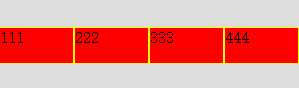
2、flex-shrink:0/1/2;当空间不足的时候,元素的缩小比例;(0表示不压缩,1表示等比压缩,2表示当前元素被压缩2份)
div.com1{display: flex; flex-direction:row; justify-content:space-between; align-items:center;}
div.com1 div.item{width:35px; }/* 第三个不压缩 */
div.com1 div.item:nth-child(3){flex-shrink:0;}
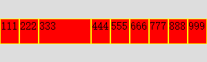
3、flex-basis:元素在主轴上占据的空间
div.com1{display: flex; flex-direction:row; justify-content:space-between; align-items:center;}
div.com1 div.item{width:35px; }/* 第三个占据 100px */
div.com1 div.item:nth-child(3){flex-basis: 100px;}
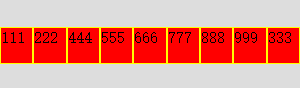
4、order:定义元素的排序
div.com1{display: flex; flex-direction:row; justify-content:space-between; align-items:center;}
div.com1 div.item{width:35px; order: 2;}
div.com1 div.item:nth-child(3){flex-grow: 2; order: 4;}
5、align-self:定义元素自身的对齐方式;
6、flex:是grow shrink basis 的缩写。例如:flex:1 2 25px;