源地址:https://realdougwilson.com/writing/coding-with-character
Operator Mono

I’ll start off with what I personally use: Operator Mono Screen Smart from Hoefler & Co. What sets it apart is the italic which has just the right amount of cursive elements (harking back to IBM Script) that allow comments and other parts of code to stand out without being distracting.
The “Screen Smart” part of the name refers to being “engineered for use on the web (and in programming environments) at text sizes as small as nine point” according to Hoefler & Co. I can’t comment on the technical details of if this actually makes a difference, but I know it looks great on my screen.
Favorite Characters: r, l, f, a, italic l, s, and g
从我正在用的开始介绍:来自 Hoefler & Co 的 Operator Mono Screen Smart。
它的斜体十分与众不同,具有适量的草书元素(追溯到 IBM Script),可以让评论和其他部分代码脱颖而出而不会分散注意力。
根据 Hoefler & Co. 的说法,名称中的“Screen Smart”部分指的是“专为在网络(和编程环境)上使用而设计的文本大小小至 9 磅”。
我说不出来究竟作用多大,但它在我的屏幕上确实不错。
Comic Code
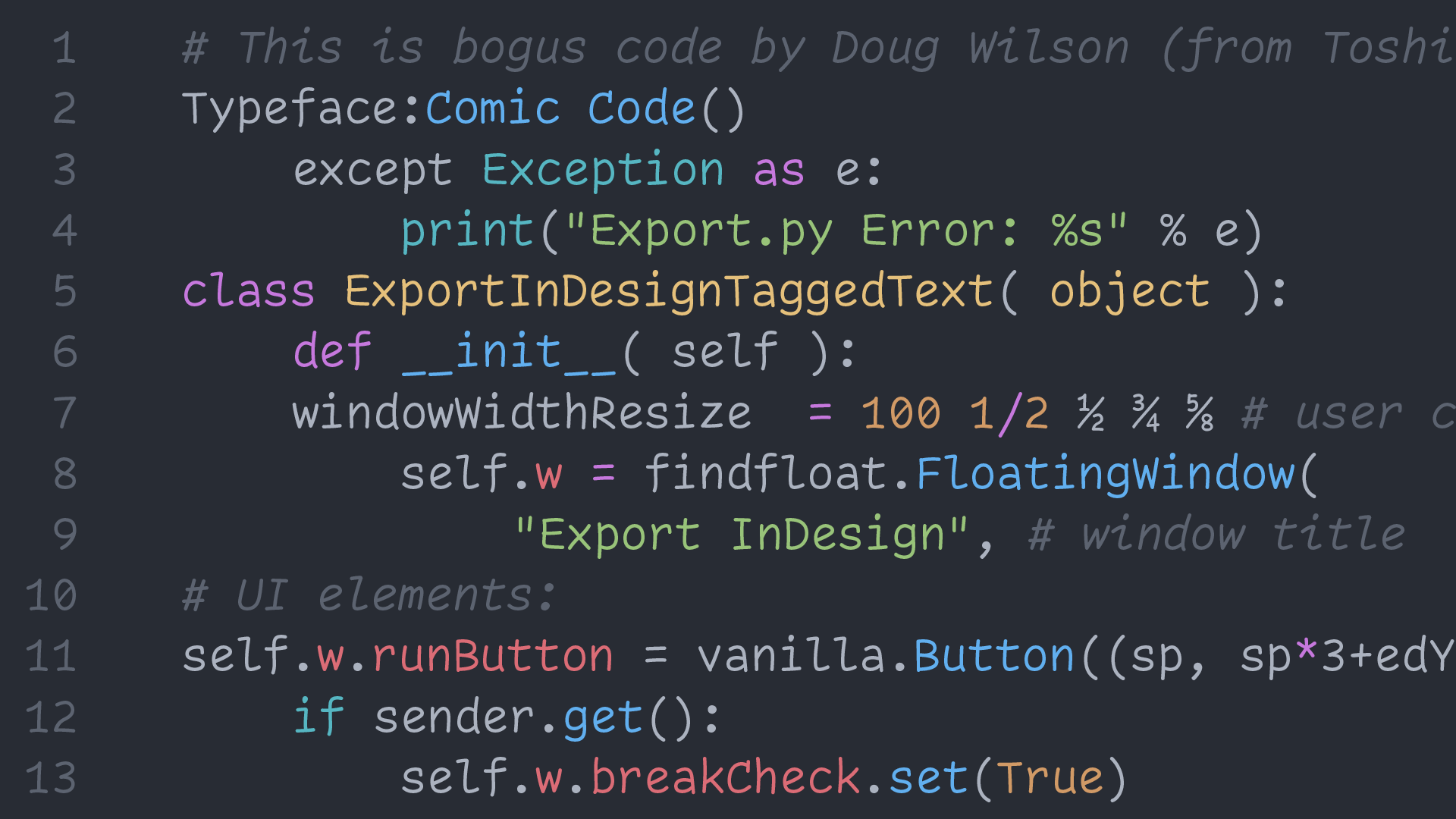
My first thought: This has to be a joke, right?! Comic Sans has a bad reputation and was never meant to be used for coding—but what if…? That is what crazy mastermind Toshi Omagari seemed to ask.
He says, “Comic Code is a monospaced adaptation of the most over-hated typeface.” I haven’t asked, but I feel his thought process may have been something like this GIF.

Believe it or not, I think it actually works and certainly brings a smile—or at least a smirk—to your face.
Favorite Characters: R, C, l, r, italic f
我第一次见它时的想法:这简直是个笑话,对吧?! Comic Sans有个坏名声且从来不被认为可以用来写代码—但如果试一下呢....?
这似乎就是实现这种怪异字体想法的 Toshi Omagari 要说的
他说,“ Comic Sans 是最令人讨厌的等距字体的改编” 我并没有问过,但感觉他的思想过程就像这个GIF
不管怎样,我觉得它确实能用,并且能给你带来微笑—或者至少是一个傻笑
Vulf Mono

“A custom monospace font for a funk band” is not a sentence that I thought I would ever write, but that is the true origin story of Vulf Mono from OH no Type Co.
Remember what I wrote above about finding creativity inside the strict constraints of the monospace genre? Well, James Edmondson has that in spades with Vulf Mono. Quirky, wide, and funky—but still totally usable for coding—makes this a personal favorite.
Favorite Characters: ½, italic i, z, %
“为 funk 乐队定制的等宽字体”不是我想我会写的一句话,但那是 真实的起源 有关 来自 OH no Type Co 的 Vulf Mono.
还记得我上面写的关于在等宽字体类型的严格限制中寻找创造力的内容吗?
好吧,詹姆斯·埃德蒙森 (James Edmondson) 与 Vulf Mono 完全一致。
怪、宽、时髦——但仍然完全可用于编码——使其符合有些人的喜好。
Aglet Mono
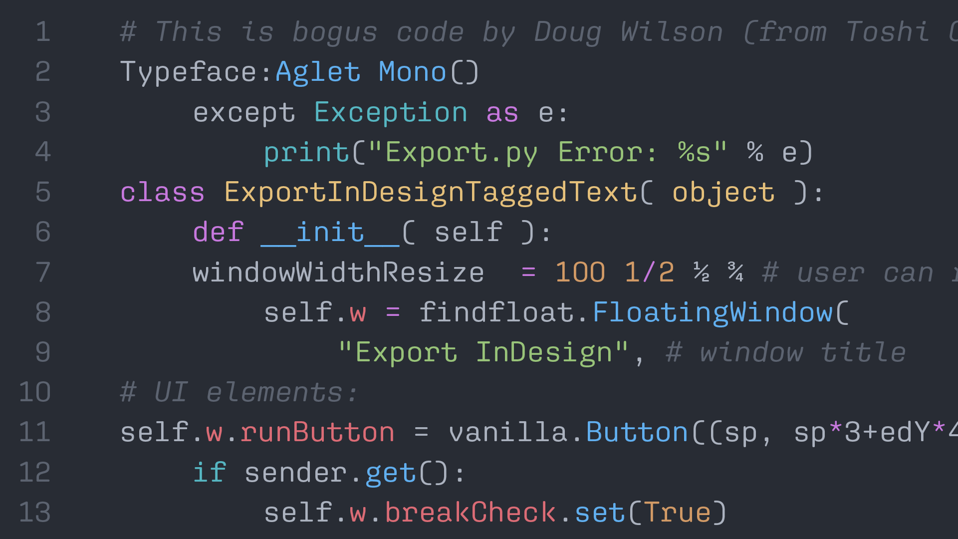
Bridging the gap between square-ish and round-ish is Aglet Mono, the monospaced member of the Aglet family from XYZ Type. At first, I wasn’t sure about the r but it grew on me, and I find Aglet Mono to have a nice, steady visual texture.
The parentheses and fractions are particularly well-designed. Speaking of well-designed, there is a fantastic promotional Riso-printed video by the talented Kelli Anderson that may also convince you to like it.
Favorite Characters: W, R, g, (), k
弥合方形和圆形之间差距的是 Aglet Mono,XYZ Type 的 Aglet 系列的等宽成员。
起初,我好奇
r要怎么办,但它处理的非常令人满意。
Aglet Mono 有一个漂亮、稳定的视觉纹理,括号和分数设计得特别好。
说到精心设计,才华横溢的 Kelli Anderson 可能会让你喜欢上它。
Cascadia Code

Cascadia Code is a new typeface designed by Aaron Bell for the Windows Terminal team and it is surprisingly delightful. The characters find the right balance of playful, yet invisible. There is also a non-ligature version and a Powerline version for the real nerds.
For this screen shot, I manually changed the italics to the more-playful (but arguably less familiar) Stylistic Set 01, which makes the italics more cursive in form. I personally love these cursive-leaning forms and am happy that they are included as an option.
Favorite Characters: a, 4, italic i, l, f, and s
Cascadia Code 是 Aaron Bell 为 Windows 终端团队设计的一种新字体,令人惊喜。
字符找到了俏皮而隐秘的恰到好处的平衡。
对于极客,还有一个非连字版本和一个电力线版本。
这个截图,我手动将斜体更改为更有趣(但可能不太熟悉)的 Stylistic Set 01,这使斜体在形式上更加草书。
我个人喜欢这些草书形式,很高兴它们作为选项包含在内。
Dico Code
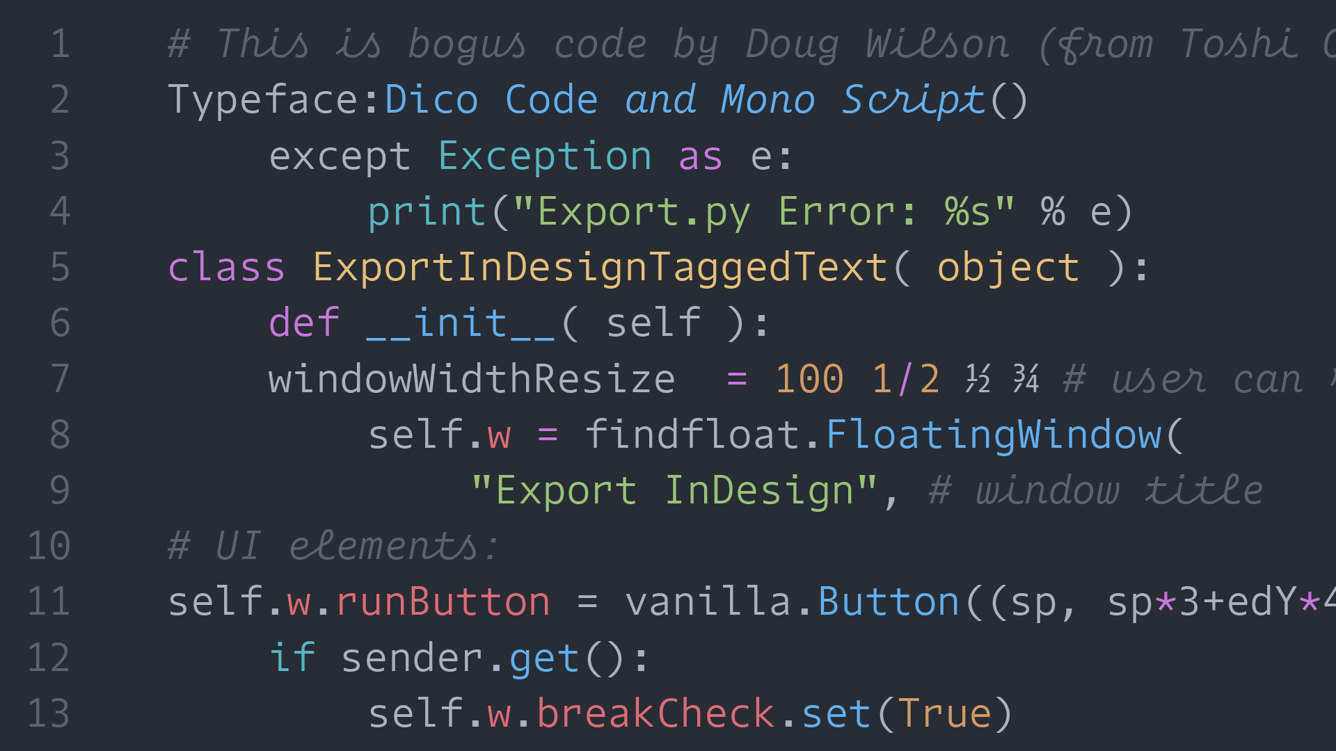
As part of the Dico superfamily (which includes Sans, Slab, Mono, Code, and Mono Slab) Dico Code and Mono Script expands the usefulness into the coding realm. With the right mix of understated practicality in the Code style and playful personality in the Mono Script, Dico is a solid choice to get outside of the default monos.
I chose to show off the “Code” style of Dico because I like how the punctuation is slightly larger which makes it easier on the eyes to differentiate in a coding context. I also chose the “Mono Script” version for the italics because it has so much style.
Favorite Characters: script f and t, i, and r
作为 Dico 超级家族(包括 Sans、Slab、Mono、Code 和 Mono Slab)的一部分 Dico Code 和 Mono Script 将实用性扩展到编码领域。
凭借 Code 风格中的低调实用性和 Mono Script 中俏皮个性的正确组合,Dico 是摆脱默认 monos 的可靠选择。
我选择 Dico 的 “Code” 风格,因为我喜欢标点符号稍大的样式,这使得代码上下文更容易区分。
我还为斜体选择了“Mono Script”版本,它有很多好看的风格。
IBM Plex Mono

Any post that mentions the IBM Selectric typewriter would be remiss to not also mention IBM Plex Mono. To me, part of its beauty is how it fits within the larger type family of IBM Plex that has a sans, sans-condensed, and serif.
Inspired by Selectric typefaces (especially in the italics) Plex Mono blends the technical feel of typewriter fonts with a touch of personality. Since the typeface is free and open source, you are able to clone and make your own remixes or design tweaks—if you are so inclined—which is just so cool.
Favorite Characters: g, x, r, italic i, l,
任何提及 IBM Selectric typewriter 的帖子都会忽略 IBM Plex Mono。
对我来说,它的部分优点在于怎样适应具有 sans、sans-condensed 和 serif 的更大的 IBM Plex 字体系列。
受 Selectric 字体(尤其是斜体)的启发,Plex Mono 将打字机字体的技术感与个性化融合在一起。
由于字体是 免费和开源,你可以复制并制作自己的风格或设计调整(如果愿意的话),awesome!
Recursive Mono Casual
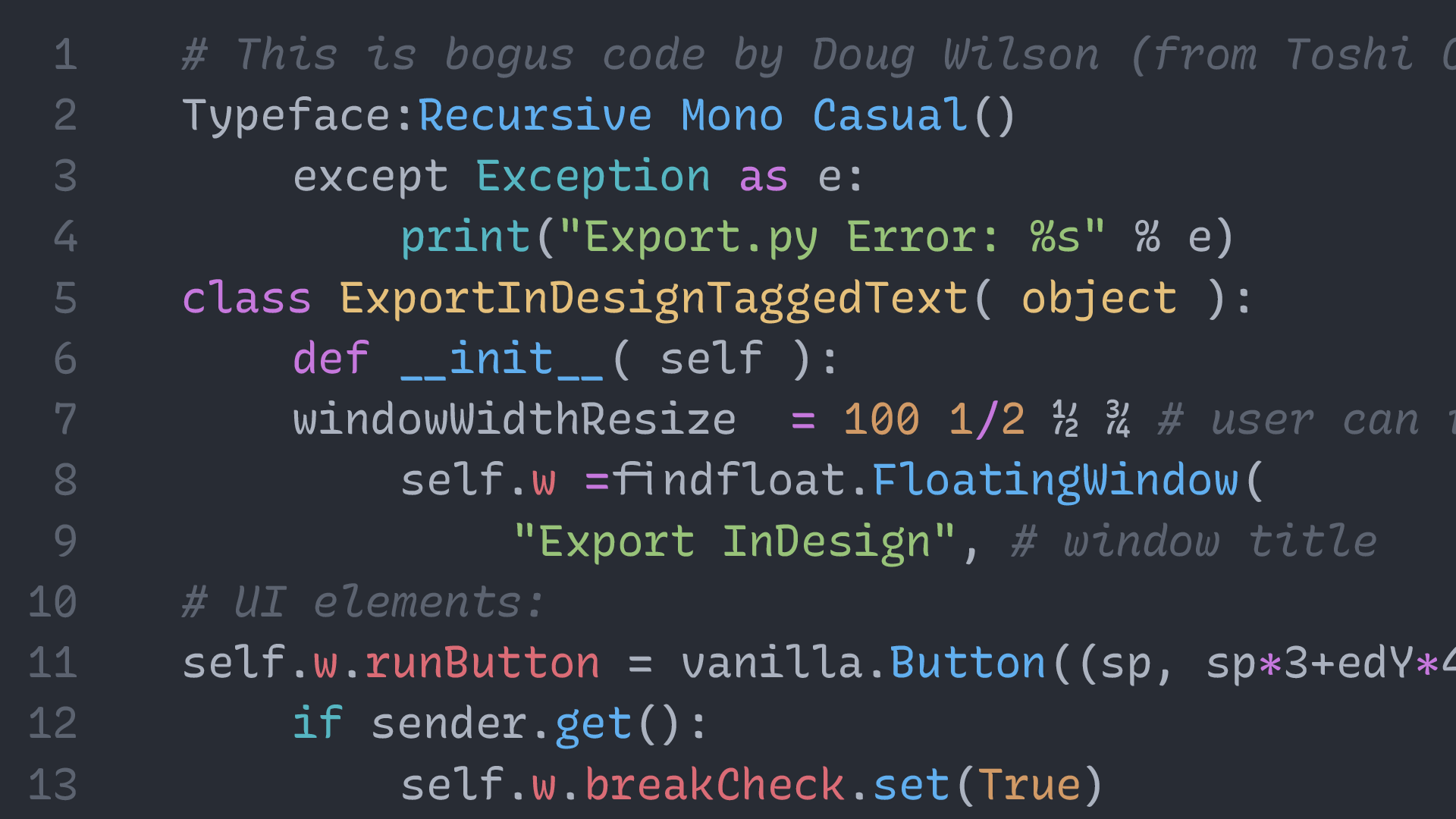
Recursive is so much more than just a monospace font, but the Mono Casual style is perfect for bringing life to your code. If the casual is a bit too casual, you can easily tweak the variable font towards the “Linear” style or anywhere in-between.
The fact that Recursive is free and infinitely customizable (click “Get Recursive” in the top right of the website) makes this a top contender. And oh yeah, the fractions are fantastic!
Favorite Characters: r, a, ½, ¾, italic l and r
Recursive 不仅仅是一种等宽字体, Mono Casual 风格非常适合为你的代码带来活力。
如果随意的有点太随意,你可以轻松地将可变字体调整为“Linear”样式或介于两者之间的任何位置。
Recursive 是免费且可无限定制的(单击 网站 右上角的“Get Recursive”)这将使其拥有强大的竞争力。好耶!分数的样式真的是太棒了!
Dispatch Mono
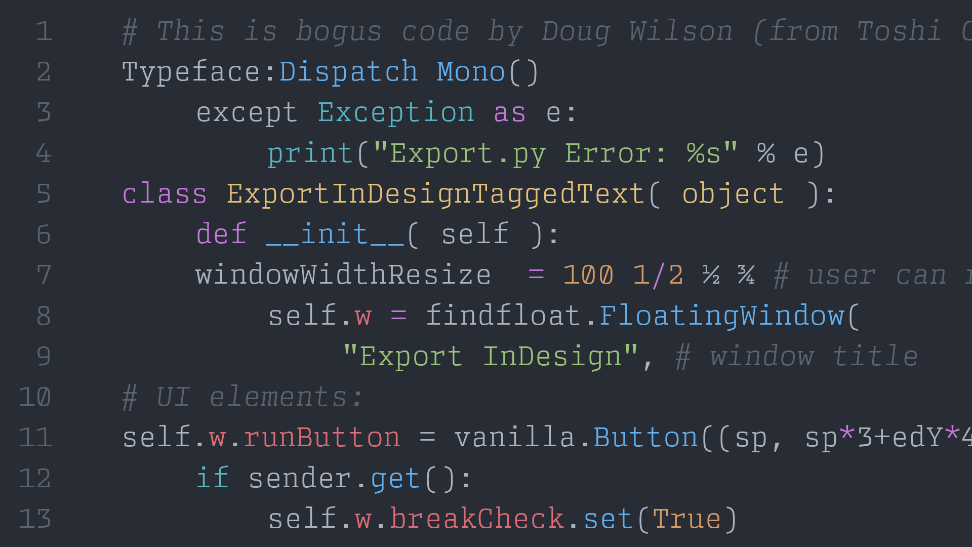
Designed as a monospaced member of the Dispatch family, Dispatch Mono is a slab-serifed monospace with good City vibes.
Originally made for designer Cyrus Highsmith’s own personal use on shipping labels and for printing out PostScript code, Dispatch Mono is now available to bring a bit of “industrial strength” to your coding.
Favorite Characters: T, a, g, p, and f
Dispatch Mono 是 Dispatch 系列的等宽字体,跟 City 有着类似的感觉。
Dispatch Mono 最初是为设计师 Cyrus Highsmith 个人在运输标签上使用和打印 PostScript 代码而设计的,现在可以为您的编码带来一点“Industrial strength”(工业感)。
Gintronic

As the marketing materials state, Gintronic is “Designed to not fatigue your eyes while working habitually with code … and flavoured with a jovial and non-techy character.” This typeface has grown on me and I can’t wait to try it out.
Also, a little birdie (the designer himself) told me that a new, updated version of Gintronic (with a new name) is in the works and should be out soon.
Favorite Characters: r, l, g, i, D, and &
正如营销介绍所述,Gintronic 旨在“在习惯性地使用代码时不使您的眼睛疲劳……并且具有灵快和非技术性的特征。
这种字体让我非常喜欢,迫不及待地想尝试一下。
此外,一个小鸟(设计师本人)告诉我,一个新的、更新版本的 Gintronic(有一个新名称)正在开发中,应该很快就会推出。
Array Mono

Bringing a touch of unconventionality and DIY aesthetic to a monospace font, Array Mono makes for a lively coding experience.
For some crazy reason, the designer James Hultquist-Todd wanted to try and combine classic, Renaissance type styles with a monospace. Honestly, I barely understand what that means but, you know what? I think it might actually work.
Favorite Characters: T, g, %, r, and E
Array Mono 为等宽字体带来了一些非常规和 DIY 的美感,给予了生动的编码体验。
出于某种疯狂的原因,设计师 James Hultquist-Todd 想尝试将经典的文艺复兴时期风格与等宽字体相结合。
老实说,我几乎不明白这是什么意思,但是,你知道吗?我认为它可能真的有效。
Arnold
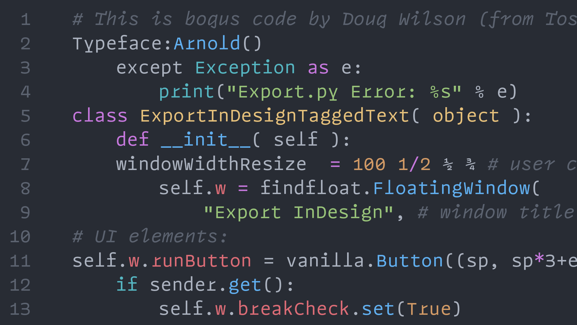
I’m a big fan of Future Fonts. It’s a great place for designers to have an idea, get it out into the world, and see how people react. One of the gems on there is Arnold by Rüdiger.
Designer Philipp Neumeyer admits, “Arnold was never conceived as a generic coding font featuring meticulously calculated width to save screen space or to be exceptionally readable. Arnold is what it is; kind of strange, but also fun.” Personally, I love it and think it’s great.
Favorite Characters: r, f, italic T, I, and l
我是 Future Fonts 的忠实粉丝。这是设计师提出想法、将其推向世界并了解人们如何反应的好地方。
那里的杰出作品之一是 Rüdiger 的 Arnold。设计师 Philipp Neumeyer 承认,“Arnold 从未被设想为一种通用编码字体,其具有精心计算的宽度以节省屏幕空间或具有出色的可读性。阿诺德就是这样;有点奇怪,但也很有趣。”
就个人而言,我喜欢它并认为它很棒。
Cartograph

Subtly-rounded characters give Cartograph its own human touch and nice visual appeal on screen. The playful italic characters with cursive forms bring further distinction and personality when used for coding.
With reasonable pricing and generous license terms for both desktop and webfonts, this is certainly a typeface worth checking out.
Favorite Characters: a, ,, italic i, s, and f
巧妙圆润的字符赋予 Cartograph 自己的人性化触感和良好的屏幕视觉吸引力。
当用于编码时,带有草书形式的俏皮斜体字符带来了进一步的区别和个性。
凭借桌面和网络字体的合理定价和慷慨的许可条款,这无疑是一种值得一试的字体。
Input Narrow Mono
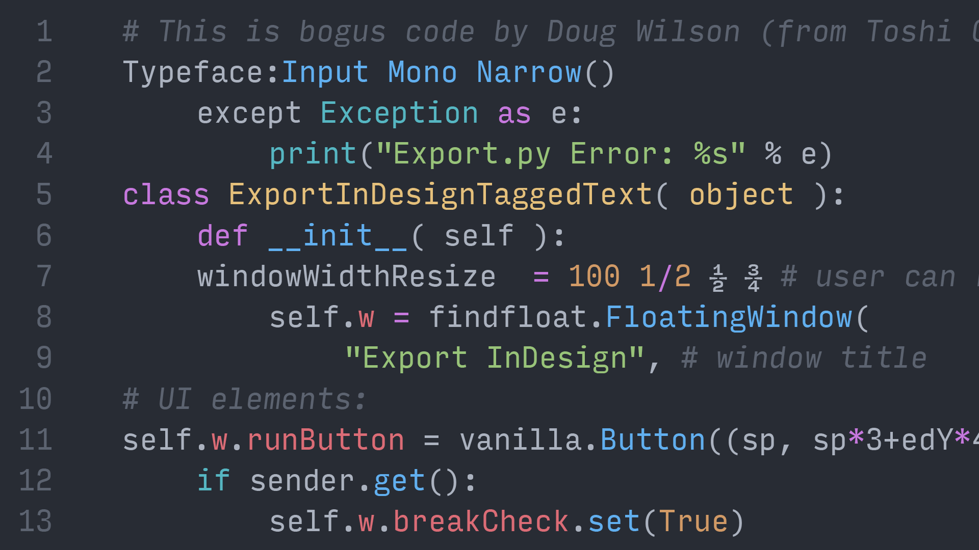
Input Mono was my font of choice for coding (before switching to Operator Mono) and is such a great typeface. The beauty of Input Mono is the customization options available to you, the user—and all for free! Choose from four different widths, multiple styles, and character defaults.
I highly suggest giving Input a try and the fact that it is made by one of the nicest people in the type industry is simply icing on the cake. Make sure to click the “Customize your download” on this page to get exactly what you want.
Favorite Characters: a, r, g, 1, and y
Input Mono 是我选择的编码字体(在切换到 Operator Mono 之前),它是一种很棒的字体。Input Mono 的美妙之处在于你可以使用自定义选项——而且都是免费的!从四种不同的宽度、多种样式和字符默认值中进行选择。
我强烈建议尝试一下 Input,它是由字体行业中最好的人之一制作的,锦上添花。
请务必单击 此页面 上的“自定义下载”以获取您想要的内容。
Logic Monospace & Script

Leaning into the “technical” look of monospaced fonts, Logic Monospace and Monoscript brings life and warmth to the screen. Inspired by Advocate for the IBM Selectric and the ubiquitous Courier, it has the visual appearance of a screenwriter’s script.
Logic Monoscript is especially fun; as it claims to be one of a few connecting monospace scripts in existence and brings such a unique feeling to comments in code.
Favorite Characters: g, E, r, script T, e, l, and r
借助等宽字体的“技术”外观,Logic Monospace and Monoscript 为代码带来生机和温暖。
受 Advocate for the IBM Selectric 和无处不在的 Courier 的启发,它具有编剧剧本的感觉。Logic Monoscript 特别有趣;声称是现有的少数连接等宽脚本之一,为代码中的注释带来了独特的感觉。
GT Maru Mono

As a member of the large Maru family, GT Maru Mono allows code to have a little fun. Rounded, playful, and quirky characters—apparently inspired by the English letterforms found in Japanese signage—still fit into the strict monospaced grid but with a bit of style.
The italics are simply oblique forms—rather than fully-italic—which is either a positive or negative, depending on your personal preference, but I hope by this point in the post, you have an opinion!
Favorite Characters: g, M, W, and 1
GT Maru Mono 作为 Maru 大家族的一员,让代码可以有一点乐趣。
圆润、俏皮和古怪的字符——显然受到日本标牌中英文字母形式的启发——仍然适合严格的等宽网格,很是独特。
斜体只是斜体形式——而不是全斜体——是好是坏,取决于你的个人喜好
Monoflow
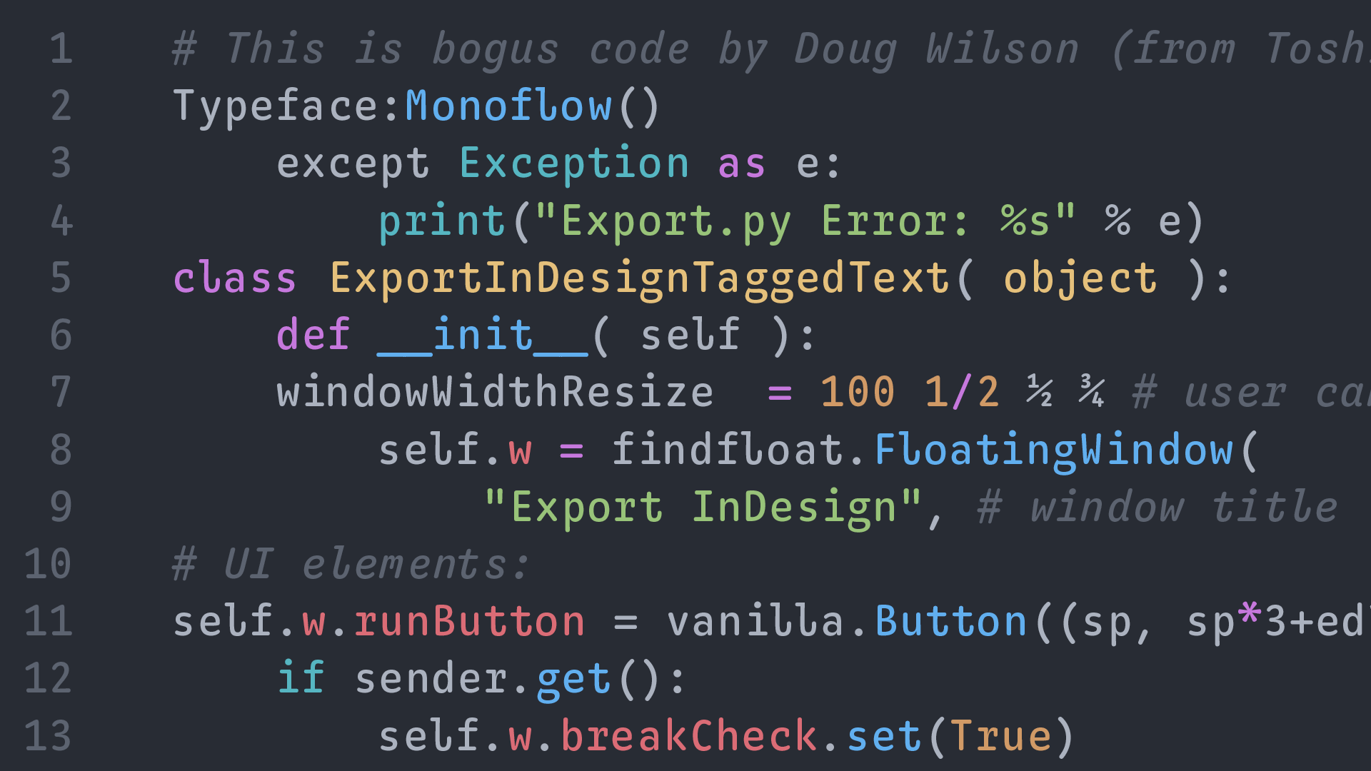
The final typeface in this post has an interesting goal: “To significantly improve the readability and aesthetics of monospace typefaces.” Monoflow does this by what the designers call “contextual repositioning,” which means that it automatically adjusts the individual letter spacing as you type.
Obviously, monospace fonts are defined by their fixed width, but Monoflow repositions characters inside of those fixed widths to make the “color” of your text more visually appealing. It is an interesting idea and I hope more people play with this idea in the future.
Favorite Characters: l, r, g, 4, italic x, y, and z
这篇文章最后一个字体有一个有趣的目标:“显着提高等宽字体的可读性和美感。”
Monoflow 通过设计师所说的“上下文重新定位”来做到这一点,这意味着它会在您键入时自动调整单个字母间距。
显然,等宽字体是由它们的固定宽度定义的,但 Monoflow 重新定位这些固定宽度的内 字符,以使文本的“颜色”更具视觉吸引力。
这是一个有趣的想法,希望将来有更多的人试试这个想法。