echart官网地址: https://www.echartsjs.com/index.html
echarts实例地址: https://echarts.baidu.com/examples/
vue-cli对echart的引用
安装echarts依赖 npm install echarts -S
方式一:全局引入
main.js
import echarts from 'echarts'
Vue.prototype.$echarts = echarts
vue组件


<template>
<div>
  <div id="myChart" :style="{ '300px', height: '300px'}"></div>
</div>
</template>

<script>
export default {
  name: 'myecharts2',
  data () {
    return {
      msg: 'Welcome to Your Vue.js App'
    }
  },
  mounted () {
    this.drawLine()
  },
  methods: {
    drawLine () {
      // 基于准备好的dom,初始化echarts实例
      let myChart = this.$echarts.init(document.getElementById('myChart'))
      // 绘制图表
      myChart.setOption({
        title: { text: '在Vue中使用echarts' },
        tooltip: {},
        xAxis: {
          data: ['衬衫', '羊毛衫', '雪纺衫', '裤子', '高跟鞋', '袜子']
        },
        yAxis: {},
        series: [{
          name: '销量',
          type: 'bar',
          data: [5, 20, 36, 10, 10, 20]
        }]
      })
    }
  }
}
</script>

<style scoped>

</style>
方式二:按需引入
全局引入会将所有的echarts图标打包,导致体积过大,所以还是按需引入较好
<template>
<div>
<e-charts class="echart-item" theme="ovilia-green" :options="option_default"></e-charts>
</div>
</template>

<script>
import ECharts from 'vue-echarts'
let echarts = require('echarts/lib/echarts')

// 引入线形图组件
require('echarts/lib/chart/line')
// 引入提示框和title组件
require('echarts/lib/component/tooltip')
require('echarts/lib/component/title')
export default {
  name: 'myecharts',
  data: function () {
    return {
      option_default: {
        tooltip: {
          trigger: 'axis'
        },
        xAxis: {
          type: 'category',
          boundaryGap: false,
          data: ['Mon', 'Tue', 'Wed', 'Thu', 'Fri', 'Sat', 'Sun']
        },
        yAxis: {
          type: 'value'
        },
        series: [{
          data: [820, 932, 901, 934, 1290, 1330, 1320],
          type: 'line',
          areaStyle: {}
        }]
      }

    }
  },
  components: {
    ECharts
  }
}
</script>

<style lang="less" scoped>
  @gray_light:#999;
  @gray_normal:#666;
  @gray_dark:#333;
  @font_small:12px;
  .stats-chart{
    border-top:1px solid #eee;
    padding-top: 10px;
    margin-bottom: 20px;
  p{font-size: @font_small;color:@gray_light;}
  .stats-chart-item{
    border:1px solid #eee;
    border-radius: 5px;
    padding:15px 0px;
  .chart-item-name{margin-left:20px;margin-bottom:5px; font-size: @font_small;color:@gray_light}
  .chart-item-total{margin-left:20px;font-size:22px;color:@gray_dark}
  .echart-item{
    width: 100%;
    margin-top: -45px;
    margin-bottom: -35px;
    max-height: 220px;
  @media (min-width: 768px) {
    max-height: 260px;
  }
  @media (min- 1280px) {
    max-height: 300px;
  }
  }
  }
  }
</style>
几点问题:
tooltip显示问题(即鼠标上浮到echarts组件会显示x、y坐标数据)
1、需要引入提示框和title组件
// 引入提示框和title组件
require('echarts/lib/component/tooltip')
require('echarts/lib/component/title')
2、在图标option中设置tooltip的trigger属性
tooltip: {
trigger: 'axis'
},
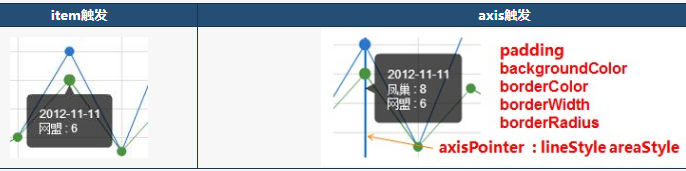
trigger:默认 'item' 可选‘item|axis’
item:鼠标上浮到具体的点位显示tip提示,并只显示一条线的
axis:鼠标上浮到echart表格显示tip提示,可显示多条线
说明文档地址:https://echarts.baidu.com/echarts2/doc/doc.html#Tooltip
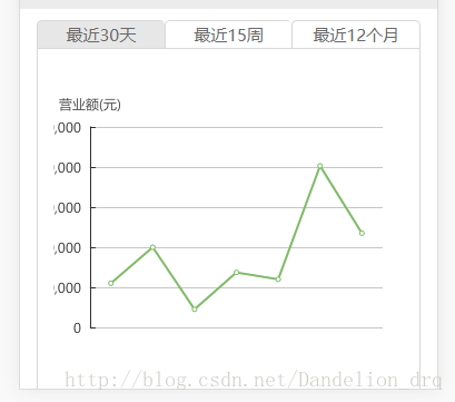
Y轴标签值太长显示不全问题
未处理之前的效果
处理:设置option下的有关属性
grid.left:grid组件距离容器左侧的距离,默认10%,可以修改成像素值和百分比
grid.right:grid组件距离容器右侧的距离,默认10%,可以修改成像素值和百分比
yAxis.axisLabel.margin:刻度标签与轴线之间的距离。默认值是8
yAxis.axisLabel.formatter:刻度标签的内容格式器,支持字符串模板和回调函数两种形式。比如可以设置太长了换行之类的。
设置参数如下:
    option:{
              grid: {show:'true',borderWidth:'0',left: '15%',right:'15%'},
              yAxis: {
                type: 'value',
                axisTick: {
                  show: false
                },
                axisLine: {
                  show: false
                },
                axisLabel: {
                  margin: 2,
                  formatter: function (value, index) {
                    if (value >= 100000 && value < 10000000) {
                      value = value / 10000 + '万'
                    } else if (value >= 10000000) {
                      value = value / 10000000 + '千万'
                    }
                    return value
                  }
                }
              },
    ……
        }
引用: https://blog.csdn.net/dandelion_drq/article/details/79270597
相关属性说明:(项目中使用的是line线形图组件)
lineStyle:线条颜色设置
lineStyle:{
color:'#3ca0ff',
type:'solid'
}
areaStyle:线条下的阴影颜色设置
areaStyle:{
color:'#c1eaff'
}
series.itemStyle 数据节点颜色设置
series.smooth 平滑曲线设置
series: [{
data: [],
type: 'line',
smooth: true,
areaStyle: {},
itemStyle: {
normal: {
color:'#00a9ff'
}
}
}]