----对于用户来说,界面就是程序本身。那么一个漂亮的web一定是你继续使用这个应用的前题。
这一节我们来一起写个Bootstrap的hello wrold。
Bootstrap
Bootstrap 是最受欢迎的 HTML、CSS 和 JS 框架,用于开发响应式布局、移动设备优先的 WEB 项目。
如何使用Bootstrap?
Bootstrap的使用一般有两种方法。一种是引用在线的Bootstrap的样式,一种是将Bootstrap下载到本地进行引用。
引用在线样式:
引用在线样式的好处就是不用本地安装Bootstrap,也是不用考虑引用时的路径问题。缺点是担心性能问题,一旦在线样式挂了,那么自己的网站页面样式也就乱掉了。
http://v3.bootcss.com/getting-started/#download
Bootstrap中文网为 Bootstrap 专门构建了自己的免费 CDN 加速服务。
使用方法非常简单:
<!DOCTYPE html>
<html lang="en">
  <head>
    <meta charset="utf-8">
    <title>Hello Bootstrap</title>
    <!-- Bootstrap core CSS -->
    <link href="http://cdn.bootcss.com/bootstrap/3.2.0/css/bootstrap.min.css" rel="stylesheet">
    </head>
    <body>
        <h1>hello Bootstrap<h1>
    </body>
</html>
<link href="http://cdn.bootcss.com/bootstrap/3.2.0/css/bootstrap.min.css" rel="stylesheet"> 这一行已经将在线的样式引进来了。注意本文使用的是当前最新的Bootstrap3.2.0。
使用本地的Bootstrap
下载Bootstrap到本地进行解压,解压完成,你将得到一个Bootstrap目录,结构如下:
bootstrap/
├── css/
│   ├── bootstrap.css
│   ├── bootstrap.min.css
│   ├── bootstrap-theme.css
│   └── bootstrap-theme.min.css
├── js/
│   ├── bootstrap.js
│   └── bootstrap.min.js
└── fonts/
    ├── glyphicons-halflings-regular.eot
    ├── glyphicons-halflings-regular.svg
    ├── glyphicons-halflings-regular.ttf
    └── glyphicons-halflings-regular.woff
本地调用如下:
<!DOCTYPE html>
<html lang="en">
  <head>
    <meta charset="utf-8">
    <title>Hello Bootstrap</title>
    <!-- Bootstrap core CSS -->
    <link href="./bootstrap-3.2.0-dist/css/bootstrap.min.css" rel="stylesheet">
    <style type='text/css'>
      body {
        background-color: #CCC;
      }
    </style>
    </head>
    <body>
        <h1>hello Bootstrap<h1>
    </body>
</html>
<link href="./bootstrap-3.2.0-dist/css/bootstrap.min.css" rel="stylesheet"> --表示引入当前目录下的Bootstrap样式。
<link href="D:/bootstrap-3.2.0-dist/css/bootstrap.min.css" rel="stylesheet"> --当然也可以使用绝对路径。
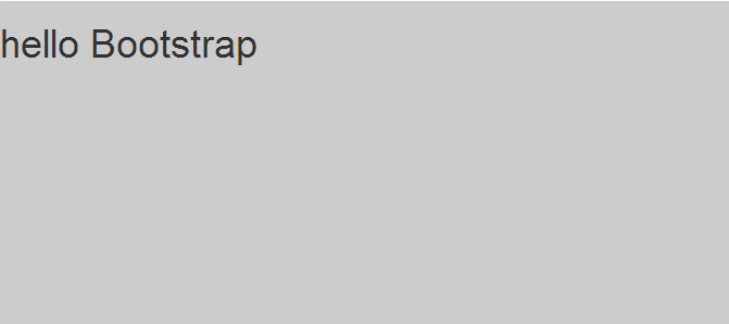
我们多加了一个背景色效果如下:
下面利用Bootstrap的样式编写一个网站出来。
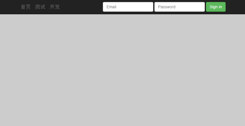
添加导航行栏和登录框
<nav class="navbar navbar-inverse navbar-fixed-top" role="navigation">
      <div class="container">
        <div class="navbar-header">
          <button type="button" class="navbar-toggle collapsed" data-toggle="collapse" data-target="#navbar" aria-expanded="false" aria-controls="navbar">
            <span class="sr-only">Toggle navigation</span>
            <span class="icon-bar"></span>
            <span class="icon-bar"></span>
            <span class="icon-bar"></span>
          </button>
          <a class="navbar-brand" href="#">首页</a>
          <a class="navbar-brand" href="#">测试</a>
          <a class="navbar-brand" href="#">开发</a>
        </div>
        <div id="navbar" class="navbar-collapse collapse">
          <form class="navbar-form navbar-right" role="form">
            <div class="form-group">
              <input type="text" placeholder="Email" class="form-control">
            </div>
            <div class="form-group">
              <input type="password" placeholder="Password" class="form-control">
            </div>
            <button type="submit" class="btn btn-success">Sign in</button>
          </form>
        </div><!--/.navbar-collapse -->
      </div>
    </nav>
浏览器效果如下:
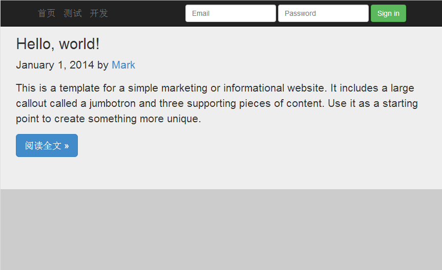
添加一篇文章
<div class="jumbotron"> <div id='content' class='row-fluid'> <h2>Hello, world!</h2> <p class="blog-post-meta">January 1, 2014 by <a href="#">Mark</a></p> <p>This is a template for a simple marketing or informational website. It includes a large callout called a jumbotron and three supporting pieces of content. Use it as a starting point to create something more unique.</p> <p><a class="btn btn-primary btn-lg" role="button">阅读全文 »</a></p> </div> </div>
浏览器效果如下:
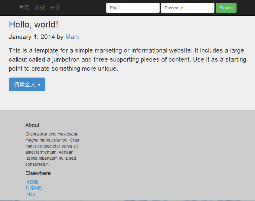
添加底部介绍与友情链接
<div class="col-sm-3 col-sm-offset-1 blog-sidebar">
          <div class="sidebar-module sidebar-module-inset">
            <h4>About</h4>
            <p>Etiam porta <em>sem malesuada magna</em> mollis euismod. Cras mattis consectetur purus sit amet fermentum. Aenean lacinia bibendum nulla sed consectetur.</p>
          </div>
          <div class="sidebar-module">
            <h4>Elsewhere</h4>
            <ol class="list-unstyled">
              <li><a href="#">博客园</a></li>
              <li><a href="#">开源中国</a></li>
              <li><a href="#">infoq</a></li>
            </ol>
          </div>
    </div>
最终效果如下:
完整代码:


<!DOCTYPE html> <html lang="en"> <head> <meta charset="utf-8"> <title>Hello Bootstrap</title> <!-- Bootstrap core CSS --> <link href="./bootstrap-3.2.0-dist/css/bootstrap.min.css" rel="stylesheet"> <style type='text/css'> body { background-color: #CCC; } </style> </head> <body> <nav class="navbar navbar-inverse navbar-fixed-top" role="navigation"> <div class="container"> <div class="navbar-header"> <button type="button" class="navbar-toggle collapsed" data-toggle="collapse" data-target="#navbar" aria-expanded="false" aria-controls="navbar"> <span class="sr-only">Toggle navigation</span> <span class="icon-bar"></span> <span class="icon-bar"></span> <span class="icon-bar"></span> </button> <a class="navbar-brand" href="#">首页</a> <a class="navbar-brand" href="#">测试</a> <a class="navbar-brand" href="#">开发</a> </div> <div id="navbar" class="navbar-collapse collapse"> <form class="navbar-form navbar-right" role="form"> <div class="form-group"> <input type="text" placeholder="Email" class="form-control"> </div> <div class="form-group"> <input type="password" placeholder="Password" class="form-control"> </div> <button type="submit" class="btn btn-success">Sign in</button> </form> </div><!--/.navbar-collapse --> </div> </nav> <div class="jumbotron"> <div id='content' class='row-fluid'> <h2>Hello, world!</h2> <p class="blog-post-meta">January 1, 2014 by <a href="#">Mark</a></p> <p>This is a template for a simple marketing or informational website. It includes a large callout called a jumbotron and three supporting pieces of content. Use it as a starting point to create something more unique.</p> <p><a class="btn btn-primary btn-lg" role="button">阅读全文 »</a></p> </div> </div> <div class="col-sm-3 col-sm-offset-1 blog-sidebar"> <div class="sidebar-module sidebar-module-inset"> <h4>About</h4> <p>Etiam porta <em>sem malesuada magna</em> mollis euismod. Cras mattis consectetur purus sit amet fermentum. Aenean lacinia bibendum nulla sed consectetur.</p> </div> <div class="sidebar-module"> <h4>Elsewhere</h4> <ol class="list-unstyled"> <li><a href="#">博客园</a></li> <li><a href="#">开源中国</a></li> <li><a href="#">infoq</a></li> </ol> </div> </div> </body> </html>
样式的继承
你一定很好奇,这些样式是怎么玩的?如何你细心的就会留意到div 标签的class属性。
通过class的属性值去继承Bootstrap的样式定义,那么就达到了某种样式效果。
<!DOCTYPE html>
<html xmlns="http://www.w3.org/1999/xhtml">
<head>
    <meta charset="utf-8" />
    <title>自定义样式</title>
    <!--自定义侧边栏样式-->
    <style>
        .divcss5-right{width:320px; height:120px;border:1px solid #F00;float:right}
    </style>
</head>
<body>
    <!--class属性引用自定义样式-->
    <div class="divcss5-right">
        <h4>友情链接:</h4>
            <ol class="list-unstyled">
              <li><a href="#">博客园</a></li>
              <li><a href="#">开源中国</a></li>
              <li><a href="#">infoq</a></li>
            </ol>
    </div>
</body>
</html>
玩前端就是要不断的修改里面的属性或信息,然后看浏览器上的展示效果。