基础技能1 - 神奇的border
我们先来画一个长方形:
.Rectangle
{
    height: 100px;
    width: 200px;
    background: darkgray;
    border-width: 50px;
    border-style: solid;
    border-top-color: cyan;
    border-bottom-color: blue;
    border-left-color: orange;
    border-right-color: green;
}
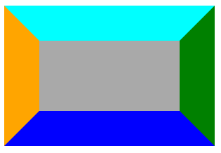
有没有发现什么? 对,四个边的交界处是45°角。那我们可以用这个东东干点什么呢?往下看。
进阶技能1 - 三角形
如果我们把左边的border变宽,右边的border设为0,上下的border设为透明,自身长宽都设为0,猜猜会发生什么?
.Triangle
{
    height: 0;
    width: 0;
    border-left: 50px solid orange;
    border-top: 50px solid transparent;
    border-bottom: 50px solid transparent;
}

不错,我们得到了一个三角形。那么根据以上思路,我们可以调整各边border长度,获取各种不同形状和大小的三角形。
当然,梯形也是一样的道理。
基础技能2 - 神奇的radius
来,我们先画一个圆形。 什么?不知道怎么画?Look
.Cycle
{
    width: 120px;
    height: 120px;
    background: orange;
    border-radius: 60px;
}
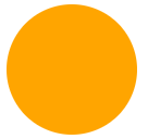
border-radius允许我们设置上下二条边的左右侧弧度,那么采用border-radius可以画出各种圆角图形,如椭圆,鸡蛋等。
border-radius:2em;
border-radius是以下四种写法的简写
    border-top-left-radius:2em;
    border-top-right-radius:2em;
    border-bottom-right-radius:2em;
    border-bottom-left-radius:2em;
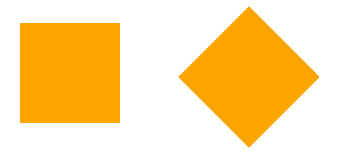
基础技能3 - 神奇的rotate
Rotate允许我们把元素向某个方向进行旋转
.NoRotate {
    width: 100px;
    height: 100px;
    background: orange;
    /* transform: rotate(-45deg); */
}
.Rotate
{
    width: 100px;
    height: 100px;
    background: orange;
    transform: rotate(-45deg);
}
基础技能4 - 伪元素
:before 和 :after 伪元素是存在于真实元素前和后的虚拟元素,通常我们可以借用这二个伪元素实现某些css效果。
比如,恩,红星闪闪放光彩,来个红星?
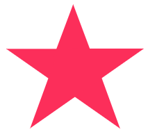
好想法,以上图形可以拆解为3个三角形的叠加,使用伪元素+Rotate我们可以巧妙的把图形叠加起来
#star {
    width: 0;
    height: 0;
    margin: 50px 0;
    color: #fc2e5a;
    position: relative;
    display: block;
    border-right: 100px solid transparent;
    border-bottom: 70px solid #fc2e5a;
    border-left: 100px solid transparent;
    transform: rotate(35deg);
}

#star:before {
    height: 0;
    width: 0;
    position: absolute;
    display: block;
    top: -45px;
    left: -65px;
    border-bottom: 80px solid #fc2e5a;
    border-left: 30px solid transparent;
    border-right: 30px solid transparent;
    content: '';
    transform: rotate(-35deg);
}

#star:after {
    content: '';
    width: 0;
    height: 0;
    position: absolute;
    display: block;
    top: 3px;
    left: -105px;
    color: #fc2e5a;
    border-right: 100px solid transparent;
    border-bottom: 70px solid #fc2e5a;
    border-left: 100px solid transparent;
    transform: rotate(-70deg);
}
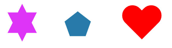
进阶技能2 - 各种不规则几何图形
根据以上基础技能,我们现在掌握了 三角形+圆形+旋转+伪元素 的技能组合,那么基本上我们可以把常见的非规则图形拆解为以上图形进行组合。比如:
六角形,五边形,心形等。
终极大招 - Canvas & SVG
好了,自信满满了,组合技能在手,who怕who。
BOSS: 那谁谁谁,你给我画个中国地图出来。
纳尼?Are you kidding me?
Canvas
Canvas 通过 JavaScript 来绘制 2D 图形。
Canvas 是逐像素进行渲染的。
在 canvas 中,一旦图形被绘制完成,它就不会继续得到浏览器的关注。如果其位置发生变化,那么整个场景也需要重新绘制,包括任何或许已被图形覆盖的对象。
示例代码如下:
var canvas = document.getElementById('test-shape-canvas'),
var ctx = canvas.getContext('2d');
ctx.clearRect(0, 0, 200, 200); // 擦除(0,0)位置大小为200x200的矩形,擦除的意思是把该区域变为透明
ctx.fillStyle = '#dddddd'; // 设置颜色
ctx.fillRect(10, 10, 130, 130); // 把(10,10)位置大小为130x130的矩形涂色
// 利用Path绘制复杂路径:
var path=new Path2D();
path.arc(75, 75, 50, 0, Math.PI*2, true);
path.moveTo(110,75);
path.arc(75, 75, 35, 0, Math.PI, false);
path.moveTo(65, 65);
path.arc(60, 65, 5, 0, Math.PI*2, true);
path.moveTo(95, 65);
path.arc(90, 65, 5, 0, Math.PI*2, true);
ctx.strokeStyle = '#0000ff';
ctx.stroke(path);
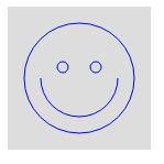
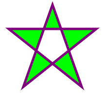
SVG
SVG 是一种使用 XML 描述 2D 图形的语言。
SVG 基于 XML,这意味着 SVG DOM 中的每个元素都是可用的。您可以为某个元素附加 JavaScript 事件处理器。
在 SVG 中,每个被绘制的图形均被视为对象。如果 SVG 对象的属性发生变化,那么浏览器能够自动重现图形。
示例代码如下:
<svg xmlns="http://www.w3.org/2000/svg" version="1.1" height="190">

  <polygon points="100,10 40,180 190,60 10,60 160,180"

  style="fill:lime;stroke:purple;stroke-5;fill-rule:evenodd;">

</svg>
总结
总的来说,随着CSS3和HTML5新特性的逐渐发力,前端图形展示很多时候脱离了原始的图片模式,采用CSS绘图可以减少图片的使用,缩小页面大小,加快加载速度,特别是对于移动端具有较高的性价比。
refers:
http://www.w3school.com.cn/html5/html_5_canvas_vs_svg.asp
https://www.cnblogs.com/liangxiaofeng/p/5936760.html
https://www.liaoxuefeng.com/wiki