接着上文css3弹性盒模型flex快速入门与上手1继续,上文还剩下两个父容器的属性align-items和align-content.
一、align-content:多行的副轴对齐方式
| 含义 | 多行的副轴对齐方式 |
| 可选值 | stretch | flex-start | center | flex-end | space-between | space-around |
| 默认值 | stretch |
属性定义了多根轴线的对齐方式。如果项目只有一根轴线,该属性不起作用
即:此属性只在flex容器中有多行flex元素时才有作用.
 1 <!DOCTYPE html>
 2 <html lang="en">
 3
 4 <head>
 5     <meta charset="UTF-8">
 6     <meta name="viewport" content="width=device-width, initial-scale=1.0">
 7     <meta http-equiv="X-UA-Compatible" content="ie=edge">
 8     <title>flex布局 - by ghostwu</title>
 9     <style>
10         #box {
11             display: flex;
12             flex-direction: row;
13             flex-wrap: wrap;
14             align-content: flex-start;
15             /* align-content: flex-end; */
16             /* align-content: center; */
17             /* align-content: stretch; */
18             /* align-content: space-between; */
19             /* align-content: space-around; */
20             height: 400px;
21             background: #ccc;
22         }
23
24         #box div {
25             width: 100px;
26             height: 100px;
27             background: #09f;
28             margin: 10px;
29         }
30     </style>
31 </head>
32
33 <body>
34     <div id="box">
35         <div>1</div>
36         <div>2</div>
37         <div>3</div>
38         <div>4</div>
39         <div>5</div>
40         <div>6</div>
41         <div>7</div>
42         <div>8</div>
43         <div>9</div>
44         <div>10</div>
45         <div>11</div>
46         <div>12</div>
47         <div>13</div>
48         <div>14</div>
49     </div>
50 </body>
51
52 </html>
flex-direction: row;
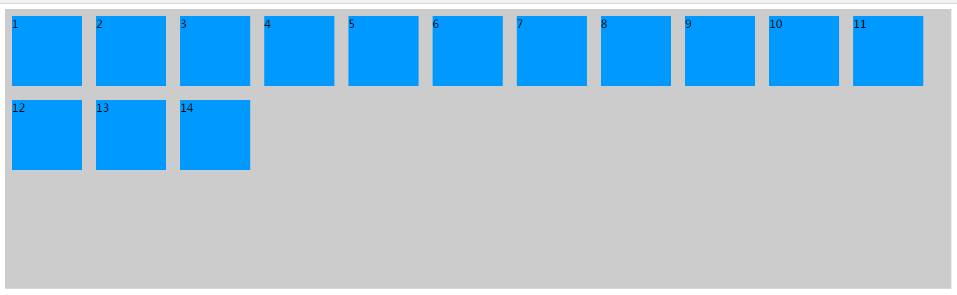
flex-wrap: wrap;
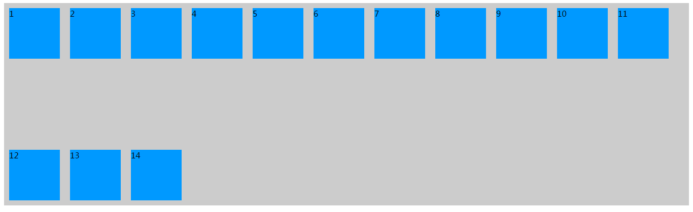
align-content: flex-start;
flex-direction: row;
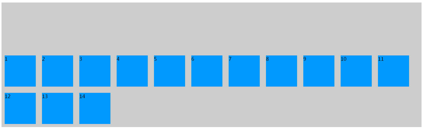
flex-wrap: wrap;
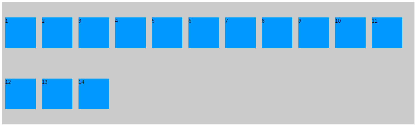
align-content: flex-end;
flex-direction: row;
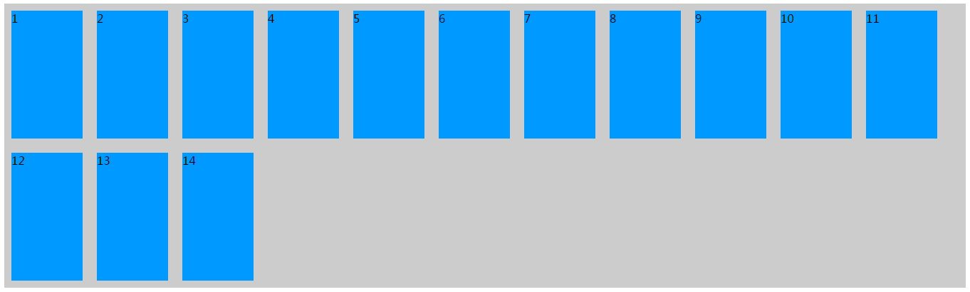
flex-wrap: wrap;
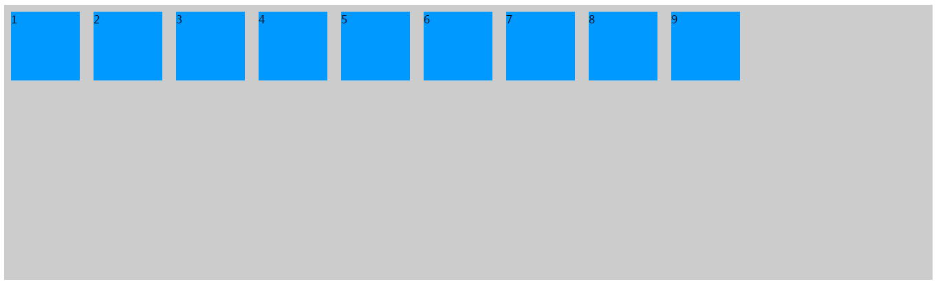
align-content: center;

flex-direction: row;
flex-wrap: wrap;
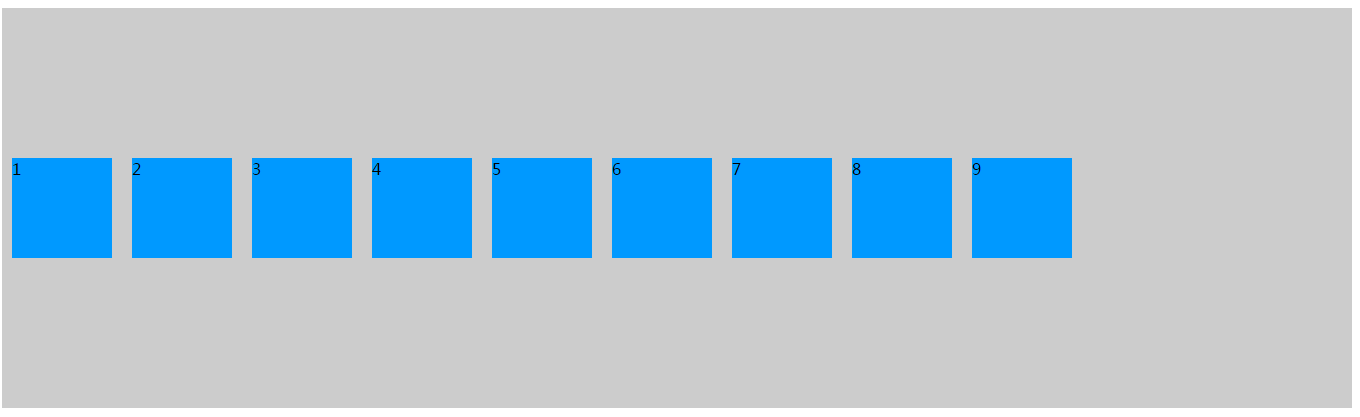
align-content: stretch;
设置了align-content为stretch时,把容器的子元素height变成auto,不要设置固定的高度,才能看见拉伸效果
#box div {
100px;
height: auto;
background: #09f;
margin: 10px;
}
flex-direction: row;
flex-wrap: wrap;
align-content: space-between;
flex-direction: row;
flex-wrap: wrap;
align-content: space-around;
flex-direction: column;
flex-wrap: wrap;
align-content: space-around;
把flex-direction变成column方向.

小结:这个属性一定要有多行flex元素,否则看不到效果, 即配合flex-wrap: wrap;让flex元素换行 才能看见效果
align-items:单行的副轴对齐方式
| 含义 | 单行的副轴对齐方式 |
| 可选值 | flex-start | flex-end | center | stretch | baseline |
| 默认值 | stretch |
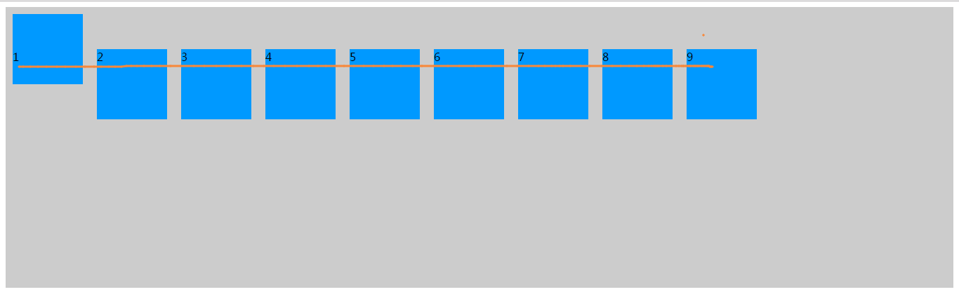
 1 <!DOCTYPE html>
 2 <html lang="en">
 3 <head>
 4     <meta charset="UTF-8">
 5     <meta name="viewport" content="width=device-width, initial-scale=1.0">
 6     <meta http-equiv="X-UA-Compatible" content="ie=edge">
 7     <title>flex布局 - by ghostwu</title>
 8     <style>
 9         #box {
10             display: flex;
11             /* flex-direction: column; */
12             flex-direction: row;
13             /* align-items: flex-start; */
14             align-items: flex-end;
15             /* align-items: center; */
16             /* align-items: baseline; */
17
18             height:400px;
19             background:#ccc;
20         }
21         #box div {
22             width: 100px;
23             height: 100px;
24             background: #09f;
25             margin: 10px;
26             box-sizing: border-box;
27         }
28     </style>
29 </head>
30 <body>
31     <div id="box">
32         <div>1</div>
33         <div>2</div>
34         <div>3</div>
35         <div>4</div>
36         <div>5</div>
37         <div>6</div>
38         <div>7</div>
39         <div>8</div>
40         <div>9</div>
41     </div>
42 </body>
43 </html>
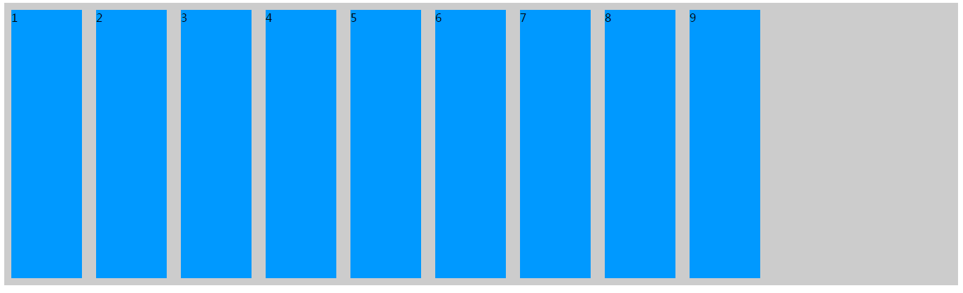
flex-direction: row;
align-items: flex-end;

flex-direction: row;
align-items: flex-start;
flex-direction: row;
align-items: center;
flex-direction: row;
align-items: baseline;
baseline:对齐第一个flex元素文本的基线
#box div:nth-of-type(1) {
padding-top:50px;
}
flex-direction: row;
align-items: stretch;
把所有的flex元素高度设置为auto,或者去掉 才能看见拉伸(stretch)效果:
#box div {
100px;
height: auto;
background: #09f;
margin: 10px;
box-sizing: border-box;
}