Button 按钮
常用的操作按钮。
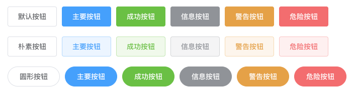
¶基础用法
基础的按钮用法。
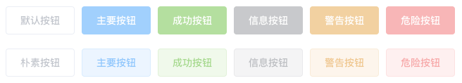
¶禁用状态
按钮不可用状态。
¶文字按钮
没有边框和背景色的按钮。

¶图标按钮
带图标的按钮可增强辨识度(有文字)或节省空间(无文字)。

¶按钮组
以按钮组的方式出现,常用于多项类似操作。

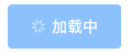
¶加载中
点击按钮后进行数据加载操作,在按钮上显示加载状态。
¶不同尺寸
Button 组件提供除了默认值以外的三种尺寸,可以在不同场景下选择合适的按钮尺寸。

¶Attributes
| 参数 | 说明 | 类型 | 可选值 | 默认值 |
|---|---|---|---|---|
| size | 尺寸 | string | medium / small / mini | — |
| type | 类型 | string | primary / success / warning / danger / info / text | — |
| plain | 是否朴素按钮 | boolean | — | false |
| round | 是否圆形按钮 | boolean | — | false |
| loading | 是否加载中状态 | boolean | — | false |
| disabled | 是否禁用状态 | boolean | — | false |
| icon | 图标类名 | string | — | — |
| autofocus | 是否默认聚焦 | boolean | — | false |
| native-type | 原生 type 属性 | string | button / submit / reset | button |