首先我们先来了解状态效果
android:state_pressed=["true" | "false"] 按下状态
android:state_focused=["true" | "false"] 聚焦状态
android:state_selected=["true" | "false"] 选中状态
android:state_active=["true" | "false"] 激活状态
android:state_checkable=["true" | "false"] 可校验状态
android:state_checked=["true" | "false"] 检查状态
android:state_enabled=["true" | "false"] 启用状态
android:state_window_focused=["true" | "false"] 状态栏聚焦状态
 <?xml version="1.0" encoding="utf-8"?>
    <selector xmlns:android="http://schemas.android.com/apk/res/android">
        <item android:state_enabled="true" android:state_checked="true" android:state_pressed="true"
              android:drawable="@drawable/enabled_on_pressed" />
        <item android:state_enabled="true" android:state_checked="false" android:state_pressed="true"
              android:drawable="@drawable/enabled_off_pressed" />
        <item android:state_enabled="true" android:state_checked="true"
              android:drawable="@drawable/enabled_on" />
        <item android:state_enabled="true" android:state_checked="false"
              android:drawable="@drawable/enabled_off" />
        <item android:state_enabled="false" android:state_checked="true"
              android:drawable="@drawable/disabled_on" />
        <item android:state_enabled="false" android:state_checked="false"
              android:drawable="@drawable/disabled_off" />
    </selector>
Item顺序是有讲究的,条件限定越细致,则应该放到前面。比如这儿如果把1,2行和3,4行的item交换,那么pressed的就永远无法触发了,因为有item已经满足条件返回了。可以理解为代码中的if语句。
基本属性(corners、gradient、padding、size、solid、stroke)
上面给大家简单的讲了下shape标签组的简单使用方法,下面就具体讲讲shape标签里所具有的几个子标签及所具有的属性。
1、Corners
<corners //定义圆角

android:radius="dimension" //全部的圆角半径

android:topLeftRadius="dimension" //左上角的圆角半径

android:topRightRadius="dimension" //右上角的圆角半径

android:bottomLeftRadius="dimension" //左下角的圆角半径

android:bottomRightRadius="dimension" /> //右下角的圆角半径
Corners标签是用来字义圆角的,其中radius与其它四个并不能共同使用。
android:radius:定义四个角的的圆角半径。
其它四个是逐个字义每个角的圆角半径。
2、solid
solid用以指定内部填充色
只有一个属性:
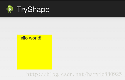
<solid  android:color="color" />

<?xml version="1.0" encoding="utf-8"?>

<shape xmlns:android="http://schemas.android.com/apk/res/android" >

<solid android:color="#ffff00"/>

</shape>
效果
3、gradient
gradient用以定义渐变色,可以定义两色渐变和三色渐变,及渐变样式,它的属性有下面几个:
<gradient

android:type=["linear" | "radial" | "sweep"] //共有3中渐变类型,线性渐变(默认)/放射渐变/扫描式渐变

android:angle="integer" //渐变角度,必须为45的倍数,0为从左到右,90为从上到下

android:centerX="float" //渐变中心X的相当位置,范围为0~1

android:centerY="float" //渐变中心Y的相当位置,范围为0~1

android:startColor="color" //渐变开始点的颜色

android:centerColor="color" //渐变中间点的颜色,在开始与结束点之间

android:endColor="color" //渐变结束点的颜色

android:gradientRadius="float" //渐变的半径,只有当渐变类型为radial时才能使用

android:useLevel=["true" | "false"] /> //使用LevelListDrawable时就要设置为true。设为false时才有渐变效果
首先有三种渐变类型,分别是:linear(线性渐变)、radial(放射性渐变)、sweep(扫描式渐变
先看看这几个属性的使用方法:
android:type=["linear" | "radial" | "sweep"]

android:startColor="color" //渐变开始点的颜色

android:centerColor="color" //渐变中间点的颜色,在开始与结束点之间

android:endColor="color" //渐变结束点的颜色

android:gradientRadius="float" //渐变的半径,只有当渐变类型为radial时才能使用
下面我们使用三色渐变来看看这三种渐变方式都是怎么显示的:(如果不使用centerColor属性就是双色渐变,这个属性是可选的)
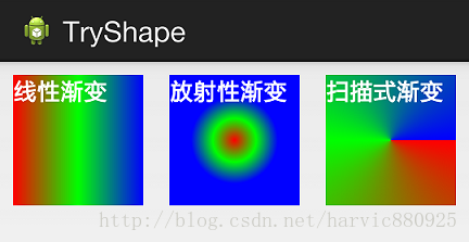
需要注意的一点是,在构造放射性渐变时,要加上android:gradientRadius属性(渐变半径),即必须指定渐变半径的大小才会起作用,下面列出这三个渐变方式的shape代码,供大家参考:
线性渐变:
<?xml version="1.0" encoding="utf-8"?>

<shape xmlns:android="http://schemas.android.com/apk/res/android" >

<gradient

android:type="linear"

android:startColor="#ff0000"

android:centerColor="#00ff00"

android:endColor="#0000ff"/>

</shape>
放射性渐变:
 <?xml version="1.0" encoding="utf-8"?>

    <shape xmlns:android="http://schemas.android.com/apk/res/android" >

    <gradient

    android:type="radial"

    android:startColor="#ff0000"

    android:centerColor="#00ff00"

    android:endColor="#0000ff"

    android:gradientRadius="100"/>

    </shape>
扫描式渐变:
<?xml version="1.0" encoding="utf-8"?>

<shape xmlns:android="http://schemas.android.com/apk/res/android" >

<gradient

android:type="sweep"

android:startColor="#ff0000"

android:centerColor="#00ff00"

android:endColor="#0000ff"/>

</shape>
可见放射性渐变,只是比其它两个多了个android:gradientRadius属性
android:angle属性(仅对线性渐变有效)
android:angle="integer" //渐变角度,必须为45的倍数,0为从左到右,90为从上到下 我们在上面的三种渐变上都加上angle属性,看看效果如何:
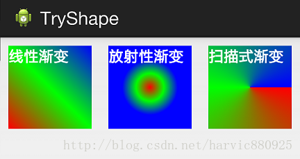
能过跟上一个图对比可以发现,angle属性确实只对线性渐变有效,其它两种渐变方式都没有任何动静,下面是此时的线性渐变shape代码:
<?xml version="1.0" encoding="utf-8"?>

<shape xmlns:android="http://schemas.android.com/apk/res/android" >

<gradient

android:type="linear"

android:startColor="#ff0000"

android:centerColor="#00ff00"

android:endColor="#0000ff"

android:angle="45"/>

</shape>
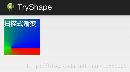
android:centerX与android:centerY:
centerX、centerY两个属性用于设置渐变的中心点位置,仅当渐变类型为放射渐变时有效,类型为分数或小数,不接受Dimension。默认值是0.5,有效值是0.0~1.0,超出该范围后会看不出渐变效果。centerX、centerY的取值其实是宽和高的百分比;不难理解,下面看代码:
<?xml version="1.0" encoding="utf-8"?>

<shape xmlns:android="http://schemas.android.com/apk/res/android" >

<gradient

android:type="sweep"

android:startColor="#ff0000"

android:centerColor="#00ff00"

android:endColor="#0000ff"

android:centerX="0.2"

android:centerY="0.8"/>

</shape>
取宽度的20%和高度的80%的位置,作为新的渐变原点,效果是这样的:
android:useLevel
useLevel属性通常不使用。该属性用于指定是否将该shape当成一个LevelListDrawable来使用,默认值为false。
4、stroke
这是描边属性,可以定义描边的宽度,颜色,虚实线等
<stroke

android:width="dimension" //描边的宽度

android:color="color" //描边的颜色

// 以下两个属性设置虚线

android:dashWidth="dimension" //虚线的宽度,值为0时是实线

android:dashGap="dimension" /> //虚线的间隔
上面各个属性的意义如下:
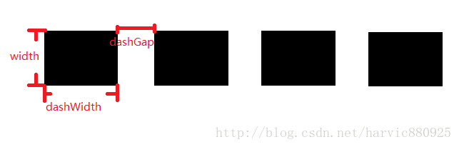
我们使用绿色虚线描边,虚线高度是20dp,虚线宽度为10dp虚线间距为1dp:
    <?xml version="1.0" encoding="utf-8"?>

    <shape xmlns:android="http://schemas.android.com/apk/res/android" >

    <stroke

    android:width="20dp"

    android:color="#00ff00"

    android:dashWidth="10dp"

    android:dashGap="1dp" />

    </shape>
从效果图中,我们也能清晰的看出这三个参数(width、dashwidth、dashGap)之间的区别,另外请注意!如果你发现一直没有虚线效果,可能是你没关闭硬件加速导致的:
你可以在Activity里选择关闭硬件加速:
 <activity ... />
    <activity android:hardwareAccelerated="false" />
也可以指定某个View关闭硬件加速:
代码里:
myView.setLayerType(View.LAYER_TYPE_SOFTWARE, null);
xml里:
android:layerType="software"
5、size和padding
这两个基本上不怎么用,因为他们所具有的功能,控件本身也能实现。
size:是用来定义图形的大小的。
<size

android:width="dimension"

android:height="dimension" />
padding:用来定义内部边距
<padding

android:left="dimension"

android:top="dimension"

android:right="dimension"

android:bottom="dimension" />
三、Shape的属性(rectangle、oval、line、ring)
上面我们讲了Shape的子标签的的作用,但Shape本身还没讲,Shape自已是可以定义当前Shape的形状的,比如上面的矩形,还有椭圆形,线形和环形;这些都是通过Shape标签的 shape属性来定义的,Shape标签总共有下面几个属性,我们一个个讲:
android:shape=["rectangle" | "oval" | "line" | "ring"]

shape的形状,默认为矩形,可以设置为矩形(rectangle)、椭圆形(oval)、线性形状(line)、环形(ring)

下面的属性只有在android:shape="ring时可用:

android:innerRadius 尺寸,内环的半径。

android:innerRadiusRatio 浮点型,以环的宽度比率来表示内环的半径,

android:thickness 尺寸,环的厚度

android:thicknessRatio 浮点型,以环的宽度比率来表示环的厚度,例如,如果android:thicknessRatio="2",

android:useLevel boolean值,如果当做是LevelListDrawable使用时值为true,否则为false.
可见,只有第一个shape是可用的,其它五个都是shape等于ring时所特有的。
注意,无论这里shape取什么形状,他的子标签都是可用的,但有时并不会有效果,比如在shape为椭圆时,那corners标签就不会有效果,很显然的道理。下面一个个看看各个形状都是怎么样的;
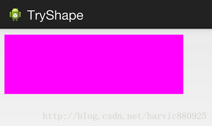
1、rectangle (矩形)
不指定shape属性时,默认就是矩形的。
<?xml version="1.0" encoding="utf-8"?>

<shape xmlns:android="http://schemas.android.com/apk/res/android"

android:shape="rectangle">

<solid android:color="#ff00ff"/>

</shape>
对应图形:
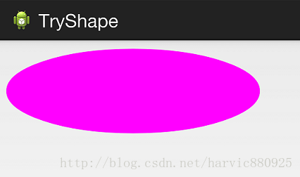
2、oval(椭圆)
    <?xml version="1.0" encoding="utf-8"?>

    <shape xmlns:android="http://schemas.android.com/apk/res/android"

    android:shape="oval">

    <solid android:color="#ff00ff"/>

    </shape>
对应图形:(控件大小的矩形所对应的椭圆)
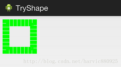
3、line(线形)
虚线
拿shape 做虚线,shape 设置为line , stroke 是描边属性,
其中 dashGap dashWidth 两个属性彼此一起存在才生效。
请注意!如果你发现一直没有虚线效果,可能是你没关闭硬件加速导致的,指定某个View关闭硬件加速:
xml里:
android:layerType="software"
dashGap :两段之间的空隙宽度、
dashWidth :一段线的宽度
<shape xmlns:android="http://schemas.android.com/apk/res/android"
    android:shape="line" >
    <stroke
        android:dashGap="3dp"
        android:dashWidth="8dp"
        android:width="1dp"
        android:color="#009999" />
</shape>
效果如下:

4、ring(环形)
还记得他所特有的几个属性么:
android:innerRadius 尺寸,内环的半径。

android:thickness 尺寸,环的厚度

android:innerRadiusRatio 浮点型,以环的宽度比率来表示内环的半径,

例如,如果android:innerRadiusRatio,表示内环半径等于环的宽度除以5,这个值是可以被覆盖的,默认为9.

android:thicknessRatio 浮点型,以环的宽度比率来表示环的厚度,例如,如果android:thicknessRatio="2",

那么环的厚度就等于环的宽度除以2。这个值是可以被android:thickness覆盖的,默认值是3.

android:useLevel boolean值,如果当做是LevelListDrawable使用时值为true,否则为false.
这么几个属性无外乎就是定义环形的内环尺寸和环的宽度。
举个例子:
控件定义:
<LinearLayout xmlns:android="http://schemas.android.com/apk/res/android"

android:layout_width="match_parent"

android:layout_height="match_parent"

android:orientation="horizontal" >

<TextView

android:layout_width="300dp"

android:layout_height="100dp"

android:layout_margin="10dp"

android:textColor="#ffffff"

android:textSize="18sp"

android:textStyle="bold"

android:background="@drawable/try_shape_2"/>

</LinearLayout>
shape定义:(这里一定要要加上useLevel属性并定义为false,不然没有效果)
<?xml version="1.0" encoding="utf-8"?>

<shape xmlns:android="http://schemas.android.com/apk/res/android"

android:shape="ring"

android:innerRadius="20dp"

android:thickness="50dp"

android:useLevel="false">

<solid android:color="#ff00ff"/>

</shape>
效果图:
---------------------------例子代码-----------------------------------
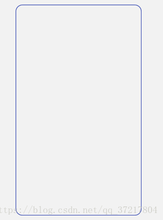
1.圆角空心正方形
<?xml version="1.0" encoding="utf-8"?>
<shape xmlns:android="http://schemas.android.com/apk/res/android"
    android:shape="rectangle">
   <stroke android:width="2dp" android:color="@color/colorPrimary"/>
    <corners android:radius="20dp"/>
    <padding android:left="10dp"
        android:bottom="10dp"
        android:right="10dp"
        android:top="10dp"/>

</shape>
效果如下:

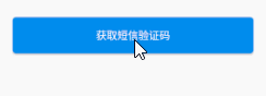
2.有按下效果的正方形
    <?xml version="1.0" encoding="utf-8"?>
    <selector xmlns:android="http://schemas.android.com/apk/res/android">

        <item android:state_pressed="false">
            <shape android:shape="rectangle">
                <solid android:color="@color/colorBlue"></solid>
                <corners android:radius="5dp"/>
                <padding android:bottom="10dp"
                    android:left="10dp"
                    android:right="10dp"
                    android:top="10dp"/>
            </shape>
        </item>
        <item
            android:state_pressed="true">
            <shape android:shape="rectangle">
                <solid android:color="@color/colorDownBlue"></solid>
                <corners android:radius="5dp"/>
                <padding android:bottom="10dp"
                    android:left="10dp"
                    android:right="10dp"
                    android:top="10dp"/>
            </shape>
        </item>

    </selector>
效果如下:
3.按下效果的圆形
<?xml version="1.0" encoding="utf-8"?>
<selector xmlns:android="http://schemas.android.com/apk/res/android">
    <item android:state_pressed="true">
        <shape android:shape="oval" >
            <size android:width="@dimen/size_40" android:height="@dimen/size_40"/>
            <solid android:color="@color/ivory"/>
        </shape>
    </item>
    <item android:state_pressed="false">
        <shape android:shape="oval">
            <size android:height="@dimen/size_40" android:width="@dimen/size_40"/>
            <solid android:color="@color/yellow"/>
        </shape>
    </item>
</selector>
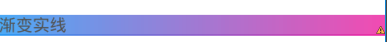
4.shape做渐变实线
gradient 表示渐变
angle 渐变角度,45的倍数。
startColor endColor centerColor 起 止 中 的颜色
<shape xmlns:android="http://schemas.android.com/apk/res/android" >

    <gradient
        android:type="linear"
        android:angle="0"
        android:endColor="#F028A2"
        android:startColor="#2A99F3" />
</shape>
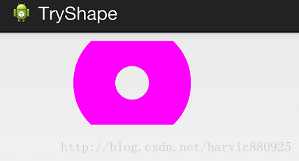
5.另一个实现环形的办法
<?xml version="1.0" encoding="utf-8"?>
<shape xmlns:android="http://schemas.android.com/apk/res/android"
    android:shape="oval">
    <size android:height="5dp" android:width="5dp"/>
    <stroke android:width="0.5dp" android:color="@color/theme_color"/>
</shape>
6.实现一个底部带线条的正方形背景
<layer-list xmlns:android="http://schemas.android.com/apk/res/android">

    <item  >
        <shape>
            <solid android:color="@color/color_blue" />
        </shape>

    </item>

    <!--  注意! item是相反的,蓝色线条应该在上面,黑色背景反而在下面  -->
    <item android:bottom="30dp">
        <shape >
            <solid android:color="@color/color_black"/>
        </shape>
    </item>


</layer-list>
效果图:
