        <div class="container">
            container
        </div>
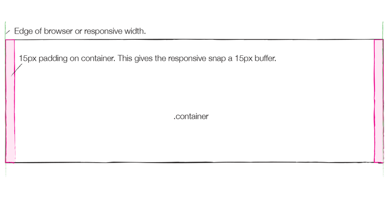
.container {
  .container-fixed();容器的width为auto    左右padding为15  (注意是borderBox)

     容器的width为750     左右padding为15  (注意是borderBox)
  @media (min- @screen-sm-min) {
     @container-sm;
  }   容器的width为970     左右padding为15 (注意是borderBox)
  @media (min- @screen-md-min) {

     @container-md;
  }         lg大屏     w >=1200 容器的width为1170   左右padding为15 (注意是borderBox)
  @media (min- @screen-lg-min) {
            1140+30=1700
     @container-lg;
  }
}


<!DOCTYPE html>
<html>
    <head>
        <meta charset="UTF-8">
        <title></title>
        <link rel="stylesheet" href="css/bootstrap.min.css" />
        <style type="text/css">
            .container{
                border: 1px solid;
                height: 30px;
                background: pink;
            }
        </style>
    </head>
    <body>
        <!--固定容器
                                width >= 1200         1170
            1200    >= width >= 992           970
            992        >= width >= 768            750
            768        >= width                        流体
        -->
        <div class="container">
            container
        </div>
    </body>
    <script src="js/jquery.min.js"></script>
    <script src="js/bootstrap.min.js"></script>
</html>