先上实现后的图片:
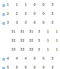
其中每行中的数据都是绑定的用户控件,拿第一个顶级菜单举例,其中1,1,1,0,0,3代表的六个TextBlock 如下:
<TextBlock Text="{Binding Info_class_id, Mode=OneTime}" Height="23" Grid.Column="0" />
<TextBlock Text="{Binding Info_class_code, Mode=TwoWay}" Height="23" Grid.Column="1" />
<TextBlock Text="{Binding Name, Mode=TwoWay}" Height="23" Grid.Column="2" />
<TextBlock Text="{Binding Parent_class_id, Mode=TwoWay}" Height="23" Grid.Column="3" />
<TextBlock Text="{Binding Class_level, Mode=TwoWay}" Height="23" Grid.Column="4" />
<TextBlock Text="{Binding InfoCount, Mode=TwoWay}" Height="23" Grid.Column="5" />
首先在项目中添加system.windows.controls引用,然后在TreeView显示界面中添加下面的引用:xmlns:sdk="http://schemas.microsoft.com/winfx/2006/xaml/presentation/sdk"
xmlns:System="clr-namespace:System;assembly=mscorlib"
xmlns:local="clr-namespace:SLTreeView" //本项目(需要用其他用户控件)
然后在TreeView样式中添加自定义控件,如图(阴影部分为自定义控件):
xaml代码如下:
<UserControl x:Class="SLTreeView.MainPage"
xmlns="http://schemas.microsoft.com/winfx/2006/xaml/presentation"
xmlns:x="http://schemas.microsoft.com/winfx/2006/xaml"
xmlns:d="http://schemas.microsoft.com/expression/blend/2008"
xmlns:mc="http://schemas.openxmlformats.org/markup-compatibility/2006"
xmlns:sdk="http://schemas.microsoft.com/winfx/2006/xaml/presentation/sdk"
xmlns:System="clr-namespace:System;assembly=mscorlib"
xmlns:local="clr-namespace:SLTreeView"
mc:Ignorable="d" d:DesignHeight="300" d:DesignWidth="400">
<UserControl.Resources>
<ControlTemplate x:Key="CommonValidationToolTipTemplate" TargetType="ToolTip">
<Grid x:Name="Root" Margin="5,0" Opacity="0" RenderTransformOrigin="0,0">
<Grid.RenderTransform>
<TranslateTransform x:Name="Translation" X="-25"/>
</Grid.RenderTransform>
<VisualStateManager.VisualStateGroups>
<VisualStateGroup x:Name="OpenStates">
<VisualStateGroup.Transitions>
<VisualTransition GeneratedDuration="0"/>
<VisualTransition GeneratedDuration="0:0:0.2" To="Open">
<Storyboard>
<DoubleAnimation Duration="0:0:0.2" To="0" Storyboard.TargetProperty="X" Storyboard.TargetName="Translation">
<DoubleAnimation.EasingFunction>
<BackEase Amplitude=".3" EasingMode="EaseOut"/>
</DoubleAnimation.EasingFunction>
</DoubleAnimation>
<DoubleAnimation Duration="0:0:0.2" To="1" Storyboard.TargetProperty="Opacity" Storyboard.TargetName="Root"/>
</Storyboard>
</VisualTransition>
</VisualStateGroup.Transitions>
<VisualState x:Name="Closed">
<Storyboard>
<DoubleAnimation Duration="0" To="0" Storyboard.TargetProperty="Opacity" Storyboard.TargetName="Root"/>
</Storyboard>
</VisualState>
<VisualState x:Name="Open">
<Storyboard>
<DoubleAnimation Duration="0" To="0" Storyboard.TargetProperty="X" Storyboard.TargetName="Translation"/>
<DoubleAnimation Duration="0" To="1" Storyboard.TargetProperty="Opacity" Storyboard.TargetName="Root"/>
</Storyboard>
</VisualState>
</VisualStateGroup>
</VisualStateManager.VisualStateGroups>
<Border Background="#052A2E31" CornerRadius="5" Margin="4,4,-4,-4"/>
<Border Background="#152A2E31" CornerRadius="4" Margin="3,3,-3,-3"/>
<Border Background="#252A2E31" CornerRadius="3" Margin="2,2,-2,-2"/>
<Border Background="#352A2E31" CornerRadius="2" Margin="1,1,-1,-1"/>
<Border Background="#FFDC000C" CornerRadius="2">
<TextBlock Foreground="White" MaxWidth="250" Margin="8,4,8,4" TextWrapping="Wrap" Text="{Binding (Validation.Errors)[0].ErrorContent}" UseLayoutRounding="false"/>
</Border>
</Grid>
</ControlTemplate>
<Style x:Key="TreeViewItemStyle1" TargetType="sdk:TreeViewItem">
<Setter Property="Padding" Value="3"/>
<Setter Property="HorizontalContentAlignment" Value="Left"/>
<Setter Property="VerticalContentAlignment" Value="Top"/>
<Setter Property="Background" Value="Transparent"/>
<Setter Property="BorderThickness" Value="1"/>
<Setter Property="Cursor" Value="Arrow"/>
<Setter Property="IsTabStop" Value="True"/>
<Setter Property="TabNavigation" Value="Once"/>
<Setter Property="Margin" Value="0 1 0 0"/>
<Setter Property="Template">
<Setter.Value>
<ControlTemplate TargetType="sdk:TreeViewItem">
<Grid Background="{x:Null}">
<Grid.ColumnDefinitions>
<ColumnDefinition Width="15"/>
<ColumnDefinition Width="Auto"/>
<ColumnDefinition Width="*"/>
</Grid.ColumnDefinitions>
<Grid.RowDefinitions>
<RowDefinition Height="Auto"/>
<RowDefinition Height="*"/>
</Grid.RowDefinitions>
<VisualStateManager.VisualStateGroups>
<VisualStateGroup x:Name="CommonStates">
<VisualState x:Name="Normal"/>
<VisualState x:Name="MouseOver"/>
<VisualState x:Name="Pressed"/>
<VisualState x:Name="Disabled">
<Storyboard>
<ObjectAnimationUsingKeyFrames Duration="0" Storyboard.TargetProperty="Foreground" Storyboard.TargetName="Header">
<DiscreteObjectKeyFrame KeyTime="0">
<DiscreteObjectKeyFrame.Value>
<SolidColorBrush Color="#FF999999"/>
</DiscreteObjectKeyFrame.Value>
</DiscreteObjectKeyFrame>
</ObjectAnimationUsingKeyFrames>
</Storyboard>
</VisualState>
</VisualStateGroup>
<VisualStateGroup x:Name="SelectionStates">
<VisualState x:Name="Unselected"/>
<VisualState x:Name="Selected">
<Storyboard>
<DoubleAnimation Duration="0" To=".75" Storyboard.TargetProperty="Opacity" Storyboard.TargetName="Selection"/>
</Storyboard>
</VisualState>
<VisualState x:Name="SelectedInactive">
<Storyboard>
<DoubleAnimation Duration="0" To=".2" Storyboard.TargetProperty="Opacity" Storyboard.TargetName="Selection"/>
<ColorAnimation Duration="0" To="#FF999999" Storyboard.TargetProperty="Color" Storyboard.TargetName="SelectionFill"/>
<ColorAnimation Duration="0" To="#FF333333" Storyboard.TargetProperty="Color" Storyboard.TargetName="SelectionStroke"/>
</Storyboard>
</VisualState>
</VisualStateGroup>
<VisualStateGroup x:Name="HasItemsStates">
<VisualState x:Name="HasItems"/>
<VisualState x:Name="NoItems">
<Storyboard>
<ObjectAnimationUsingKeyFrames Duration="0" Storyboard.TargetProperty="Visibility" Storyboard.TargetName="ExpanderButton">
<DiscreteObjectKeyFrame KeyTime="0" Value="Collapsed"/>
</ObjectAnimationUsingKeyFrames>
</Storyboard>
</VisualState>
</VisualStateGroup>
<VisualStateGroup x:Name="ExpansionStates">
<VisualState x:Name="Collapsed"/>
<VisualState x:Name="Expanded">
<Storyboard>
<ObjectAnimationUsingKeyFrames Duration="0" Storyboard.TargetProperty="Visibility" Storyboard.TargetName="ItemsHost">
<DiscreteObjectKeyFrame KeyTime="0" Value="Visible"/>
</ObjectAnimationUsingKeyFrames>
</Storyboard>
</VisualState>
</VisualStateGroup>
<VisualStateGroup x:Name="ValidationStates">
<VisualState x:Name="Valid"/>
<VisualState x:Name="InvalidUnfocused">
<Storyboard>
<ObjectAnimationUsingKeyFrames Storyboard.TargetProperty="Visibility" Storyboard.TargetName="Validation">
<DiscreteObjectKeyFrame KeyTime="0" Value="Visible"/>
</ObjectAnimationUsingKeyFrames>
</Storyboard>
</VisualState>
<VisualState x:Name="InvalidFocused">
<Storyboard>
<ObjectAnimationUsingKeyFrames Storyboard.TargetProperty="Visibility" Storyboard.TargetName="Validation">
<DiscreteObjectKeyFrame KeyTime="0" Value="Visible"/>
</ObjectAnimationUsingKeyFrames>
<ObjectAnimationUsingKeyFrames Storyboard.TargetProperty="IsOpen" Storyboard.TargetName="ValidationToolTip">
<DiscreteObjectKeyFrame KeyTime="0">
<DiscreteObjectKeyFrame.Value>
<System:Boolean>True</System:Boolean>
</DiscreteObjectKeyFrame.Value>
</DiscreteObjectKeyFrame>
</ObjectAnimationUsingKeyFrames>
</Storyboard>
</VisualState>
</VisualStateGroup>
</VisualStateManager.VisualStateGroups>
<ToggleButton x:Name="ExpanderButton" HorizontalAlignment="Stretch" IsTabStop="False" TabNavigation="Once" VerticalAlignment="Stretch" Background="#FF286599">
<ToggleButton.BorderBrush>
<LinearGradientBrush EndPoint="0.5,1" StartPoint="0.5,0">
<GradientStop Color="#FFA3AEB9" Offset="0"/>
<GradientStop Color="#FF8399A9" Offset="0.375"/>
<GradientStop Color="#FF718597" Offset="0.375"/>
<GradientStop Color="#FF175685" Offset="1"/>
</LinearGradientBrush>
</ToggleButton.BorderBrush>
<ToggleButton.Template>
<ControlTemplate TargetType="ToggleButton">
<Grid x:Name="Root" Background="Transparent">
<VisualStateManager.VisualStateGroups>
<VisualStateGroup x:Name="CommonStates">
<VisualState x:Name="Normal"/>
<VisualState x:Name="MouseOver">
<Storyboard>
<ColorAnimation Duration="0" To="#FF96CCF7" Storyboard.TargetProperty="(Shape.Fill).(SolidColorBrush.Color)" Storyboard.TargetName="UncheckedVisual" d:IsOptimized="True"/>
</Storyboard>
</VisualState>
<VisualState x:Name="Disabled"/>
</VisualStateGroup>
<VisualStateGroup x:Name="CheckStates">
<VisualState x:Name="Unchecked"/>
<VisualState x:Name="Checked">
<Storyboard>
<DoubleAnimation Duration="0" To="0" Storyboard.TargetProperty="Opacity" Storyboard.TargetName="UncheckedVisual"/>
<DoubleAnimation Duration="0" To="1" Storyboard.TargetProperty="Opacity" Storyboard.TargetName="CheckedVisual"/>
</Storyboard>
</VisualState>
</VisualStateGroup>
</VisualStateManager.VisualStateGroups>
<Grid Margin="1">
<Path x:Name="UncheckedVisual" Data="M9,4.5 C9,6.9852815 6.9852815,9 4.5,9 C2.0147185,9 0,6.9852815 0,4.5 C0,2.0147185 2.0147185,0 4.5,0 C6.9852815,0 9,2.0147185 9,4.5 z M7.5000157,4.3950109 L3.1660161,1.795011 L3.1660156,6.9950109 z" Fill="#FF5A9FF0" HorizontalAlignment="Center" Height="9" Margin="0" RenderTransformOrigin="0.5,0.5" Stretch="Fill" StrokeThickness="1" UseLayoutRounding="False" VerticalAlignment="Center" Width="9" />
<Path x:Name="CheckedVisual" Opacity="0" Data="M9,4.5 C9,6.9852815 6.9852815,9 4.5,9 C2.0147185,9 0,6.9852815 0,4.5 C0,2.0147185 2.0147185,0 4.5,0 C6.9852815,0 9,2.0147185 9,4.5 z M7.5000157,4.3950109 L3.1660161,1.795011 L3.1660156,6.9950109 z" Fill="#FF5A9FF0" HorizontalAlignment="Center" Height="9" Margin="0" RenderTransformOrigin="0.5,0.5" Stretch="Fill" StrokeThickness="1" UseLayoutRounding="False" VerticalAlignment="Center" Width="9" >
<Path.RenderTransform>
<CompositeTransform Rotation="90"/>
</Path.RenderTransform>
</Path>
</Grid>
</Grid>
</ControlTemplate>
</ToggleButton.Template>
</ToggleButton>
<Rectangle x:Name="Selection" Grid.Column="1" IsHitTestVisible="False" Opacity="0" RadiusY="2" RadiusX="2" StrokeThickness="1">
<Rectangle.Fill>
<SolidColorBrush x:Name="SelectionFill" Color="#FFBADDE9"/>
</Rectangle.Fill>
<Rectangle.Stroke>
<SolidColorBrush x:Name="SelectionStroke" Color="#FF6DBDD1"/>
</Rectangle.Stroke>
</Rectangle>
<Button x:Name="Header" BorderBrush="{TemplateBinding BorderBrush}" BorderThickness="{TemplateBinding BorderThickness}" Background="{TemplateBinding Background}" Cursor="{TemplateBinding Cursor}" ClickMode="Hover" Grid.Column="1" Foreground="{TemplateBinding Foreground}" HorizontalAlignment="{TemplateBinding HorizontalContentAlignment}" IsTabStop="False" TabNavigation="Once" VerticalAlignment="{TemplateBinding VerticalContentAlignment}">
<Button.Template>
<ControlTemplate TargetType="Button">
<Grid Background="{TemplateBinding Background}">
<VisualStateManager.VisualStateGroups>
<VisualStateGroup x:Name="CommonStates">
<VisualState x:Name="Normal"/>
<VisualState x:Name="Pressed">
<Storyboard>
<DoubleAnimation Duration="0" To=".5" Storyboard.TargetProperty="Opacity" Storyboard.TargetName="Hover"/>
</Storyboard>
</VisualState>
<VisualState x:Name="Disabled">
<Storyboard>
<DoubleAnimation Duration="0" To=".55" Storyboard.TargetProperty="Opacity" Storyboard.TargetName="Content"/>
</Storyboard>
</VisualState>
</VisualStateGroup>
</VisualStateManager.VisualStateGroups>
<Rectangle x:Name="Hover" Fill="#FFBADDE9" IsHitTestVisible="False" Opacity="0" RadiusY="2" RadiusX="2" Stroke="#FF6DBDD1" StrokeThickness="1"/>
<ContentPresenter x:Name="Content" Cursor="{TemplateBinding Cursor}" ContentTemplate="{TemplateBinding ContentTemplate}" Content="{TemplateBinding Content}" HorizontalAlignment="Left" Margin="{TemplateBinding Padding}"/>
</Grid>
</ControlTemplate>
</Button.Template>
<local:ParentItem Width="260"></local:ParentItem>
<!--<ContentPresenter ContentTemplate="{TemplateBinding HeaderTemplate}" Content="{TemplateBinding Header}"/>-->
</Button>
<Border x:Name="Validation" BorderBrush="#FFDB000C" BorderThickness="{TemplateBinding BorderThickness}" Grid.Column="1" CornerRadius="2" Visibility="Collapsed">
<ToolTipService.ToolTip>
<ToolTip x:Name="ValidationToolTip" DataContext="{Binding RelativeSource={RelativeSource TemplatedParent}}" IsHitTestVisible="True" Placement="Right" PlacementTarget="{Binding ElementName=Header}" Template="{StaticResource CommonValidationToolTipTemplate}"/>
</ToolTipService.ToolTip>
<Grid Background="Transparent" HorizontalAlignment="Right" Height="10" Margin="0,-4,-4,0" VerticalAlignment="Top" Width="10">
<Path Data="M 1,0 L6,0 A 2,2 90 0 1 8,2 L8,7 Z" Fill="#FFDC000C" Margin="-1,3,0,0"/>
<Path Data="M 0,0 L2,0 L 8,6 L8,8" Fill="#FFFFFFFF" Margin="-1,3,0,0"/>
</Grid>
</Border>
<ItemsPresenter x:Name="ItemsHost" Grid.ColumnSpan="2" Grid.Column="1" Grid.Row="1" Visibility="Collapsed"/>
</Grid>
</ControlTemplate>
</Setter.Value>
</Setter>
</Style>
</UserControl.Resources>
<Grid x:Name="LayoutRoot" Margin="2">
<Grid.RowDefinitions>
<RowDefinition />
<RowDefinition Height="Auto" />
</Grid.RowDefinitions>
<sdk:TreeView Grid.Row="0" x:Name="ArtistTree" />
</Grid>
</UserControl>
大家可以看到粗体部分为我的自定义用户控件代码如下在(只加了六列):
<UserControl x:Class="SLTreeView.ParentItem"
xmlns="http://schemas.microsoft.com/winfx/2006/xaml/presentation"
xmlns:x="http://schemas.microsoft.com/winfx/2006/xaml"
xmlns:d="http://schemas.microsoft.com/expression/blend/2008"
xmlns:mc="http://schemas.openxmlformats.org/markup-compatibility/2006"
mc:Ignorable="d" Height="23" Width="180">
<Grid x:Name="LayoutRoot" Background="White">
<Grid.ColumnDefinitions>
<ColumnDefinition Width="30" />
<ColumnDefinition Width="30" />
<ColumnDefinition Width="30" />
<ColumnDefinition Width="30" />
<ColumnDefinition Width="30" />
<ColumnDefinition Width="30" />
</Grid.ColumnDefinitions>
<TextBlock Text="{Binding Info_class_id, Mode=OneTime}" Height="23" Grid.Column="0" />
<TextBlock Text="{Binding Info_class_code, Mode=TwoWay}" Height="23" Grid.Column="1" />
<TextBlock Text="{Binding Name, Mode=TwoWay}" Height="23" Grid.Column="2" />
<TextBlock Text="{Binding Parent_class_id, Mode=TwoWay}" Height="23" Grid.Column="3" />
<TextBlock Text="{Binding Class_level, Mode=TwoWay}" Height="23" Grid.Column="4" />
<TextBlock Text="{Binding InfoCount, Mode=TwoWay}" Height="23" Grid.Column="5" />
</Grid>
</UserControl>
TreeView实现的后台xmal.cs代码如下(我用for循环造的假数据,然后用AddTreeNode递归方法将数据加载到TreeView中):
using System;
using System.Collections.Generic;
using System.Linq;
using System.Windows;
using System.Windows.Controls;
namespace SLTreeView
{
public partial class MainPage : UserControl
{
public MainPage()
{
InitializeComponent();
this.Loaded += new RoutedEventHandler(MainPage_Loaded);
}
void MainPage_Loaded(object sender, RoutedEventArgs e)
{
List<VMS_Info_Plate> _VMS_Info_PlateList = new List<VMS_Info_Plate>();
for (int i = 1; i <= 5; i++)
{
_VMS_Info_PlateList.Add(new VMS_Info_Plate
{
Info_class_id = i,
Info_class_code = i.ToString(),
Name = i.ToString(),
Parent_class_id = 0,
Class_level = 0,
InfoCount = 3
});
for (int j = 1; j <= 3; j++)
{
_VMS_Info_PlateList.Add(new VMS_Info_Plate
{
Info_class_id = i * 10 + j,
Info_class_code = (i * 10 + j).ToString(),
Name = (i * 10 + j).ToString(),
Parent_class_id = i,
Class_level = 1,
InfoCount = 1
});
}
}
AddTreeNode(0, null, _VMS_Info_PlateList);
}
#region 添加叶子节点信息
/// <summary>
/// 添加叶子节点信息
/// </summary>
/// <param name="parentID">父亲节点信息</param>
/// <param name="treeViewItem"></param>
private void AddTreeNode(Int32 parent_Code_Id, TreeViewItem treeViewItem, List<VMS_Info_Plate> _List)
{
// 检索查询的集合
List<VMS_Info_Plate> result = _List.Where(A => A.Parent_class_id == parent_Code_Id).ToList();
// 查询结果不为空
if (result.Count > 0)
{
foreach (VMS_Info_Plate _InfoClassCount in result)
{
TreeViewItem objTreeNode = new TreeViewItem();
//objTreeNode.Header = _InfoClassCount.Name + " : " + _InfoClassCount.InfoCount + "条";
objTreeNode.DataContext = _InfoClassCount;
//objTreeNode.
////此样式将会添加的所有叶子结点上
objTreeNode.Style = this.Resources["TreeViewItemStyle1"] as Style;
//添加根节点
if (treeViewItem == null)
{
ArtistTree.Items.Add(objTreeNode);
}
else
{
treeViewItem.Items.Add(objTreeNode);
}
AddTreeNode(_InfoClassCount.Info_class_id, objTreeNode, _List);
}
// 给父亲节点添加属性信息
//objTreeNode.ItemContainerStyle = this.Resources["RedItemStyle"] as Style;
}
}
#endregion
#region 信息类别
/// <summary>
/// 信息类别
/// </summary>
public class VMS_Info_Plate
{
/// <summary>
/// 类别主键
/// </summary>
public Int32 Info_class_id { get; set; }
/// <summary>
/// 类别编号
/// </summary>
public String Info_class_code { get; set; }
/// <summary>
/// 类别名称
/// </summary>
public String Name { get; set; }
/// <summary>
/// 所属主类
/// </summary>
public Int32 Parent_class_id { get; set; }
/// <summary>
/// 类级别
/// </summary>
public Int32 Class_level { get; set; }
/// <summary>
/// 包含信息条数
/// </summary>
public Int32? InfoCount { get; set; }
}
#endregion
}
}
到此TreeView动态绑定数据,将数据绑定到用户控件已经实现,至于美观方面不是我的特长,还需同学们自己处理一下,TreeView绑定数据只是借花献佛,在此特别谢谢博客园的大师们!
Rar下载:TreeView动态绑定数据,将数据绑定到用户控件(开发环境Vs2010Sp1+Slilverlight4)
作者:彭海松
出处:http://www.cnblogs.com/haisongvip/
本文版权归作者和博客园共有,欢迎转载,但未经作者同意必须保留此段声明,且在文章页面明显位置给出原文连接,否则保留追究法律责任的权利。