使用css制作简单的点击切换效果,参考了以下教程:css实现的轮播和点击切换(无js版)
首先先制作一个容器,用来容纳所显示的内容:
HTML代码:
<html></html>
<head>
    <meta charset="utf-8">
    <link href="css/test.css" rel="stylesheet" type="text/css" media="all">
</head>
<body>
<div class="contain">
    <ul>
        <li></li>
        <li></li>
        <li>/li>
    </ul>
</div>
</body>
</html>
CSS代码:
.contain{
        position: relative;
        margin:auto;
         600px;
        height: 200px;
        text-align: center;
        font-family: Arial;
        color: #FFF;
}HTML代码:
<div class="contain">
    <ul>
        <li class="sildeInput-1">one-点击切换</li>
        <li class="sildeInput-2">two-点击切换</li>
        <li class="sildeInput-3">three-点击切换</li>
    </ul>
</div>
.contain ul{
    margin:10px 0;
    padding:0;
     1800px;
}
.contain li{
    float: left;
     600px;
    height: 200px;
    list-style: none;
    line-height: 200px;
    font-size: 36px;
}
.sildeInput-1{
    background: #9fa8ef;
}

.sildeInput-2{
    background: #ef9fb1;
}

 .sildeInput-3{
    background: #9fefc3;
}
效果如下:
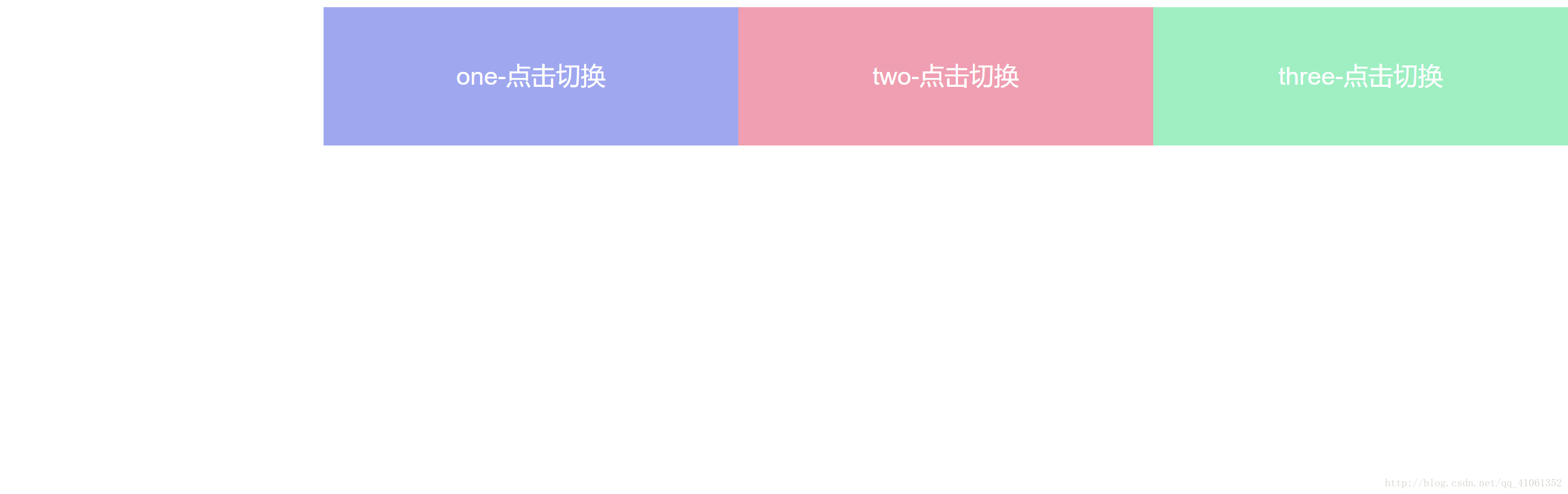
可以看到,多出来的部分也被显示出来了,此时就要给显示窗口设置overflow:hidden;属性,将多出来的部分隐藏起来
CSS代码:
.contain{overflow: hidden;}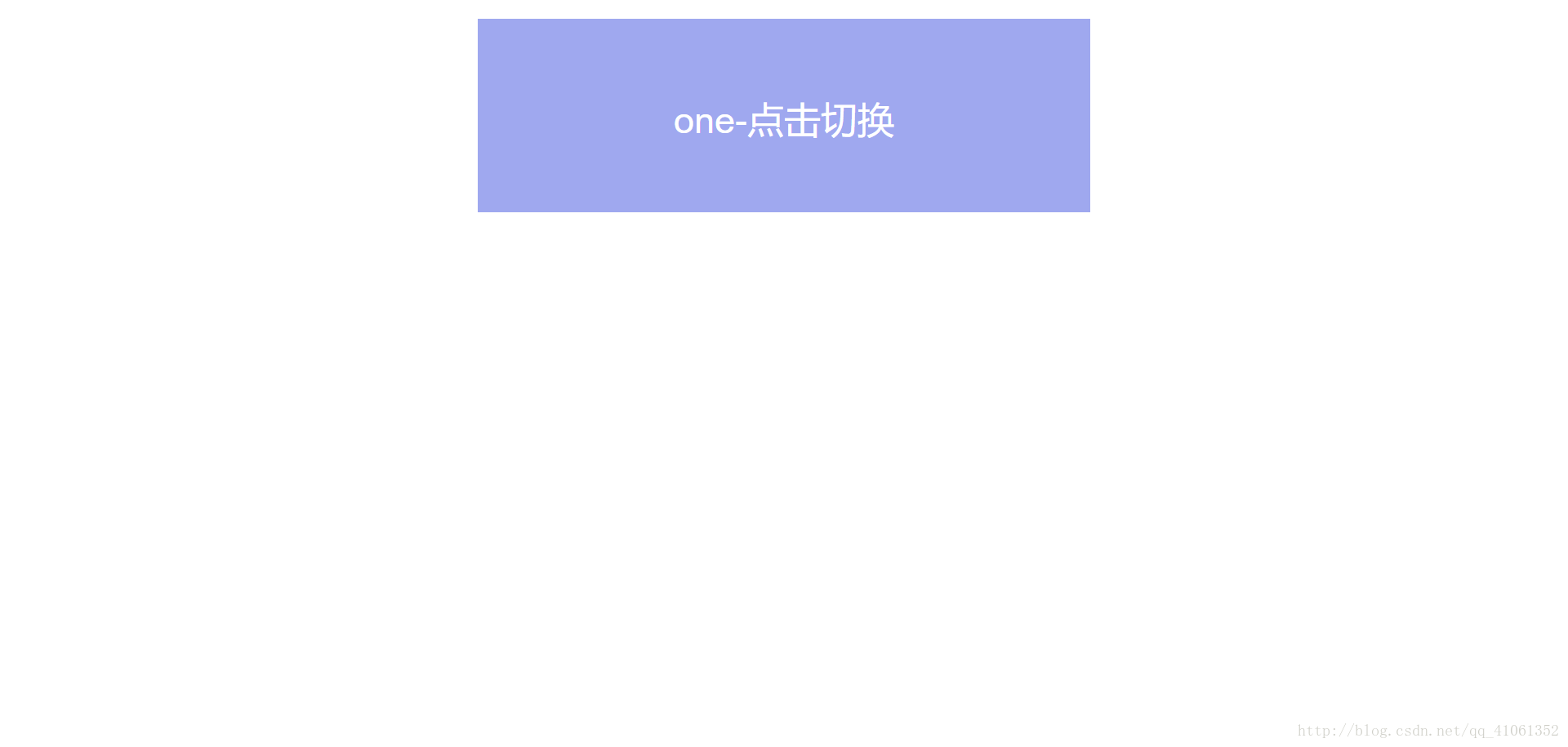
可以看到,多出来的部分全部被隐藏起来了,这样,我们就可以通过修改ul的margin-left属性值实现简单的切换效果。
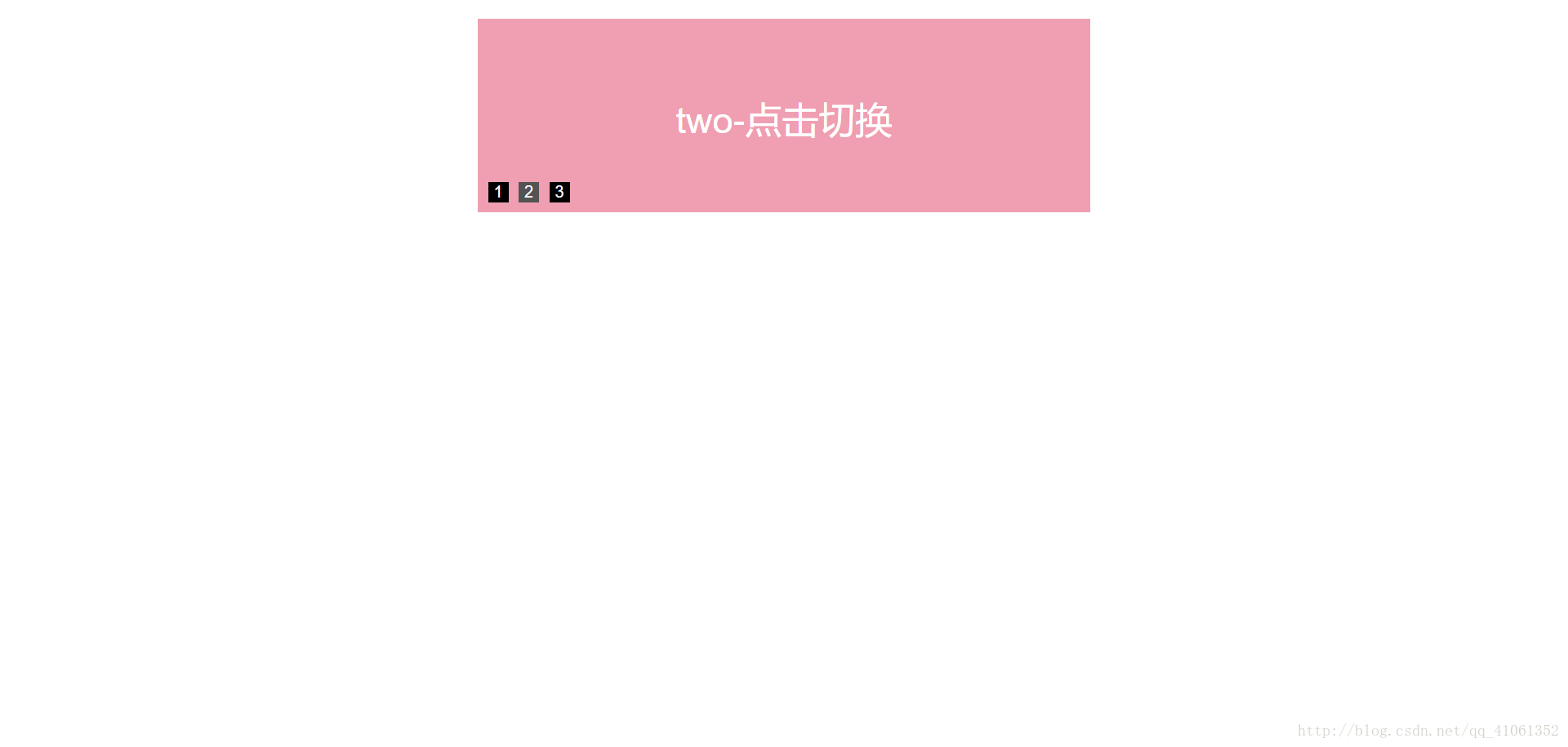
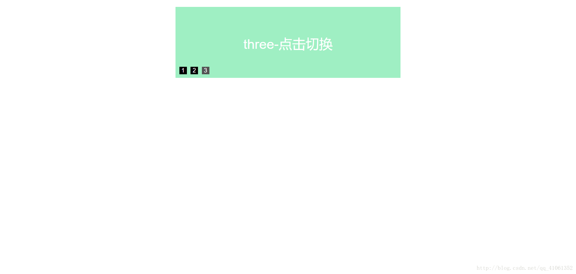
接下来写三个单选框用于切换,因为需要实现点击之后才进行切换的效果,此时将lable指向相应的input标签的id并使用伪类:checked来实现选择切换的效果。
HTML代码:
<div class="contain">
    <input type="radio" name="sildeInput" value="0" id="Input1" hidden>
    <label class="label1" for="Input1">1</label>
    <input type="radio" name="sildeInput" value="1" id="Input2" hidden>
    <label class="label2" for="Input2">2</label>
    <input type="radio" name="sildeInput" value="1" id="Input3" hidden>
    <label class="label3" for="Input3">3</label>
    <ul>
        <li class="sildeInput-1">one-点击切换</li>
        <li class="sildeInput-2">two-点击切换</li>
        <li class="sildeInput-3">three-点击切换</li>
    </ul>
</div>
.label1{
    position: absolute;
    bottom: 10px;
    left: 0px;
     20px;
    height: 20px;
    margin: 0 10px;
    line-height: 20px;
    color: #FFF;
    background: #000;
    cursor: pointer;
}/*用于调整单选框的属性以及位置*/
.label2{
    position: absolute;
    bottom: 10px;
    left: 30px;
     20px;
    height: 20px;
    margin: 0 10px;
    line-height: 20px;
    color: #FFF;
    background: #000;
    cursor: pointer;
}/*用于调整单选框的属性以及位置*/
.label3{
    position: absolute;
    bottom: 10px;
    left: 60px;
     20px;
    height: 20px;
    margin: 0 10px;
    line-height: 20px;
    color: #FFF;
    background: #000;
    cursor: pointer;
}/*用于调整单选框的属性以及位置*/
#Input1:checked~ul{ margin-left: 0;}/*第一张点击切换*/
#Input1:checked~.label1{ background: #535353;}/*点击后改变单选框颜色*/
#Input2:checked~ul{ margin-left: -600px;}/*第二张点击切换*/
#Input2:checked~.label2{ background: #535353;}/*点击后改变单选框颜色*/
#Input3:checked~ul{ margin-left: -1200px;}/*第三张点击切换*/
#Input3:checked~.label3{ background: #535353;}/*点击后改变单选框颜色*/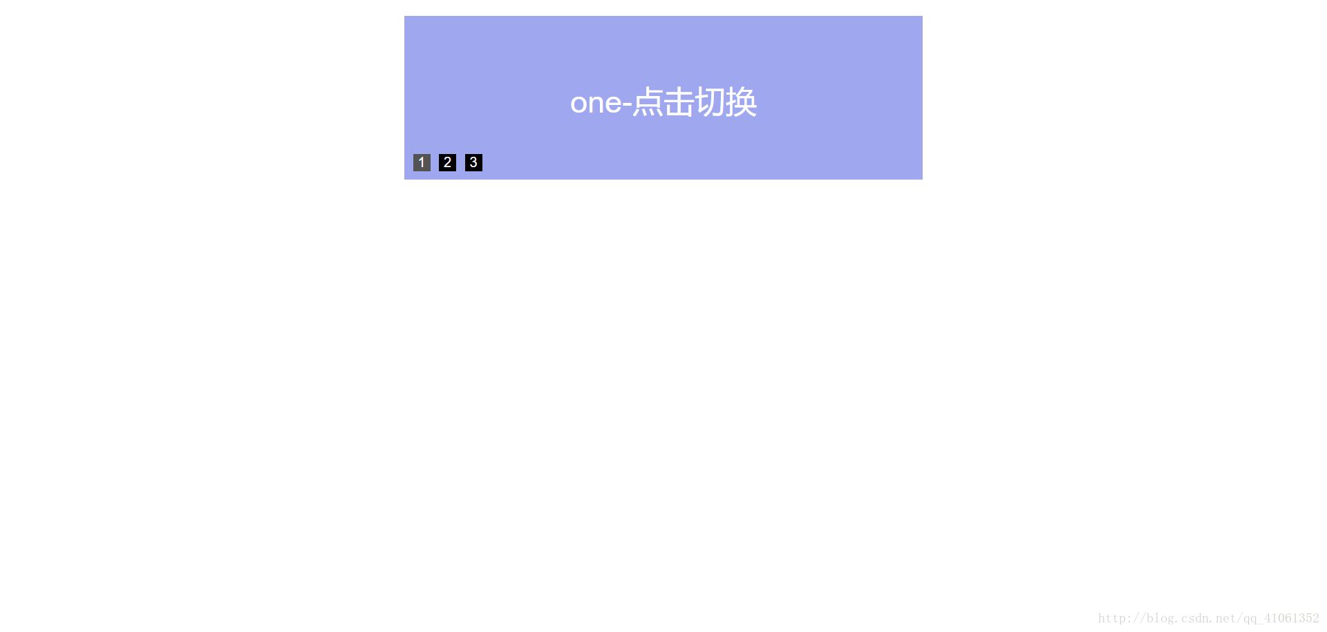
最后,再给ul标签添加transition:all 0.5s;属性,设置0.5秒的平滑过渡
css代码:
.contain ul{transition:all 0.5s;}