一、CSS语法
官网链接:http://www.w3school.com.cn/css
runood链接:http://www.runoob.com/css/css-tutorial.html
博客园链接:https://www.cnblogs.com/madsnotes/articles/5656039.html
一、语法规则
css规则由两个主要的部分组成:选择器,以及一条或多条声明。
'''
        selector {
                  property: value;
                  property: value;
             ...  property: value

          }

'''
例子:
h1 {color:red; font-size:14px;}

二、CSS的四种引入方式
一、行内式
行内式是在标记style属性中设定CSS样式。这种方式没有体现出CSS的优势,不推荐使用。
<p style="background-color: rebeccapurple">hello yuan</p>
二、嵌入式
嵌入式是将CSS样式集中写在网页的<head></head>标签对的<style></style>标签对中。格式如下:
<head>
    <meta charset="UTF-8">
    <title>Title</title>
    <style>
        p{
            background-color: #2b99ff;
        }
    </style>
</head>
三、链接式
将一个.css文件引入到html文件中
<link href="mystyle.css" rel="stylesheet" type="text/css"/>
四、导入式
将一个独立的.css文件引入html文件中,导入式使用CSS引入外部CSS文件,<stytle>标记也是写在<head>标记中,使用的语法如下:
    <style type="text/css">
        @import "css/1.1wzs.css";  /* 此处要注意.css文件的路径*/
    </style>
注意:
导入式会在整个网页装载完后再装载CSS文件。因此这就导致了一个问题:若网页比较大则会出现先显示无样式的页面,闪烁一下之后,再出现网页的样式。这是导入式固有的一个缺陷。
使用链接式时与导入式不同的是它会以网页文件主体装载CSS文件,因此显示出来的网页从一开始就是带样式的效果的,它不会像导入式那样显示无样式的网页,然后再显示有样式的网页,这就是链接式的优点。
三、CSS选择器
一、基本选择器
1、分类如下图
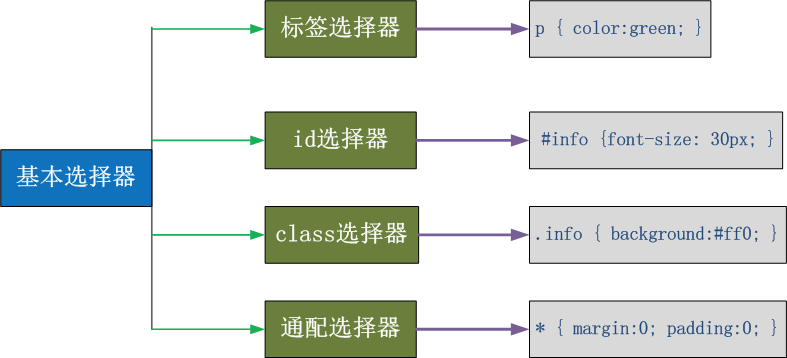
2、应用实例
 1 <!DOCTYPE html>
 2 <html lang="en">
 3 <head>
 4     <meta charset="UTF-8">
 5     <title>基本选择器</title>
 6     <style>
 7         /*1 标签选择器:匹配到文件中所有的这类标签*/
 8         /*p{*/
 9             /*color: red;*/
10         /*}*/
11
12         /*2 id选择器:匹配id相同的标签*/
13         /*#p3{*/
14             /*background-color: darkblue;*/
15         /*}*/
16
17         /*3 class选择器:匹配类名相同的标签*/
18         /*.c1{*/
19             /*font-size: 32px;*/
20         /*}*/
21
22         /*4 *通配选择器:匹配所有的标签(更改完所有的标签都会使用这个样式)*/
23         *{
24             background-color: lightgreen;
25         }
26     </style>
27 </head>
28 <body>
29
30     <p class="c1">p1</p>
31     <p>p2</p>
32     <p id="p3">p3</p>
33     <p class="c1">p4</p>
34 </body>
二、组合选择器
1、选择器分类
E,F   多元素选择器,同时匹配所有E元素或F元素,E和F之间用逗号分隔      :div,p { color:#f00; }
E F   后代元素选择器,匹配所有属于E元素后代的F元素,E和F之间用空格分隔 :li a { font-weight:bold;}
E > F   子元素选择器,匹配所有E元素的子元素F            :div > p { color:#f00; }
E + F   毗邻元素选择器,匹配所有紧随E元素之后的同级元素F  :div + p { color:#f00; }
E ~ F   普通兄弟选择器(以破折号分隔)                 :.div1 ~ p{font-size: 30px; }
注意,关于标签嵌套:
一般,块级元素可以包含内联元素或某些块级元素,但内联元素不能包含块级元素,它只能包含内联元素。需要注意的是:p标签不能包含块级元素。
2、代码实现
!DOCTYPE html>
<html lang="en">
<head>
    <meta charset="UTF-8">
    <title>层级选择器</title>


    <style>
        /*后代选择器*/
        /*.c1 .c3{*/
            /*color: red;*/
        /*}*/

        /*子代选择器 若c1包含c3,则给c1加上如下样式*/
        /*.c1>.c3{*/
            /*background-color: lightgreen;*/
        /*}*/

        /*毗邻选择器*/
        .c1 +p{
            background-color: darkred;
        }

        /*兄弟选择器*/
        /*.c1~p{*/
            /*color: goldenrod;*/
        /*}*/

        /* 与条件选择器 */
        /*span.d1{*/
            /*background-color: palevioletred;*/
        /*}*/

        /*class可以拥有多个值,每个值通过空格隔开*/
        /*.c1{*/
            /*color: rebeccapurple;*/
        /*}*/

        /*.c2{*/
            /*background-color: lightslategrey;*/
        /*}*/

        /*设定多个标签的样式,标签之间用逗号分开*/
        /*div,span{*/
            /*color: red;*/
            /*font-size: 32px;*/
            /*background-color: lightslategrey;*/
            /*font-weight: 300;*/
        /*}*/

    </style>
</head>
<body>
    <div class="c1">
        <p class="c3">p1</p>
        <p>p2</p>
        <div>
            <span class="c3">span</span>
        </div>
    </div>

    <span>span1</span>
    <p class="c3">p2</p>
    <p class="c3">p3</p>
    <hr>

    <!--<span>span2</span>-->
    <!--<div class="d1">DIV</div>-->
    <!--<span class="d1">span3</span>-->
    <!--<hr>-->

    <!--<div CLASS="c1 c2">DIV</div>-->
    <!--<hr>-->

    <!--<div>DIV</div>-->
    <!--<span>span</span>-->
</body>
</html>
三、属性选择器
1、属性选择器分类
E[att]          匹配所有具有att属性的E元素,不考虑它的值。(注意:E在此处可以省略。
                比如“[cheacked]”。以下同。)   p[title] { color:#f00; }

E[att=val]      匹配所有att属性等于“val”的E元素   div[class=”error”] { color:#f00; }

E[att~=val]     匹配所有att属性具有多个空格分隔的值、其中一个值等于“val”的E元素
                td[class~=”name”] { color:#f00; }

E[attr^=val]    匹配属性值以指定值开头的每个元素
                div[class^="test"]{background:#ffff00;}

E[attr$=val]    匹配属性值以指定值结尾的每个元素    div[class$="test"]{background:#ffff00;}

E[attr*=val]    匹配属性值中包含指定值的每个元素    div[class*="test"]{background:#ffff00;}
2、代码实现
<!DOCTYPE html>
<html lang="en">
<head>
    <meta charset="UTF-8">
    <title>属性选择器</title>

    <style>

        /*div[egon]{*/
            /*color: goldenrod;*/
        /*}*/

        /*[egon]{*/
            /*color: red;*/
        /*}*/

        [egon='egg']{
            color: yellowgreen;
        }

        /*[egon*='e']{*/
            /*color: blue;*/
        /*}*/


    </style>
</head>
<body>

    <div egon="egg">egg</div>
    <span egon="egg">egg</span>
    <div egon="alex">eggg</div>
    <div alex="12211">alex</div>
</body>
</html>
四、伪类
1、anchor伪类:专用于控制链接的显示效果
a:link(没有接触过的链接),用于定义了链接的常规状态
a:hover(鼠标放在链接上的状态),用于产生视觉效果
a:visited(访问过的链接),用于阅读文章,能清楚的判断已经访问过的链接。
a:active(在链接上按下鼠标时的状态),用于表现鼠标按下时的链接状态


伪类选择器:伪类指的是标签不同的状态。
            a  ===>点过状态 没有点过状态 鼠标悬浮状态 激活状态

a:link {color: #FF0000} /* 未访问的链接 */
a:visited {color: #00FF00} /* 已访问的链接 */
a:hover {color: #FF00FF} /* 鼠标移动到链接上 */
a:active {color: #0000FF} /* 选定的链接 */ 格式: 标签:伪类名称{ css代码; }
2、before、after伪类
:before    p:before       在每个<p>元素之前插入内容
:after     p:after        在每个<p>元素之后插入内容

例:p:before{content:"hello";color:red;display: block;}
3、代码实践


<!DOCTYPE html>
<html lang="en">
<head>
    <meta charset="UTF-8">
    <title>伪类选择器</title>
    <!--
        a:link(没有接触过的链接),用于定义了链接的常规状态。
        a:hover(鼠标放在链接上的状态),用于产生视觉效果。
        a:visited(访问过的链接),用于阅读文章,能清楚的判断已经访问过的链接。
        a:active(在链接上按下鼠标时的状态),用于表现鼠标按下时的链接状态。
    -->
    <style>
        span{
            color: blue;
            width: 300px;
            height: 300px;
            background-color:lightgreen;
        }
        span:hover{
            color: red;
        }

        .s1,.s2{
            width: 100px;
            height: 100px;
        }
        .s1{
            background-color: greenyellow;
        }

        .s2{
            background-color: darkblue;
        }
        .outer{
            border: 2px solid red;
        }

        .outer:hover .s1{
            background-color: blueviolet;
        }
        .outer:before{
            content: "hello world";
            color: red;
        }

    </style>
</head>
<body>
    <span>hello world</span>

    <hr>
    <div class="outer">
        <div class="s1"></div>
        <div class="s2"></div>
    </div>

</body>
</html>
五、选择器的优先级
1、css的继承
继承是css的一个主要特征,它是依赖祖先—后代的关系的。继承是一种机制,它允许样式不仅可以应用于某个特定的元素,还可以应用于它的后代。例如一个BODY定义了的颜色值也会应用到段落的文本中。
body{color:red;} <p>helloyuan</p>
这段文字都继承了由body{color:red;}样式定义的角色。然而css的继承性的权重还要低的0。
p{color:green}
发现只需要给加个颜色值就能覆盖掉它继承的样式颜色。由此可见:任何显示申明的规则都可以覆盖其继承样式。
此外,继承是css重要的一部分,我们甚至不用去考虑它为什么能够这样,但css继承也是可以有限制的。有些属性不能被继承,如:border,margin,padding,backgroud等。
div{
  border:1px solid #222
}

<div>hello <p>yuan</p> </div>
2、css的优先级
所谓css的优先级,即是指css样式在浏览器中被解析的先后顺序。
样式表中的特殊性描述了不同规则的相对权重,它的基本规则是:
1 内联样式表的权值最高                  style=""------------1000;
2 统计选择符中的ID属性个数。         #id --------------100
3 统计选择符中的CLASS属性个数。   .class -------------10
4 统计选择符中的HTML标签名个数。  p ---------------1
按这些规则将字符串逐位相加,就得到最终的权重,然后在比较取舍时按照从左到右的顺序逐位比较。
1 文内的样式优先级为1,0,0,0,所以始终高于外部定义。
2 有!important声明的规则高于一切。
3 如果!important声明冲突,则比较优先权。
4 如果优先权一样,则按照在源码中出现的顺序决定,后来者居上。
5 由继承而得到的样式没有specificity的计算,它低于一切其它规则(比如全局选择符*定义的规则)。
3、代码实践
<!DOCTYPE html>
<html lang="en">
<head>
    <meta charset="UTF-8">
    <title>选择器优先级</title>
    <!--
1 内联样式表的权值最高                  style=""------------1000;
2 统计选择符中的ID属性个数。         #id --------------100
3 统计选择符中的CLASS属性个数。   .class -------------10
4 统计选择符中的HTML标签名个数。  p ---------------1
    -->

    <style>
        /*1、class选择器*/
        /*.p1{*/
            /*color: lightgreen;*/
        /*}*/
        /*2、id选择区*/
        /*#p1{*/
            /*color: darkblue;*/
        /*}*/

        /*3 标签选择器,所有的这种标签都会发生改变*/
        /*p{*/
            /*color: red;*/
        /*}*/

        /*优先级:按这些规则将数字符串逐位相加,就得到最终的权重,然后在比较取舍时按照从左到右的顺序逐位比较。*/
        /*
        1 文内的样式优先级为1,0,0,0,所以始终高于外部定义。
        2 有!important声明的规则高于一切。
        3 如果!important声明冲突,则比较优先权。
        4 如果优先权一样,则按照在源码中出现的顺序决定,后来者居上。
        5 由继承而得到的样式没有specificity的计算,它低于一切其它规则(比如全局选择符*定义的规则)。
        */
        .c2 p{
            color: red;
        }

        .c1 .c2 .c3 p{
            color: goldenrod;
        }
        .c1 .c2 .c3 .c4{
            color: blue;
        }

        /*.c4{*/
            /*color: greenyellow!important;*/
        /*}*/

        /*y与字体相关的样式:继承*/
        .outer{
            color: green;
        }

        body{
            font-size: 16px;
            color: red;
        }
    </style>

</head>
<body>
    <p class="p1" id="p1">this is p</p>
    <div class="c1">
        <div class="c2">
            <div class="c3">
                <p class="c4" id="p2" style="color: green">p2</p>
            </div>
        </div>
        <p>p3</p>

    </div>

    <hr>
    <div class="outer">
        <p>p4</p>
        <span>span</span>
    </div>
</body>
</html>
四、CSS属性操作
一、css text
1、文本颜色:color
颜色属性被用来设置文字的颜色。
颜色是通过css最经常的指定:
1 十六进制值 - 如: #FF0000
2 一个RGB值 - 如: RGB(255,0,0)
3 颜色的名称 - 如:  red
p { color: rebeccapurple; }
2、水平对齐方式
text-align属性规定元素中的文本水平对齐方式。
1 left      把文本排列到左边。默认值:由浏览器决定。
2 right     把文本排列到右边。
3 center    把文本排列到中间。
4 justify   实现两端对齐文本效果。
3、文本其他属性
 1 line-height: 200px;   文本行高 通俗的讲,文字高度加上文字上下的空白区域的高度 50%:基于字体大小的百分比
 2 vertical-align:-4px  设置元素内容的垂直对齐方式 ,只对行内元素有效,对块级元素无效
 3 text-decoration:none       text-decoration 属性用来设置或删除文本的装饰。主要是用来删除链接的下划线
 4 font-family: 'Lucida Bright'  为段落设置字体
 5 font-weight: lighter/bold/border/   设置段落的字体的粗细
 6 font-style: oblique       设置不同的字体样式
 7 text-indent: 150px;      首行缩进150px
 8 letter-spacing: 10px;  字母间距
 9 word-spacing: 20px;  单词间距
10 text-transform: capitalize/uppercase/lowercase ; 文本转换,用于所有字句变成大写或小写字母,或每个单词的首字母大写
4、代码实践
<!DOCTYPE html>
<html lang="en">
<head>
    <meta charset="UTF-8">
    <title>文本属性操作</title>
    <style>
        p{
            color: #EE4000;
            background-color: green;
            text-align: justify;
            font-weight: 100;
            font-size: 12px;
            font-style: italic;
        }

        a{
            text-decoration: none;
        }

        div{
            color: green;
        }

        .c1{
            width: 200px;
            height: 200px;
            background-color: lightseagreen;
            text-align: center;
        }
        /*轮播图方向键*/
        .btn{
            width: 50px;
            height: 100px;
            background-color: darkgray;
            text-align: center;
            line-height: 100px;
        }
        img{
            vertical-align: -200px;
        }
    </style>
</head>
<body>
    <p>hello world</p>
    <div><a href="https://www.baidu.com/">click</a></div>

    <div class="c1">DIV</div>
    <div class="btn"> > </div>
    <div><img src="你懂得.jpg" width="100" height="80" alt="">靓仔</div>
</body>
</html>
二、背景属性
1、属性介绍
1 background-color     背景颜色
2 background-image     背景图
3 background-repeat    背景平铺
4 background-position  背景的位置
2、分开写和简写两种方式
分开写
background-color: cornflowerblue
background-image: url('1.jpg');
background-repeat: no-repeat;(repeat:平铺满)
background-position: right top(20px 20px);
简写
background:#ffffff url('1.png') no-repeat right top;
3、应用实践
<!DOCTYPE html>
<html lang="en">
<head>
    <meta charset="UTF-8">
    <title>背景属性</title>
    <style>
        .c1{
            border: 1px solid red;
            width: 100%;
            height: 500px;
            /*background-color: darkgray;*/
            /*background-image: url("你懂得.jpg");*/
            /*background-repeat: no-repeat;  !*不平铺,可以根据需求进行设定不同的值*!*/
            /*background-position: center center;*/
            /*简写方式*/
            /*background: no-repeat url("你懂得.jpg") center;*/
        }

        .c2{
            border: 1px solid green;
            width: 40px;
            height: 40px;
            /*找到动物的鼻子*/
            background: no-repeat url("egon.jpg") -198px 95px;
        }

    </style>
</head>
<body>
    <div class="c1"></div>
    <div class="c2"></div>

</body>
</html>
三、边框属性
1、属性介绍
1 border-width
2 border-style (required)
3 border-color
border-style: solid;

border-color: chartreuse;

border- 20px;
2、简写
border: 30px rebeccapurple solid;
3、边框-单独设置各边
1 border-top-style:dotted;
2 border-right-style:solid;
3 border-bottom-style:dotted;
4 border-left-style:none;
4、代码实践
<!DOCTYPE html>
<html lang="en">
<head>
    <meta charset="UTF-8">
    <title>表框属性</title>
    <style>
        .c1{
            width: 300px;
            height: 200px;
            background-color: darkgray;

            /*border- 12px;*/
            /*border-color: red;*/
            /*border-style: dashed;*/
            /**/
            /*border-radius: 80%;*/
            /*border: 1px solid blue;*/
            border-right: 1px solid red;
        }
        ul{
            list-style: none;
            padding: 0;
        }
    </style>
</head>
<body>
    <div class="c1"></div>
    <ul>
        <li>111</li>
        <li>222</li>
        <li>333</li>
    </ul>
</body>
</html>
四、列表属性
1、属性介绍
1 list-style-type        设置列表项标志的类型。
2 list-style-image       将图象设置为列表项标志。
3 list-style-position    设置列表中列表项标志的位置。
4 list-style             简写属性。用于把所有用于列表的属性设置于一个声明中
2、代码实践
在无序列表和有序列表
<!DOCTYPE html>
<html lang="en">
<head>
    <meta charset="UTF-8">
    <title>列表属性</title>
    <style>
        /*无序列表*/
        /*ul.circle{*/
            /*list-style-type: circle;*/
        /*}*/
        /*ul.disc{*/
            /*list-style-type: disc;*/
        /*}*/
        /*ul.square{*/
            /*list-style-type: square;*/
        /*}*/
        /*ul.none{*/
            /*list-style-type: none;*/
        /*}*/
        /*有序列表*/
        /*阿拉伯数字*/
        /*ol.decimal{*/
            /*list-style-type: decimal;*/
        /*}*/
        /*!*小写罗马数字*!*/
        /*ol.lroman{*/
            /*list-style-type: lower-roman;*/
        /*}*/
        /*!*大写罗马数字*!*/
        /*ol.uroman{*/
            /*list-style-type: upper-roman;*/
        /*}*/
        /*!*小写英文字母*!*/
        /*ol.lalpha{*/
            /*list-style-type: lower-alpha;*/
        /*}*/
        /*!*大写英文字母*!*/
        /*ol.ualpha{*/
            /*list-style-type: upper-alpha;*/
        /*}*/

        /*将图像作为列表项标记*/
        ul{
            list-style: square inside url("https://timgsa.baidu.com/timg?image&quality=80&size=b9999_10000&sec=1513139502164&di=1ec88bdaae8bcfeb605abb0af61bd550&imgtype=0&src=http%3A%2F%2Fm.qqzhi.com%2Fupload%2Fimg_0_3378653935D1557642009_23.jpg");
        }

    </style>
</head>
<body>
    <!--<ul class="circle">-->
        <!--<li>咖啡</li>-->
        <!--<li>茶</li>-->
        <!--<li>可口可乐</li>-->
    <!--</ul>-->
    <!--<ul class="disc">-->
        <!--<li>咖啡</li>-->
        <!--<li>茶</li>-->
        <!--<li>可口可乐</li>-->
    <!--</ul>-->
    <!--<ul class="square">-->
        <!--<li>咖啡</li>-->
        <!--<li>茶</li>-->
        <!--<li>可口可乐</li>-->
    <!--</ul>-->
    <!--<ul class="none">-->
        <!--<li>咖啡</li>-->
        <!--<li>茶</li>-->
        <!--<li>可口可乐</li>-->
    <!--</ul>-->

    <hr>
    <!--<ol class="decimal">-->
        <!--<li>咖啡</li>-->
        <!--<li>茶</li>-->
        <!--<li>可口可乐</li>-->
    <!--</ol>-->
    <!--<ol class="lroman">-->
        <!--<li>咖啡</li>-->
        <!--<li>茶</li>-->
        <!--<li>可口可乐</li>-->
    <!--</ol>-->
    <!--<ol class="uroman">-->
        <!--<li>咖啡</li>-->
        <!--<li>茶</li>-->
        <!--<li>可口可乐</li>-->
    <!--</ol>-->
    <!--<ol class="lalpha">-->
        <!--<li>咖啡</li>-->
        <!--<li>茶</li>-->
        <!--<li>可口可乐</li>-->
    <!--</ol>-->
    <!--<ol class="ualpha">-->
        <!--<li>咖啡</li>-->
        <!--<li>茶</li>-->
        <!--<li>可口可乐</li>-->
    <!--</ol>-->

    <hr>
    <ul>
        <li>咖啡</li>
        <li>茶</li>
        <li>可口可乐</li>
    </ul>
    <hr>


</body>
</html>
列表的位置(链接地址:http://www.w3school.com.cn/cssref/pr_list-style-position.asp)
<!DOCTYPE html>
<html lang="en">
<head>
    <meta charset="UTF-8">
    <title>Title</title>
    <style type="text/css">
        ul.inside
        {
        list-style-position: inside
        }

        ul.outside
        {
        list-style-position: outside
        }
    </style>
</head>

<body>
    <p>该列表的 list-style-position 的值是 "inside":</p>
    <ul class="inside">
        <li>Earl Grey Tea - 一种黑颜色的茶</li>
        <li>Jasmine Tea - 一种神奇的“全功能”茶</li>
        <li>Honeybush Tea - 一种令人愉快的果味茶</li>
    </ul>

    <p>该列表的 list-style-position 的值是 "outside":</p>
    <ul class="outside">
        <li>Earl Grey Tea - 一种黑颜色的茶</li>
        <li>Jasmine Tea - 一种神奇的“全功能”茶</li>
        <li>Honeybush Tea - 一种令人愉快的果味茶</li>
    </ul>
</body>
</html>
五、display属性
1、属性介绍
1 none           隐藏某标签
2 block          转换为块级标签
3 inline         转换成内联标签
4 inline-block   具有内联和块级标签的特性
2、none:隐藏某标签
p{display:none;}
注意与visibility:hiden的区别
visibility:hidden可以隐藏某个元素,但隐藏的元素仍需占用与未隐藏之前一样的空间。也就是说,该元素虽然被隐藏了,但仍然会影响布局。

display:none可以隐藏某个元素,且隐藏的元素不会占用任何空间。也就是说,该元素不但被隐藏了,而且该元素原本占用的空间也会从页面布局中消失。
2、block:内联标签设置为块级标签
span {display:block;}
注意:一个内联标签元素设置为display:block是不允许有它内部的嵌套块元素。
3、inline:块级标签设置为内联标签
li {display:inline;}
4、inline-block:具有块级和内联标签的特性
display:inline-block可做列表布局,其中的类似于图片间的间隙小bug可以通过如下设置解决:
#outer{
            border: 3px dashed;
            word-spacing: -5px;
        }
5、代码实现
<!DOCTYPE html>
<html lang="en">
<head>
    <meta charset="UTF-8">
    <title>display</title>
    <style>
        span{
            background-color: blue;
            width: 200px;
            height: 200px;
            /*将标签声明为块级标签*/
            display: block;
        }
        .c1{
            background-color: greenyellow;
            width: 200px;
            height: 200px;
            /*将标签声明为内联标签*/
            /*display: inline;*/
            /*隐藏某标签*/
            display: none;  /*注意两个隐藏的差异*/
            /*visibility: hidden;*/
        }

        /*将标签声明为inline-block标签*/
        .c3,.c4,.c5{
            width: 100px;
            height: 100px;
            display: inline-block;
            margin-left: -6px;
        }
        .c3{
            background-color: #EE4000;
        }
        .c4{
            background-color: greenyellow;
        }
        .c5{
            background-color: darkgray;
        }

    </style>
</head>
<body>
    <span>span</span>
    <div class="c1">DIV1</div>
    <div class="c2">DIV2</div>

    <hr>
    <!--将三个元素放到一行,依次排序-->
    <span class="c3">span3</span>
    <span class="c4">span4</span>
    <span class="c5">span5</span>
</body>
</html>
六、内外边距
1、属性介绍(盒子模型)
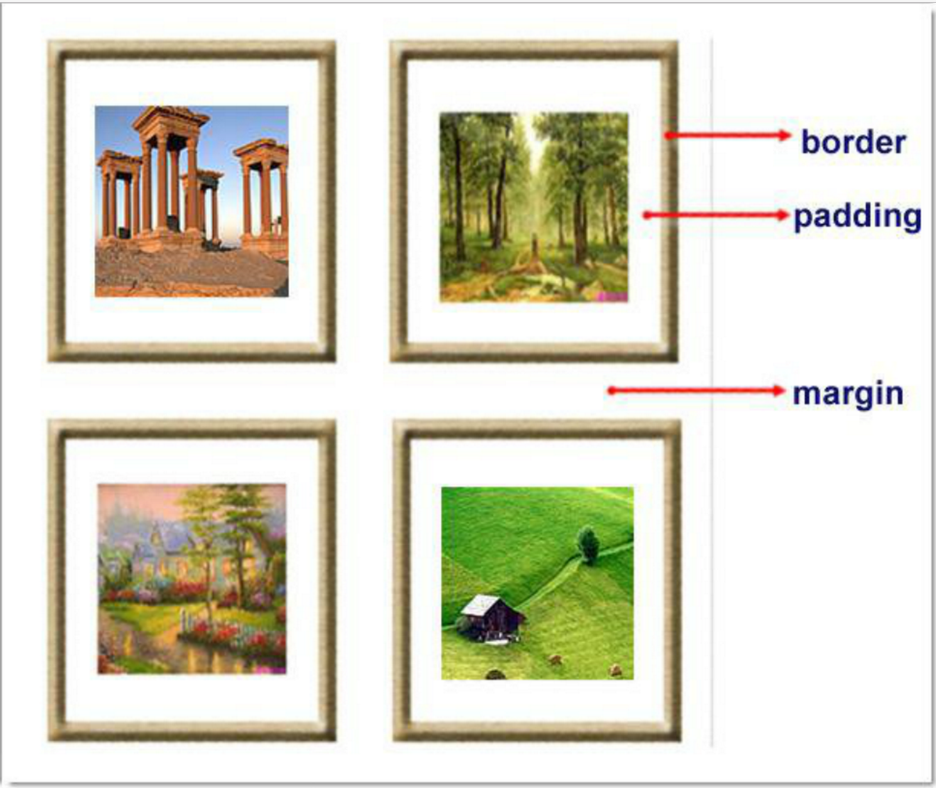
1 margin:            用于控制元素与元素之间的距离;margin的最基本用途就是控制元素周围空间的间隔,从视觉角度上达到相互隔开的目的。
2 padding:           用于控制内容与边框之间的距离;
3 Border(边框):       围绕在内边距和内容外的边框。
4 Content(内容):      盒子的内容,显示文本和图像。
5 margine(外边距)
2、margine:外边距
单边外边距属性
1 margin-top:100px;
2 margin-bottom:100px;
3 margin-right:50px;
4 margin-left:50px;
简写属性
 1 margin:10px 20px 20px 10px;
 2
 3         上边距为10px
 4         右边距为20px
 5         下边距为20px
 6         左边距为10px
 7
 8 margin:10px 20px 10px;
 9
10         上边距为10px
11         左右边距为20px
12         下边距为10px
13
14 margin:10px 20px;
15
16         上下边距为10px
17         左右边距为20px
18
19 margin:25px;
20
21         所有的4个边距都是25px
居中应用
margin: 0 auto;
3、padding:内边距
单独使用填充属性可以改变上下左右的填充。缩写填充属性也可以使用,一旦改变一切都改变。
设置同margine;
页码实例
<!DOCTYPE html>
<html lang="en">
<head>
    <meta charset="UTF-8">
    <title>边距属性</title>
    <style>
        .outer{
            margin: 0 auto;
            width: 80%;

        }

        .content{
            background-color: darkgrey;
            height: 500px;

        }

        a{
            text-decoration: none;
        }

        .page-area{

            text-align: center;
            padding-top: 30px;
            padding-bottom: 30px;
            background-color: #f0ad4e;

        }

        .page-area ul li{
            display: inline-block;
        }


        .page-area ul li a ,.page-area ul li span{

            display: inline-block;
            color: #369;
            height: 25px;
            width: 25px;
            text-align: center;
            line-height: 25px;

            padding: 8px;
            margin-left: 8px;

            border: 1px solid #e1e1e1;
            border-radius: 15%;

        }

        .page-area ul li .page-next{
           width: 70px;
           border-radius:0
        }


        .page-area ul li span.current_page{
           border: none;
           color: black;
           font-weight:900;
        }

        .page-area ul li a:hover{

           color: #fff;
           background-color: #2459a2;
        }


    </style>
</head>
<body>

    <div class="outer">

        <div class="content"></div>

        <div class="page-area">

            <ul>

             <li><span class="current_page">1</span></li>
             <li><a href="#" class="page-a">2</a></li>
             <li><a href="#" class="page-a">3</a></li>
             <li><a href="#" class="page-a">4</a></li>
             <li><a href="#" class="page-a">5</a></li>
             <li><a href="#" class="page-a">6</a></li>
             <li><a href="#" class="page-a">7</a></li>
             <li><a href="#" class="page-a">8</a></li>
             <li><a href="#" class="page-a">9</a></li>
             <li><a href="#" class="page-a">10</a></li>
             <li><a href="#" class="page-a page-next">下一页</a></li>

            </ul>

        </div>

    </div>
</body>
</html>
4、思考
思考一:body的外边距
边框在默认情况下会定位于浏览器窗口的左上角,但是并没有紧贴着浏览器的窗口的边框,这是因为body本身也是一个盒子(外层还有html),在默认情况下, body距离html会有若干像素的margin,具体数值因各个浏览器不尽相同,所以body中的盒子不会紧贴浏览器窗口的边框了,为了验证这一点,加上:
body{
    border: 1px solid;
    background-color: cadetblue;
}
>>>>解决方法:
body{
    margin: 0;
}
思考二:margin collapse(边界塌陷或者说边界重叠)
1、兄弟div:
上面div的margin-bottom和下面div的margin-top会塌陷,也就是会取上下两者margin里最大值作为显示值
2、父子div:
if 父级div中没有border,padding,inlinecontent,子级div的margin会一直向上找,直到找到某个标签包括border,padding,inline content中的其中一个,然后按此div 进行margin;
<!DOCTYPE html>
<html lang="en" style="padding: 0px">
<head>
    <meta charset="UTF-8">
    <title>Title</title>
    <style>

        body{
            margin: 0px;
        }

        .div1{
            background-color: rebeccapurple;
            width: 300px;
            height: 300px;
            overflow: hidden;

        }
        .div2{
            background-color: green;
            width: 100px;
            height: 100px;
            margin-bottom: 40px;
            margin-top: 20px;
        }
        .div3{
            background-color:teal;
            width: 100px;
            height: 100px;
            margin-top: 20px;
        }
    </style>
</head>
<body>
<div style="background-color: bisque; 300px;height: 300px"></div>

<div class="div1">

   <div class="div2"></div>
   <div class="div3"></div>
</div>

</body>

</html>
>>>> 解决方法:
overflow: hidden;
七、float属性
1、基本浮动规则
1、block元素和inline元素在文档流中的排列方式
block元素通常被现实为独立的一块,独占一行,多个block元素会各自新起一行,默认block元素宽度自动填满其父元素宽度。block元素可以设置width、height、margin、padding属性;
inline元素不会独占一行,多个相邻的行内元素会排列在同一行里,直到一行排列不下,才会新换一行,其宽度随元素的内容而变化。inline元素设置width、height属性无效
- 常见的块级元素有 div、form、table、p、pre、h1~h5、dl、ol、ul 等。
- 常见的内联元素有span、a、strong、em、label、input、select、textarea、img、br等
2、文档流介绍
所谓的文档流,指的是元素排版布局过程中,元素会自动从左往右,从上往下的流式排列。
脱离文档流,也就是将元素从普通的布局排版中拿走,其他盒子在定位的时候,会当做脱离文档流的元素不存在而进行定位。
假如某个div元素A是浮动的,如果A元素上一个元素也是浮动的,那么A元素会跟随在上一个元素的后边(如果一行放不下这两个元素,那么A元素会被挤到下一行);如果A元素上一个元素是标准流中的元素,那么A的相对垂直位置不会改变,也就是说A的顶部总是和上一个元素的底部对齐。此外,浮动的框之后的block元素元素会认为这个框不存在,但其中的文本依然会为这个元素让出位置。 浮动的框之后的inline元素,会为这个框空出位置,然后按顺序排列。
3、示例代码
<!DOCTYPE html>
<html lang="en">
<head>
    <meta charset="UTF-8">
    <meta http-equiv="X-UA-Compatible" content="IE=edge">
    <meta name="viewport" content="width=device-width, initial-scale=1">
    <title>Title</title>
    <style>
        *{
            margin: 0;
        }
        .c1,.c2,.c3{

            height: 100px;

        }
        .c1{
            background-color: #EE4000;
            width: 100px;
            float: left;

        }
        .c2{
            background-color: green;
            width: 200px;
            float: left;

        }
        .c3{
            background-color: lightslategrey;
            width: 300px;
            float: right;
        }
    </style>
</head>
<body>

<div class="c1"></div>
<div class="c2"></div>
<div class="c3"></div>


</body>
</html>
2、非完全脱离文档流
左右结构div盒子重叠现象,一般是由于相邻两个div一个使用浮动一个没有使用浮动。一个使用浮动一个没有导致div不是在同个“平面”上,但内容不会造成覆盖现象,只有div形成覆盖现象。
<!DOCTYPE html>
<html lang="en">
<head>
    <meta charset="UTF-8">
    <title>非完全脱离文档流</title>
    <style>
        *{
            margin: 0;
        }
        .r1{
            width: 100px;
            height: 100px;
            background-color: red;
            float: left;
        }

        .r2{
            width: 200px;
            height: 200px;
            background-color: yellow;
        }
    </style>
</head>
<body>
    <div class="r1"></div>
    <div class="r2">region2</div>

</body>
</html>
>>>>解决方法:要么都不使用浮动;要么都使用float浮动;要么对没有使用float浮动的DIV设置margin样式。
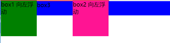
3、父级塌陷现象
<!DOCTYPE html>
<html lang="en">
<head>
    <meta charset="UTF-8">
    <title>父级塌陷现象</title>
    <style>
        *{
            margin: 0;
            padding: 0;
        }
        .container{
            border: 1px solid red;
            width: 300px;
        }

        #box1{
            background-color: green;
            float: left;
            width: 100px;
            height: 100px;
        }

        #box2{
            background-color: deeppink;
            float: right;
            width: 100px;
            height: 100px;
        }
        #box3{
            background-color: blue;
            height: 40px;
        }

    </style>
</head>
<body>

    <div class="container">
        <div id="box1">box1 向左浮动</div>
        <div id="box2">box2 向左浮动</div>
    </div>
    <div id="box3">box3</div>

</body>
</html>
执行结果:如下图
》》》解决办法
1、固定高度
例子如上:container和box3的布局是上下结构,上图发现box3跑到了上面,与.container产生了重叠,但文本内容没有发生覆盖,只有div发生覆盖现象。这个是因为大盒子里的元素使用了浮动,脱离了文档流,导致".container"高度(当然能确定内容多高,这种情况下“.container”是可以设置一个高度即可解决覆盖问题)。或者给.container加一个固定高度的子div。
<div class="container">
                <div id="box1">box1 向左浮动</div>
                <div id="box2">box2 向右浮动</div>
                <div id="empty" style="height: 100px"></div>
</div>
<div id="box3">box3</div>
但是这样限定固定高度会使页面操作不灵活,不推荐!!!
2、清除浮动(推荐)
clear语法:
clear:none | left | right | both
取值
1 none : 默认值。允许两边都可以有浮动对象
2 left : 不允许左边有浮动对象
3 right : 不允许右边有浮动对象
4 both : 不允许有浮动对象
但是需要注意的是:clear属性只会对自身起作用,而不会影响其他元素。
清除浮动
<!DOCTYPE html>
<html lang="en">
<head>
    <meta charset="UTF-8">
    <title>清除浮动</title>
    <style>
        *{
            margin: 0;
        }

        .r1{
            width: 300px;
            height: 100px;
            background-color: red;
        }

        .r2{
            width: 200px;
            height: 200px;
            background-color: yellow;
            float: left;
            clear: left;
        }
        .r3{
            width: 100px;
            height: 200px;
            background-color: green;
            float: left;
        }
    </style>
</head>
<body>
    <div class="r1"></div>
    <div class="r2"></div>
    <div class="r3"></div>
</body>
</html>
执行结果如图
把握两点:
1、元素是从上到下,从左到右依次加载的。
2、clear:left对自身起作用,一旦左边有浮动元素,即切换到下一行来保证左边元素不是浮动的,一句这一点解决父级塌陷问题。
思考:
<!DOCTYPE html>
<html lang="en">
<head>
    <meta charset="UTF-8">
    <title>Title</title>
    <style>
        *{
            margin: 0;
        }

        .r1{
            width: 300px;
            height: 100px;
            background-color: #7A77C8;
            float: left;
        }
        .r2{
            width: 200px;
            height: 200px;
            background-color: wheat;
            float: left;
            clear: both;

        }
        .r3{
            width: 100px;
            height: 200px;
            background-color: darkgreen;
            float: left;
        }
    </style>
</head>
<body>

<div class="r1"></div>
<div class="r2"></div>
<div class="r3"></div>


</body>
</html>
解决父级塌陷问题
'''

    .clearfix:after {             <----在类名为“clearfix”的元素内最后面加入内容;
    content: ".";                 <----内容为“.”就是一个英文的句号而已。也可以不写。
    display: block;               <----加入的这个元素转换为块级元素。
    clear: both;                  <----清除左右两边浮动。
    visibility: hidden;           <----可见度设为隐藏。注意它和display:none;是有区别的。
                                       visibility:hidden;仍然占据空间,只是看不到而已;
    line-height: 0;               <----行高为0;
    height: 0;                    <----高度为0;
    font-size:0;                  <----字体大小为0;
    }

    .clearfix { *zoom:1;}         <----这是针对于IE6的,因为IE6不支持:after伪类,这个神
                                       奇的zoom:1让IE6的元素可以清除浮动来包裹内部元素。


整段代码就相当于在浮动元素后面跟了个宽高为0的空div,然后设定它clear:both来达到清除浮动的效果。
之所以用它,是因为,你不必在html文件中写入大量无意义的空标签,又能清除浮动。
<div class="head clearfix"></div>

'''
3、overflow:hidden
overflow:hidden的含义超出的部门要裁切隐藏,float的元素虽然不在普通流中,但是他是浮动在普通瓶之上的,可以把普通流元素+浮动的流动元素想象成一个立方体。若没有明确设定包含容器高度的情况下,他要计算内容的全部高度才能确定在什么位置hidden,这样浮动元素的高度就要被计算进去,这样包含容器就会被撑开。
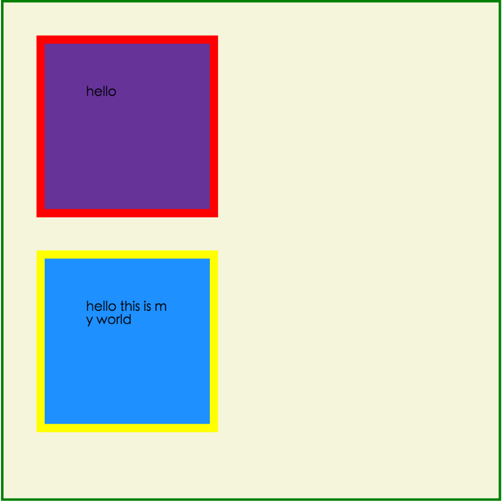
八、position定位
1、static
static 默认值,无定位,不能当作绝对定位的参照物,并且设置标签对象的left、top等值是不起作用的的。
2、postion:relativex相对定位/absolute绝对定位
relative: 相对定位。
相对定位是相对于该元素在文档流中的原始位置,即以自己原始位置为参照物。有趣的是,即使设定了元素的相对定位以及偏移值,元素还占有着原来的位置,即占据文档流空间。对象遵循正常文档流,但将依据top,right,bottom,left等属性在正常文档流中偏移位置。而其层叠通过z-index属性定义。
注意:position:relative的一个主要用法:方便绝对定位元素找到参照物。
absolute: 绝对定位。
定义:设置为绝对定位的元素框从文档流完全删除,并相对于最近的已定位祖先元素定位,如果元素没有已定位的祖先元素,那么它的位置相对于最初的包含块(即body元素)。元素原先在正常文档流中所占的空间会关闭,就好像该元素原来不存在一样。元素定位后生成一个块级框,而不论原来它在正常流中生成何种类型的框。
重点:如果父级设置了position属性,例如position:relative;,那么子元素就会以父级的左上角为原始点进行定位。这样能很好的解决自适应网站的标签偏离问题,即父级为自适应的,那我子元素就设置position:absolute;父元素设置position:relative;,然后Top、Right、Bottom、Left用百分比宽度表示。
另外,对象脱离正常文档流,使用top,right,bottom,left等属性进行绝对定位。而其层叠通过z-index属性定义。
<!DOCTYPE html>
<html lang="en">
<head>
    <meta charset="UTF-8">
    <title>position属性1</title>
    <style>
        *{
            margin: 0;
        }

        .c1,.c2,.c3{
            height: 200px;
            width: 200px;
        }

        .c1{
            background-color: red;
        }

        .c2{
            background-color: yellow;
            /*绝对定位*/
            position: absolute;
            left: 200px;
            top: 200px;
        }
        .c3{
            background-color: green;
        }

        .parent{
            position: relative;
        }

    </style>
</head>
<body>
    <div class="c1"></div>
    <div class="parent">
        <div class="c2"></div>
    </div>
    <div class="c3"></div>
</body>
</html>
总结:参照物用相对定位,子元素用绝对定位,并且保证相对定位参照物不会偏移即可。
3、position:fixed固定在指定的位置
fixed:对象脱离正常文档流,使用top,right,bottom,left等属性以窗口为参考点进行定位,当出现滚动条时,对象不会随着滚动。而其层叠通过z-index属性 定义。 注意点: 一个元素若设置了 position:absolute | fixed; 则该元素就不能设置float。这 是一个常识性的知识点,因为这是两个不同的流,一个是浮动流,另一个是“定位流”。但是 relative 却可以。因为它原本所占的空间仍然占据文档流。
在理论上,被设置为fixed的元素会被定位于浏览器窗口的一个指定坐标,不论窗口是否滚动,它都会固定在这个位置。
写一个返回顶部的功能,将图标固定在屏幕的指定的位置。
<!DOCTYPE html>
<html lang="en">
<head>
    <meta charset="UTF-8">
    <title>position属性</title>
    <style>
        .c1{
            width: 100%;
            height: 2000px;
            background-color: darkgray;
        }

        .btn{
            width: 120px;
            height: 50px;
            background-color: green;
            text-align: center;
            line-height: 50px;
            color: wheat;

            /*位置锁定*/
            position: fixed;
            /*one:右下角*/
            /*right: 20px;*/
            /*bottom: 30px;*/

            /*two:左上角*/
            /*left: 20px;*/
            /*top: 20px;*/

            /*three:页面中央*/
            left: 50%;
            top: 50%;
            margin-left: -25px;
            margin-top: -60px;
        }
    </style>
</head>
<body>
    <div class="c1"></div>
    <div class="btn">返回顶部</div>
</body>
</html>
五、notice
一、默认的高度和宽度问题
1、父子都是块级元素
<!DOCTYPE html>
<html>
<head>
    <title>fortest</title>
    <style>
        div.parent{
            width: 500px;
            height: 300px;
            background: #ccc;
        }
        div.son{
            width: 100%;
            height: 200px;
            background: green;
        }
    </style>
</head>
<body>
    <div class="parent">
        <div class="son"></div>
    </div>
</body>
</html>
这时,子元素设置为了父元素width的100%,那么子元素的宽度也是500px;
但是如果我们把子元素的width去掉之后,就会发现子元素还是等于父元素的width。也就是说,对于块级元素,子元素的宽度默认为父元素的100%。
当我们给子元素添加padding和margin时,可以发现宽度width是父元素的宽度减去子元素的margin值和padding值。
毫无疑问,如果去掉子元素的height,就会发先子元素的高度为0,故height是不会为100%的,一般我们都是通过添加内容(子元素)将父元素撑起来。
2、父:块级元素 子:内联元素
如果内联元素是不可替换元素(除img,input以外的一般元素),元素是没有办法设置宽度的,也就谈不上100%的问题了。 即内联元素必须依靠其内部的内容才能撑开。
如果内联元素是可替换元素(img,input,本身可以设置长和宽),不管怎么设置父元素的宽度和高度,而不设置img的宽和高时,img总是表现为其原始的宽和高。
<!DOCTYPE html>
<html>
<head>
    <title>...</title>
    <style>
        div.parent{
            width: 500px;
            height: 300px;
            background: #ccc;
        }
        img{
            height: 100px;
            background: green;
        }
    </style>
</head>
<body>
    <div class="parent">
        <img class="son" src="s1.jpg"></img>
    </div>
</body>
</html>
由此我们可以发现,虽然没有设置宽度,但是表现在浏览器上为160px,它并没有继承父元素的100%得到500px,而是根据既定的高度来等比例缩小宽度。 同样, 如果只设置width,那么height也会等比例改变。 如果我们把img的width设置为100%,就可以发现其宽度这时就和父元素的宽度一致了。而我们一般的做法时,首先确定img的父元素的宽度和高度,然后再将img的宽度和高度设置位100%,这样,图片就能铺满父元素了。
六、后台管理布局
<!DOCTYPE html>
<html lang="en">
<head>
    <meta charset="UTF-8">
    <title>Title</title>

    <style>

        .pg-header{
           height: 48px;
           width: 100%;
           background-color: #2459a2;
           position: fixed;
           top:0;
           left: 0;
        }
        .left{
            position:absolute;
            left:0;
            top:48px;
            bottom:0;
            width:200px;
            background-color: #ededed;
        }

        .right{
            position:absolute;
            right:0;
            left:200px;
            top:48px;
            bottom:0;
            overflow:auto;

        }
        .content{
            height: 2000px;
            width: 100%;

        }
    </style>
</head>
<body>


<div class="pg-header"></div>
<div>
    <div class="left">

    </div>
    <div class="right">
      <div class="content"></div>
    </div>
</div>

</body>
</html>
七、CSS响应式布局
一、抽屉网导航栏布局
<!DOCTYPE html>
<html lang="en">
<head>
    <meta charset="UTF-8">
    <title>Title</title>
    <style>

        /*======================================初始化=====================*/
            *{
             margin: 0;
             padding: 0;
                  }

            body{
                font-size: 12px;
            }

            a{
              text-decoration: none;
            }

        /*======================================header区域设置=====================*/
        .header{
               height: 44px;
               width: 100%;
               background-color: #2459a2;
               position: fixed;
               top:0;
               left: 0;
        }


        .header_content{
            width: 80%;
            height: 44px;
            background-color: #2459a2;
            margin: 0 auto;
            line-height: 44px;
            position: relative;

        }


/*======header区part1:logo ===========*/


               .logo{

                    float: left;
                    width: 121px;
                    height: 23px;
                    margin-top: 9px;

                }

/*======header区part2:action-menu =====*/

               .action-menu{
                    float: left;
                    margin-left: 30px;
                }

                .action-menu a.tb{
                            color: #c0cddf;
                            padding: 0 10px;
                            text-align: center;
                            margin-left: -3px;
                            display: inline-block;


                        }

                .action-menu a.tb:hover {
                    color: #fff;
                    background-color: lightslategrey;

                }

                 .action-menu a.active, .action-menu a.active:hover {
                                color: #fff;
                                background-color:#204982;;

                            }

/*======header区part3:key-search =====*/

                 .key-search{
                         margin-top: 5px;
                         float: right;
                    }


                 .key-search a.search-icon-box, .search-txt {
                        float: left;
                    }

                .search-txt {

                    color: #333;
                    line-height: 25px;
                    padding: 2px 2px 2px 5px;
                    height: 25px;
                    width: 91px;

                }

                .key-search a.search-icon-box {
                    border: 1px solid #e0e0e0;
                    background-color: #f4f4f4;
                    width: 30px;
                    height: 31px;
                    border-left: 0;
                }


                .key-search a.search-icon-box span.search-icon{
                    background: url("images/icon.png") no-repeat 0 -197px;
                    float: left;
                    height: 12px;
                    width: 11px;
                    margin-left: 10px;
                    margin-top: 9px;
                }

/*======header区part4:action-nav =====*/

                .action-nav {
                       float: right;
                       margin-right: 10px;
                    }

                 .action-nav a {
                        color: white;
                        padding: 14px 18px;

                    }

                .action-nav a:hover{
                    background-color: lightslategrey;
                    color: white;
                }
 /*======================================content区域设置=====================*/

             .content-box {
                    background-color: #ededed;
                    padding-top: 44px;
                    height: 100%;
                }

             .content {
                    width: 960px;
                    margin: 0 auto;
                    height: auto!important;
                    overflow: hidden;
                    min-height: 713px;
                    padding: 6px 28px;
                    background-color: #fff;
                    /*overflow: hidden;取消后看看效果*/
                }

        /*===============================响应式布局=====================*/


         @media(max-1050px) {


          .action-menu a.item{

              display: none;
              background-color: gold;
              border: dashed 1px rebeccapurple;

              color: black;


          }

             .action-menu a.active{

                 padding: 0 25px;

             }

             .action-nav{

                 float: left;

                 margin-left: 80px;

             }

             .key-search{
                 float: right;
                 margin-right: 100px;
             }


          .action-menu:hover a.item{
              display: block;


          }


         }


        @media(max-810px) {

             .key-search{
                 display: none;
             }

            .action-nav{
                display: none;
            }
        }


    </style>
</head>
<body>


    <!--header结构-->
    <div class="header">

         <div class="header_content">

               <div class="logo">
                   <a href="/"><img src="images/logo.png" alt=""></a>
               </div>

               <div class="action-menu">

                        <a href="#" class="tb active">全部</a>
                        <a href="#" class="tb item">42区</a>
                        <a href="#" class="tb item">段子</a>
                        <a href="#" class="tb item">图片</a>
                        <a href="#" class="tb item">挨踢1024</a>
                        <a href="#" class="tb item">你问我答</a>
               </div>

               <div class="key-search">

                    <form action="/" method="post">
                        <input type="text" class="search-txt">

                        <a href="#" class="search-icon-box" >
                            <span class="search-icon"></span>
                        </a>
                    </form>

               </div>

               <div class="action-nav">

                    <a href="#" class="register-btn">注册</a>
                    <a href="#" class="login-btn">登录</a>
               </div>

         </div>
    </div>


    <!--content结构-->

    <div class="content-box">

        <div class="content">


        </div>

    </div>


</body>
</html>
二、cs补充内容
1、css实现图形尖角
实现方法:将想显示的东西设置成想要的颜色,不想显示的东西设置为
<!DOCTYPE html>
<html lang="en">
<head>
    <meta charset="UTF-8">
    <title>尖角</title>
    <style>
        .icona {
            display: inline-block;
            border-top: 50px solid red;
            border-right: 50px solid red;
            border-bottom: 50px solid red;
            border-left: 50px solid red;
        }
        .iconb{
            display: inline-block;
            border-top: 50px solid red;
            border-right: 50px solid green;
            border-bottom: 50px solid black;
            border-left: 50px solid yellow;
        }
        .iconc{
            display: inline-block;
            border-top: 50px solid red;
            border-right: 50px solid white;
            border-bottom: 50px solid white;
            border-left: 50px solid white;
        }
        .icond{
            display: inline-block;
            border-top: 50px solid white;
            border-right: 50px solid red;
            border-bottom: 50px solid white;
            border-left: 50px solid white;
        }
        .icone{
            display: inline-block;
            border-top: 50px solid white;
            border-right: 50px solid white;
            border-bottom: 50px solid red;
            border-left: 50px solid white;
        }
        .iconf{
            display: inline-block;
            border-top: 50px solid white;
            border-right: 50px solid white;
            border-bottom: 50px solid white;
            border-left: 50px solid red;
        }
    </style>
</head>
<body>
    <div class="icona"></div>
    <div class="iconb"></div>
    <div class="iconc"></div>
    <div class="icond"></div>
    <div class="icone"></div>
    <div class="iconf"></div>
</body>
</html>
效果如图:

2、消除浮动
<!DOCTYPE html>
<html lang="en">
<head>
    <meta charset="UTF-8">
    <title>消除浮动</title>
    <style>
        .left{
            float: left;
        }

        .clearfix:after{
            content: ".";
            clear: both;
            display: block;
            visibility: hidden;
            height: 0;
        }
    </style>
</head>
<body>
    <div style="background-color: red" class="clearfix">
        <div class="left" style="height: 100px;background-color: green">1</div>
        <div class="left">2</div>
    </div>
</body>
</html>
效果如图:

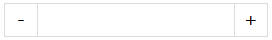
3、购物数量选择效果
<!DOCTYPE html>
<html lang="en">
<head>
    <meta charset="UTF-8">
    <title>购物数量选择</title>
    <style>
        .inp{
            border: 0;
            border-left: 1px solid #dddddd;
            border-right: 1px solid #dddddd;
            height: 25px;
            margin: 0;
            padding: 0;
            float: left;
        }

        .sp{
            display: inline-block;
            height: 25px;
            width: 25px;
            text-align: center;
            line-height: 25px;
            float: left;
        }
    </style>
</head>
<body>
    <div style="border: 1px solid #dddddd;display: inline-block;">
        <div class="sp">-</div>
        <input class="inp" type="text">
        <div class="sp">+</div>
    </div>
</body>
</html>
效果如图:
4、调整css样式应用优先级
<!DOCTYPE html>
<html lang="en">
<head>
    <meta charset="UTF-8">
    <title>调整css样式应用优先级</title>
    <style>
        .hide{
            display: none !important;
        }
        .c1{
            color: red !important;
        }
        .c2{
            color: green;
        }
    </style>
</head>
<body>
    <div class="c1 c2">测试文本</div>
</body>
</html>
注意:默认显示为绿色,但是由于c1样式添加了特殊设置,顾显示为红色。!important级别最高。(有这个,不比较其他的)
5、类似Excel冻结首航效果
<!DOCTYPE html>
<html lang="en">
<head>
    <meta charset="UTF-8">
    <title>冻结首行</title>
    <style>
        .pg-header{
            position: fixed;
            top: 0;
            left: 0;
            right: 0;
            height: 48px;
            background-color: #2459a2;
        }
        .pg-body{
            height: 2000px;
            margin-top: 48px;
        }
    </style>
</head>
<body>
    <div class="pg-header">one</div>
    <div class="pg-body">two</div>
</body>
</html>