一、Flex布局实现头尾固定、中间内容自适应
头尾固定,中间区域可以滑动效果是移动端最常见的效果,以京东页面为例。以前开发时常用的方法是用固定布局position:fixed;实现,但是该方法在ios上或者其他机型上会出现问题。现在,可以用flex方法快速实现该布局。

<div class="wrap">
       <div class="header">头部</div>
       <div class="content">中间内容区域</div>
       <div class="footer">尾部</div>
</div>
html,body{
    height: 100%;    /* 很重要 */
}
.wrap{
    width: 100%;
    height: 100%;     /* 很重要 */
    display: flex;
    flex-direction: column;
    font-size: 16px;
}
.header{
    background: aquamarine;
    height: 60px;
}
.content{
    flex: 1;    /* 很重要 */
    overflow-y:auto; /* 很重要,否则当该内容超过一屏时,尾部区域不会固定 */
    background: #4CAF50;
}
.footer{
    background: tan;
    height: 40px;
}

/* 让内容居中显示 */
.header,.content,.footer{
    display: flex;
    align-items: center;
    justify-content: center;
}
运行效果:

说明:css样式中,一定要设置html,body以及最外层包裹容器的高度为100%,同时中间内容区域的样式一定要添加flex:1;以及overflow-y:auto;
二、flex布局最后一行列表左对齐的N种方法
1、如果每一行列数是固定的
如果每一行列数是固定的,则下面两种方法可以实现最后一行左对齐。
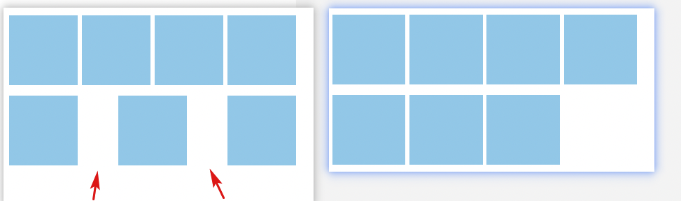
方法一:模拟space-between和间隙
也就是我们不使用justify-content:space-between声明在模拟两端对齐效果。中间的gap间隙我们使用margin进行控制。
例如:
.container {
    display: flex;
    flex-wrap: wrap;
}
.list {
    width: 24%; height: 100px;
    background-color: skyblue;
    margin-top: 15px;
}
.list:not(:nth-child(4n)) {
    margin-right: calc(4% / 3);
}
此时,布局效果是这样的:
方法二:根据个数最后一个元素动态margin
由于每一列的数目都是固定的,因此,我们可以计算出不同个数列表应当多大的margin值才能保证完全左对齐。
例如,假设每行4个元素,结果最后一行只有3个元素,则最后一个元素的margin-right大小是“列表宽度+间隙大小”的话,那最后3个元素也是可以完美左对齐的。
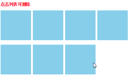
然后,借助树结构伪类数量匹配技术(这篇文章“伪类匹配列表数目实现微信群头像CSS布局的技巧”中的布局技巧就是借助这种技术实现),我们可以知道最后一行有几个元素。
例如:
.list:last-child:nth-child(4n - 1)说明最后一行,要么3个元素,要么7个元素……
.list:last-child:nth-child(4n - 2)说明最后一行,要么2个元素,要么6个元素……
在本例中,一行就4个元素,因此,我们可以有如下CSS设置:
.container {
    display: flex;
    /* 两端对齐 */
    justify-content: space-between;
    flex-wrap: wrap;
}
.list {
    width: 24%; height: 100px;
    background-color: skyblue;
    margin-top: 15px;
}
/* 如果最后一行是3个元素 */
.list:last-child:nth-child(4n - 1) {
    margin-right: calc(24% + 4% / 3);
}
/* 如果最后一行是2个元素 */
.list:last-child:nth-child(4n - 2) {
    margin-right: calc(48% + 8% / 3);
}
效果如下GIF示意,删除列表后,布局依然稳稳地左对齐。
2、如果每一子项宽度不固定
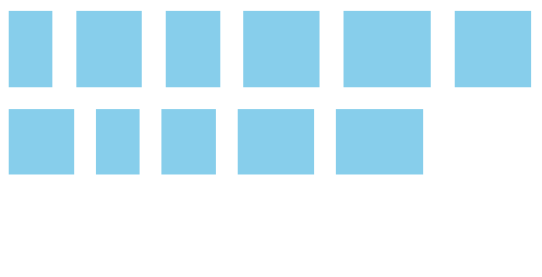
有时候,每一个flex子项的宽度都是不固定的,这个时候希望最后一行左对齐该如何实现呢?
由于此时间隙的大小不固定,对齐不严格,因此,我们可以直接让最后一行左对齐即可。具体方法有两个:
方法一:最后一项margin-right:auto
CSS代码如下:
.container {
    display: flex;
    justify-content: space-between;
    flex-wrap: wrap;
}
.list {
    background-color: skyblue;
    margin: 10px;
}
/* 最后一项margin-right:auto */
.list:last-child {
    margin-right: auto;
}
方法二:创建伪元素并设置flex:auto或flex:1
.container {
    display: flex;
    justify-content: space-between;
    flex-wrap: wrap;
}
.list {
    background-color: skyblue;
    margin: 10px;
}
/* 使用伪元素辅助左对齐 */
.container::after {
    content: '';
    flex: auto;    /* 或者flex: 1 */
}
参考:https://www.zhangxinxu.com/wordpress/2019/08/css-flex-last-align/