这里不做flex的详细介绍,学习flex请转flex布局语法教程。
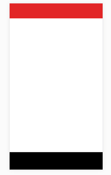
要实现的效果:
因为在移动端使用fixed(固定定位)定位footer时,存在抖动问题(fixed在移动端的坑),所以这里使用flex来代替fixed使footer始终在底部位置。
flex属性简单介绍:
设置在容器上的属性:
flex-direction:row | row-reverse | column | column-reverse;决定主轴方向
flex-wrap:nowrap | wrap | wrap-reverse;是否换行
flex-flow:row nowrap; flex-direction和flex-wrap的简写形式
justify-content:flex-start | flex-end | center | space-between | space-around;在主轴方向上的对齐方式
align-items:flex-start | flex-end | center | baseline | stretch;在交叉轴方向上的对齐方式
align-content:flex-start | flex-end | center | soace-between | space-around | stretch;多根轴线的对齐方式,单轴无效;
设置在项目上的属性:
order: 排序,数值越小,排列越靠前,默认为0;
flex-grow:定义项目的放大比例,默认为0 ,即如果存在剩余空间,也不放大。
flex-shrink:定义项目的放大比例,默认为1 ,即如果空间不足,也缩小。
flex-basis: 定义了在分配多余空间之前,项目占据的主轴空间(main size)。浏览器根据这个属性,计算主轴是否有多余空间。它的默认值为auto,即项目的本来小。
flex: flex属性是flex-grow, flex-shrink 和 flex-basis的简写,默认值为0 1 auto。后两个属性可选。该属性有两个快捷值:auto (1 1 auto) 和 none (0 0 auto)。
align-self: align-self属性允许单个项目有与其他项目不一样的对齐方式,可覆盖align-items属性。默认值为auto,表示继承父元素的align-items属性,如果没有父元素等同于stretch。
思路:
1、先让body,html的高度是屏幕的高度。
2、body作为容器,主轴设置为column;
3、header、footer高度固定,flex-grow:0;(放大比例设置为0)
4、中间容器flex-grow:1;(放大比例设置为1,存在剩余空间放大,把页面撑开)
代码:
<!DOCTYPE html>
<html lang="en">
<head>
    <meta charset="UTF-8">
    <meta name="viewport" content="width=device-width,height=device-height,initial-scale=1.0, minimum-scale=1.0, maximum-scale=1.0, user-scalable=no">
    <title>flex布局</title>
</head>
<style type="text/css">
    body,html,header,section,footer,div{
        margin:0;
        padding:0;
    }
    body,html{
        width:100%;
        height:100%;
    }
    body{
        display:flex;
        flex-flow:column nowrap;
    }
    header{
        width:100%;
        height:60px;
        background:#cc3333;
        flex:0 0 auto;
    }
    .mainContainer{
        width:100%;
        flex:1 0 auto;
    }
    footer{
        width:100%;
        height:70px;
        background:#000;
        flex:0 0 auto;
    }
</style>
<body>
    <!-- 头部 -->
    <header></header>
    <!-- 内容容器 -->
    <section class="mainContainer"></section>
    <!-- 底部 -->
    <footer></footer>
</body>
</html>