原文链接
基本知识
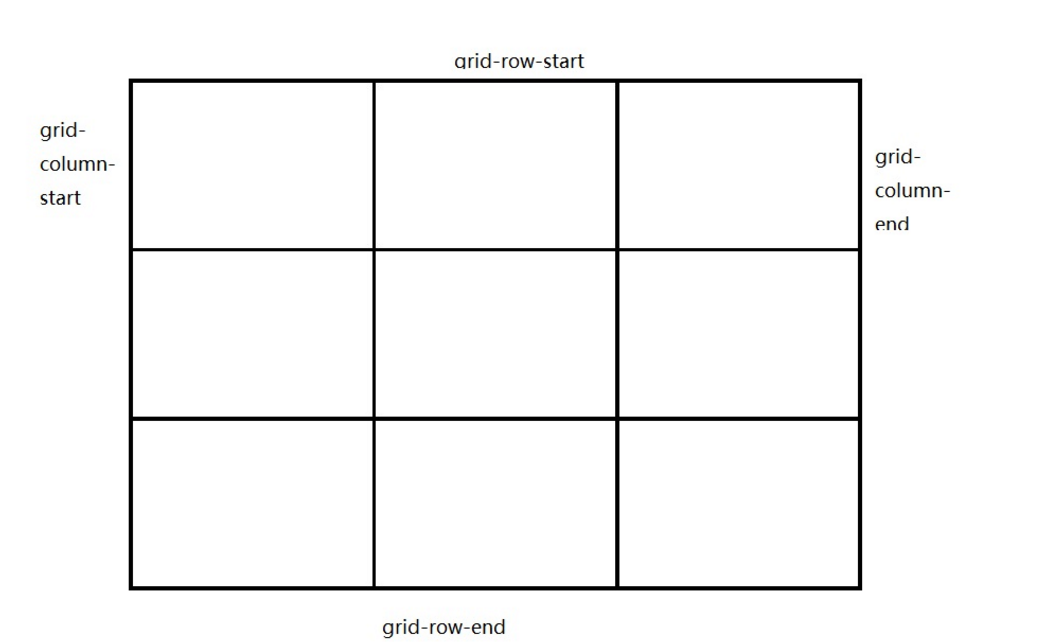
CSS grid 布局有两个核心组成部分:wrapper(网格容器,父元素)和items(网格项,子元素)。
基本属性
| 属性 | 含义 |
|---|---|
| display: grid | 网格布局(父元素设置) |
| grid-template-columns: 10px 10rem 10%; | 将列分为3份 |
| grid-template-rows: 10px 10rem 10%; | 将行分为3份 |
| grid-column-start: 1;grid-column-end: 4; | 盒子开始于第一条列线,结束于第四条列线 |
| grid-column: 1 / 4; | 以上的简写形式 |
| grid-row-start: 1;grid-row-end: 3; | 盒子开始于第一条行线,结束于第三条行线 |
| grid-row: 1 / 4; | 以上的代码简写 |
小案例
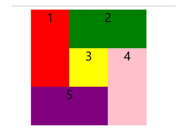
  <div class="wrapper">
    <div class="item1">1</div>
    <div class="item2">2</div>
    <div class="item3">3</div>
    <div class="item4">4</div>
    <div class="item5">5</div>
  </div>
.wrapper {
  width: 300px;
  height: 300px;
  background-color: #ddd;
  text-align: center;
  font-size: 30px;
  margin: 0 auto;
  /* 网格布局 */
  display: grid;
  /* 现在是3*3的网格 */
  /* 将行分为3份 */
  grid-template-columns: 33.3% 33.3% 33.3%;
  /* 将列分为2份,不够或者多出都可以 */
  grid-template-rows: 33.3% 33.3% 33.3%;
}

.item1 {
  /* 开始于第一条行网格线,结束于第四条行网格线 */
  grid-row-start: 1;
  grid-row-end: 3;
  background-color: red;
}
.item2 {
  /* 简写:开始于第一条行网格线,结束于第三条行网格线 */
  grid-column: 2/4;
  background-color: green;
}
.item3 {
  background-color: yellow;
}
.item4 {
  grid-row: 2/4;
  grid-column: 3/4;
  background-color: pink;
}
.item5 {
  grid-row: 3/4;
  grid-column: 1/3;
  background-color: purple;
}
基本属性
| 属性 | 含义 |
|---|---|
| grid-template-columns: repeat(n, 1fr); | 将网格分为n列,1fr表示n分之一份 父元素 |
| grid-template-rows: 50px 400px 50px; | 分为3行,每一行的高度为50px 400px 50px。 父元素 |
| grid-template-areas: | 每一个网格项,你可以使用任意名称。“ . ”代表空白网格项。 父元素 |
| grid-area: | 网格区域(Grid Area)。 子元素 |
小案例
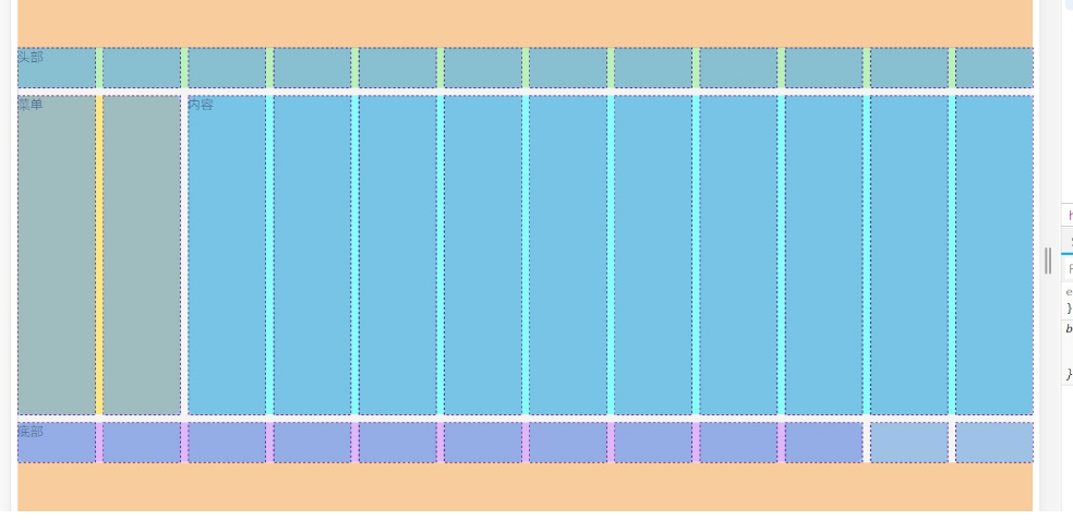
  <div class="wrapper">
    <div class="header">头部</div>
    <div class="menu">菜单</div>
    <div class="content">内容</div>
    <div class="footer">底部</div>
  </div>
.wrapper {
  margin: 100px auto;
  width: 600px;
  background-color: #f5f5f5;
  display: grid;
  /* 分为12列,每一列为1fr */
  grid-template-columns: repeat(12, 1fr);
  grid-template-rows: 50px 400px 50px;
  /* 12 * 3 = 36 个网页项 .为空白网格项*/
  grid-template-areas:
    "h h h h h h h h h h h h"
    "m m c c c c c c c c c c"
    "f f f f f f f f f f . .";
  /* 网格边距 10px */
  grid-gap: 10px;
}

.wrapper .header {
  border-radius: 10px;
  background-color: #bbf1bb;
  /* 占据 名称为 h 的网格项 */
  grid-area: h;
}

.wrapper .menu {
  border-radius: 10px;
  background-color: #fde886;
  /* 占据 名称为 m 的网格项 */
  grid-area: m;
}

.wrapper .content {
  border-radius: 10px;
  background-color: #8afcf9;
  /* 占据 名称为 c 的网格项 */
  grid-area: c;
}

.wrapper .footer {
  border-radius: 10px;
  background-color: #dfb8f8;
  /* 占据 名称为 f 的网格项 */
  grid-area: f;
}
还有一种书写方式实现该布局:
.wrapper {
  margin: 100px auto;
  background-color: #f5f5f5;
  display: grid;
  /* 分为12列,每一列为1fr */
  grid-template-columns: repeat(12, 1fr);
  grid-template-rows: 50px 400px 50px;
  /* 网格边距 10px */
  grid-gap: 10px;
}

.wrapper .header {
  border-radius: 10px;
  background-color: #bbf1bb;
  /* 占据 名称为 h 的网格项 */
  grid-area: 1/1/2/13;
}

.wrapper .menu {
  border-radius: 10px;
  background-color: #fde886;
  /* 占据 名称为 m 的网格项 */
  grid-area: 2/1/3/3;
}

.wrapper .content {
  border-radius: 10px;
  background-color: #8afcf9;
  /* 占据 名称为 c 的网格项 */
  grid-area: 2/3/3/13;
}

.wrapper .footer {
  border-radius: 10px;
  background-color: #dfb8f8;
  /* 占据 名称为 f 的网格项 */
  grid-area: 3/1/4/11;
}

/* 屏幕像素小于等于1000px时 */
@media screen and (max- 1000px) {
  .wrapper {
  grid-template-areas:
  "m m m m m m h h h h h h"
  "c c c c c c c c c c c c"
  "f f f f f f f f f f f f";
  }
}
