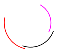
<!doctype html>
<html>
<head>
<meta charset="utf-8">
<title>CSS 加载动画</title>

<style>
body {
  background-color: #fff;
}
#demo {
    position: fixed;
    top: 0;
    left: 0;
    width: 100%;
    height: 100%;
}
#loading {
    display: block;
    position: relative;
    left: 50%;
    top: 50%;
    width: 200px;
    height: 200px;
    margin: -90px 0 0 -90px;
    border-radius: 50%;
    border: 3px solid transparent;
    border-top-color: red;
    -webkit-animation: spin 2s linear infinite;
    animation: spin 2s linear infinite;
}
#loading:before {
    content: "";
    position: absolute;
    top: 5px;
    left: 5px;
    right: 5px;
    bottom: 5px;
    border-radius: 50%;
    border: 3px solid transparent;
    border-top-color: #000;
    -webkit-animation: spin 3s linear infinite;
    animation: spin 3s linear infinite;
}
#loading:after {
    content: "";
    position: absolute;
    top: 20px;
    left: 20px;
    right: 20px;
    bottom: 20px;
    border-radius: 50%;
    border: 3px solid transparent;
    border-top-color: #FF00FF;
    -webkit-animation: spin 1.5s linear infinite;
    animation: spin 1.5s linear infinite;
}
@-webkit-keyframes spin {
    0%   {
        -webkit-transform: rotate(0deg);
        -ms-transform: rotate(0deg);
        transform: rotate(0deg);
    }
    100% {
        -webkit-transform: rotate(360deg);
        -ms-transform: rotate(360deg);
        transform: rotate(360deg);
    }
}
@keyframes spin {
    0%   {
        -webkit-transform: rotate(0deg);
        -ms-transform: rotate(0deg);
        transform: rotate(0deg);
    }
    100% {
        -webkit-transform: rotate(360deg);
        -ms-transform: rotate(360deg);
        transform: rotate(360deg);
    }
}
</style>

</head>
<body>

<div id="demo">
  <div id="loading"></div>
</div>

</body>
</html>
效果图: