一、Flexbox背景
Flexbox布局(弹性盒模型)模块的目的在于提供一种更有效的方法在容器中的项之间布局、对齐和分配空间,即使它们的大小未知或是动态的(因此使用“flex一词)。
二、Flexbox术语
- 伸缩容器:一个设有“display:flex”或“display:inline-flex”的元素
- 伸缩项目:伸缩容器的子元素
- 主轴、主轴方向:用户代理沿着一个伸缩容器的主轴配置伸缩项目,主轴是主轴方向的延伸。
- 主轴起点、主轴终点:伸缩项目的配置从容器的主轴起点边开始,往主轴终点边结束。
- 主轴长度、主轴长度属性:伸缩项目的在主轴方向的宽度或高度就是项目的主轴长度,伸缩项目的主轴长度属性是width或height属性,由哪一个对着主轴方向决定。
- 侧轴、侧轴方向:与主轴垂直的轴称作侧轴,是侧轴方向的延伸。
- 侧轴起点、侧轴终点:填满项目的伸缩行的配置从容器的侧轴起点边开始,往侧轴终点边结束。
- 侧轴长度、侧轴长度属性:伸缩项目的在侧轴方向的宽度或高度就是项目的侧轴长度,伸缩项目的侧轴长度属性是「width」或「height」属性,由哪一个对着侧轴方向决定。
下图是一个row伸缩容器中各种方向与大小术语的示意图:

上图以及术语介绍来自于:http://www.w3.org/html/ig/zh/wiki/Css3-flexbox/zh-hans
三、Flexbox属性和示例
普通示例:


<!DOCTYPE html>
<html>
    <head>
        <meta charset="UTF-8">
        <title>Flexbox布局</title>
        <style type="text/css">
            div{
                width: 100px;
                height: 100px;
                background-color: red;
                margin: 10px;
            }
        </style>
    </head>
    <body>
        <div></div>
        <div></div>
        <div></div>
    </body>
</html>
效果图:
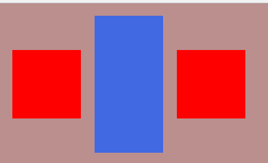
1、display: flex:指定某元素使用 Flexbox 布局。
<!DOCTYPE html>
<html>
    <head>
        <meta charset="UTF-8">
        <title>Flexbox布局</title>
        <style type="text/css">
            body{
                display: flex;
                background-color: rosybrown;
            }
            div{
                width: 100px;
                height: 100px;
                background-color: red;
                margin: 10px;
            }
        </style>
    </head>
    <body>
        <div></div>
        <div></div>
        <div></div>
    </body>
</html>
效果图:

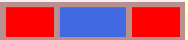
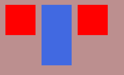
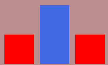
2、flex-grow:1;【默认为0】
说明:容器中剩余的空间将平均分配给所有子元素。如果其中一个子元素的值为2,那么剩余的空间将会占用两倍于其他元素的空间;
<!DOCTYPE html>
<html>
    <head>
        <meta charset="UTF-8">
        <title>Flexbox布局</title>
        <style type="text/css">
            body{
                display: flex;
                background-color: rosybrown;
            }
            div{
                width: 100px;
                height: 100px;
                background-color: red;
                margin: 10px;
                flex-grow: 1;
            }
            div:nth-child(2){
                background-color: royalblue;
                flex-grow: 2;
            }
        </style>
    </head>
    <body>
        <div></div>
        <div></div>
        <div></div>
    </body>
</html>
效果图:
小窗口:
大窗口:

3、align-self 属性定义flex子项单独在侧轴(纵轴)方向上的对齐方式。
值:
1、flex-start:顶边对齐,高度不拉伸
2、flex-end :底边对齐,高度不拉伸
3、center :居中,高度不拉伸
4、stretch :默认值,高度自动拉伸
使用flex-start:顶部对齐,高度不拉伸效果图:
使用flex-end:底边对齐,高度不拉伸效果图:
使用cente:居中,高度不拉伸效果图:
4、align-items 属性定义flex子项在flex容器的当前行的侧轴(纵轴)方向上的对齐方式。
效果和 align-self 一样,只是这个是写在父元素上的:
例:
<!DOCTYPE html>
<html>
    <head>
        <meta charset="UTF-8">
        <title>Flexbox布局</title>
        <style type="text/css">
            body{
                display: flex;
                background-color: rosybrown;
                align-items:center;
            }
            div{
                width: 100px;
                height: 100px;
                background-color: red;
                margin: 10px;
            }
            div:nth-child(2){
                background-color: royalblue;
                height: 200px;
            }
        </style>
    </head>
    <body>
        <div></div>
        <div></div>
        <div></div>
    </body>
</html>
效果图:

5、flex-direction 属性规定灵活项目的方向
值:
1、row(默认) :从左到右;
2、row-reverse :是从右到左
3、column :从上到下
4、column-reverse:从下到上
row :从左到右效果图:

<!DOCTYPE html>
<html>
    <head>
        <meta charset="UTF-8">
        <title>Flexbox布局</title>
        <style type="text/css">
            body{
                display: flex;
                background-color: rosybrown;
                flex-direction:row-reverse;
            }
            div{
                width: 100px;
                height: 100px;
                background-color: red;
                margin: 10px;

                text-align: center;
                line-height: 100px;
                font-size: 50px;

            }
        </style>
    </head>
    <body>
        <div>A</div>
        <div>B</div>
        <div>C</div>
    </body>
</html>
效果图:

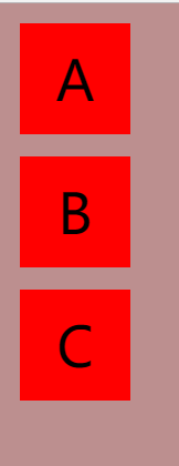
<!DOCTYPE html>
<html>
    <head>
        <meta charset="UTF-8">
        <title>Flexbox布局</title>
        <style type="text/css">
            body{
                display: flex;
                background-color: rosybrown;
                flex-direction:column;
            }
            div{
                width: 100px;
                height: 100px;
                background-color: red;
                margin: 10px;

                text-align: center;
                line-height: 100px;
                font-size: 50px;

            }
        </style>
    </head>
    <body>
        <div>A</div>
        <div>B</div>
        <div>C</div>
    </body>
</html>
效果图:
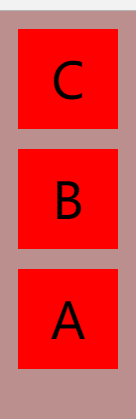
<!DOCTYPE html>
<html>
    <head>
        <meta charset="UTF-8">
        <title>Flexbox布局</title>
        <style type="text/css">
            body{
                display: flex;
                background-color: rosybrown;
                flex-direction:column-reverse;
            }
            div{
                width: 100px;
                height: 100px;
                background-color: red;
                margin: 10px;

                text-align: center;
                line-height: 100px;
                font-size: 50px;

            }
        </style>
    </head>
    <body>
        <div>A</div>
        <div>B</div>
        <div>C</div>
    </body>
</html>
效果图:
6、flex-wrap 属性规定flex容器是单行或者多行,同时横轴的方向决定了新行堆叠的方向。
值:
1、nowrap(默认):所有flex item将在一条线上
2、wrap :flex item将会从上到下分为多行
3、wrap-reverse :flex item将会从下到上分为多行
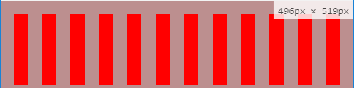
nowrap:所有flex item将在一条线上效果图:
大窗口 :

小窗口:
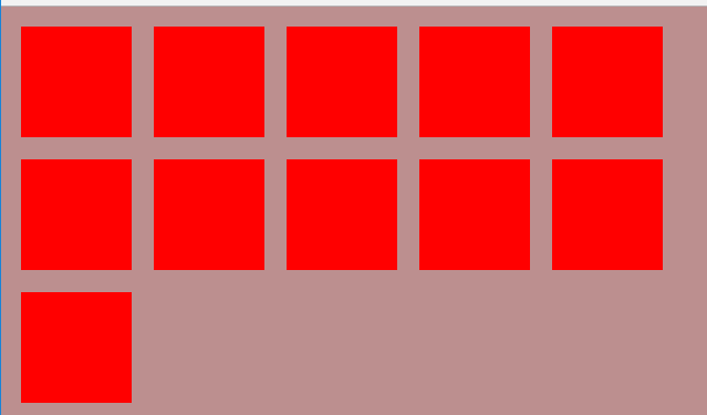
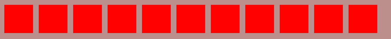
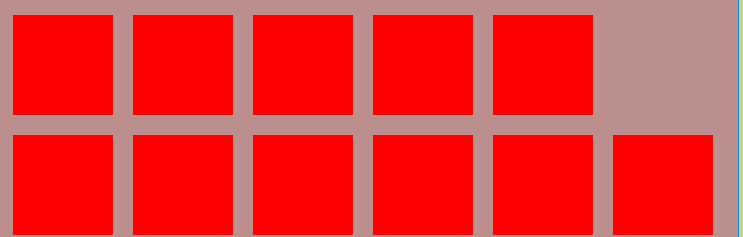
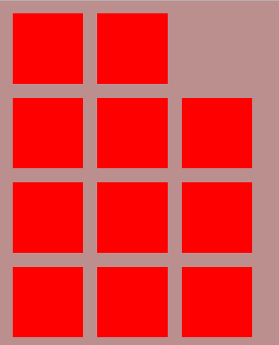
<!DOCTYPE html>
<html>
    <head>
        <meta charset="UTF-8">
        <title>Flexbox布局</title>
        <style type="text/css">
            body{
                display: flex;
                background-color: rosybrown;
                flex-wrap:wrap;
            }
            div{
                width: 100px;
                height: 100px;
                background-color: red;
                margin: 10px;
            }
        </style>
    </head>
    <body>
        <div></div>
        <div></div>
        <div></div>
        <div></div>
        <div></div>
        <div></div>
        <div></div>
        <div></div>
        <div></div>
        <div></div>
        <div></div>
        <div></div>
    </body>
</html>
大窗口:

中窗口:
小窗口:

<!DOCTYPE html>
<html>
    <head>
        <meta charset="UTF-8">
        <title>Flexbox布局</title>
        <style type="text/css">
            body{
                display: flex;
                background-color: rosybrown;
                flex-wrap:wrap-reverse;
            }
            div{
                width: 100px;
                height: 100px;
                background-color: red;
                margin: 10px;
            }
        </style>
    </head>
    <body>
        <div></div>
        <div></div>
        <div></div>
        <div></div>
        <div></div>
        <div></div>
        <div></div>
        <div></div>
        <div></div>
        <div></div>
        <div></div>
    </body>
</html>
大窗口:
中窗口:
小窗口:
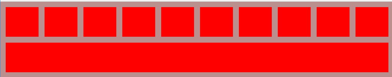
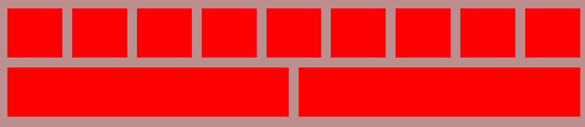
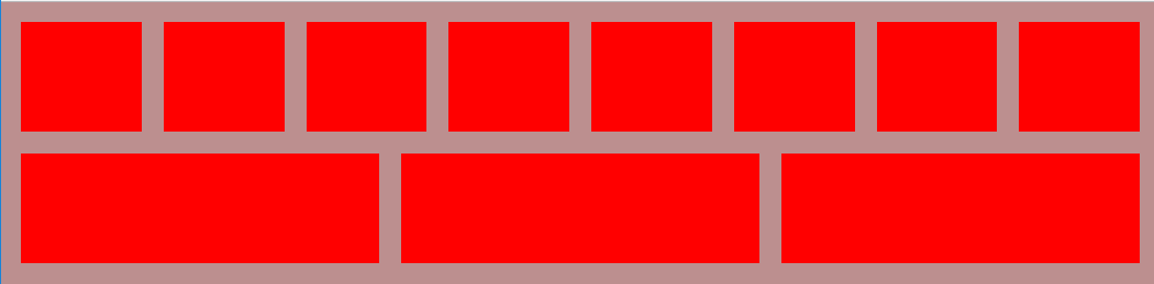
为了页面更美观,我们可以把flex-grow和flex-wrap一起使用
<!DOCTYPE html>
<html>
    <head>
        <meta charset="UTF-8">
        <title>Flexbox布局</title>
        <style type="text/css">
            body{
                display: flex;
                background-color: rosybrown;
                flex-wrap:wrap;
            }
            div{
                width: 100px;
                height: 100px;
                background-color: red;
                margin: 10px;
                flex-grow: 1;
            }
        </style>
    </head>
    <body>
        <div></div>
        <div></div>
        <div></div>
        <div></div>
        <div></div>
        <div></div>
        <div></div>
        <div></div>
        <div></div>
        <div></div>
        <div></div>
    </body>
</html>
效果图:
窗口大小依次减少