本文转自 CSS记录篇,如有侵权,请联系删除。
一、提高开发效率、提高用户体验
二、常用的css动画
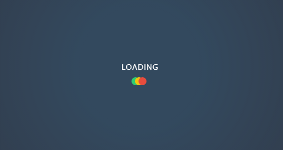
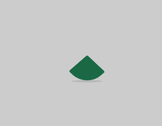
2.1 音乐跳动动画
<div className='m-preloading'> |
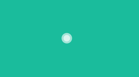
2.2 横向旋转动画1
<div class="m-loader"> |
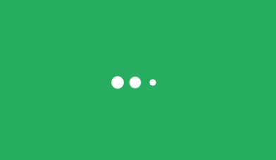
2.3 四圆点旋转动画
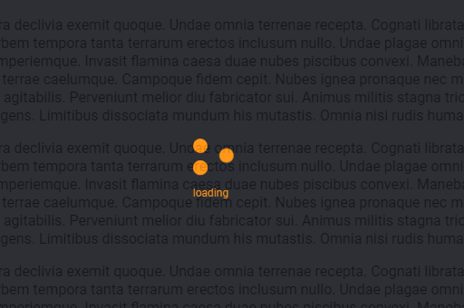
<div class="m-loading"> |
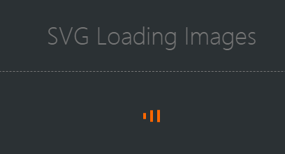
2.4 条形旋转动画变颜色
<svg class="m-loading" width="65px" height="65px" viewBox="0 0 66 66"> |
2.5 跳动弹性的盒子
<div class="boxLoading" /> |
2.6 闪烁的点
<div class="spinner"> |
2.7 三个球逐渐显现
<div class="spinner"> |
2.8 折叠积木

<div class="sk-folding-cube"> |
2.9 伸拉的输入框
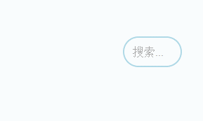
<input class="search" type="text" placeholder="搜索..."> |
2.10 手浮右侧切入动画
<div class="banner1"> |
2.11 骨架屏动画
@keyframes loading { |
2.12 蚂蚁行军图
<div class="ants-border"> |
.ants-border{ |
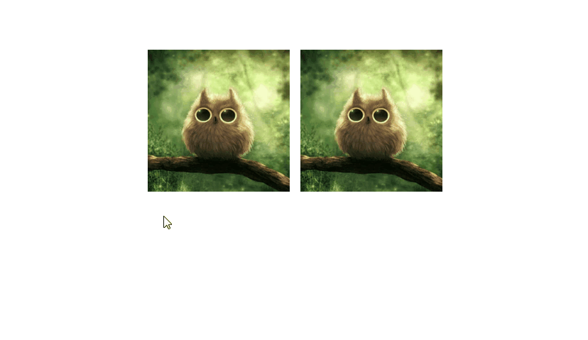
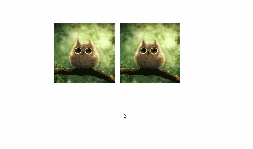
2.13 裁切路径
<img class="pic" src="images/pic.jpg"> |
.pic{ |
2.100 动画参考列表
三、常用的css样式 box-shadow hover
3.1 box-shoadow
-
用法
/* x偏移量 | y偏移量 | 阴影模糊半径 | 阴影扩散半径 | 阴影颜色 */
box-shadow: 2px 2px 2px 1px rgba(0, 0, 0, 0.2);

/* 插页(阴影向内) | x偏移量 | y偏移量 | 阴影颜色 */
box-shadow: inset 5em 1em gold;

/* 任意数量的阴影,以逗号分隔 */
box-shadow: 3px 3px red, -1em 0 0.4em olive; -
示例
.u-box-shadow1 {
  box-shadow: 0 14px 28px rgba(0,0,0,0.25), 0 10px 10px rgba(0,0,0,0.22);
}

.u-box-shadow2 {
  box-shadow:
    inset 0 -3em 3em rgba(0,0,0,0.1),
          0 0  0 2px rgb(255,255,255),
          0.3em 0.3em 1em rgba(0,0,0,0.3);
}

.u-box-shadow3 {
  box-shadow: 0 30px 40px -15px rgba(0,0,0,0.35);
}

.u-box-shadow4 {
  box-shadow: 0 10px 20px rgba(0,0,0,0.19), 0 6px 6px rgba(0,0,0,0.23);
}

.u-box-shadow5 {
  box-shadow: 0 10px 20px rgba(0,0,0,0.19), 0 6px 6px rgba(0,0,0,0.23);
}

.u-box-shadow6 {
  box-shadow: 0 0 50px rgba(0,0,0,0.75);
}

.u-box-shadow7 {
  box-shadow: 0 1px 1px rgba(0,0,0,0.15),
              0 2px 2px rgba(0,0,0,0.15),
              0 4px 4px rgba(0,0,0,0.15),
              0 8px 8px rgba(0,0,0,0.15);
}

.u-box-shadow8 {
  box-shadow: 0 1px 1px rgba(0,0,0,0.11),
              0 2px 2px rgba(0,0,0,0.11),
              0 4px 4px rgba(0,0,0,0.11),
              0 8px 8px rgba(0,0,0,0.11),
              0 16px 16px rgba(0,0,0,0.11),
              0 32px 32px rgba(0,0,0,0.11);
}

.u-box-shadow9 {
    box-shadow: 0 1px 2px rgba(0,0,0,0.07),
                0 2px 4px rgba(0,0,0,0.07),
                0 4px 8px rgba(0,0,0,0.07),
                0 8px 16px rgba(0,0,0,0.07),
                0 16px 32px rgba(0,0,0,0.07),
                0 32px 64px rgba(0,0,0,0.07);
}
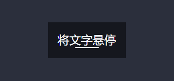
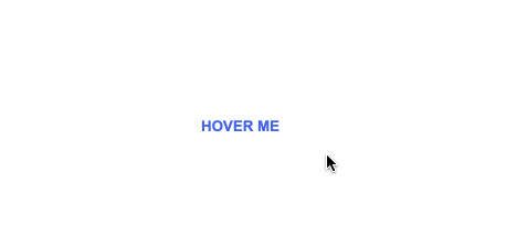
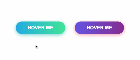
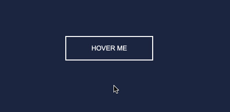
3.2 Hover
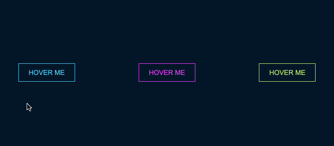
<div id="neon-btn"> |
h2 > a { |
.box { |
<div id="draw-border"> |
<div id="frozen-btn"> |
<div id="shiny-shadow"> |
<div class="lists"> |
<div class="lists"> |
<div class="lists"> |
<div class="lists"> |
<div class="lists"> |
四、常用的css样式 - color background font 渐变色
4.1 传统色
4.2 渐变色
五、404页面示例
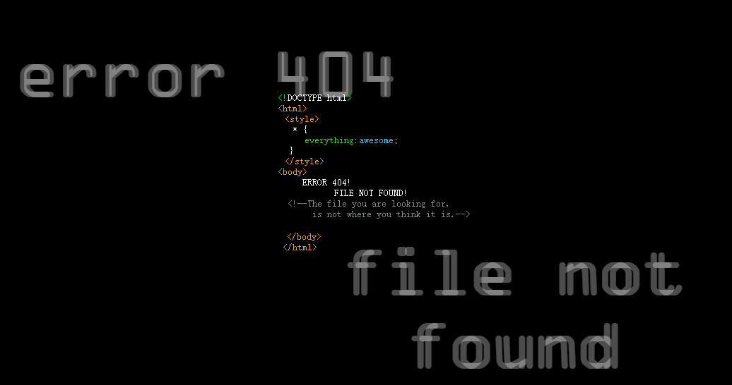
暂停维护页面
404页面
404页面
404页面
404页面
六、常用的动画库
Hover动画
制作动画工具生成代码
animate.css
css3动画及效果开发参考大全
七、常见的css问题
7.1 不定宽溢出文本适配滚动
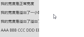
<div class="wrap"> |
本文转自 https://lousanpang.github.io/2019/05/01/frontend/css/css-summary/,如有侵权,请联系删除。