在我们看到类似于这样的图片时:

我们一般都会想,哎,这还不简单,用一张图片就可以了。
的确,用图片可以很轻松地做到。不过我们接下来要讨论的是:
如何用css也作出这样的效果。
首先,我们来定义一个div:
<div class="up"></div>
然后给它增加一些样式:
.up{
50px;
height: 50px;
background-color: red;
font-size: 0px;
line-height: 0px;
}
结果如图:
 你TM逗我呢,这明明是正方形好吗!
好好好,别急,放下你手中的砖头,我们不妨设置一下它的边框。
.up{
50px;
height: 50px;
background-color: red;
border:50px solid green;
font-size: 0px;
line-height: 0px;
}
然后就变成这样:
 你这是在找死
好的好的,别急,我说最后一句:
我们尝试着把它的四个边框的颜色改成不一样。
.up{
50px;
height: 50px;
background-color: red;
border-top: 50px solid green;
border-right: 50px solid yellow;
border-bottom: 50px solid blue;
border-left:50px solid black;
font-size: 0px;
line-height: 0px;
}
结果如下:
 好像有点意思
好的,别急,我们再尝试着把div的宽度和高度都设置为0;
.up{
0px;
height: 0px;
background-color: red;
border-top: 50px solid green;
border-right: 50px solid yellow;
border-bottom: 50px solid blue;
border-left:50px solid black;
font-size: 0px;
line-height: 0px;
}
结果:

好的,我们得到了四个三角形,
现在,我们要得到方向指向上的那个蓝色的三角形,所以我们把其他三角形的背景颜色设置成透明的,并且去掉之前设置的背景颜色:
.up{
0px;
height: 0px;
border-top: 50px solid transparent;
border-right: 50px solid transparent;
border-bottom: 50px solid blue;
border-left:50px solid transparent;
font-size: 0px;
line-height: 0px;
}
 好的 ,掌声在哪里?
我知道你想说什么,我们仔细观察,发现其实上边框是不必要的,因为它不影响我们下面的那个三角形的大小和形状,所以我们去掉上边框,然后再调整一下背景颜色:
.up{
0px;
height: 0px;
border-right: 50px solid transparent;
border-left:50px solid transparent;
border-bottom: 50px solid #6699cc;
font-size: 0px;
line-height: 0px;
}
完成了。
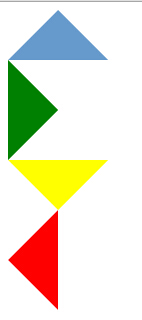
按照这种方法,我们可以制作四个方向上的三角形:
完整的代码:
html:
1 <div class="up"></div>
2 <div class="right"></div>
3 <div class="down"></div>
4 <div class="left"></div>
css:
 1 .up,.right,.down,.left{
 2   width: 0px;
 3   height: 0px;
 4   font-size: 0px;
 5   line-height: 0px;
 6 }
 7 .up{
 8   border-right: 50px solid transparent;
 9   border-left:50px solid transparent;
10   border-bottom: 50px solid #6699cc;
11 }
12 .right{
13   border-bottom: 50px solid transparent;
14   border-top:50px solid transparent;
15   border-left: 50px solid green;
16 }
17 .down{
18   border-top: 50px solid yellow;
19   border-right:50px solid transparent;
20   border-left: 50px solid transparent;
21 }
22 .left{
23   border-right: 50px solid red;
24   border-top:50px solid transparent;
25   border-bottom: 50px solid transparent;
26 }
完整的效果图: