《CSS3 经典教程系列》的前一篇文章向大家详细介绍了 text-shadow 文本阴影特性的用法,今天这篇文章我们在一起来看看 CSS3 中实现渐变效果的 Gradient 属性的具体用法。在以前,渐变效果和阴影、圆角效果一样都是做成图片,直接编写 CSS 代码就可以实现。
CSS3 Gradient 分为 linear-gradient(线性渐变)和 radial-gradient(径向渐变)。而我们今天主要是针对线性渐变来剖析其具体的用法。为了更好的应用 CSS3 Gradient,我们需要先了解一下目前的几种现代浏览器的内核,主要有 Mozilla(Firefox,Flock等)、WebKit(Safari、Chrome等)、Opera(Opera浏览器)、Trident(讨厌的IE浏览器)。
本文照常忽略IE不管,我们主要看看在 Mozilla、Webkit、Opera 下的应用,当然在 IE 下也可以实现,他需要通过 IE 特有的滤镜来实现,在后面会列出滤镜的使用语法,但不会具体介绍如何实用,感兴趣的可以搜索相关技术文档。
一、线性渐变在 Mozilla 下的应用
语法:
|
1
|
-moz-linear-gradient( [<point> || <angle>,]? <stop>, <stop> [, <stop>]* ) |
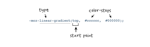
参数:其共有三个参数,第一个参数表示线性渐变的方向,top 是从上到下、left 是从左到右,如果定义成 left top,那就是从左上角到右下角。第二个和第三个参数分别是起点颜色和终点颜色。你还可以在它们之间插入更多的参数,表示多种颜色的渐变。如图所示:
根据上面的介绍,我们先来看一个简单的例子:
HTML:
|
1
|
<div class="example example1"></div> |
CSS:
|
1
2
3
4
5
6
7
|
.example { width: 150px; height: 80px; } |
如无特殊说明,我们后面的示例都是应用这一段 html 和 css 的基本代码。
现在我们给这个div应用一个简单的渐变样式:
|
1
2
3
4
5
|
.example1 { background: -moz-linear-gradient( top,#ccc,#000);} |
效果如下:

二、线性渐变在 Webkit 下的应用
语法:
|
1
2
3
|
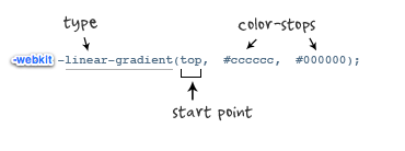
-webkit-linear-gradient( [<point> || <angle>,]? <stop>, <stop> [, <stop>]* )//最新发布书写语法-webkit-gradient(<type>, <point> [, <radius>]?, <point> [, <radius>]? [, <stop>]*) //老式语法书写规则 |
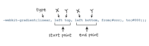
参数:-webkit-gradient 是 webkit 引擎对渐变的实现参数,一共有五个。第一个参数表示渐变类型(type),可以是linear(线性渐变)或者radial(径向渐变)。第二个参数和第三个参数,都是一对值,分别表示渐变起点和终点。这对值可以用坐标形式表示,也可以用关键值表示,比如 left top(左上角)和left bottom(左下角)。第四个和第五个参数,分别是两个color-stop函数。color-stop 函数接受两个参数,第一个表示渐变的位置,0为起点,0.5为中点,1为结束点;第二个表示该点的颜色。如图所示:
我们先来看一个老式的写法示例:
效果如下所示:
接着我们在来看一下新式的写法:
|
1
|
-webkit-linear-gradient(top,#ccc,#000); |
这个效果我就不在贴出来了,大家在浏览器中一看就明白了,他们是否一致的效果。仔细对比,在 Mozilla 和 Webkit 下两者的学法都基本上一致了,只是其前缀的区别,当然哪一天他们能统一成一样,对我们来说当然是更好了,那就不用去处理了。将大大节省我们的开发时间哟。
三、线性渐变在 Opera 下的应用
语法:
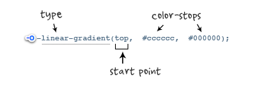
参数:-o-linear-gradient 有三个参数。第一个参数表示线性渐变的方向,top 是从上到下、left 是从左到右,如果定义成 left top,那就是从左上角到右下角。第二个和第三个参数分别是起点颜色和终点颜色。你还可以在它们之间插入更多的参数,表示多种颜色的渐变。(注:Opera 支持的版本有限,本例测试都是在 Opera11.1 版本下,后面不在提示),如图所示:
示例代码:
|
1
|
background: -o-linear-gradient(top,#ccc, #000); |
效果如图所示:
四、线性渐变在 Trident (IE) 下的应用
语法:
|
1
2
3
|
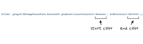
filter: progid:DXImageTransform.Microsoft.gradient(GradientType=0, startColorstr=#1471da, endColorstr=#1C85FB);/*IE<9>*/-ms-filter: "progid:DXImageTransform.Microsoft.gradient (GradientType=0, startColorstr=#1471da, endColorstr=#1C85FB)";/*IE8+*/ |
IE依靠滤镜实现渐变。startColorstr表示起点的颜色,endColorstr 表示终点颜色。GradientType 表示渐变类型,0 为缺省值,表示垂直渐变,1 表示水平渐变。如图所示:
上面我们主要介绍了线性渐变在上述四大核心模块下的实现方法,接着我们主要针对线性渐变在 Mozilla、Webkit、Opera 三大模块下实现各种不同线性渐变实例:
从上面的语法中我们可以很清楚的知道,要创建一个线性渐变,我们需要创建一个起点和一个渐变方向(或角度),定义一个起始色:
|
1
2
3
4
5
|
-moz-linear-gradient( [<point> || <angle>,]? <stop>, <stop> [, <stop>]* )-webkit-linear-gradient( [<point> || <angle>,]? <stop>, <stop> [, <stop>]* )-o-linear-gradient( [<point> || <angle>,]? <stop>, <stop> [, <stop>]* ) |
具体应用如下:
|
1
2
3
4
5
6
7
|
background:-moz-linear-gradient(left,#ace,#f96);/*Mozilla*/background:-webkit-gradient(linear,0 50%,100% 50%,from(#ace),to(#f96));/*Old gradient for webkit*/background:-webkit-linear-gradient(left,#ace,#f96);/*new gradient for Webkit*/background:-o-linear-gradient(left,#ace,#f96); /*Opera11*/ |
效果如下:

起始点(Starting Point)的工作方式类似于 background position。您可以设置水平和垂直位置为百分比,或以像素为单位,或在水平方向上可以使用left/center/right,在垂直方向上可以使用top/center/bottom。位置起始于左上角。如果你不指定水平或垂直位置,它将默认为center。其工作方式主要包含:Top → Bottom、Left → Right、bottom → top、right → left等,接着我们主要一种一种来看其实现的效果:
1、开始于center(水平方向)和top(垂直方向)也就是Top → Bottom:
|
1
2
3
4
5
6
7
8
9
10
11
12
13
14
15
16
17
|
/* Firefox 3.6+ */background: -moz-linear-gradient(top, #ace, #f96); /* Safari 4-5, Chrome 1-9 *//* -webkit-gradient(, [, ]?, [, ]? [, ]*) */background: -webkit-gradient(linear,top,from(#ace),to(#f96));/* Safari 5.1+, Chrome 10+ */background: -webkit-linear-gradient(top, #ace, #f96);/* Opera 11.10+ */background: -o-linear-gradient(top, #ace, #f96); |
效果:

2、始于left(水平方向)和center(垂直方向)也是就Left → Right:
|
1
2
3
4
5
6
7
8
9
10
11
|
/* Firefox 3.6+ */background: -moz-linear-gradient(left, #ace, #f96);/* Safari 5.1+, Chrome 10+ */background: -webkit-linear-gradient(left, #ace, #f96);/* Opera 11.10+ */background: -o-linear-gradient(left, #ace, #f96); |
效果如下:

3、起始于left(水平方向)和top(垂直方向):
|
1
2
3
4
5
|
background: -moz-linear-gradient(left top, #ace, #f96);background: -webkit-linear-gradient(left top, #ace, #f96);background: -o-linear-gradient(left top, #ace, #f96); |
效果如下:

4、Linear Gradient (with Even Stops):
|
1
2
3
4
5
6
7
8
9
10
11
12
13
14
15
|
/* Firefox 3.6+ */background: -moz-linear-gradient(left, #ace, #f96, #ace, #f96, #ace); /* Safari 4-5, Chrome 1-9 */background: -webkit-gradient(linear, left top, right top, from(#ace), color-stop(0.25, #f96), color-stop(0.5, #ace), color-stop(0.75, #f96), to(#ace)); /* Safari 5.1+, Chrome 10+ */background: -webkit-linear-gradient(left, #ace, #f96, #ace, #f96, #ace); /* Opera 11.10+ */background: -o-linear-gradient(left, #ace, #f96, #ace, #f96, #ace); |
效果如下:
5、with Specified Arbitrary Stops:
|
1
2
3
4
5
6
7
8
9
10
11
12
13
14
15
|
/* Firefox 3.6+ */ background: -moz-linear-gradient(left, #ace, #f96 5%, #ace, #f96 95%, #ace); /* Safari 4-5, Chrome 1-9 */ background: -webkit-gradient(linear, left top, right top, from(#ace), color-stop(0.05, #f96), color-stop(0.5, #ace), color-stop(0.95, #f96), to(#ace)); /* Safari 5.1+, Chrome 10+ */ background: -webkit-linear-gradient(left, #ace, #f96 5%, #ace, #f96 95%, #ace); /* Opera 11.10+ */ background: -o-linear-gradient(left, #ace, #f96 5%, #ace, #f96 95%, #ace); |
效果如下:
6、角度(Angle):
正如上面看到的示例,如果您不指定一个角度,它会根据起始位置自动定义。如果你想更多的控制渐变的方向,您不妨设置角度试试。例如,下面的两个渐变具有相同的起点left center,但是加上一个30度的角度。
没有角度的示例代码:
|
1
2
3
4
5
|
background: -moz-linear-gradient(left, #ace, #f96);background: -webkit-linear-gradient(left,#ace,#f96);background: -o-linear-gradient(left, #ace, #f96); |
加上30度的角度代码:
|
1
2
3
4
5
|
background: -moz-linear-gradient(left 30deg, #ace, #f96);background: -webkit-gradient(linear, 0 0, 100% 100%, from(#ace),to(#f96));background: -o-linear-gradient(30deg, #ace, #f96); |
效果图如下:


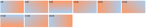
当指定的角度,请记住,它是一个由水平线与渐变线产生的的角度,逆时针方向。因此,使用0deg将产生一个左到右横向梯度,而90度将创建一个从底部到顶部的垂直渐变。我来看看你核心代码:
|
1
2
3
4
5
6
7
|
background: -moz-linear-gradient(<angle>, #ace, #f96);background: -webkit-gradient(<type>,<angle>, from(#ace), to(#f96));background: -webkit-linear-gradient(<angle>, #ace, #f96);background: -o-linear-gradient(<angle>, #ace, #f96); |
我们来看看各角度的区别:
|
1
2
3
4
5
6
7
8
9
10
11
12
13
14
15
16
17
18
19
20
21
22
23
24
25
26
27
28
29
30
31
32
33
34
35
36
37
38
39
40
41
42
43
44
45
46
47
48
49
50
51
52
53
54
55
56
57
58
59
60
61
62
63
64
65
66
67
68
69
70
71
72
73
74
75
76
77
78
79
80
81
82
83
84
85
86
87
88
89
90
91
92
93
94
95
96
97
98
99
100
101
102
103
104
105
106
107
108
109
|
.deg0 { background: -moz-linear-gradient(0deg, #ace, #f96); background: -webkit-gradient(linear,0 50%,100% 50%,from(#ace),to(#f96)); background: -webkit-linear-gradient(0deg, #ace, #f96); background: -o-linear-gradient(0deg, #ace, #f96);} .deg45 { background: -moz-linear-gradient(45deg, #ace, #f96); background: -webkit-gradient(linear,0 100%,100% 0%,from(#ace),to(#f96)); background: -webkit-linear-gradient(45deg, #ace, #f96); background: -o-linear-gradient(45deg, #ace, #f96);}.deg90 { background: -moz-linear-gradient(90deg, #ace, #f96); background: -webkit-gradient(linear,50% 100%,50% 0%,from(#ace),to(#f96)); background: -webkit-linear-gradient(90deg, #ace, #f96); background: -o-linear-gradient(90deg, #ace, #f96);}.deg135 { background: -moz-linear-gradient(135deg, #ace, #f96); background: -webkit-gradient(linear,100% 100%,0 0,from(#ace),to(#f96)); background: -webkit-linear-gradient(135deg, #ace, #f96); background: -o-linear-gradient(135deg, #ace, #f96);}.deg180 { background: -moz-linear-gradient(180deg, #ace, #f96); background: -webkit-gradient(linear,100% 50%,0 50%,from(#ace),to(#f96)); background: -webkit-linear-gradient(180deg, #ace, #f96); background: -o-linear-gradient(180deg, #ace, #f96);}.deg225 { background: -moz-linear-gradient(225deg, #ace, #f96); background: -webkit-gradient(linear,100% 0%,0 100%,from(#ace),to(#f96)); background: -webkit-linear-gradient(225deg, #ace, #f96); background: -o-linear-gradient(225deg, #ace, #f96);}.deg270 { background: -moz-linear-gradient(270deg, #ace, #f96); background: -webkit-gradient(linear,50% 0%,50% 100%,from(#ace),to(#f96)); background: -webkit-linear-gradient(270deg, #ace, #f96); background: -o-linear-gradient(270deg, #ace, #f96);}.deg315 { background: -moz-linear-gradient(315deg, #ace, #f96); background: -webkit-gradient(linear,0% 0%,100% 100%,from(#ace),to(#f96)); background: -webkit-linear-gradient(315deg, #ace, #f96); background: -o-linear-gradient(315deg, #ace, #f96);}.deg360 { background: -moz-linear-gradient(360deg, #ace, #f96); background: -webkit-gradient(linear,0 50%,100% 50%,from(#ace),to(#f96)); background: -webkit-linear-gradient(360deg, #ace, #f96); background: -o-linear-gradient(360deg, #ace, #f96);} |
效果如下:
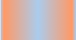
除了起始位置和角度,你应该指定起止颜色。起止颜色是沿着渐变线,将会在指定位置(以百分比或长度设定)含有指定颜色的点。色彩的起止数是无限的。如果您使用一个百分比位置,0%代表起点和100%是终点,但区域外的值可以被用来达到预期的效果。 这也是通过CSS3 Gradient制作渐变的一个关键所在,其直接影响了你的设计效果,像我们这里的示例都不是完美的效果,只是为了能给大家展示一个渐变的效果,大家就这样先用着吧。我们接着看一下不同的起址色的示例:
|
1
2
3
4
5
|
background: -moz-linear-gradient(top, #ace, #f96 80%, #f96);background: -webkit-linear-gradient(top,#ace,#f96 80%,#f96);background: -o-linear-gradient(top, #ace, #f96 80%, #f96); |
效果如下:

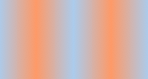
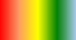
如果没有指定位置,颜色会均匀分布。如下面的示例:
|
1
2
3
4
5
|
background: -moz-linear-gradient(left, red, #f96, yellow, green, #ace);background: -webkit-linear-gradient(left,red,#f96,yellow,green,#ace);background: -o-linear-gradient(left, red, #f96, yellow, green, #ace); |
效果如下
7、渐变上应用透明度(Transparency):
透明渐变对于制作一些特殊的效果是相当有用的,例如,当堆叠多个背景时。这里是两个背景的结合:一张图片,一个白色到透明的线性渐变。我们来看一个官网的示例吧:
|
1
2
3
4
5
|
background: -moz-linear-gradient(right, rgba(255,255,255,0), rgba(255,255,255,1)),url(http://demos.hacks.mozilla.org/openweb/resources/images/patterns/flowers-pattern.jpg);background: -webkit-linear-gradient(right, rgba(255,255,255,0), rgba(255,255,255,1)),url(http://demos.hacks.mozilla.org/openweb/resources/images/patterns/flowers-pattern.jpg);background: -o-linear-gradient(right, rgba(255,255,255,0), rgba(255,255,255,1)),url(http://demos.hacks.mozilla.org/openweb/resources/images/patterns/flowers-pattern.jpg); |
接着看看效果吧