Sometimes the flex items within a flex container do not fill all the space in the container. It is common to want to tell CSS how to align and space out the flex items a certain way. Fortunately, the justify-content property has several options to do this. But first, there is some important terminology to understand before reviewing those options.
Here is a useful image showing a row to illustrate the concepts below.
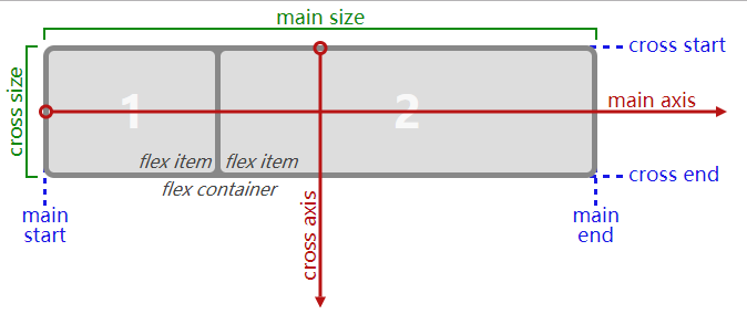
Recall that setting a flex container as a row places the flex items side-by-side from left-to-right. A flex container set as a column places the flex items in a vertical stack from top-to-bottom. For each, the direction the flex items are arranged is called the main axis. For a row, this is a horizontal line that cuts through each item. And for a column, the main axis is a vertical line through the items.
There are several options for how to space the flex items along the line that is the main axis. One of the most commonly used is justify-content: center;, which aligns all the flex items to the center inside the flex container. Others options include:
flex-start: aligns items to the start of the flex container. For a row, this pushes the items to the left of the container. For a column, this pushes the items to the top of the container. This is the default alignment if nojustify-contentis specified.flex-end: aligns items to the end of the flex container. For a row, this pushes the items to the right of the container. For a column, this pushes the items to the bottom of the container.space-between: aligns items to the center of the main axis, with extra space placed between the items. The first and last items are pushed to the very edge of the flex container. For example, in a row the first item is against the left side of the container, the last item is against the right side of the container, then the remaining space is distributed evenly among the other items.space-around: similar tospace-betweenbut the first and last items are not locked to the edges of the container, the space is distributed around all the items with a half space on either end of the flex container.space-evenly: Distributes space evenly between the flex items with a full space at either end of the flex container
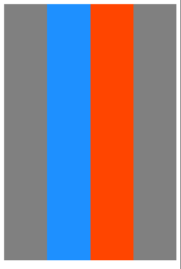
An example helps show this property in action. Add the CSS property justify-content to the #box-container element, and give it a value of center.
Bonus
Try the other options for the justify-content property in the code editor to see their differences. But note that a value of center is the only one that will pass this challenge.
换上上面提到的几个属性,都可以操作,体会实际效果~
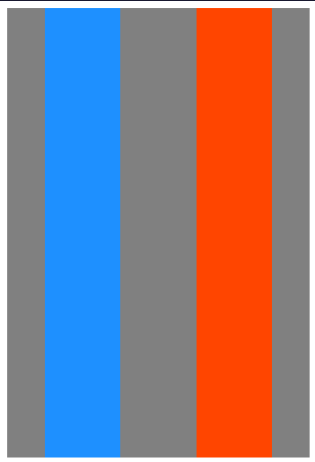
from:
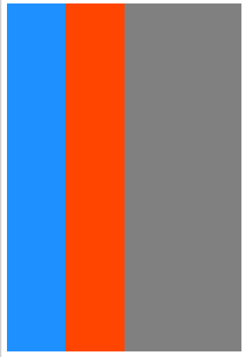
to: