CSS选择器
1、标签选择器
为类型标签设置样式例如:<div>、<a>、等标签设置一个样式,代码如下:
<style>
        /*标签选择器,找到所有的标签应用以下样式*/
        div {
            background-color: red;
            color: blue;
        }
</style>
<body>
    <div>
        <div>div style</div>
  <div>
<body>
2.类选择器(用的比较多的选择器)
/*class选择器,找到class=c1的所有标签,应用一下样式*/
        .c1 {
            background-color: pink;
        }


<div class="c1">c1style</div>
3.id选择器
为指定的ID设置样式,代码如下:
/*id选择器,找到标签id等于i1的标签,应用以下样式*/
        #i1 {
            font-size: 56px;
            color: green;
        }

<div id="i1">id style</div>
4、关联选择器
/*层级选择器,找到 class=c2 下的div下的p下的class=c3标签,应用以下样式*/
        .c2 div p a{
            background-color: yellow;
        }


   <div class="c2">
        <div></div>
        <div>
            <p>
                <span>oo</span>
                <br/>
                <a >c2 div p a style</a>
            </p>
        </div>
    </div>
关联选择器:应用场景为某标签下面的标签设置指定的样式:
5、组合选择器
有这么一个场景,看下面的关联组合器,cc1和cc2都要使用相同的样式怎么办?重写一遍?
.container .a .cc1 {
                background-color: pink;
            }
.container .a .cc2 {
                background-color: pink;
            }
解决方法代码如下:组合选择器1
  .container .a .cc1,.container .a .cc2  {
                background-color: pink;
            }
上面cc1后面的“逗号”就是或的关系,如果路径都是相同的话可以进行改良代码如下:
      .container .a .cc1,.cc2  {
                background-color: pink;
            }
这里组合的时候他是按照第一个出现的逗号来进行处理的,看下面的代码:
            /*组合选择器*/
            .container b ,.a .cc1,.cc2  {
                background-color: pink;
            }
            /*组合选择器分解,上面的分解完成之后谁来应用:background-color: pink;这个样式呢?*/
            .container b
            .container b .a .cc1
            .container b .cc2
       ......这里需要注意,“逗号”是或的关系,一般这个不常用,常用的是上面的方法
6.属性选择器
写表单验证的时候最常用,举个例子来说看下面的代码:
我要在这么input下找到type为text的标签并且给他设置样式,在上面咱们知道了组合标签,但是组合选择器最小单元是标签,他不能定位到type属性
  <div>
        <input type="text" />
        <input type="password" />
        <input type="file" />
        <input type="checkbox"/>
        <input type="button"/>
        <input type="reset"/>
    </div>
怎么做呢?在组合选择器后面加个[type=“text”]即可
    <style>
        /*input和[之间不能有空格]*/
        .con input[type="text"] {
            border:3px solid red;
        }
    </style>
效果如下:
需求又来了,我想找到input标签为type为text并且name为“user”的那个input标签
   <div>
        <input type="text" />
        <input type="text" name="user">
        <input type="password" />
        <input type="file" />
        <input type="checkbox"/>
        <input type="button"/>
        <input type="reset"/>
    </div>
解决方法:在增加一个属性就行了(注意中括号之间没有空格不会报错但是没有效果),代码如下:
<style>

        /*input和[之间不能有空格]*/
         input[type="text"][name="user"] {
            border:3px solid red;
        }

    </style>
效果图如下:
属性标签经常用,要记住
也可以使用自定义属性来定义,并且所有的标签都可以使用自定义属性:


<!DOCTYPE html>
<html lang="en">
<head>
    <meta charset="UTF-8">
    <title>Title</title>
    <style>

        /*input和[之间不能有空格]*/
         input[type="text"][name="user"] {
            border:3px solid red;
        }

    </style>
</head>
<body>
    <div>
        <input type="text" />
        <input type="text" name="user">
        <input type="password" />
        <input type="file" />
        <input type="checkbox"/>
        <input type="button"/>
        <input type="reset"/>
    </div>
</body>
7、background-position 图片位移
应用场景,在实际的生产环境中咱们在网页上看到的小图片不是一个一个的零散的小图片的,咱们只是看到了大图片的一部分。比如一个大图片,我只让他显示一部分并不全部显示怎么做?
可以这么想:
有一个窗口,你在窗口的一边,只能通过窗口来看外面,你不能动,我们可以通过移动这个窗口来让你看到不同的场景,当然你看到的大小和窗口的大小有关!
代码如下:
<style>
    .img{
        /*背景颜色*/
        background-color: #67b168;
        /*引用的背景图片,可以为相对路径*/
        background-image: url("4.gif");
        height: 150px;
         400px;
        /*图片不重复*/
        background-repeat: no-repeat;
    }
    .img2{
        background-image: url("2.jpg");
        height: 50px;
         50px;
        background-position: 84px -58px;
    }
    .img3{
        background-image: url("2.png");
        height: 100px;
         100px;
        background-position: 30px 20px;
        background-repeat: no-repeat;
    }
    .img4{
        /*定义一个图片*/
        background-image: url("bcak.png");
        /*定义一个窗口,指定长和宽*/
        height: 100px;
         100px;
        background-position: 30px 20px;
        /*设置图片不重复*/
        background-repeat: no-repeat;
        /*图片伸缩*/
        -webkit-transform:scale(1.5,1.5);
        -moz-transform:scale(1.5,1.5);
        -transform:scale(1.5,1.5);
    }
</style>
8.定位position
position的四个属性值:
- static
- fixed
- relative
- absolute
1、position的默认值,一般不设置position属性时,会按照正常的文档流进行排列。
2、fixed是特殊的absolute,即fixed总是以body为定位对象的,按照浏览器的窗口进行定位。
举例,代码如下:
<body>
    <div style="height:2000px;background-color: blueviolet;">
        <!--这里设置position:fixed 并且靠右边和底部各30px-->
        <a style="position: fixed;right: 30px;bottom: 30px;">
        跳转到顶部
        </a>
    </div>
</body>
3.relative
<!DOCTYPE html>
<html lang="en">
<head>
    <meta charset="UTF-8">
    <title>Title</title>
    <style>
        #sub1{
            position: relative;
            padding: 5px;
            top: 5px;
            left: 5px;
            margin-left: 5px;
            margin-top: 5px;
        }
    </style>
</head>
<body>
     <div  id="parent">
         <div style="background-color:blueviolet;" id="sub1">sub1</div>
         <div style="background-color:blue;" id="sub2">sub2</div>
    </div>
</body>
</html>
效果如下:
注:
sub1这个div如果没有设置:position: relative会按照正常的文档位置进行定位,如果设置了,并给他设置了边距那么,他会根据他本身进行偏移,并且他的偏移不影响sub2。
4、absolute
absolute这个属性总是有人给出误导。说当position属性设为absolute后,总是按照浏览器窗口来进行定位的,这其实是错误的。实际上,这是fixed属性的特点。
当sub1的position设置为absolute后,其到底以谁为对象进行偏移呢?这里分为两种情况:
- 当sub1的父对象(或曾祖父,只要是父级对象)parent也设置了position属性,且position的属性值为absolute或者relative时,也就是说,不是默认值的情况,此时sub1按照这个parent(在父对象内)来进行定位。
- 如果sub1不存在一个有着position属性的父对象,那么那就会以body为定位对象,按照浏览器的窗口进行定位,这个比较容易理解
代码如下:
 <div style="position:relative;background-color: blue;height:100px;">
        <!--当sub1的父对象(或曾祖父,只要是父级对象)parent也设置了position属性-->
        <div style="position:absolute;right: 0px;bottom:0px;background-color: blueviolet">su1</div>
</div>
<div style="background-color: blueviolet;height: 2000px;">
        <!--如果父对象内没有,positionabsolute或者relative时,那么会按照你打开网页时的位置进行固定,然后滑动浏览器的时候也随之变化-->
        <div style="position:absolute;right: 30px;bottom: 30px;">
            su1
        </div>
</div>
9.样式:overflow
应用场景,有这么一种情况,在一个div内有很多的的内容,如果div的框体不是很大超出去了怎么办?详细情况如下图,代码
代码如下:
<div style="height:100px;background-color:green;">
        test <br/>
        test <br/>
        test <br/>
        test <br/>
        test <br/>
        test <br/>
        test <br/>
        test <br/>
        test <br/>
        test <br/>
        test <br/>
        test <br/>
        test <br/>
        test <br/>
        test <br/>
        test <br/>
</div>
效果如下:

解决方法:增加overflow样式,代码如下:
<div style="height:100px;background-color:green;overflow: auto">
        test <br/>
        test <br/>
        test <br/>
        test <br/>
        test <br/>
        test <br/>
        test <br/>
        test <br/>
        test <br/>
        test <br/>
        test <br/>
        test <br/>
        test <br/>
        test <br/>
        test <br/>
        test <br/>
    </div>
效果就会,在div块级标签内有个滚动条,如下图

还有一个样式:hidden超出div区域的将会自动隐藏
<div style="overflow:hidden;height:100px;background-color:green;">
10.透明度
透明度,用的比较多,需要注意,简单代码例子如下:
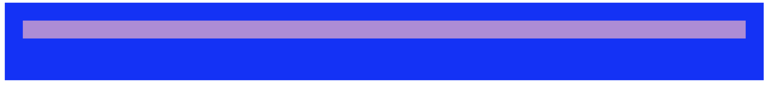
  <div style="background-color:blue;height:100px;padding-top:30px">
        <!--这里设置内部的div的透明度-->
        <div style="opacity: 0.6;background-color:pink;height:30px;margin-left: 30px;margin-right:30px;">

        </div>
    </div>
效果如下:
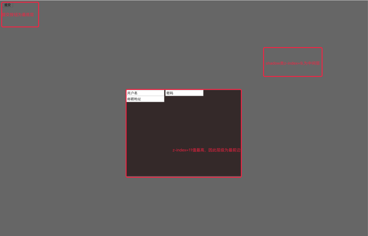
11、z-index
用来设置展示在浏览器中的页面的层级
已登录提交弹出的对话框为例,代码如下:
<!DOCTYPE html>
<html lang="en">
<head>
    <meta charset="UTF-8">
    <title>Title</title>
    <style>
        .hide {
            display: none;
        }
        .modal {
            height: 300px;
            width: 400px;
            background-color: rgba(20,0,0,.6);
            position: fixed;
            top: 50%;
            left: 50%;
            margin-left: -200px;
            margin-top: -150px;
            z-index: 11;#z-index值越大层级越高
        }
        .shadow{
            position: fixed;
            top: 0;
            right: 0;
            bottom: 0;
            left: 0;
            /*background-color: black;*/
            /*opacity: 0.4;*/
            background-color: rgba(0,0,0,.6);
            z-index: 9;
        }
    </style>
</head>
<body>

    <input type="button" value="提交" />
    <div class="shadow"></div>
    <div class="modal">
        <input name="usr" value="用户名" />
        <input name="pwd" value="密码"/>
        <input name="email" value="邮箱地址"/>
    </div>
    <div class=""></div>


</body>
</html>
效果如下图:
12、CSS布局页面实例
<!DOCTYPE html>
<html lang="en">
<head>
    <meta charset="UTF-8">
    <title>shuaige</title>
    <style>
        .pg-hander {
            height:48px;
            background-color: cornflowerblue;

        }
        .pg-body .pg-left {
            /*往左飘*/
            position:absolute;
            top: 50px;
            left: 0px;
            bottom: 0px;
            width:200px;
            overflow: auto;
            background-color: #dddddd;
        }
        .pg-body .pg-right {
            position: absolute;
            top:50px;
            bottom:0px;
            /*这里离左边是200像素,因为上面设置的宽为200px*/
            left:200px;
            right:0px;
            overflow: auto;
            background-color: lightblue;
        }
    </style>
</head>
<body style="margin:0 auto">
    <!--定义把整个窗体分为2大部分上,下

    <!--上部分-->
    <div class="pg-hander">

    </div>

    <!--下部分-->
    <div class="pg-body">
        <!--左部分-->
        <div class="pg-left">
            <a>Jason Wang test</a>
        </div>
        <!--右部分-->
        <div class="pg-right">
            <div style="height:1000px">
                test
            </div>
        </div>
    </div>
</body>

</html>
<!DOCTYPE html>
<html lang="en">
<head>
    <meta charset="UTF-8">
    <title></title>
    <style>
        body{
            margin: 0;
        }
        .pg-header{
            height: 48px;
            background-color: #2459a2;
        }
        .pg-body .body-menu{
            position: absolute;
            top: 48px;
            left: 0;
            bottom: 0;
            width: 200px;
            background-color: red;
        }
        .pg-body .body-content{
            position: absolute;
            top: 48px;
            left: 210px;
            right: 0;
            background-color: green;
            bottom: 0;
            overflow: auto;
        }
    </style>
</head>
<body>
    <div class="pg-header"></div>
    <div class="pg-body">
        <div class="body-menu"></div>
        <div class="body-content">
           asdfasdf <br/>
            asdfasdf<br/>asdfasdf<br/>asdfasdf<br/>asdfasdf<br/>asdfasdf<br/>asdfasdf<br/>asdfasdf<br/>

        </div>
    </div>
    <div class="pg-footer"></div>
</body>
</html>
<!DOCTYPE html>
<html lang="en">
<head>
    <meta charset="UTF-8">
    <title>Title</title>
    <style>
        body{
            margin:0;
        }
        .pg-header{
            height: 48px;
            background-color: #1b6d85;
        }
        .pg-body .body_menu{
            position: absolute;
            top: 48px;
            left: 0;
            bottom: 0;
            width: 200px;
            background-color: red;
        }
        .pg-body .body-content{
            position: absolute;
            top: 48px;
            left: 210px;
            right: 0;
            bottom: 0;
            background-color: green;
            /*overflow: auto;*/
        }
    </style>
</head>
<body>
    <div class="pg-header"></div>
    <div class="pg-body">
        <div class="body_menu"></div>
        <div class="body-content">
            test <br/> test <br/> test <br/> test <br/> test <br/>
            test <br/> test <br/> test <br/> test <br/> test <br/> test <br/> test <br/> test <br/> test <br/> test <br/>
            test <br/> test <br/> test <br/> test <br/> test <br/> test <br/> test <br/> test <br/> test <br/> test <br/> test <br/> test <br/> test <br/> test <br/> test <br/> test <br/> test <br/> test <br/> test <br/> test <br/>
            test <br/> test <br/> test <br/> test <br/> test <br/> test <br/> test <br/> test <br/> test <br/> test <br/> test <br/> test <br/> test <br/> test <br/> test <br/> test <br/> test <br/> test <br/> test <br/> test <br/>
        </div>
        </div>
</body>
</html>
13.font-awesome
下面介绍一种引用页面图标的插件font-awesome,官网下载地址:http://fontawesome.io/#modal-download
应用方法举例如下:首先要将插件存放在指定目录,此后引用里面的font-awesome样式文件
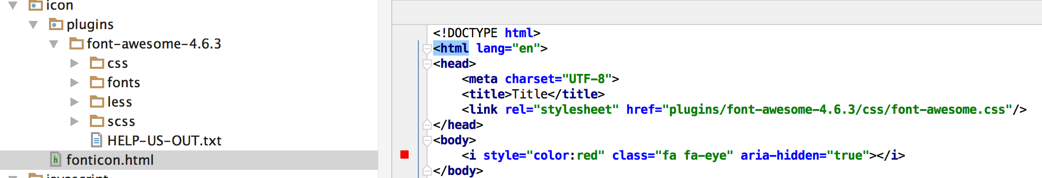
代码如下:
<!DOCTYPE html>
<html lang="en">
<head>
    <meta charset="UTF-8">
    <title>Title</title>
    <link rel="stylesheet" href="plugins/font-awesome-4.6.3/css/font-awesome.css"/>
</head>
<body>
    <i style="color:red" class="fa fa-eye" aria-hidden="true"></i>
</body>
</html>
效果如下:
