先言:本文基于大佬 Steven的视频教程的个人总结。b站链接。大佬有很多很棒的总结,真的少见。
CSS 中最常用到的五个尺寸单位:
px
px, 即pixels, 像素。 这是最为常用的一种css单位,不加赘述。
em
相对单位,是基于当前元素的容器的字体大小来设定的。可以理解为倍数。例如
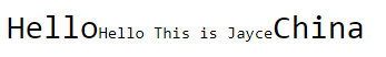
<div>Hello<span>Hello This is Jayce</span>China</div>
div {
  font-size: 30px;
}

span {
  font-size: 0.5em;
}
以上的显示结果就是,div元素内的字体大小为30px, span标签中的字体大小就是30 x 0.5 = 15px。
rem
相对单位,和em很像,不过区别在于rem是相对根元素,而不是父级容器。简单的示例:
<!DOCTYPE html>
<html>
<head>
<style>
html{
	font-size:60px
}

div {
  font-size: 30px;
}

p {
  font-size: 0.3rem;
}
</style>
</head>


<body>
This is root element:html
<div>
This is div element
<p>This is p element</p>
This is div element
</div>
This is root element:html
</body>
</html>
根元素html字体大小设定为60px, 其下级元素 div 的字体大小为 30 px, 其下下级元素 p 的大小是 0.3rem 。
此时,p 元素转换为 px ,就是60px x 0.3 = 18px 。
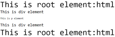
但是注意,如果这时候,你不单独指定 p 元素的大小,那么默认的,p 元素会继承其父元素的大小,即30px。
vw&vh
vw 指的是 viewport width,即 可视区宽度,vh 指的是 viewport hight,即 可视区高度,。单位1 vw 即指的是1%的可视区宽度。20vh即20%的可是区域高度。
vmin&vmax
vmin指的是设备最小的可视长度,vmax指的是设备最大的可视长度,1vmin 就是1%的设备最小可视长度。 以手机为例,最小的可视长度就是手机的宽度,最大可视长度就是手机的高度。
例如:
<!DOCTYPE html>
<html>
<head>
    <style>

        *{
            overflow: hidden;
            margin: 0;
            padding: 0;
        }
        img{
             100vmin;
        }
    </style>
</head>
<body>
    <img src="./pic.jpg" alt="">
</body>
</html>
你将看到如下效果:


我们设定了图片的宽度:100vmin,也就是说以手机最短的边(宽)的100%作为图片的高度,可见,这在手机横屏的时候比较容易理解,100vmin时,图片的宽度就是手机的宽度。
我们可以通过媒体查询,做一些改动。实现这样的效果:

<!DOCTYPE html>
<html>

<head>
    <style>
        * {
            overflow: hidden;
            margin: 0;
            padding: 0;
        }

        @media screen and (orientation: portrait) {
            img {
                 100vmin;
            }
            /* 竖屏 */
        }

        @media screen and (orientation: landscape) {
            img {
                transform: translate(0, -28%);
                 100vmax;

            }
            /* 横屏 */
        }
    </style>
</head>

<body>
    <img src="./pic.jpg" alt="">
</body>

</html>
更多
| Unit | Description | |
|---|---|---|
| em | Relative to the font-size of the element (2em means 2 times the size of the current font) | |
| ex | Relative to the x-height of the current font (rarely used) | |
| ch | Relative to width of the "0" (zero) | |
| rem | Relative to font-size of the root element | |
| vw | Relative to 1% of the width of the viewport* | |
| vh | Relative to 1% of the height of the viewport* | |
| vmin | Relative to 1% of viewport's* smaller dimension | |
| vmax | Relative to 1% of viewport's* larger dimension | |
| % | Relative to the parent element |