word-break: break-all;换行 word-wrap: break-word 换行[换行后,如果不是一个word 还要换行]white-space: nowrap;不换行,横向撑大[ white-space:nowrap;overflow:hidden;] word-spacing:-3px;letter-Spacing = '-.15em';字符间距
text-align: justify; 左右对齐。最后一列,右对齐 text-indent:30px;头空格  [中文] > >  [半个中文] >   4 3 2 1
-moz-text-align-last: right; /* Code for Firefox */
text-align-last: right;
width: calc(100% - 3em);
注意:margin-top:百分比的话相对不是高度。是宽度.例:
transform:translate(-50%,-50%) 自身高度,宽度50% 平移
<div style="200px;height:400px;border:solid red 1px"><div style="margin-top:100%">sfdfsf</div></div>
ab c|<br/>ab c|<br/>1
ab  c|<br/>ab c|<br/>2
ab     c|<br/>5
ab c|<br/>4
box flexbox flex
display:flex;
flex-direction: row | row-reverse | column | column-reverse;
flex-wrap: nowrap | wrap | wrap-reverse;
flex-flow: <‘flex-direction’> || <‘flex-wrap’>
justify-content: flex-start | flex-end | center | space-between | space-around;
align-items: flex-start | flex-end | center | baseline | stretch;
align-content: flex-start | flex-end | center | space-between | space-around | stretch;
order: <integer>;
flex-grow: <number>;
flex-shrink: <number>; /* default 1 */
flex-basis: <length> | auto;
flex: none | [ <'flex-grow'> <'flex-shrink'>? || <'flex-basis'> ]
align-self: auto | flex-start | flex-end | center | baseline | stretch;
-
The
justify-contentproperty applies to all flex containers, and sets the alignment of the flex items along the main axis of each flex line.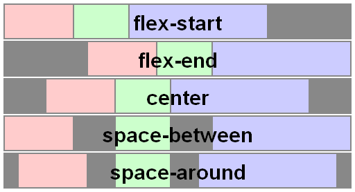
-
The
align-itemsproperty applies to all flex containers, and sets the default alignment of the flex items along the cross axis of each flex line. Thealign-selfapplies to all flex items, allows this default alignment to be overridden for individual flex items.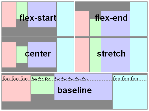
-
The
align-contentproperty only applies to multi-line flex containers, and aligns the flex lines within the flex container when there is extra space in the cross-axis.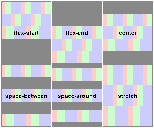


box;
box-orient:[inherit; horizontal;inline-axis| vertical,block-axis][竖横];box-direction:reverse;[顺序] ;box-ordinal-group: 1[顺序];
box-pack:start,end,center,justify[对齐];box-lines:single,multiple[]
box-flex: 1;
https://css-tricks.com/snippets/css/a-guide-to-flexbox/
.test1 {
90px;
height: 60px;
-webkit-animation-name: skyset;
-webkit-animation-duration: 2000ms;
-webkit-animation-iteration-count: infinite; /*无限循环*/
-webkit-animation-timing-function: linear;
}
@-webkit-keyframes skyset {
0% { background: red;}
50%{ background: blue}
100% {background: yellow;}
}
test1以2000ms无限循环做skyset动画.