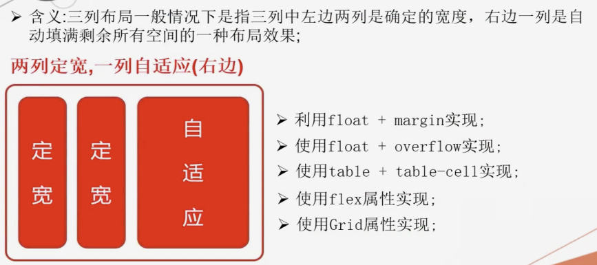
三列布局一般情况下是指三列中左边两列是确定的宽度,右边一列是自动填满剩余所有空间的一种布局效果;
两列定宽,一列自适应(右边)
- float + margin属性实现;
- float + overflow属性实现;
- display属性的table相关值实现;
- 使用flex实现;
- 使用Grid实现;
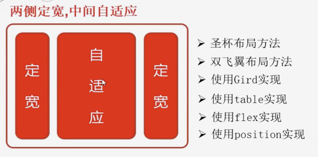
两侧定宽,中间自适应
- 圣杯布局方法
- 双飞翼布局方法
- 使用Gird实现
- 使用table实现
- 使用flex实现
- 使用position实现
<!DOCTYPE html>
<html lang="en">

<head>
  <meta charset="UTF-8">
  <meta name="viewport" content="width=device-width, initial-scale=1.0">
  <meta http-equiv="X-UA-Compatible" content="ie=edge">
  <title>三列布局解决方案1- float + margin</title>
  <style>
    * {
      margin: 0;
      padding: 0;
    }

    #left {
       200px;
      /* 定宽 */
      height: 300px;
      background-color: #c9394a;

      /* 浮动 */
      float: left;
    }

    #center {
       200px;
      /* 定宽 */
      height: 300px;
      background-color: green;

      /* 浮动 */
      float: left;
    }

    #right {
      /* 宽度自适应 */
      height: 400px;
      background-color: #cccccc;

      /* 整体移动往右移动 */
      margin-left: 410px;
    }
  </style>
</head>

<body>
  <div id="parent">
    <div id="left"></div>
    <div id="center"></div>
    <div id="right"></div>
  </div>
</body>

</html>
<!DOCTYPE html>
<html lang="en">

<head>
  <meta charset="UTF-8">
  <meta name="viewport" content="width=device-width, initial-scale=1.0">
  <meta http-equiv="X-UA-Compatible" content="ie=edge">
  <title>三列布局解决方案2- float + overflow</title>
  <style>
    * {
      margin: 0;
      padding: 0;
    }

    #left {
       200px;
      /* 定宽 */
      height: 300px;
      background-color: #c9394a;
      float: left;
    }

    #center {
       200px;
      /* 定宽 */
      height: 300px;
      background-color: green;
      float: left;
    }

    #right {
      height: 400px;
      background-color: #cccccc;

      /* 利用BFC的特点  - 隔离的容器  不会与其他容器出现重叠的情况 */
      overflow: hidden;
      margin-left: 410px;
    }
  </style>
</head>

<body>
  <div id="parent">
    <div id="left"></div>
    <div id="center"></div>
    <div id="right"></div>
  </div>
</body>

</html>
<!DOCTYPE html>
<html lang="en">

<head>
  <meta charset="UTF-8">
  <meta name="viewport" content="width=device-width, initial-scale=1.0">
  <meta http-equiv="X-UA-Compatible" content="ie=edge">
  <title>三列布局解决方案3- table + table-cell</title>
  <style>
    * {
      margin: 0;
      padding: 0;
    }

    #parent {
       100%;
      /* table */
      display: table;
    }

    #left {
       200px;
      /* 定宽 */
      height: 300px;
      background-color: #c9394a;

      /*  td */
      display: table-cell;
    }

    #center {
       200px;
      /* 定宽 */
      height: 300px;
      background-color: green;

      /*  td */
      display: table-cell;
    }

    #right {
      height: 400px;
      background-color: #cccccc;

      /*  td */
      display: table-cell;
    }
  </style>
</head>

<body>
  <div id="parent">
    <div id="left"></div>
    <div id="center"></div>
    <div id="right"></div>
  </div>
</body>

</html>
<!DOCTYPE html>
<html lang="en">

  <head>
    <meta charset="UTF-8">
    <meta name="viewport" content="width=device-width, initial-scale=1.0">
    <meta http-equiv="X-UA-Compatible" content="ie=edge">
    <title>三列布局解决方案4-flex</title>
    <style>
    *{margin: 0;padding: 0;}

    #parent{
      height: 300px;

      /* flex 子元素 - 水平排列 */
      display:flex;
    }

    #left {
       200px; /* 定宽 */
      height: 300px;
      background-color: #c9394a;
    }

    #center {
       200px; /* 定宽 */
      height: 300px;
      background-color: green;
    }

    #right {
      /* flex:1  = 100% - 200 - 200 */

      flex:1;
      height: 400px;
      background-color: #cccccc;
    }
  </style>
  </head>

  <body>
    <div id="parent">
      <div id="left"></div>
      <div id="center"></div>
      <div id="right"></div>
    </div>
  </body>

</html>
<!DOCTYPE html>
<html lang="en">

  <head>
    <meta charset="UTF-8">
    <meta name="viewport" content="width=device-width, initial-scale=1.0">
    <meta http-equiv="X-UA-Compatible" content="ie=edge">
    <title>三列布局解决方案5-grid网格布局</title>
    <style>
    *{margin: 0;padding: 0;}

    #parent{
       height: 400px;
       /* grid */
       display: grid;
       /* 左 = 400px  中间 =  400px  右 = auto 自适应 */
       grid-template-columns:400px 400px auto;
    }
    #left {
      height: 300px;
      background-color: #c9394a;
    }

    #center {
      height: 300px;
      background-color: green;
    }

    #right {
      height: 400px;
      background-color: #cccccc;
    }
  </style>
  </head>

  <body>
    <div id="parent">
      <div id="left"></div>
      <div id="center"></div>
      <div id="right"></div>
    </div>
  </body>

</html>
<!DOCTYPE html>
<html lang="en">

  <head>
    <meta charset="UTF-8">
    <meta name="viewport" content="width=device-width, initial-scale=1.0">
    <meta http-equiv="X-UA-Compatible" content="ie=edge">
    <title>三列布局解决方案6-postion定位</title>
    <style>
    *{margin: 0;padding: 0;}

    #parent{
       height: 400px;
       position: relative;
    }
    #left {
     /* 定宽 */
      200px;
      height: 300px;
      background-color: #c9394a;

      /* 左容器靠左 */
      position: absolute;
      top:0;
      left:0;
    }

    #center {
     /* 定宽 */
      200px;
      height: 300px;
      background-color: green;
       /* 中间容器 - 在left的右边 */
       position: absolute;
       top:0;
       left:200px;
    }

    #right {
      height: 400px;
      background-color: #cccccc;

      /* 自适应 100% - 200 - 200 = */
      position: absolute;
      top:0;
      left:400px;
      right:0;
    }
  </style>
  </head>

  <body>
    <div id="parent">
      <div id="left"></div>
      <div id="center"></div>
      <div id="right"></div>
    </div>
  </body>

</html>
<!DOCTYPE html>
<html lang="en">

  <head>
    <meta charset="UTF-8">
    <meta name="viewport" content="width=device-width, initial-scale=1.0">
    <meta http-equiv="X-UA-Compatible" content="ie=edge">
    <title>左右定宽 中间自适应-四种方法(左中右结构)</title>
    <style>

        /*
        方法一:
       display: grid;
       grid-template-columns: 200px auto 200px;

        方法二:
        父容器  100%; display:table  (table)
        子容器  display: table-cell;  (td)

        方法三
        父容器: display:flex;
        子容器  中 = 自适应   flex:1   左= 右 = 200px

        方法四:


         */
    *{margin: 0;padding: 0;}

    #parent{
        /* 定位开启 */
       position: relative;
       height: 400px;

    }
    #left {
     /* 定宽 */
      200px;
      height: 300px;
      background-color: #c9394a;

      position: absolute;
      top:0;
      left:0;

    }

    #center {
      /* 自适应 */
      height: 300px;
      background-color: green;

      /* 宽度自适应 100%  - 200 - 200 */
      position: absolute;
      top:0;
      left:210px;
      right:210px;

    }

    #right {
      /* 定宽 */
       200px;
      height: 400px;
      background-color: #cccccc;

      position: absolute;
      top:0;
      right:0;


    }
  </style>
  </head>

  <body>
      <!-- 主体容器center  优先加载
      三列布局  center放在其他容器结构的最上面

      center
      left
      right

      -->
    <div id="parent">
      <div id="left"></div>
      <div id="center"></div>
      <div id="right"></div>
    </div>
  </body>

</html>