ECharts 基本概念
ECharts 基本概念: 系列
系列(series)是指:一组数值映射成对应的图 【一个系列对应一张图,series中的一个子项对应一张图。】

案例:多系列混合
<!DOCTYPE html>
<html>
  <head>
    <meta charset="utf-8">
    <script src="https://cdn.jsdelivr.net/npm/echarts@4.7.0/dist/echarts.min.js"></script>
    <style>
      #chart {
         800px;
        height: 400px;
      }
    </style>
  </head>
  <body>
    <div id="chart"></div>
    <script>
      const chartDom = document.getElementById('chart')
      const chart = echarts.init(chartDom)
      const option = {
        xAxis: {
          data: ['一季度', '二季度', '三季度', '四季度']
        },
        yAxis: {},
        // 【一个系列对应一张图,series中的一个子项对应一张图。】
        series: [{
          type: 'pie',
          // 第一个参数是字符串,不是数字
          center: ['65%', 60],
          radius: 35,
          data: [{
            // value:表示占比
            name: '分类1', value: 50
          }, {
            name: '分类2', value: 60
          }, {
            name: '分类3', value: 55
          }, {
            name: '分类4', value: 70
          }]
        }, {
          type: 'line',
          // 每个数字对应xAxis.data中的每个柱状位置
          // 【纵坐标的数字会以series中所有子项的data的最大值的这项为准,并成等差队列。】
          data: [100, 112, 96, 123]
        }, {
          type: 'bar',
          data: [79, 81, 88, 72]
        }]
      }
      chart.setOption(option)
    </script>
  </body>
</html>
<!DOCTYPE html>
<html lang="en">
<head>
<meta charset="UTF-8">
<meta http-equiv="X-UA-Compatible" content="IE=edge">
<meta name="viewport" content="width=device-width, initial-scale=1.0">
<title>Document</title>
<script src="https://cdn.jsdelivr.net/npm/echarts@4.7.0/dist/echarts.js"></script>
<style>
#chart {
666px;
height: 566px;
}
</style>
</head>
<body>
<div id="chart"></div>
<script>
const chartDom = document.querySelector('#chart')
const chart = echarts.init(chartDom)
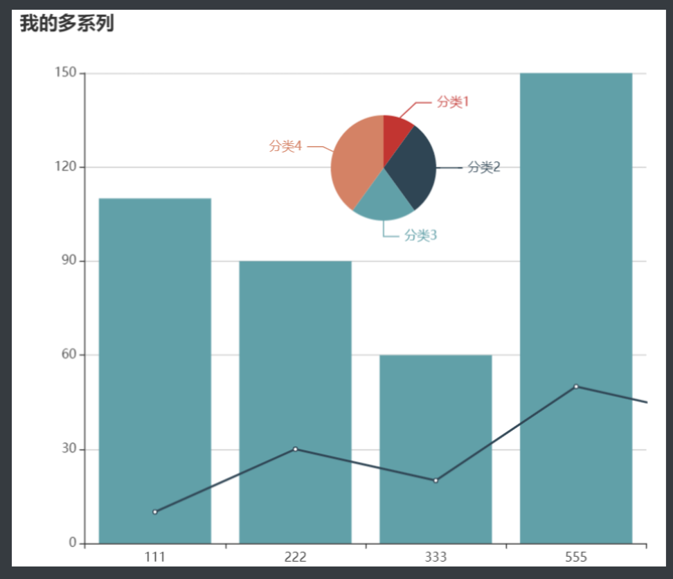
chart.setOption({
title: {
text: '我的多系列'
},
xAxis: {
data: [111, 222, 333, 555]
},
yAxis: {
},
series: [
{
name: '饼图',
type: 'pie',
center: [350, 150],
radius: 50,
data: [{
name: '分类1', value: 10
}, {
name: '分类2', value: 30
}, {
name: '分类3', value: 20
}, {
name: '分类4', value: 40
}]
},
{
name: '折线图',
type: 'line',
data: [10, 30, 20, 50, 40, 60, 80, 70]
},
{
name: '柱状图',
type: 'bar',
data: [110, 90, 60, 150, 66]
}
]
})
</script>
</body>
</html>
~
~
test-echarts.html
<!DOCTYPE html>
<html>
<head>
<meta charset="utf-8">
<script src="https://cdn.jsdelivr.net/npm/echarts@4.7.0/dist/echarts.js"></script>
<style>
#chart {
800px;
height: 400px;
}
</style>
<script>
// 路径:文档 --> 教程 --> ECharts 中的样式简介 --> 颜色主题(Theme --> 选择方案 --> 点击基本配置,修改配置 --> 下载主题 --> 点击复制,把js代码复制到<script><script>中 --> 在echarts.init添加第二个参数为刚刚生成的主题色 -->
(function (root, factory) {
if (typeof define === 'function' && define.amd) {
// AMD. Register as an anonymous module.
define(['exports', 'echarts'], factory);
} else if (typeof exports === 'object' && typeof exports.nodeName !== 'string') {
// CommonJS
factory(exports, require('echarts'));
} else {
// Browser globals
factory({}, root.echarts);
}
}(this, function (exports, echarts) {
var log = function (msg) {
if (typeof console !== 'undefined') {
console && console.error && console.error(msg);
}
};
if (!echarts) {
log('ECharts is not Loaded');
return;
}
echarts.registerTheme('westeros', {
"color": [
"#516b91",
"#59c4e6",
"#edafda",
"#93b7e3",
"#a5e7f0",
"#cbb0e3"
],
"backgroundColor": "rgba(0,0,0,0)",
"textStyle": {},
"title": {
"textStyle": {
"color": "#516b91"
},
"subtextStyle": {
"color": "#93b7e3"
}
},
"line": {
"itemStyle": {
"normal": {
"borderWidth": "2"
}
},
"lineStyle": {
"normal": {
"width": "2"
}
},
"symbolSize": "6",
"symbol": "emptyCircle",
"smooth": true
},
"radar": {
"itemStyle": {
"normal": {
"borderWidth": "2"
}
},
"lineStyle": {
"normal": {
"width": "2"
}
},
"symbolSize": "6",
"symbol": "emptyCircle",
"smooth": true
},
"bar": {
"itemStyle": {
"normal": {
"barBorderWidth": 0,
"barBorderColor": "#ccc"
},
"emphasis": {
"barBorderWidth": 0,
"barBorderColor": "#ccc"
}
}
},
"pie": {
"itemStyle": {
"normal": {
"borderWidth": 0,
"borderColor": "#ccc"
},
"emphasis": {
"borderWidth": 0,
"borderColor": "#ccc"
}
}
},
"scatter": {
"itemStyle": {
"normal": {
"borderWidth": 0,
"borderColor": "#ccc"
},
"emphasis": {
"borderWidth": 0,
"borderColor": "#ccc"
}
}
},
"boxplot": {
"itemStyle": {
"normal": {
"borderWidth": 0,
"borderColor": "#ccc"
},
"emphasis": {
"borderWidth": 0,
"borderColor": "#ccc"
}
}
},
"parallel": {
"itemStyle": {
"normal": {
"borderWidth": 0,
"borderColor": "#ccc"
},
"emphasis": {
"borderWidth": 0,
"borderColor": "#ccc"
}
}
},
"sankey": {
"itemStyle": {
"normal": {
"borderWidth": 0,
"borderColor": "#ccc"
},
"emphasis": {
"borderWidth": 0,
"borderColor": "#ccc"
}
}
},
"funnel": {
"itemStyle": {
"normal": {
"borderWidth": 0,
"borderColor": "#ccc"
},
"emphasis": {
"borderWidth": 0,
"borderColor": "#ccc"
}
}
},
"gauge": {
"itemStyle": {
"normal": {
"borderWidth": 0,
"borderColor": "#ccc"
},
"emphasis": {
"borderWidth": 0,
"borderColor": "#ccc"
}
}
},
"candlestick": {
"itemStyle": {
"normal": {
"color": "#edafda",
"color0": "transparent",
"borderColor": "#d680bc",
"borderColor0": "#8fd3e8",
"borderWidth": "2"
}
}
},
"graph": {
"itemStyle": {
"normal": {
"borderWidth": 0,
"borderColor": "#ccc"
}
},
"lineStyle": {
"normal": {
"width": 1,
"color": "#aaaaaa"
}
},
"symbolSize": "6",
"symbol": "emptyCircle",
"smooth": true,
"color": [
"#516b91",
"#59c4e6",
"#edafda",
"#93b7e3",
"#a5e7f0",
"#cbb0e3"
],
"label": {
"normal": {
"textStyle": {
"color": "#eeeeee"
}
}
}
},
"map": {
"itemStyle": {
"normal": {
"areaColor": "#f3f3f3",
"borderColor": "#516b91",
"borderWidth": 0.5
},
"emphasis": {
"areaColor": "#a5e7f0",
"borderColor": "#516b91",
"borderWidth": 1
}
},
"label": {
"normal": {
"textStyle": {
"color": "#000"
}
},
"emphasis": {
"textStyle": {
"color": "#516b91"
}
}
}
},
"geo": {
"itemStyle": {
"normal": {
"areaColor": "#f3f3f3",
"borderColor": "#516b91",
"borderWidth": 0.5
},
"emphasis": {
"areaColor": "#a5e7f0",
"borderColor": "#516b91",
"borderWidth": 1
}
},
"label": {
"normal": {
"textStyle": {
"color": "#000"
}
},
"emphasis": {
"textStyle": {
"color": "#516b91"
}
}
}
},
"categoryAxis": {
"axisLine": {
"show": true,
"lineStyle": {
"color": "#cccccc"
}
},
"axisTick": {
"show": false,
"lineStyle": {
"color": "#333"
}
},
"axisLabel": {
"show": true,
"textStyle": {
"color": "#999999"
}
},
"splitLine": {
"show": true,
"lineStyle": {
"color": [
"#eeeeee"
]
}
},
"splitArea": {
"show": false,
"areaStyle": {
"color": [
"rgba(250,250,250,0.05)",
"rgba(200,200,200,0.02)"
]
}
}
},
"valueAxis": {
"axisLine": {
"show": true,
"lineStyle": {
"color": "#cccccc"
}
},
"axisTick": {
"show": false,
"lineStyle": {
"color": "#333"
}
},
"axisLabel": {
"show": true,
"textStyle": {
"color": "#999999"
}
},
"splitLine": {
"show": true,
"lineStyle": {
"color": [
"#eeeeee"
]
}
},
"splitArea": {
"show": false,
"areaStyle": {
"color": [
"rgba(250,250,250,0.05)",
"rgba(200,200,200,0.02)"
]
}
}
},
"logAxis": {
"axisLine": {
"show": true,
"lineStyle": {
"color": "#cccccc"
}
},
"axisTick": {
"show": false,
"lineStyle": {
"color": "#333"
}
},
"axisLabel": {
"show": true,
"textStyle": {
"color": "#999999"
}
},
"splitLine": {
"show": true,
"lineStyle": {
"color": [
"#eeeeee"
]
}
},
"splitArea": {
"show": false,
"areaStyle": {
"color": [
"rgba(250,250,250,0.05)",
"rgba(200,200,200,0.02)"
]
}
}
},
"timeAxis": {
"axisLine": {
"show": true,
"lineStyle": {
"color": "#cccccc"
}
},
"axisTick": {
"show": false,
"lineStyle": {
"color": "#333"
}
},
"axisLabel": {
"show": true,
"textStyle": {
"color": "#999999"
}
},
"splitLine": {
"show": true,
"lineStyle": {
"color": [
"#eeeeee"
]
}
},
"splitArea": {
"show": false,
"areaStyle": {
"color": [
"rgba(250,250,250,0.05)",
"rgba(200,200,200,0.02)"
]
}
}
},
"toolbox": {
"iconStyle": {
"normal": {
"borderColor": "#999999"
},
"emphasis": {
"borderColor": "#666666"
}
}
},
"legend": {
"textStyle": {
"color": "#999999"
}
},
"tooltip": {
"axisPointer": {
"lineStyle": {
"color": "#cccccc",
"width": 1
},
"crossStyle": {
"color": "#cccccc",
"width": 1
}
}
},
"timeline": {
"lineStyle": {
"color": "#8fd3e8",
"width": 1
},
"itemStyle": {
"normal": {
"color": "#8fd3e8",
"borderWidth": 1
},
"emphasis": {
"color": "#8fd3e8"
}
},
"controlStyle": {
"normal": {
"color": "#8fd3e8",
"borderColor": "#8fd3e8",
"borderWidth": 0.5
},
"emphasis": {
"color": "#8fd3e8",
"borderColor": "#8fd3e8",
"borderWidth": 0.5
}
},
"checkpointStyle": {
"color": "#8fd3e8",
"borderColor": "rgba(138,124,168,0.37)"
},
"label": {
"normal": {
"textStyle": {
"color": "#8fd3e8"
}
},
"emphasis": {
"textStyle": {
"color": "#8fd3e8"
}
}
}
},
"visualMap": {
"color": [
"#516b91",
"#59c4e6",
"#a5e7f0"
]
},
"dataZoom": {
"backgroundColor": "rgba(0,0,0,0)",
"dataBackgroundColor": "rgba(255,255,255,0.3)",
"fillerColor": "rgba(167,183,204,0.4)",
"handleColor": "#a7b7cc",
"handleSize": "100%",
"textStyle": {
"color": "#333333"
}
},
"markPoint": {
"label": {
"normal": {
"textStyle": {
"color": "#eeeeee"
}
},
"emphasis": {
"textStyle": {
"color": "#eeeeee"
}
}
}
}
});
}));
</script>
</head>
<body>
<div id="chart"></div>
<script>
const chartDom = document.getElementById('chart');
// 1、引入echarts.js后,会生成全局的echarts类;2、参数二:主题的文本,参数三:渲染成svg
const chart = echarts.init(chartDom, 'westeros', { renderer: 'svg' });
// 不是setOptions,没有s
chart.setOption({
title: {
text: 'ECharts 入门案例'
},
// 渲染一个图表,至少需要添加3个元素
// x轴
xAxis: {
data: ['食品', '数码', '服饰', '箱包']
},
// y轴,没有数据,也要写上
yAxis: {},
// 数据、图表类型
series: {
type: 'bar', // 使用柱状图
data: [100, 120, 90, 150] // 一次对应xAxis.data的每一项
}
});
</script>
</body>
</html>
ECharts 4.0 新特性:dataset
ECharts 4 开始支持了 数据集(dataset)组件用于单独的数据集声明,从而数据可以单独管理,被多个组件复用,并且可以自由指定数据到视觉的映射。这一特性能将逻辑和数据分离,带来更好的复用,并易于理解。

案例:dataset 移植
<!DOCTYPE html>
<html>
  <head>
    <meta charset="utf-8">
    <script src="https://cdn.jsdelivr.net/npm/echarts@4.7.0/dist/echarts.min.js"></script>
    <style>
      #chart {
         800px;
        height: 400px;
      }
    </style>
  </head>
  <body>
    <div id="chart"></div>
    <script>
      const chartDom = document.getElementById('chart')
      const chart = echarts.init(chartDom)
      const option = {
        xAxis: {
          type: 'category'
        },
        yAxis: {},
        dataset: {
          source: [
            ['一季度', 79, 100, '分类1', 50],
            ['二季度', 81, 112, '分类2', 60],
            ['三季度', 88, 96, '分类3', 55],
            ['四季度', 72, 123, '分类4', 70],
          ]
        },
        series: [{
          type: 'pie',
          center: ['65%', 60],
          radius: 35,
          // encode里指定的数据,列要对得上,否则图标会错乱,有的不显示
          encode: { itemName: 3, value: 4 }
        }, {
          type: 'line',
          encode: { x: 0, y: 2 } // x指定的列会渲染到x轴上
        }, {
          type: 'bar',
          encode: { x: 0, y: 1 }
        }]
      }
      chart.setOption(option)
    </script>
  </body>
</html>
ECharts 基本概念: 组件
ECharts 中除了绘图之外其他部分,都可抽象为 「组件」。例如,ECharts 中至少有这些组件:xAxis(直角坐标系 X 轴)、yAxis(直角坐标系 Y 轴)、grid(直角坐标系底板)、angleAxis(极坐标系角度轴)...

案例:各种组件
<!DOCTYPE html>
<html>

<head>
  <meta charset="utf-8">
  <script src="https://cdn.jsdelivr.net/npm/echarts@4.7.0/dist/echarts.min.js"></script>
  <style>
    #chart {
       800px;
      height: 400px;
    }
  </style>
</head>

<body>
  <div id="chart"></div>
  <script>
    const chartDom = document.getElementById('chart')
    const chart = echarts.init(chartDom)
    const option = {
      title: {
        text: '数据可视化',
        subtext: '哈哈哈数据可视化'
      },
      xAxis: {
        type: 'category'
      },
      yAxis: {},
      // 图例,要和series绑定,绑定方法:给series的子项添加name属性,属性名和data中的保持一致才会在图表中显示name文字
      legend: {
        data: [
          {
            name: '分类',
            // 强制设置图形为圆。
            icon: 'circle',
            // 设置文本为红色
            textStyle: {
              color: 'red'
            }
          },
          '折线图',
          '柱状图'
        ],
        left: 100
      },
      // 右上角功能区
      toolbox: {
        feature: {
          saveAsImage: {},  // 改变按钮位置,把保存图片放到最前面
          dataZoom: {
            yAxisIndex: false // 设置为false,不控制任何y轴,缩放才会正常
          },
          restore: {} // 还原按钮,写了才会显示
        }
      },
      dataZoom: [{
        show: true,
        // 分别从30%、70%的位置开始、结束
        start: 30,
        end: 70
      }],
      dataset: {
        source: [
          ['一季度', 79, 100, '分类1', 50],
          ['二季度', 81, 112, '分类2', 60],
          ['三季度', 88, 96, '分类3', 55],
          ['四季度', 72, 123, '分类4', 70]
        ]
      },
      grid: [{
        // 【表示图表距离左边、顶部的距离,有上右下左,只影响图表位置,不影响标题、图例等组件,因为图例组件本身有同样的属性控制位置。】
        left: 50,
        top: 70
      }],
      series: [{
        name: '分类',
        type: 'pie',
        center: ['65%', 60],
        radius: 35,
        encode: { itemName: 3, value: 4 }
      }, {
        name: '折线图',
        type: 'line',
        encode: { x: 0, y: 2 }
      }, {
        name: '柱状图',
        type: 'bar',
        encode: { x: 0, y: 1 }
      }]
    }
    chart.setOption(option)
  </script>
</body>

</html>
test-echarts-series.html
<!DOCTYPE html>
<html>

<head>
  <meta charset="utf-8">
  <script src="https://cdn.jsdelivr.net/npm/echarts@4.7.0/dist/echarts.js"></script>
  <style>
    #chart {
       800px;
      height: 400px;
    }
  </style>
</head>

<body>
  <div id="chart"></div>
  <script>
    const chartDom = document.getElementById('chart');
    const chart = echarts.init(chartDom);
    chart.setOption({
      dataset: {
        source: [
          ['一季度', 100, 79, '分类1', 50],
          ['二季度', 112, 81, '分类2', 60],
          ['三季度', 96, 88, '分类3', 55],
          ['四季度', 123, 72, '分类4', 70]
        ]
      },
      title: {
        text: 'ECharts 多系列案例',
        subtext: '哈哈数据可视化呵呵'
      },
      xAxis: {
        data: ['一季度', '二季度', '三季度', '四季度']
      },
      yAxis: {},
      // 图例,要和series绑定,绑定方法:给series的子项添加name属性
      legend: {
        data: [{
          // 可以修改图例的样式
          name: '分类',
          icon: 'circle',
          textStyle: {
            color: 'red'
          }
        }, '折线图', '柱状图'],
        left: 300 // 距离左侧位置
      },
      grid: {
        top: 100,
        left: '10%',
        right: '10%',
        bottom: 100
      },
      // 右上角功能区
      toolbox: {
        feature: {
          saveAsImage: {},  // 改变按钮位置,把保存图片放到最前面
          dataZoom: {
            yAxisIndex: false // 设置为false,不控制任何y轴,缩放才会正常
          },
          restore: {}
        }
      },
      // 【底部控制可视区的滚动条】
      dataZoom: [
        {
          show: true,
          start: 30,
          end: 70
        }
      ],
      series: [{
        name: '分类',
        type: 'pie', // 饼图
        center: ['65%', 60], // 饼图【圆心】的位置 【距离左侧65%,距离右侧60px(应该是上侧)】
        radius: 35,
        encode: { itemName: 3, value: 4 } // 第四列、第五列
      }, {
        name: '折线图',
        type: 'line',
        encode: { x: 0, y: 1 }
      }, {
        name: '柱状图',
        type: 'bar',
        encode: { x: 0, y: 2 }
      }]
    });
  </script>
</body>

</html>
ECharts 基本概念:定位
大多数组件都提供了定位属性,我们可以采用类似 CSS absolute 的定位属性来控制组件的位置,下面这个案例可以通过修改 grid 组件定位来控制图表的位置

<!DOCTYPE html>
<html>

<head>
  <meta charset="utf-8">
  <script src="https://cdn.jsdelivr.net/npm/echarts@4.7.0/dist/echarts.min.js"></script>
  <style>
    #chart {
       800px;
      height: 400px;
      margin-top: 10px;
    }
  </style>
</head>

<body>
  <div>
    top: <input type="text" id="top">
    left: <input type="text" id="left">
    right: <input type="text" id="right">
    bottom: <input type="text" id="bottom">
  </div>
  <div id="chart"></div>

  <script>
    let _left = 0
    let _top = 0
    let _bottom = 0
    let _right = 0
    const topInput = document.getElementById('top')
    const leftInput = document.getElementById('left')
    const bottomInput = document.getElementById('bottom')
    const rightInput = document.getElementById('right')
    const chartDom = document.getElementById('chart')
    const chart = echarts.init(chartDom)

    function addInputEvent(dom, key) {
      dom.addEventListener('input', function (e) {
        value = e.target.value
        switch (key) {
          case 'top':
            _top = value
            break
          case 'left':
            _left = value
            break
          case 'bottom':
            _bottom = value
            break
          case 'right':
            _right = value
            break
        }
        render()
      })
    }

    function render() {
      const option = {
        title: {
          text: '数据可视化',
          subtext: '哈哈哈数据可视化哈哈哈'
        },
        xAxis: {
          type: 'category'
        },
        yAxis: {},
        dataset: {
          source: [
            ['一季度', 79, 100, '分类1', 50],
            ['二季度', 81, 112, '分类2', 60],
            ['三季度', 88, 96, '分类3', 55],
            ['四季度', 72, 123, '分类4', 70],
          ]
        },
        grid: [{
          left: _left,
          top: _top,
          right: _right,
          bottom: _bottom
        }],
        series: [{
          name: '折线图',
          type: 'line',
          encode: { x: 0, y: 2 }
        }]
      }
      chart.setOption(option)
    }

    window.onload = function () {
      topInput.value = _top
      leftInput.value = _left
      bottomInput.value = _bottom
      rightInput.value = _right
      addInputEvent(topInput, 'top')
      addInputEvent(leftInput, 'left')
      addInputEvent(bottomInput, 'bottom')
      addInputEvent(rightInput, 'right')
      render()
    }
  </script>
</body>

</html>
ECharts 基本概念:坐标系
很多系列,例如 line(折线图)、bar(柱状图)、scatter(散点图)、heatmap(热力图)等等,需要运行在 “坐标系” 上。坐标系用于布局这些图,以及显示数据的刻度等等。例如 ECharts 中至少支持这些坐标系:直角坐标系、极坐标系、地理坐标系(GEO)、单轴坐标系、日历坐标系 等。其他一些系列,例如 pie(饼图)、tree(树图)等等,并不依赖坐标系,能独立存在。还有一些图,例如 graph(关系图)等,既能独立存在,也能布局在坐标系中,依据用户的设定而来。
一个坐标系,可能由多个组件协作而成。我们以最常见的直角坐标系来举例。直角坐标系中,包括有 xAxis(直角坐标系 X 轴)、yAxis(直角坐标系 Y 轴)、grid(直角坐标系底板)三种组件。xAxis、yAxis 被 grid 自动引用并组织起来,共同工作。
案例:散点图
我们来看下图,这是最简单的使用直角坐标系的方式:只声明了 xAxis、yAxis 和一个 scatter(散点图系列),ECharts 会为它们创建 grid 并进行关联:

<!DOCTYPE html>
<html>

<head>
  <meta charset="utf-8">
  <script src="https://cdn.jsdelivr.net/npm/echarts@4.7.0/dist/echarts.min.js"></script>
  <style>
    #chart {
       800px;
      height: 400px;
    }
  </style>
</head>

<body>
  <div id="chart"></div>

  <script>
    const chartDom = document.getElementById('chart')
    const chart = echarts.init(chartDom)

    const option = {
      xAxis: {},
      yAxis: {},
      dataset: {
        source: [
          [13, 44],
          [51, 51],
          [51, 32],
          [67, 19],
          [19, 33]
        ]
      },
      series: [{
        type: 'scatter', // 散点图的名称
        encode: { x: 0, y: 1 }
      }]
    }

    chart.setOption(option)
  </script>
</body>

</html>
案例:双坐标系
双坐标系只能存在于一个坐标系中。
再来看下图,两个 yAxis,共享了一个 xAxis。两个 series,也共享了这个 xAxis,但是分别使用不同的 yAxis,使用 yAxisIndex 来指定它自己使用的是哪个 yAxis:

<!DOCTYPE html>
<html>

<head>
  <meta charset="utf-8">
  <script src="https://cdn.jsdelivr.net/npm/echarts@4.7.0/dist/echarts.min.js"></script>
  <style>
    #chart {
       800px;
      height: 400px;
    }
  </style>
</head>

<body>
  <div id="chart"></div>
  <script>
    const chartDom = document.getElementById('chart')
    const chart = echarts.init(chartDom)

    const option = {
      legend: {},
      tooltip: {},
      xAxis: {
        // 多坐标系需要明确指定xAxis的type。这里xAxis是2012~2015这样的分类数据。
        type: 'category'
      },
      yAxis: [{
        // 纵坐标的线错位的另一种解决方案:自定义左右坐标系的刻度
        min: 0,
        max: 100
      }, {
        min: 0,
        max: 100,
        // 左右两边的纵坐标的线错位,把右边的线隐藏
        // splitLine: {
        //   show: false
        // }
      }],
      dataset: {
        source: [
          ['product', '2012', '2013', '2014', '2015'],
          ['Matcha Latte', 41.1, 30.4, 65.1, 53.3],
          ['Milk Tea', 86.5, 92.1, 85.7, 83.1]
        ]
      },
      series: [
        {
          type: 'bar',
          seriesLayoutBy: 'row', // 以行的方式进行取数据
          yAxisIndex: 0  // 表示这个柱状图对应的是yAxis的第一个坐标系
        },
        {
          type: 'line',
          seriesLayoutBy: 'row',
          yAxisIndex: 1
        }
      ]
    }
    chart.setOption(option)
  </script>
</body>

</html>
案例:多坐标系
多坐标系允许有多个直角坐标系。
再来看下图,一个 ECharts 实例中,有多个 grid,每个 grid 分别有 xAxis、yAxis,他们使用 xAxisIndex、yAxisIndex、gridIndex 来指定引用关系:

<!DOCTYPE html>
<html>

<head>
  <meta charset="utf-8">
  <script src="https://cdn.jsdelivr.net/npm/echarts@4.7.0/dist/echarts.min.js"></script>
  <style>
    #chart {
       800px;
      height: 400px;
    }
  </style>
</head>

<body>
  <div id="chart"></div>
  <script>
    const chartDom = document.getElementById('chart')
    const chart = echarts.init(chartDom)
    const option = {
      legend: {},
      tooltip: {},
      xAxis: [
        {
          type: 'category',
          gridIndex: 0
        },
        {
          type: 'category',
          gridIndex: 1
        }
      ],
      yAxis: [
        {
          // y轴的坐标系也要指定gridIndex,和x轴保持一致
          gridIndex: 0
        },
        {
          gridIndex: 1
        }
      ],
      dataset: {
        source: [
          ['product', '2012', '2013', '2014', '2015'],
          ['Matcha Latte', 41.1, 30.4, 65.1, 53.3],
          ['Milk Tea', 86.5, 92.1, 85.7, 83.1],
          ['Cheese Cocoa', 24.1, 67.2, 79.5, 86.4]
        ]
      },
      // 建2个,用来区分2个坐标系,通过间距区分,否则重叠在一起不好区分
      grid: [
        {
          bottom: '55%'
        },
        {
          top: '55%'
        }
      ],
      series: [
        // 这几个系列会在第一个直角坐标系中,每个系列对应到 dataset 的每一行。
        {
          type: 'bar',
          seriesLayoutBy: 'row'
        },
        {
          type: 'bar',
          seriesLayoutBy: 'row'
        },
        {
          type: 'bar',
          seriesLayoutBy: 'row'
        },
        // 这几个系列会在第二个直角坐标系中,每个系列对应到 dataset 的每一列。
        {
          type: 'bar',
          xAxisIndex: 1,
          yAxisIndex: 1
        },
        {
          type: 'bar',
          xAxisIndex: 1,
          yAxisIndex: 1
        },
        {
          type: 'bar',
          xAxisIndex: 1, // 选择哪个x轴
          yAxisIndex: 1
        },
        {
          type: 'bar',
          xAxisIndex: 1,
          yAxisIndex: 1
        }
      ]
    }
    chart.setOption(option)
  </script>
</body>

</html>