参考 :http://blog.csdn.net/zhangxin09/article/details/6914882
An Ext JS application's UI is made up of one or many widgets called Components. All Components are subclasses of theExt.Component class which allows them to participate in automated lifecycle management including instantiation, rendering, sizing and positioning, and destruction. Ext JS provides a wide range of useful Components out of the box, and any Component can easily be extended to create a customized Component.
ExtJS 程序由不同的器件所组成,器件也称作“组件”。所有组件皆是 Ext.Component 其子类,目的在于能够参与生存周期的自动化管理,包括实例化、渲染、大小调整与定位、销毁的问题。ExtJS不但直接提供了一个广阔且实用的组件模型,而且使得任意组件都可以轻松地扩展出新的组件。
The Component Hierarchy
A Container is a special type of Component that can contain other Components. A typical application is made up of many nested Components in a tree-like structure that is referred to as the Component hierarchy. Containers are responsible for managing the Component lifecycle of their children, which includes creation, rendering, sizing and positioning, and destruction. A typical application's Component hierarchy starts with a Viewport at the top, which has other Containers and/or Components nested within it:
容器是组件的一种特殊类型,用于承载其他组件之用。一个典型的应用程序是由若干嵌套的组件而成,这有点像树状的结构。容器负责管理子组件的生存周期,包括实例化、渲染、大小调整与定位、销毁的问题。一个典型的组件层次以“视口 Viewport ”为顶点,然后其他的容器或者组件嵌套于内:
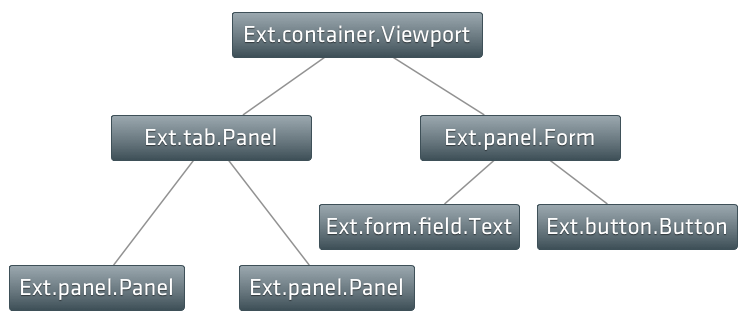
Child Components are added to a Container using the Container's items configuration property. This example uses Ext.create to instantiate two Panels, then adds those Panels as child Components of a Viewport:
可以通过容器的 items 配置项来添加容器的子组件。该例子通过 Ext.create 实例化了两个面板,这两个面板作为 Viewport 的子项出现:
var childPanel1 = Ext.create('Ext.panel.Panel', {
    title: 'Child Panel 1',
    html: 'A Panel'
});

var childPanel2 = Ext.create('Ext.panel.Panel', {
    title: 'Child Panel 2',
    html: 'Another Panel'
});

Ext.create('Ext.container.Viewport', {
    items: [ childPanel1, childPanel2 ]
});
Containers use Layout Managers to size and position their child Components. For more information on Layouts and Containers please refer to the Layouts and Containers Guide.
容器使用布局管理器进行子组件的定位和大小的调节。更多有关的资讯请参与《布局与容器》的指南。
See the Container Example for a working demo showing how to add Components to a Container using the items configuration.
通过参与容器的例子可以了解到如何通过 items 项为容器加入组件。
XTypes and Lazy Instantiation
Every Component has a symbolic name called an xtype. For example Ext.panel.Panel has an xtype of 'panel'. The xtypes for all Components are listed in the API Docs for Component. The above example showed how to add already instantiated Components to a Container. In a large application, however, this is not ideal since not all of the Components need to be instantiated right away, and some Components might never be instantiated depending on how the application is used. For example an application that uses a Tab Panel will only need the contents of each tab to be rendered if and when each tab is clicked on by the user. This is where xtypes come in handy by allowing a Container's children to be configured up front, but not instantiated until the Container determines it is necessary.
每一个组件都有一个 xtype 的标记。例如 Ext.panel.Panel 的 xtype 为 “panel”。可通过文档中心参阅全体的xtype对照表。下面的例子是如何把已经实例化的组件加入到容器中去。然而在大型的应用程序中,把所有组件马上都实例化的话,不是一个明智的选择,而且部分组件有些是根本不需要进行实例化的。例如,使用 TabPanel 控件,只是用户点击了的才会显示出来。这样的话,在进行配置的时候只是送入一个xtype,便不会实例化,而是内部需要显示的话才进行渲染。
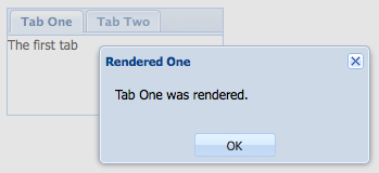
The following example code demonstrates lazy instantiation and rendering of a Container's Child components using a Tab Panel. Each tab has an event listener that displays an alert when the tab is rendered.
下面的例子演示了 TabPanel 的延时实例化过程。每张 Tab 有一个提示已经渲染好的事件触发。
Ext.create('Ext.tab.Panel', {
    renderTo: Ext.getBody(),
    height: 100,
     200,
    items: [
        {
            // Explicitly define the xtype of this Component configuration.
            // This tells the Container (the tab panel in this case)
            // to instantiate a Ext.panel.Panel when it deems necessary
            xtype: 'panel',
            title: 'Tab One',
            html: 'The first tab',
            listeners: {
                render: function() {
                    Ext.MessageBox.alert('Rendered One', 'Tab One was rendered.');
                }
            }
        },
        {
            // this component configuration does not have an xtype since 'panel' is the default
            // xtype for all Component configurations in a Container
            title: 'Tab Two',
            html: 'The second tab',
            listeners: {
                render: function() {
                    Ext.MessageBox.alert('Rendered One', 'Tab Two was rendered.');
                }
            }
        }
    ]
});
Running this code results in an immediate alert for the first tab. This happens because it is the default active tab, and so its Container Tab Panel instantiates and renders it immediately.
代码运行后立刻会出现第一个tab的alert窗口,这是因为第一个tab是缺省活动tab,因此tab panel会立刻实例化并渲染它。
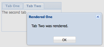
The alert for the second tab does not get displayed until the tab is clicked on. This shows that the tab was not rendered until needed, since the renderevent did not fire until the tab was activated.
第二个tab的alert不会显示,直到tab被单击。这说明tab是在用到的时候也会被渲染,因为渲染事件不会触发直到tab被激活。
For a working demo see the Lazy Instantiation Example
Showing and Hiding
All Components have built in show and hide methods. The default CSS method used to hide the Component is "display: none", but this can be changed using the hideMode configuration:
所有的组件具有内置的show和hide方法。缺省的隐藏组件的css方法是"display: none",但是这可以通过hideMode配置来改变。
var panel = Ext.create('Ext.panel.Panel', {
    renderTo: Ext.getBody(),
    title: 'Test',
    html: 'Test Panel',
    hideMode: 'visibility' // use the CSS visibility property to show and hide this component
});

panel.hide(); // hide the component

panel.show(); // show the component
Floating Components
Floating Component are positioned outside of the document flow using CSS absolute positioning, and do not participate in their Containers' layout. Some Components such as Windows are floating by default, but any Component can be made floating using the floating configuration.
浮动组件的意思是脱离 document 流的布局定位,与 CSS 的绝对定位相对相应,因此不参与其容器的布局。一些如 Windows 的组件默认便是浮动的。其实任何组件都可以改为浮动的布局,见 floatiing 配置项。
var panel = Ext.create('Ext.panel.Panel', {
     200,
    height: 100,
    floating: true, // make this panel an absolutely-positioned floating component
    title: 'Test',
    html: 'Test Panel'
});
The above code instantiates a Panel but does not render it. Normally a Component either has a renderTo configuration specified, or is added as a child Component of a Container, but in the case of floating Components neither of these is needed. Floating Components are automatically rendered to the document body the first time their show method is called:
上述代码实例化了一个 Panel 却还没有渲染它。怎么指定 Component 渲染到哪?一般来说你可以在配置项 renderTo 那里指定渲染目的地,也可以在 Container 父容器中指定,不过在本例子中就是后者作为子组件的形式出现的。浮动组件一般第一时候自动渲染到 document body,然后调用 show() 方法就会显示:
panel.show(); // render and show the floating panel
Here are a few other configurations and methods to make note of related to floating components:
这里是一些与浮动组件相关的配置项和方法:
draggable- enables dragging of a floating Component around the screen.使得浮动组件在屏幕中可作拖动shadow- customizes the look of a floating Component's shadow.自定义浮动组件其阴影的外观alignTo()- aligns a floating Component to a specific element.把浮动组件对齐到某个特定的元素。center()- centers a floating Component in its Container.把浮动组件在其容器中居中
For a working demo of floating Component features see the Floating Panel Example.
可参阅一下浮动面板的在线例子
Creating Custom Components
Composition or Extension
When creating a new UI class, the decision must be made whether that class should own an instance of a Component, or to extend that Component.
当创建一个新类,往往要作出这么的一个选择:要么拥有某个工具类的实例来扮演首要的角色,要么扩展那个类。
It is recommended to extend the nearest base class to the functionality required. This is because of the automated lifecycle management Ext JS provides which includes automated rendering when needed, automatic sizing and positioning of Components when managed by an appropriate layout manager, and automated destruction on removal from a Container.
使用 ExtJS 过程中,推荐从最靠近的基类开始扩展,实现所需的功能即可。这是因为 ExtJS 提供的自动生存周期引入了自动渲染的机制、自动大小调整和承担接受来自布局管理器的 UI 组件布局调控,还有在容器(Container)中自动销毁的功能。
It is easier to write a new class which is a Component and can take its place in the Component hierarchy rather than a new class which has an Ext JS Component, and then has to render and manage it from outside.
组织一个新类,它就是 ExtJS 的类,实现起来是很方便的,这就会导致了 Container→Component层次的形成,相比较,新类拥有一个 ExtJS 类的话,必须从外围对其渲染和组织。
Subclassing
The Class System makes it easy to extend existing Components. The following example creates a subclass of Ext.Component without adding any additional functionality:
Class System使得扩展现有的组件很容易。下面的例子创建了一个没有任何新增功能的Ext.Component组件。
Ext.define('My.custom.Component', {
    extend: 'Ext.Component'
});
Template Methods
Ext JS uses the Template method pattern to delegate to subclasses, behavior which is specific only to that subclass.
ExtJS 组件大量采用Template Method pattern(模板方法模式)来实现继承层次,交由子类来负责其特定的行为。
The meaning of this is that each class in the inheritance chain may "contribute" an extra piece of logic to certain phases in the Component's lifecycle. Each class implements its own special behavior while allowing the other classes in the inheritance chain to continue to contribute their own logic.
其意义在于,继承链中的每个子类得以于组件生存周期的某个阶段内“提交(contribute)”额外的逻辑功能。于是每一个类便拥有属于其自身的行为,当其他类加入自己的行为时也不会造成相互间的影响。
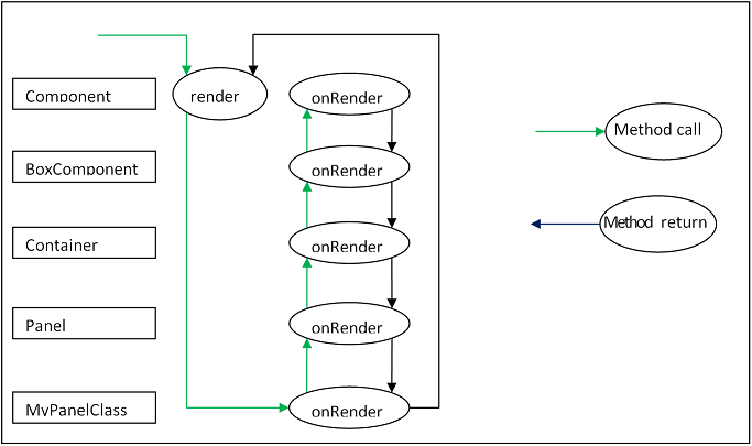
An example is the render function. render is a private method defined in Component's superclass, AbstractComponent that is responsible for initiating the rendering phase of the Component lifecycle. render must not be overridden, but it calls onRender during processing to allow the subclass implementor to add an onRender method to perform class-specific processing. Every onRender method must call its superclass' onRender method before "contributing" its extra logic.
其中一个例子是render(渲染)函数。render 函数不能够被覆盖,应该是一层一层地在各子类的实现中加入 onRender 方法,那么 render 函数就会在执行的时候把各onRender方法访问调用。每一个onRender方法必须调用其父类的onRender方法继而再埋头处理(contribute)自己(子类)的逻辑部分。
The diagram below illustrates the functioning of the onRender template method.
下面的图例演示了模板方法onRender的机能过程。
The render method is called (This is done by a Container’s layout manager). This method may not be overridden and is implemented by the Ext base class. It calls this.onRender which is the implementation within the current subclass (if implemented). This calls the superclass version which calls its superclass version etc. Eventually, each class has contributed its functionality, and control returns to the render function.
render是由容器的布局管理器(Container’s layout manager)负责调用。该方法的实现不能被“覆盖而冲掉(overridden)”,它是由 ExtJS 基类提供的。this.onRender表示当前子类所写的实现(如有提供的话)。它会访问父类的版本、父类的版本又会调用父、父类的版本……最终,每个类完成了其功能,render 函数的返回值对生存周期进行控制。
Here is an example of a Component subclass that implements the onRender method:
这里是一个组件的子类,它实现了 onRender 方法:
Ext.define('My.custom.Component', {
    extend: 'Ext.Component',
    onRender: function() {
        this.callParent(arguments); // call the superclass onRender method

        // perform additional rendering tasks here.
    }
});
It is important to note that many of the template methods also have a corresponding event. For example the render event is fired after the Component is rendered. When subclassing, however, it is it is essential to use template methods to perform class logic at important phases in the lifecycle and notevents. Events may be programmatically suspended, or may be stopped by a handler.
强调:编写子类时,模板方法应在实例化的过程中调用,属于生存周期内的一部分的动作,而不应是事件的一部分。事件有可能会由 handler 挂起,或中止。
Below are the template methods that can be implemented by subclasses of Component:
以下是 Component 子类皆可享有的模板方法:
initComponentThis method is invoked by the constructor. It is used to initialize data, set up configurations, and attach event handlers.构造器调用的方法。用于初始化数据、设置配置项,登记事件的相关任务。beforeShowThis method is invoked before the Component is shown.组件显示之前执行的方法。onShowAllows addition of behavior to the show operation. After calling the superclass’s onShow, the Component will be visible.允许在显示组件的同时加入特定的行为。父类的 onShow 执行过后,Componenet 将会显示。afterShowThis method is invoked after the Component is shown.组件显示后执行的方法onShowCompleteThis method is invoked after theafterShowmethod is complete 当 afterShow 方法完成后执行该方法onHideAllows addition of behavior to the hide operation. After calling the superclass’s onHide, the Component will be hidden. 允许在隐藏组件的同时加入特定的行为。父类的onHide执行过后,Componenet 将会隐藏。afterHideThis method is invoked after the Component has been hidden 组件隐藏后onRenderAllows addition of behavior to the rendering phase.渲染时的额外行为afterRenderAllows addition of behavior after rendering is complete. At this stage the Component’s Element will have been styled according to the configuration, will have had any configured CSS class names added, and will be in the configured visibility and the configured enable state. 允许渲染完成后加入特定的行为。此阶段的组件元素会根据配置的要求(configuartion)设置样式,会引入已配置的CSS样式名称所指定的样式名称,并会配置可见性(visibility)和配置可激活(enable)情况。onEnableAllows addition of behavior to the enable operation. After calling the superclass’s onEnable, the Component will be enabled.允许在激活组件的同时加入特定的行为。父类的onEnable执行过后,Componenet将会激活启用。onDisableAllows addition of behavior to the disable operation. After calling the superclass’s onDisable, the Component will be disabled.允许在禁用组件的同时加入特定的行为。父类的onDisable执行过后,Componenet将会禁用。onAddedAllows addition of behavior when a Component is added to a Container. At this stage, the Component is in the parent Container's collection of child items. After calling the superclass's onAdded, the ownerCt reference will be present, and if configured with a ref, the refOwner will be set.当组件被加入到容器中时允许添加新的行为。此阶段中,该组件就是容器集合中的一员。调用父类的 onAdded 之后会出现 ownerCt 的一个引用,如果你配置了 ref,则会设置 refOwner。onRemovedAllows addition of behavior when a Component is removed from its parent Container. At this stage, the Component has been removed from its parent Container's collection of child items, but has not been destroyed (It will be destroyed if the parent Container's autoDestroy is true, or if the remove call was passed a truthy second parameter). After calling the superclass's onRemoved, the ownerCt and the refOwner will not be present.当组件从容器中被移除时允许添加新的行为。此阶段中,该组件已经不是容器集合中的一员了,但尚未销毁(如父容器的 autoDestory 为 true,又或者传入了第二个参数为 true 的话,组件都会自动销毁)。当父类的 onRemoved 调用之后,不会出现 owenerCt 和 refOwner。onResizeAllows addition of behavior to the resize operation. 当调整大小尺寸时加入的行为。onPositionAllows addition of behavior to the position operation.当进行定位时加入的行为。onDestroyAllows addition of behavior to the destroy operation. After calling the superclass’s onDestroy, the Component will be destroyed.允许在销毁组件的同时加入特定的行为。父类的onDestroy执行过后,Componenet将会被销毁。beforeDestroyThis method is invoked before the Component is destroyed.当组件被销毁之前执行的方法。afterSetPositionThis method is invoked after the Components position has been set.当组件进行定位之前执行的方法afterComponentLayoutThis method is invoked after the Component is laid out.当组件执行布局之前调用的方法beforeComponentLayoutThis method is invoked before the Component is laid out.当组件执行布局之后调用的方法
Which Class To Extend
Choosing the best class to extend is mainly a matter of efficiency, and which capabilities the base class must provide. There has been a tendency to always extend Ext.Panel whenever any set of UI Components needs to be rendered and managed.
选择适合的类来扩展不但要考虑基类提供哪些功能,而且对性能方面也要着重考虑。无论有多少个 UI 控件被渲染或调控, Ext.Panel 常常就是被衍生(extend)的对象。
The Panel class has many capabilities:Panel 类拥有许多的能力:
- Border
- Header
- Header tools
- Footer
- Footer buttons
- Top toolbar
- Bottom toolbar
- Containing and managing child Components
If these are not needed, then using a Panel is a waste of resources.如果这些派不上用场,那使用 Panel 便是资源浪费。
Component
If the required UI Component does not need to contain any other Components, that is, if it just to encapsulate some form of HTML which performs the requirements, then extending Ext.Component is appropriate. For example, the following class is a Component that wraps an HTML image element, and allows setting and getting of the image's src attribute. It also fires a load event when the image is loaded:
如果要求的 UI 控件不需要其他的细节的控件,也就是,仅仅是封装某部分的 HTML 元素的话,那么可取的扩展对象就是 Ext.BoxComponent或Ext.Component。如果再缩窄一步,我不需要听凭父容器提供的大小调控功能,那么使用Ext.Component就可以了。
Ext.define('Ext.ux.Image', {
    extend: 'Ext.Component', // subclass Ext.Component
    alias: 'widget.managedimage', // this component will have an xtype of 'managedimage'
    autoEl: {
        tag: 'img',
        src: Ext.BLANK_IMAGE_URL,
        cls: 'my-managed-image'
    },

    // Add custom processing to the onRender phase.
    // Add a ‘load’ listener to the element.
    onRender: function() {
        this.autoEl = Ext.apply({}, this.initialConfig, this.autoEl);
        this.callParent(arguments);
        this.el.on('load', this.onLoad, this);
    },

    onLoad: function() {
        this.fireEvent('load', this);
    },

    setSrc: function(src) {
        if (this.rendered) {
            this.el.dom.src = src;
        } else {
            this.src = src;
        }
    },

    getSrc: function(src) {
        return this.el.dom.src || this.src;
    }
});
Usage:
var image = Ext.create('Ext.ux.Image');

Ext.create('Ext.panel.Panel', {
    title: 'Image Panel',
    height: 200,
    renderTo: Ext.getBody(),
    items: [ image ]
});

image.on('load', function() {
    console.log('image loaded: ', image.getSrc());
});

image.setSrc('http://www.sencha.com/img/sencha-large.png');
See the Managed Image Example for a working demo. This example is for demonstration purposes only - the Ext.Img class should be used for managing images in a real world application.
这是一个可封装图片的 Ext Component 类,可参与非箱子方寸模型(non box-sizing)的布局。这里看看演示。
Container
If the required UI Component is to contain other Components, but does not need any of the previously mentioned additional capabilities of a Panel, thenExt.container.Container is the appropriate class to extend. At the Container level, it is important to remember which Layout is to be used to render and manage child Components.
如果 UI 组件只是用于承载(Contain)其他 UI 元素在其身上,并不需要前文提及到的 Ext.Panel 那么多的功能,那么为避免臃肿,应采用 Ext.Container 容器类来继承。同样地,autoEl指定元素的配置项亦必不可少,将用于容器在某个元素之上进行渲染。同样,在视觉控制方面,滚动条是否显示方面(即 overflow属性),用户都可以使用 Style 配置项,或容器元素的 class 属性的两种方式进行 CSS 样式制定。
Containers have the following additional template methods:位于该层次的对象还提供了特别的模板方法:
onBeforeAddThis method is invoked before adding a new child Component. It is passed the new Component, and may be used to modify the Component, or prepare the Container in some way. Returning false aborts the add operation.当添加新的子组件的时候,就会调用该方法。这时会有新组件作为参数传入,或者可修改它,或者以特别的方式准备好 Container。返回 false 表示终止添加的操作。onAddThis method is invoked after a new Component has been added. It is passed the Component which has been added. This method may be used to update any internal structure which may depend upon the state of the child items.当加入新的组件后执行该方法。送入的组件将会被添加。该方法可用于根据子项状态而采取的内部结构更新。onRemoveThis method is invoked after a new Component has been removed. It is passed the Component which has been removed. This method may be used to update any internal structure which may depend upon the state of the child items.当新的组件被移除之后执行该方法。送入的组件将会被移除。该方法可用于根据子项状态而采取的内部结构更新。beforeLayoutThis method is invoked before the Container has laid out (and rendered if necessary) its child Components.当容器执行布局(若需要的话会进行渲染)之后前调用该方法afterLayoutThis method is invoked after the Container has laid out (and rendered if necessary) its child Components.当容器执行布局(若需要的话会进行渲染)之后调用该方法
Panel
If the required UI Component must have a header, footer, or toolbars, then Ext.Panel is the appropriate class to extend.
如果组件需要头部(header)、底部(footer)、工具条(toolbar)之类的 UI 元素,那么 Ext.Panel 便是一个很不错的基类了
Important: A Panel is a Container. It is important to remember which Layout is to be used to render and manage child Components.
注意:Panel 也是容器的一种,因此不要忘记 Panel 使用哪种布局类来渲染和调控那些子组件的。
Classes which extend Ext.Panel are usually highly application-specific and are generally used to aggregate other UI Components (Usually Containers, or form Fields) in a configured layout, and provide means to operate on the contained Components by means of controls in the tbar and the bbar.
通常 Ext.Panel 所实现的类不但有很高的程序可制定性,而且与其他 UI 组件一起有很高的内聚性(通常作为容器使用,或表单字段使用),表现在布局配置方面,针对子组件诸如tbar(顶部工具栏),bbar(底部工具栏)这些控件的命令操作。
Panels have the following additional template methods:
Panel 有下列面板方法:
afterCollapseThis method is invoked after the Panel is Collapsed. 当 Panel 闭合时调用的方法。afterExpandThis method is invoked after the Panel is expanded 当 Panel 展开时调用的方法。onDockedAddThis method is invoked after a docked item is added to the Panel 当 Panel 的槽位加入内容时调用的方法。onDockedRemoveThis method is invoked after a docked item is removed from the Panel 当 Panel 的槽位移除内容时调用的方法。