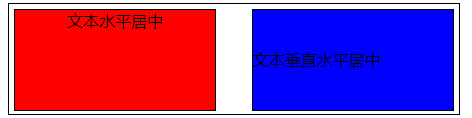
单行文本的居中
1.文字水平居中
1 <div class='box' style="text-align: center;">hello world</div>
2.文本垂直水平居中
1 <div class="box2" style="150px;height:100px;line-height: 100px;">文本垂直水平居中</div>
二、多行文本的垂直居中
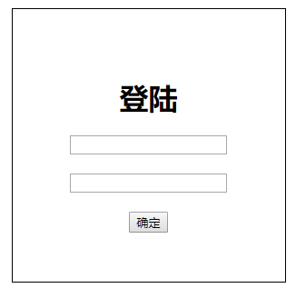
1.使用display:flex实现
flex布局会让容器内的元素得到垂直水平居中
 1 <!DOCTYPE html>
 2 <html>
 3 <head>
 4     <meta charset="utf-8">
 5     <title>登陆</title>
 6     <style type="text/css">
 7         html{width: 100%;height: 100%;}  /*整个页面的居中*/
 8         body{
 9             width: 100%;
10             height: 100%;
11             display: flex;             /*flex弹性布局*/
12             justify-content: center;
13             align-items: center;
14         }
15         #login{
16             width: 300px;
17             height: 300px;
18             border: 1px black solid;
19             display: flex;
20             flex-direction: column;        /*元素的排列方向为垂直*/
21             justify-content: center;    /*水平居中对齐*/
22             align-items: center;        /*垂直居中对齐*/
23         }
24     </style>
25 </head>
26 <body>
27     <div id="login">
28         <h1>登陆</h1>
29         <input type="text"><br>
30         <input type="password"><br>
31         <button>确定</button>
32     </div>
33 </body>
34 </html>
2.使用display:-webkit-box实现
1         body{
2             width: 100%;
3             height: 100%;
4             display: -webkit-box;             /*flex弹性布局*/
5             -webkit-box-align: center;
6             -webkit-box-pack: center;
7         }
display:flex和display:box都可用于弹性布局实现水平垂直居中,不同的是display:box是2009年的命名,已经过时,用的时候需要加上前缀;display:flex是2012年之后的命名
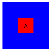
3.使用绝对定位和负边距
CSS代码:
<style>
        .box{
               width: 150px;
               height: 150px;
               background:blue;
               position: relative;
        }
        p{
               width: 50px;
               height: 50px;
               background:red;
               position: absolute;
               left:50%;
               top:50%;
               margin-left:-25px;
               margin-top: -25px;
               display: flex;
               align-items: center;
               justify-content: center;
        }
    </style>
HTML代码:
1 <div class="box"><p>A</p></div>
4.使用transform:translate定位
 1     <style>
 2     *{padding: 0;margin: 0;}   /*解决容器内元素.div是p元素产生的居中不完整*/
 3         .box{
 4                 margin: 20px auto;
 5                 width: 150px;height: 150px;
 6                 background:blue;
 7                 position: relative;
 8                 text-align: center;
 9         }
10         .box .div1{
11             position: absolute;
12             top:50%;
13             left:50%;
14             width:100%;
15             transform:translate(-50%,-50%);
16             text-align: center;
17             background: red
18         }
19     </style>
说明:/*一般情况下子元素不能是p元素,否则非完全居中,P元素自带有padding距离*/,.div1如果必须是p元素则必须加上*{margin:0;padding:0;};进行初始化,
5.绝对定位和0
 1         .box p{
 2             width:50%;
 3             height: 50%;
 4             overflow: auto;
 5             position: absolute;
 6             background:red;
 7             margin: auto;
 8             top:0;
 9             bottom:0;
10             left:0;
11             right:0;
12         }
6.通过display:table-cell
1         .box{
2                 width: 150px;height: 150px;
3                 background:blue;
4                 position: relative;
5                 text-align: center;
6                 display: table-cell;
7                 vertical-align: middle;
8 }
缺点:对容器.box的子元素的设置宽高会造成失效。