display的table和table-cell一般情况下用的不多,所以很少有人去关注它,但他们两个联手起来会给你惊喜!
当两个或者两个以上标签一起使用显示在同一行时,以前常用的是float、position进行布局,在高版本的浏览器可以使用flex、grid进行布局。无意中发现使用display:table-cell也是一个很好用的自适应布局,本文就display:table-cell做学习总结。
display:table-cell指让标签元素以表格单元格的形式呈现,使元素类似于td标签。IE8+及现代版本的浏览器都支持此属性,IE6/7不支持(可用其他方法实现类似效果)。同样,display:table-cell属性也会被float,position:absolute等属性破坏效果,应避免同时使用。
| 值 | 描述 |
|---|---|
| none | 此元素不会被显示。 |
| block | 此元素将显示为块级元素,此元素前后会带有换行符。 |
| inline | 默认。此元素会被显示为内联元素,元素前后没有换行符。 |
| inline-block | 行内块元素。(CSS2.1 新增的值) |
| list-item | 此元素会作为列表显示。 |
| run-in | 此元素会根据上下文作为块级元素或内联元素显示。 |
| compact | CSS 中有值 compact,不过由于缺乏广泛支持,已经从 CSS2.1 中删除。 |
| marker | CSS 中有值 marker,不过由于缺乏广泛支持,已经从 CSS2.1 中删除。 |
| table | 此元素会作为块级表格来显示(类似 <table>),表格前后带有换行符。 |
| inline-table | 此元素会作为内联表格来显示(类似 <table>),表格前后没有换行符。 |
| table-row-group | 此元素会作为一个或多个行的分组来显示(类似 <tbody>)。 |
| table-header-group | 此元素会作为一个或多个行的分组来显示(类似 <thead>)。 |
| table-footer-group | 此元素会作为一个或多个行的分组来显示(类似 <tfoot>)。 |
| table-row | 此元素会作为一个表格行显示(类似 <tr>)。 |
| table-column-group | 此元素会作为一个或多个列的分组来显示(类似 <colgroup>)。 |
| table-column | 此元素会作为一个单元格列显示(类似 <col>) |
| table-cell | 此元素会作为一个表格单元格显示(类似 <td> 和 <th>) |
| table-caption | 此元素会作为一个表格标题显示(类似 <caption>) |
| inherit | 规定应该从父元素继承 display 属性的值。 |
display:table-cell可以代替浮动布局,但是其不是最好的方法。其他方法有待进一步学习!
这里抛出这样一个问题,如下,让块里的多行文字垂直居中?一说到垂直居中就会想到,单行文字垂直居中line-height等于height;块级元素垂直居中,position定位或者flex布局。但这里我介绍display:table和table-cell是如何让多行文字垂直居中的。虽然感觉用的不多,但是在某些时候还是挺管用的,如下:
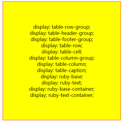
1.多行文字居中
<!DOCTYPE html>
<html lang="en">
<head>
    <meta charset="UTF-8">
    <title>table</title>
    <style>
        .parent{
            display: table;
            width: 400px;
            height: 400px;
            text-align: center;
            border:1px solid red;
            margin:0 auto;
            background: blue;   /*背景颜色无效*/
        }
        .child{
            display: table-cell;    /*子元素成为表格单元格(类似 <td> 和 <th>)*/
            height: 200px;
            background: yellow;
            vertical-align: middle; /*表格容器可以设置垂直对齐属性*/
            white-space: pre;
        }
    </style>
</head>
<body>
    <div class="parent">
        <div class="child">
display: table-row-group;
display: table-header-group;
display: table-footer-group;
display: table-row;
display: table-cell;
display: table-column-group;
display: table-column;
display: table-caption;
display: ruby-base;
display: ruby-text;
display: ruby-base-container;
display: ruby-text-container;
        </div>
    </div>
</body>
</html>
效果如下:
设置了display:table-cell的元素:
- 对宽度高度敏感
- 对margin值无反应
- 响应padding属性
- 内容溢出时会自动撑开父元素
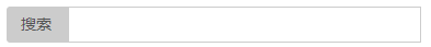
2.制作自适应搜索框
<!DOCTYPE html>
<html lang="en">
<head>
    <meta charset="UTF-8">
    <title>table</title>
    <style>
            .search-box{
                display: table;
                width:100%;
            }
            .search-content{
                width: 30%;
                display: table-cell;
                border: 1px solid #ccc;
                padding: 8px 0px;
            }
            .search-btn{
                display: table-cell;
                width: 5%;
                white-space: nowrap;
                padding: 5px 12px;
                background-color: #ccc;
                border: 1px solid #ccc;
                border-radius: 4px;
                border-bottom-right-radius: 0;
                border-top-right-radius: 0;
                font-size: 14px;
                color: #555;
                border-right: 0;
            }
    </style>
</head>
<body>
        <div class="search-box">
            <span class="search-btn">搜索</span>
            <input type="text" class="search-content"/>
        </div>
</body>
</html>
效果如下:
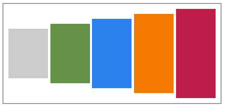
3.大小不固定的垂直居中
<!DOCTYPE html>
<html lang="en">
<head>
    <meta charset="UTF-8">
    <title>table</title>
    <style>
        .content {
            display: table-cell;
            padding: 10px;
            border: 2px solid #999;
        }

        .content div {
            display: inline-block;
            vertical-align: middle;
        }
    </style>
</head>
<body>
    <div class="content">
        <div style="padding: 50px 40px;background: #cccccc;color: #fff;"></div>
        <div style="padding: 60px 40px;background: #639146;color: #fff;"></div>
        <div style="padding: 70px 40px;background: #2B82EE;color: #fff;"></div>
        <div style="padding: 80px 40px;background: #F57900;color: #fff;"></div>
        <div style="padding: 90px 40px;background: #BC1D49;color: #fff;"></div>
    </div>
</body>
</html>
效果如下:
4.俩列自适应布局(宽度自动调节)
<!DOCTYPE html>
<html lang="en">
<head>
    <meta charset="UTF-8">
    <title>table</title>
    <style>
        .content {
            display: table;
            padding: 10px;
            border: 2px solid #999;
            width:20%;
        }
        .left-box {
            float: left;
            margin-right: 10px;
        }
        .right-box {
            display: table-cell;
            padding: 10px;
            width: 3000px;  /*右侧自适应*/
            vertical-align: top;
            border: 1px solid #ccc;
        }
    </style>
</head>
<body>
    <div class="content">
            <div class="left-box">
                <img src="https://timgsa.baidu.com/timg?image&quality=80&size=b9999_10000&sec=1563504355842&di=38efab5b4e8d2d2546238af82ce055d9&imgtype=0&src=http%3A%2F%2Fimg.9ku.com%2Fgeshoutuji%2Fsingertuji%2F1%2F15169%2F15169_1.jpg" width="70">
            </div>
            <div class="right-box">...</div>
    </div>
</body>
</html>
效果如下:
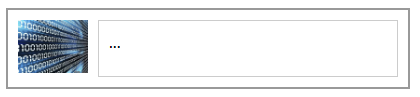
左边头像部分使用了float左浮动属性,右侧使用 display: table-cell则实现了两列自适应布局。
注:我们为一个元素设置了display:table-cell属性,而不将其父元素设置为display:table-row属性,浏览器会默认创建一个表格行。
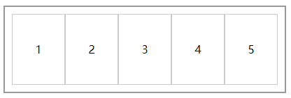
5.列表布局
<!DOCTYPE html>
<html lang="en">
<head>
    <meta charset="UTF-8">
    <title>table</title>
    <style>
    .content {
        padding: 10px;
        margin: 10px auto;
        display: table;
        width: 20%;
        border: 2px solid #999;
    }

    .content ul {
      display: table-row;
    }

    .content ul li {
      display: table-cell;
      height: 100px;
      line-height: 100px;
      text-align: center;
      border: 1px solid #ccc;
    }
    </style>
</head>
<body>
    <div class="content">
        <ul>
          <li>1</li>
          <li>2</li>
          <li>3</li>
          <li>4</li>
          <li>5</li>
        </ul>
    </div>
</body>
</html>
效果如下:
这类布局常用浮动布局(给每个li加上float:left属性)实现,但这样做有明显不足:
- 需要清除浮动
- 不支持不定高列表的浮动