flex 基本概念
flex布局(flex是flexible box的缩写), 也称为弹性盒模型 。将属性和属性值(display:flex; )写在哪个标签样式中,谁就是 容器;它的所有子元素自动成为容器成员,称为项目。
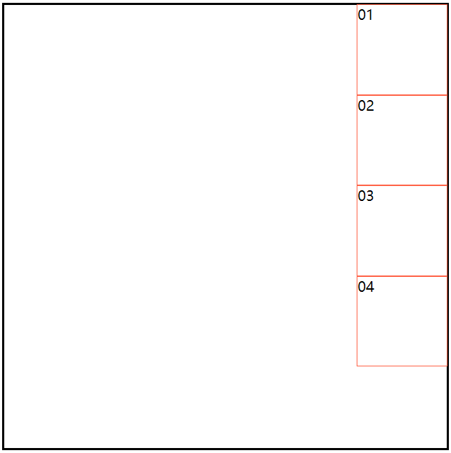
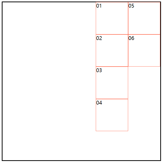
当一个元素的display 取值为flex,所有项目(子元素)会在一行显示;如果所有项目的尺寸之和大于容器,也不会超出父元素的宽、高度。不会换行(每个项目都会自动缩小相应的比例)。
<!DOCTYPE html>
<html lang="en">
<head>
    <meta charset="UTF-8">
    <meta name="viewport" content="width=device-width, initial-scale=1.0">
    <title>布局之:flex</title>
    <link rel="stylesheet" href="./CSS/normalize.css">
    <style>
        section {
            width: 500px;
            height: 800px;
            border: 2px solid black;
            margin: 50px auto;
            display: flex;
        }
        div {
            width: 100px;
            height: 100px;
            border: 1px solid tomato;
        }
    </style>
</head>
<body>
    <section>
        <div>01</div>
        <div>02</div>
        <div>03</div>
        <div>04</div>
        <div>05</div>
        <div>06</div>
    </section>
</body>
</html>
页面效果 : 每一个项目都等比例缩小了。

css代码分为两种: 一类是适用于容器的 (设置主轴的起始位置、换行、主轴的对齐方式、多跟轴线对齐方式);一类是适用于项目的(设置项目的位置)。
容器常用的属性和属性值
由于重复代码较多,就不一 一上传代码了,大家可以自己动手,敲敲代码,试试看。
一、设置主轴的起始方向 flex-direction:
默认为X轴(行):
<style>
        section {
            width: 500px;
            height: 500px;
            border: 2px solid black;
            margin: 50px auto;
            display: flex;
            /* flex-direction: row; */
            /* flex-direction: row-reverse; */
            /* flex-direction: column; */
            /* flex-direction: column-reverse; */
        }

        div {
            width: 100px;
            height: 100px;
            border: 1px solid tomato;
        }
    </style>
flex-direction:row; 默认是X轴的起始方向为开始位置 (从左到右依次摆放);
flex-direction:row-reverse; 改变X轴的起始方向为结束位置 (从右到左依次摆放);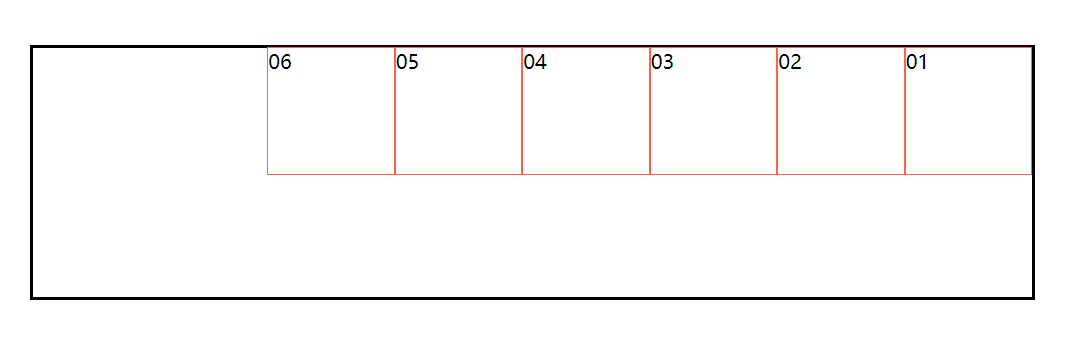
设置主轴的起始方向为Y轴(列):
flex-direction:column; 默认是Y轴的起始方向为开始位置(从上到下依次摆放)
flex-direction:column-reverse; 改变Y轴的起始方向为结束位置(从下到上依次摆放)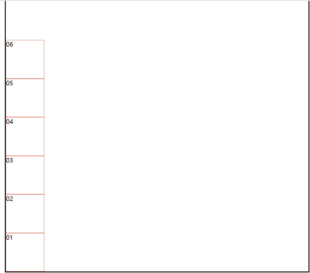
二、设置项目是否换行 flex-wrap:(默认是不换行)
 <style>
        section {
            width: 400px;
            height: 400px;
            border: 2px solid black;
            margin: 50px auto;
            display: flex;
            /* flex-wrap: wrap; */
            /* flex-wrap: wrap-reverse; */
        }

        div {
            width: 100px;
            height: 100px;
            border: 1px solid tomato;
        }
    </style>
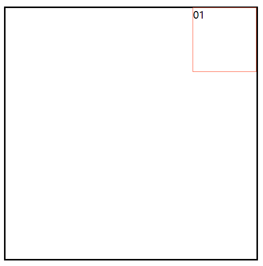
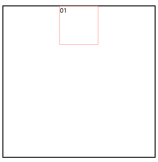
flex-wrap: nowrap; 默认值是不换行;(n个项目都会在一行显示.如果项目尺寸之和大于容器主轴的尺寸,则项目会自动缩小相应比列.) (参考第一个代码 页面结果展示)
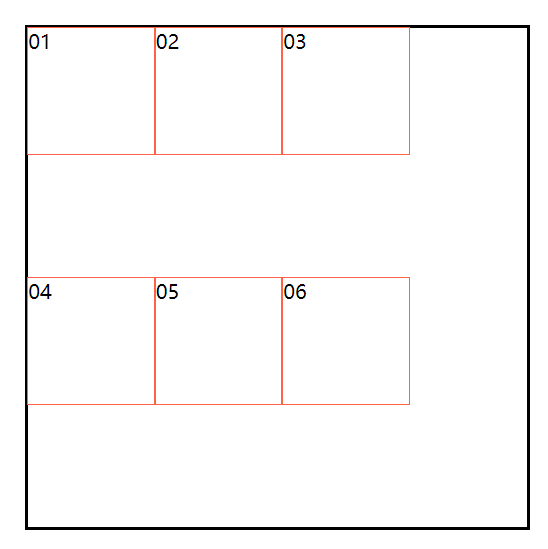
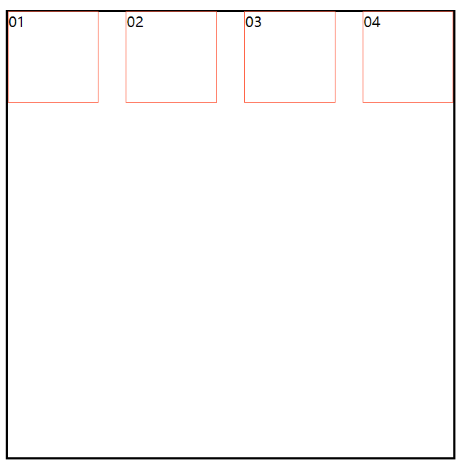
flex-wrap: wrap; 设置换行;(超出主轴的宽,则进行换行。换行后,两行之间会出现间距,是因为垂直方向有剩余空间,会平均分配给第二行的上下)
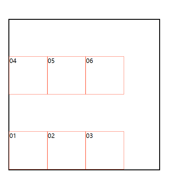
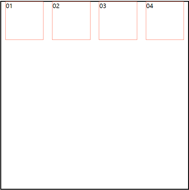
flex-wrap: wrap-reverse; 倒序换行;(如果有两行,第2行显示在前面,第一行显示在后面)
三、主轴方向的对齐方式 justify-content:
项目是一个时:
 <style>
        section {
            width: 400px;
            height: 400px;
            border: 2px solid black;
            margin: 50px auto;
            display: flex;
            /* justify-content: flex-start; */
            /* justify-content: flex-end; */
            /* justify-content: center; */
        }

        div {
            width: 100px;
            height: 100px;
            border: 1px solid tomato;
        }
    </style>
justify-content:flex-start; 以主轴开始方向对齐 (默认)
justify-content:flex-end; 以主轴结束方向对齐
justify-content:center; 主轴方向居中
项目是多个时:
<style>
        section {
            width: 500px;
            height: 500px;
            border: 2px solid black;
            margin: 50px auto;
            display: flex;
            /* justify-content: space-between; */
            /* justify-content: space-around; */
            /* justify-content: space-evenly; */
        }

        div {
            width: 100px;
            height: 100px;
            border: 1px solid tomato;
        }
    </style>
justify-content: space-between; 两端对齐 (第一个项目在容器的起始位置,最后一个项目在容器的结束位置,中间距离相等)
justify-content: space-around; 分散对齐
justify-content: space-evenly; 平分剩余空间,每个项目之间的距离相同

四、主轴改变为交叉轴方向的对齐方式
一根轴线: 主轴需改变为Y轴:flex-direction: column;
align-items: baseline; 以项目的第一行文字的基线对齐
align-items: stretch; (项目没有给高的情况下,stretch就是默认值,如果项目没有设置高度,就是容器的高)
 <style>
        section {

            width: 500px;
            height: 500px;
            border: 2px solid black;
            margin: 50px auto;
            display: flex;
            /* 主轴需改变为Y轴 项目按列摆放 */
            flex-direction: column;
            /* align-items: flex-start;  默认摆放方式 */
            /* align-items: center; */
            /* align-items: flex-end; */


        }

        div {
            width: 100px;
            height: 100px;
            border: 1px solid tomato;
        }
    </style>
align-items: flex-start; 交叉轴从开始位置对齐
align-items: center; 交叉轴居中对齐

align-items: flex-end; 交叉轴从结束位置对齐
多根轴线: (所有项目的尺寸之和,必须大于容器的尺寸,使项目换行显示)
<style>
        section {
            width: 500px;
            height: 500px;
            border: 2px solid black;
            margin: 50px auto;
            display: flex;
            flex-direction: column;
            flex-wrap: wrap;
            /* align-content: center; */
            /* align-content: flex-end; */
            /* align-content: space-between; */
            /* align-content: space-around; */
        }

        div {
            width: 100px;
            height: 100px;
            border: 1px solid tomato;
        }
    </style>
align-content: flex-start; 交叉轴从开始位置对齐
align-content: center; 交叉轴居中对齐

align-content: flex-end; 交叉轴从结束位置对齐
align-content: space-between; 交叉轴两端对齐
align-content: space-around; 交叉轴分散对齐
align-content: space-evenly; 交叉轴平均分配

项目的属性和属性值:
一、order 控制项目位置
order:1;
取值 : 正、负数 (默认值是 0)
值越小越靠前 值越大越靠后 。
(适用场景: 1.搜索引擎优化,提升SEO 把重要的信息在html代码中靠前摆放,但不影响布局 2.调整项目位置)
<style>
        section {
            width: 500px;
            height: 500px;
            border: 2px solid black;
            margin: 50px auto;
            display: flex;
        }

        div {
            width: 100px;
            height: 100px;
            border: 1px solid tomato;
        }

        div:nth-child(4) {
            order: -1;
        }
    </style>

设置一个或多个[项目]在交叉轴的对齐方式:
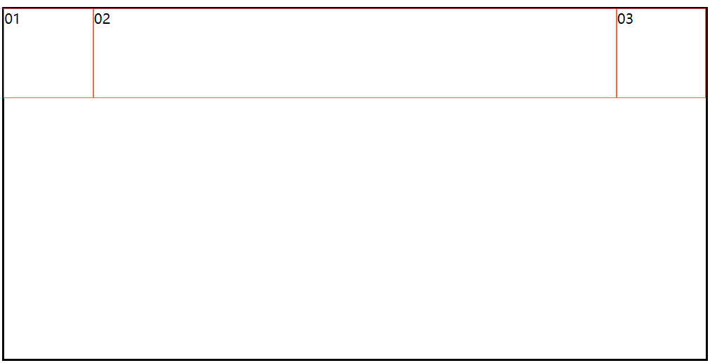
 <style>
        section {
            width: 800px;
            height: 400px;
            border: 2px solid black;
            margin: 50px auto;
            display: flex;
        }

        div {
            width: 100px;
            height: 100px;
            border: 1px solid tomato;
        }

        div:nth-child(2) {
            align-self: center;
        }

        div:nth-child(3) {
            align-self: flex-end;
        }
    </style>
align-self: flex-start; 设置项目在交叉轴开始位置摆放 (默认位置)
align-self: center; 设置项目在交叉轴居中摆放
align-self: flex-end; 设置项目在交叉轴结束位置摆放

设置某一个或多个元素放大比例
条件:所有项目的尺寸之和要小于容器的尺寸
(没有剩余空间,则设置此属性无效。)
一个元素有 flex-grow 属性
<style>
        section {
            width: 800px;
            height: 400px;
            border: 2px solid black;
            margin: 50px auto;
            display: flex;
        }

        div {
            width: 100px;
            height: 100px;
            border: 1px solid tomato;
        }

        div:nth-child(2) {
            flex-grow: 1;
        }
    </style>
多个项目有flex-grow 属性
<style>
        section {
            width: 800px;
            height: 200px;
            border: 2px solid black;
            margin: 50px auto;
            display: flex;
            box-sizing: border-box;
        }

        div {
            width: 100px;
            height: 100px;
            border: 1px solid tomato;
            box-sizing: border-box;
        }

        div:nth-child(2) {
            flex-grow: 1;
        }

        div:nth-child(4) {
            flex-grow: 2;
        }
    </style>
效果展示

将容器的剩余空间分成相应的flex-grow的份数,再按照每个项目的份数,分给有flex-grow属性的项目。
总之,flex使用起来特别方便,可适用于响应式布局,也可使用圣杯布局。只是属性较多,也要多练、多实践 ,相信你也能很快熟练使用flex的。
推荐一个小游戏,很有趣,又能增强关于flex的使用方法 :Flexbox Froggy http://blog.xiaoboswift.com/flexbox/#zh-cn 去帮助小青蛙回家吧~~